Visualization of your continuous exposure in an observational epidemiology research project
As we saw in Part 5, it’s important to describe the characteristics of your baseline population by your exposure. This helps readers get a better understanding of internal validity. For folks completing analyses with binary exposures, part 6 isn’t for you. If your analysis includes continuous exposures or ordinal exposures with at least a handful of options, read on.
I think it’s vitally important to visualize your exposure before moving any further forward with your analyses. There are a few reasons that I do this:
- Understand the distribution of your exposure. Looking at the raw spread of your data will help you understand if it has a relatively normal distribution, if it’s skewed, if it is multimodal (eg, has several peaks), or if it’s just plain old weird looking. If your exposure is non-normally distributed, then you’ll need to consider the implications of the spread in your analysis. This may mean log-transforming, square root-transforming (if you have lots of zeros in your exposure’s values), or some other sort of transformation.
- Note: make sure to visualize your transformed exposure value!
- Look for patterns that need exploring. You might notice a huge peak at a value of “999”. This might represent missing values, which will need to be recoded. You might notice that values towards the end of the tails of the bell curve might spike up at a particular value. This might represent values that were really above or below the lower limit of detection. You’ll need to think about how to handle such values, possibly recoding them following the NHANES approach as the limit of detection divided by the square root of 2.
- Understand the distribution of your exposure by key subgroups. In REGARDS, our analyses commonly focus on racial differences in CVD events. Because of this, I commonly visualize exposures with overlaid histograms for Black and White participants, and see how these exposure variables differ by race. This could easily be done for other sociodemgraphics (notably, by sex), anthropometrics, and disease states.
Ways to depict your continuous exposure
- Stem and leaf plots
- Histograms
- Kernel density plots
- Boxplots
1. Stem and leaf plots
Stem and leaf plots are handy for quickly visualizing distributions since the output happens essentially instantaneously, whereas other figures (e.g., histograms) take a second or two to render. Stem and leaf plots are basically sideways histograms using numbers. The Stata command is –stem–.
* load the sysuse auto dataset and clear all data in memory
sysuse auto, clear
* now render a stem and leaf plot of weight
stem weight
Here’s what you get in Stata’s output window. You’ll see a 2 digit number (eg “17**”) followed by a vertical bar then another 2 digit number (eg “60”). That means that 1 person has a value of 1760. If there are multiple numbers after the bar, then that means that there are more than 1 number in that group. For example, the “22**” stem has “00”, “00”, “30”, “40”, and “80” leaves, meaning that there is 2200, 2200, 2230, and 2280 as values in this dataset.
Stem-and-leaf plot for weight (Weight (lbs.))

  17** | 60
  18** | 00,00,30
  19** | 30,80,90
  20** | 20,40,50,70
  21** | 10,20,30,60
  22** | 00,00,30,40,80
  23** | 70
  24** | 10
  25** | 20,80
  26** | 40,50,50,70,90
  27** | 30,50,50
  28** | 30,30
  29** | 30
  30** |
  31** | 70,80
  32** | 00,10,20,50,60,80
  33** | 00,10,30,50,70,70
  34** | 00,20,20,30,70
  35** |
  36** | 00,00,70,90,90
  37** | 00,20,40
  38** | 30,80
  39** | 00
  40** | 30,60,60,80
  41** | 30
  42** | 90
  43** | 30
  44** |
  45** |
  46** |
  47** | 20
  48** | 40
For stems with a huge amount of values, you’ll see some other characters appear to split up the stem into multiple stems. For example, here’s the output for stem of MPG:
. stem mpg

Stem-and-leaf plot for mpg (Mileage (mpg))

  1t | 22
  1f | 44444455
  1s | 66667777
  1. | 88888888899999999
  2* | 00011111
  2t | 22222333
  2f | 444455555
  2s | 666
  2. | 8889
  3* | 001
  3t |
  3f | 455
  3s |
  3. |
  4* | 1
You’ll notice that the 10-place stem is split into 4 different stems, “1t”, “1f”, “1s”, and “1.”. I’m guessing that *=0-1, t=2-3, f=4-5, s=6-7, .=8.9.
2. Histograms
A conventional histogram splits continuous data into several evenly-spaced discrete groups called “bins”, and visualizes these discrete groups as a bar graph. These are commonly used but in Stata can’t be used with pweighting. See kernel density plots below for consideration of how to use pweighting.
Let’s see how to do this in Stata, with some randomly generated data that approximates a normal distribution. While we’re at it, we’ll make a variable called “group” that’s 0 or 1 that we’ll use later. (Also note that this dataset doesn’t use discrete values, so I’m not specifying the discrete option in my “hist” code. If you see spaces in your histogram because you are using discrete values, add “, discrete” after your variable name in the histogram line.)
clear all
// set observations to be 1000:
set obs 1000
// set a random number seed for reproducibility:
set seed 12345
// make a normally-distributed variable, with mean of 5 and SD of 10:
gen myvariable = rnormal(5,10)
// make a 0 or 1 variable for a group, following instructions for "generate ui":
// https://blog.stata.com/2012/07/18/using-statas-random-number-generators-part-1/
gen group = floor((1-0+1)*runiform() + 0)
// now make a histogram
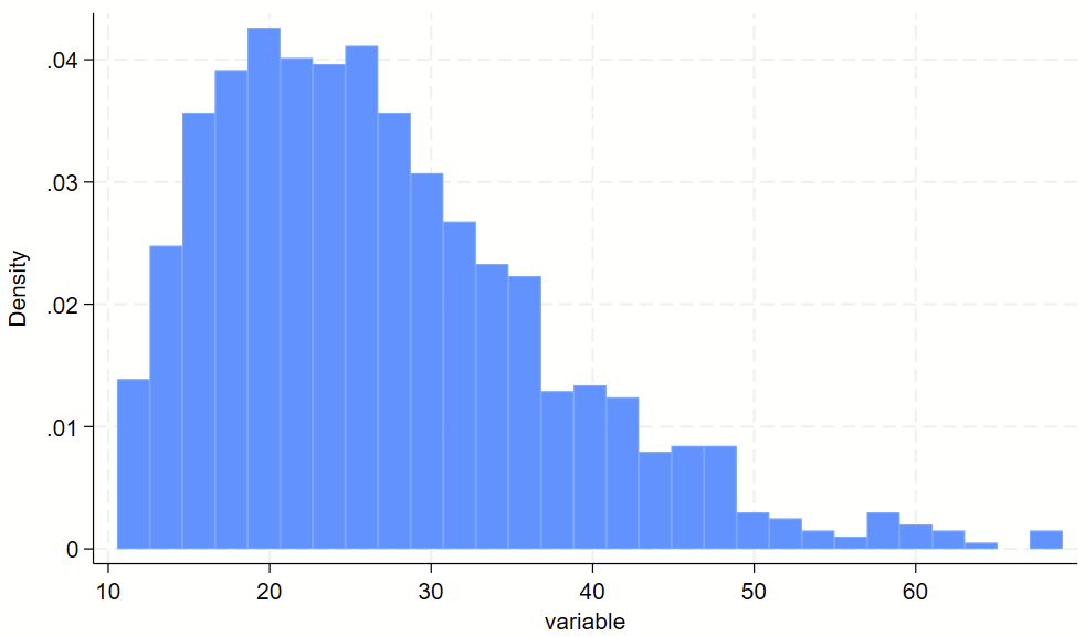
hist myvariableHere’s the overall histogram:
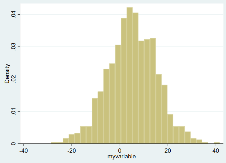
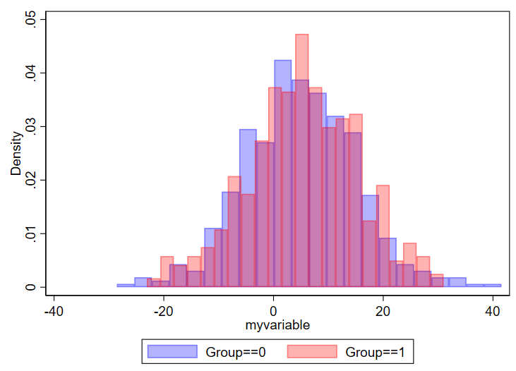
On the X axis you see the ranges of the values of variable of interest, from around -30 to about +40. On the Y axis you see the density plot. I want to show this same figure by group, however, and the bins are not currently transparent. You won’t be able to tell one group from another. So, in Stata, you need to use the “twoway histogram” option instead of just “histogram” and specify transparent colors of the figure using the %NUMBER notation. We’ll also add a legend. We’ll set the scheme to s1mono to get rid of the ugly default blue surrounding box as well. Example:
// set the scheme to s1mono:
set scheme s1mono
// now make your histogram:
twoway ///
(hist myvariable if group==0, color(blue%30)) ///
(hist myvariable if group==1, color(red%30)) ///
, ///
legend(order(1 "Group==0" 2 "Group==1"))
Here’s what you get:
You can modify things as needed. Something you might consider is changing the density to count or frequency, which is done by adding “frequency” or “percent” after the commas but before the colors. You might also opt to select different colors, which you can read about selection of colors in this editorial I wrote with Mary Cushman.
Considerations for designing histograms
One question is how many bins you want. I found this nice 2019 article by Regina L. Nuzzo, PhD (PDF link, PubMed listing) that goes over lots of considerations for the design of histograms. I specifically like the Box, which lists equations to determine number of bins and bid width. In general, if you have too many bins, your data will look choppy:
// using 100 bins here
twoway ///
(hist myvariable if group==0, color(blue%30) bin(100)) ///
(hist myvariable if group==1, color(red%30)  bin(100)) ///
, ///
legend(order(1 "Group==0" 2 "Group==1"))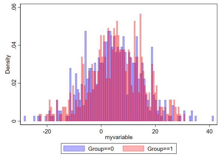
And if you have too few, you won’t be able to make sense of the overall structure of the data.
// using 2 bins here
twoway ///
(hist myvariable if group==0, color(blue%30) bin(2)) ///
(hist myvariable if group==1, color(red%30)  bin(2)) ///
, ///
legend(order(1 "Group==0" 2 "Group==1"))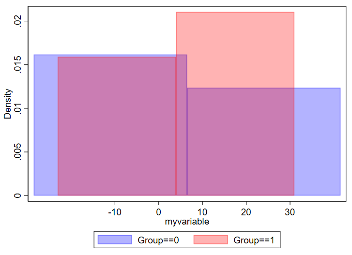
Be thoughtful about how thinly you want to splice your data.
What about histograms on a log scale?
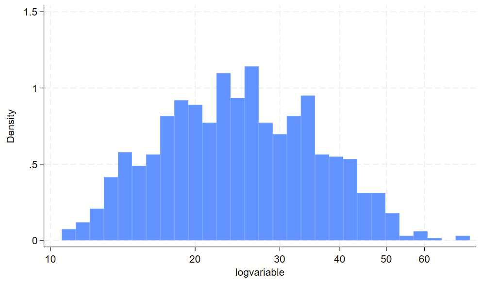
You might have some sort of skewed variable that you want to show on a log scale. The easiest way to do this is to (1) make a log-transformed variable of this, and (2) make a histogram of the log-transformed variable. For part #2, you’ll want to print the labels of the original variable in their log-transformed spot, otherwise you’ll wind up with labels for the log-transformed variable, which are usually not easy to interpret. See the `=log(number)’ trick below for how to drop non-log transformed labels in log-transformed spots.
// clear dataset and make skewed variable
clear all
set obs 1000
gen variable = 10+ ((rbeta(2, 10))*100)

// visualize non-log transformed data
twoway ///
(hist variable) ///
, ///
xlab(10 "10" 20 "20" 30 "30" 40 "40" 50 "50" 60 "60")

// make a long-transformed variable
gen logvariable=log(variable)

// visualize non-log transformed data
// plop the labels in the spots where the "original" labels should be
twoway ///
(hist logvariable) ///
, ///
xlab(`=log(10)' "10" `=log(20)' "20" `=log(30)' "30" `=log(40)' "40" `=log(50)' "50" `=log(60)' "60")
Here’s the raw variable.
Here is the histogram of the log transformed variable. Notice that the 10-60 labels are printed in the correct spots with the `=log(NUMBER)’ code above.
3. Kernel density plots
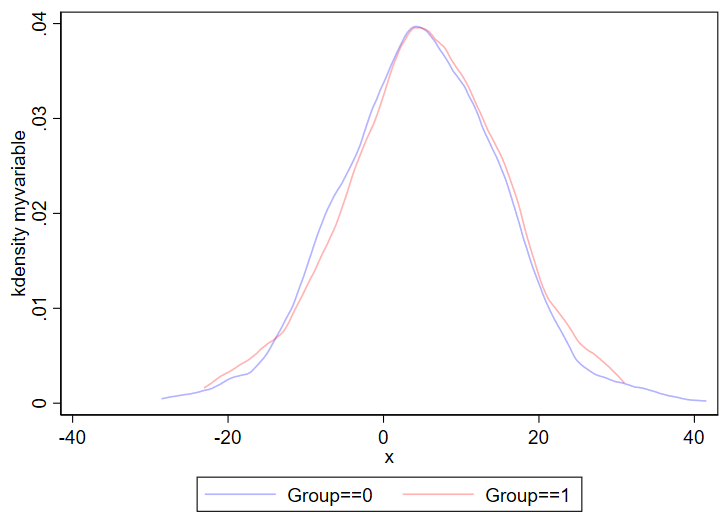
Kernel density plots are similar to histograms, except it shows a smoothed line over your data’s distribution. Histograms are less likely to hide outliers since kernel density plots can smooth over outliers. The code for a kernel density plot in Stata is nearly identical to the “twoway hist” code above.
twoway ///
(kdensity myvariable if group==0, color(blue%30)) ///
(kdensity myvariable if group==1, color(red%30)) ///
, ///
legend(order(1 "Group==0" 2 "Group==1"))
Output:
You can even combine histograms and kernel density plots!
twoway ///
(hist myvariable if group==0, color(blue%30)) ///
(hist myvariable if group==1, color(red%30)) ///
(kdensity myvariable if group==0, color(blue%30)) ///
(kdensity myvariable if group==1, color(red%30)) ///
, ///
legend(order(1 "Group==0" 2 "Group==1"))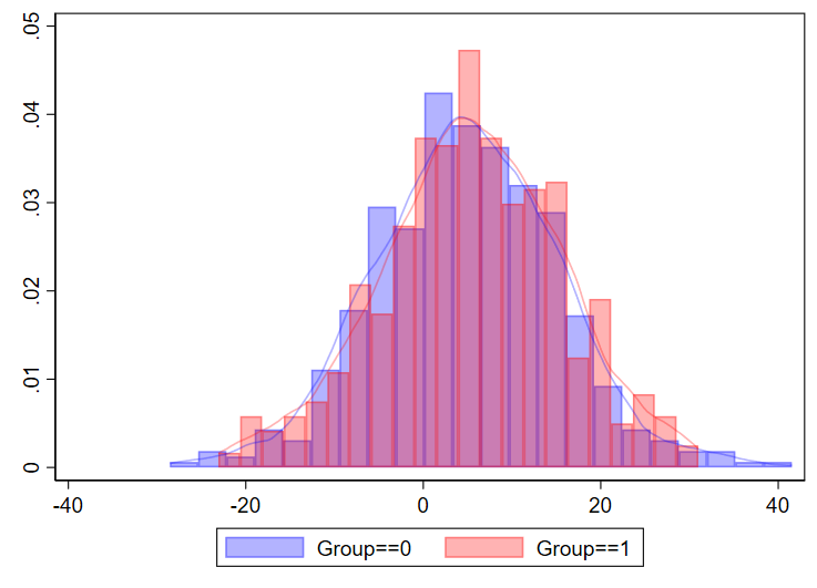
I’ve never done this myself for a manuscript, but just showing that it’s possible.
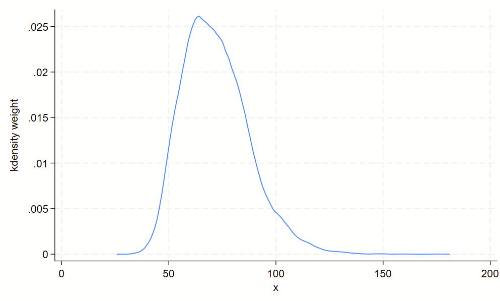
Using kdens to make kernel density plots that use pweights
You might need to make kernel density plots that use pweighting. There’s a –kdens– package that allows you to do that, which requires –moremata– to be installed. Here’s how you can make a pweighted kernel density plot with kdens.
 // only need to install once:
ssc install moremata
ssc install kdens
// load nhanes demo code
webuse nhanes2f, clear
// now svyset the data and use kdens to make a weighted plot
svyset psuid [pw=finalwgt], strata(stratid)
twoway kdens weight [pw=finalwgt]
And you’ll get this!
4. Boxplots
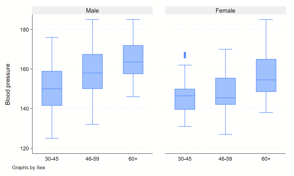
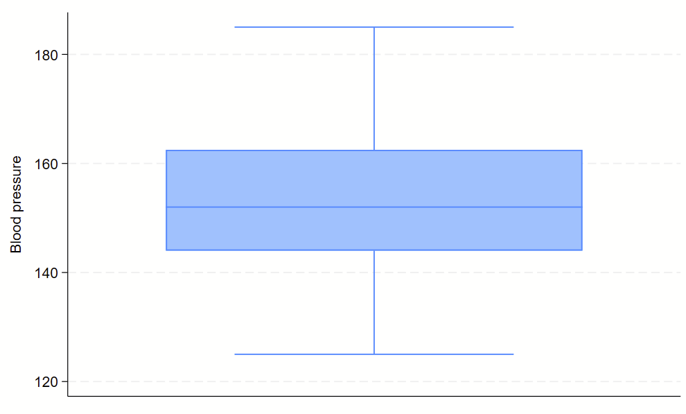
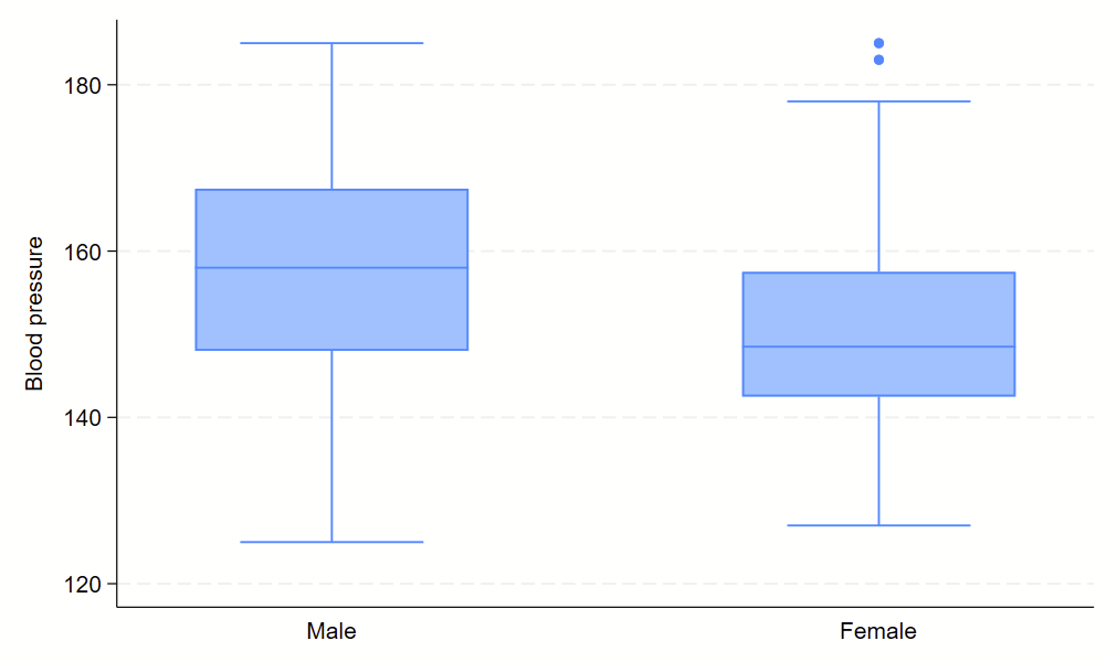
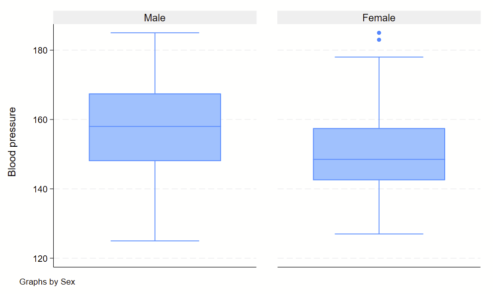
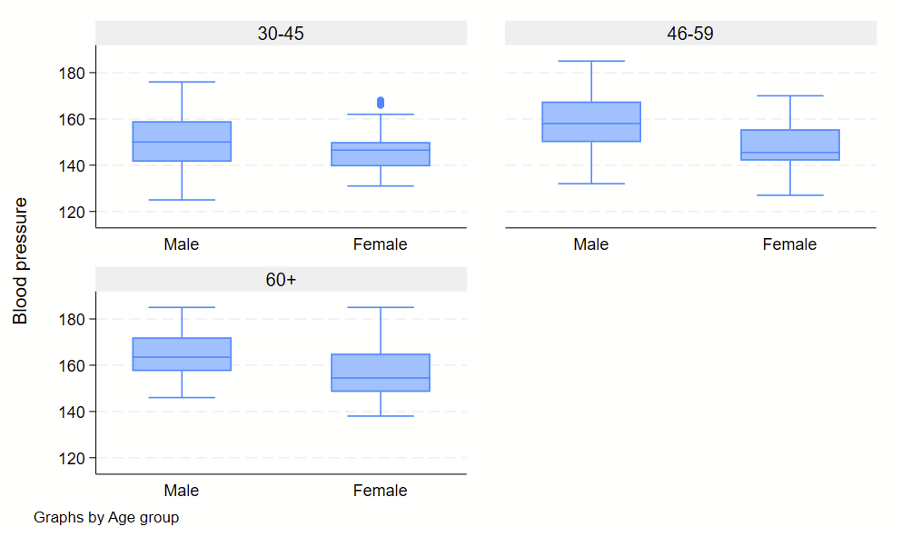
Boxplots are handy at showing distributions of multiple groups all at once. This is a nice overview of what all of the bits of the figure means. Briefly, there’s a box that is the median and IQR. There are some lines sticking out that are the upper and lower adjacent lines, which are the 75th percentile + (1.5*the width of the IQR range) and 25th percentile – (1.5*the width of the IQR range). Dots outside these ranges are the outliers.
Making boxplots is simple in stata using the –graph box– command. My one piece of advice is to be aware of the by() and over() commands since they can help you stitch together boxplots in interesting ways. Example code follows.
sysuse bplong, clear

graph box bp
graph box bp, over(sex)
graph box bp, by(sex)
graph box bp, by(agegrp) over(sex)
graph box bp, by(sex) over(agegrp)
No subcommands
Subcommand: , over(sex)
Subcommand: , by(sex)
Subcommand: , by(agegrp) over(sex)
Subcommand: , by(sex) over(agegrp)