Part 8: Regressions

There are all sorts of models out there for performing regressions. This page focuses on 3 that are used for binary outcomes:

  1. Logistic regression
  2. Modified Poisson regression
  3. Cox proportional hazards models.

Getting set up

Before you get going, you want to explicitly define your outcome of interest (aka dependent variable), primary exposure (aka independent variable) and covariates that you are adjusting for in your model (aka other independent variables). You’ll also want to know your study design (eg case-control? cross-sectional? prospective? time to event?).

Are your independent variables continuous or factor/categorical?

In these regression models, you can specify that independent variables (primary exposure and covariates that are in your model) are continuous or factor/categorical. Continuous variables can be specified with a leading “c.”, and examples might include age, height, or length. (“c.age”.) In contrast, factor/categorical variables might be New England states (e.g., 1=Connecticut, 2=Maine, 3=Mass, 4=New Hampshire, 5=RI, and 6=Vermont). So, you’d want to specifiy a variable for “newengland” as i.newengland in your regression. Stata defaults to treating the smallest number (here, 1=Connecticut) as the reference group. You can change that by using the “ib#.” prefix instead, where the # is the reference group, or here ib2.newengland to have Maine as the reference group.

Read about factor variables in –help fvvarlist–.

What about binary/dichotomous variables (things that are ==0 or 1)? Well, it doesn’t change your analysis if you specify a binary/dichotomous as either continuous (“c.”) or factor/categorical (“i.”). The math is the same on the back end.

Checking for interactions

In general, when checking for an interaction, you will need to specify if the two variables of interest are categorical or factor/categorical and drop two pound signs in between the two. See details on –help fvvarlist–. Here’s an example of how this would look, looking for an interaction between sex on age groups.

regress bp i.sex##c.agegrp

      Source |       SS           df       MS      Number of obs   =       240
-------------+----------------------------------   F(3, 236)       =     23.86
       Model |   9519.9625         3  3173.32083   Prob > F        =    0.0000
    Residual |  31392.8333       236   133.02048   R-squared       =    0.2327
-------------+----------------------------------   Adj R-squared   =    0.2229
       Total |  40912.7958       239  171.183246   Root MSE        =    11.533

------------------------------------------------------------------------------
          bp | Coefficient  Std. err.      t    P>|t|     [95% conf. interval]
-------------+----------------------------------------------------------------
         sex |
     Female  |     -4.275   3.939423    -1.09   0.279    -12.03593    3.485927
      agegrp |     7.0625   1.289479     5.48   0.000      4.52214     9.60286
             |
sex#c.agegrp |
     Female  |      -1.35   1.823599    -0.74   0.460    -4.942611    2.242611
             |
       _cons |   143.2667   2.785593    51.43   0.000     137.7789    148.7545
------------------------------------------------------------------------------

You’ll see the sex#c.agegrp P-value is 0.460, so that wouldn’t qualify as a statistically significant interaction.

Regressions using survey data?

If you are using survey analyses (eg need to account for pweighting), generally you have to use the svy: prefixes for your analyses. This includes svy: logistic, poisson, etc. Type –help svy_estimation– to see what the options are.

Logistic regression

Logistic regressions provide odds ratios of binary outcomes. Odds ratios don’t approximate the risk ratio if the outcome is common (eg >10% occurrence) so I tend to avoid them as I study hypertension, which occurs commonly in a population.

There are oodles of details on logistic regression in the excellent UCLA website. In brief, you want want to use a regression command, you can use “logit” and get the raw betas or “logistic” and get the odds ratios. Most people will want to use “logistic” to get the odds ratios.

Here’s an example of logistic regression in Stata. In this dataset, “race” is Black/White/other, so you’ll need to specify this as a factor/categorical variable with the “i.” prefix, however “smoke” is binary so you can either specify it as a continuous or as a factor/categorical variable. If you don’t specify anything, then it is treated as continuous, which is fine.


webuse lbw, clear
codebook race // see race is 1=White, 2=Black, 3=other
codebook smoke // smoke is 0/1
logistic low i.race smoke 

// output: 
Logistic regression                                     Number of obs =    189
                                                        LR chi2(3)    =  14.70
                                                        Prob > chi2   = 0.0021
Log likelihood = -109.98736                             Pseudo R2     = 0.0626

------------------------------------------------------------------------------
         low | Odds ratio   Std. err.      z    P>|z|     [95% conf. interval]
-------------+----------------------------------------------------------------
        race |
      Black  |   2.956742   1.448759     2.21   0.027     1.131716    7.724838
      Other  |   3.030001   1.212927     2.77   0.006     1.382616     6.64024
             |
       smoke |   3.052631   1.127112     3.02   0.003     1.480432    6.294487
       _cons |   .1587319   .0560108    -5.22   0.000     .0794888    .3169732
------------------------------------------------------------------------------
Note: _cons estimates baseline odds.

So, here you see that the odds ratio (OR) for the outcome of “low” is 2.96 (95% CI 1.13, 7.72) for Black relative to White participants and the OR for the outcome of “low” is 3.03 (95% CI 1.38, 6.64) for Other race relative to White participants. Since it’s the reference group, you’ll notice that White race isn’t shown. But what if we want Black race as the reference? You’d use “ib2.race” instead of “i.race”. Example:

logistic low ib2.race smoke 
// output:

Logistic regression                                     Number of obs =    189
                                                        LR chi2(3)    =  14.70
                                                        Prob > chi2   = 0.0021
Log likelihood = -109.98736                             Pseudo R2     = 0.0626

------------------------------------------------------------------------------
         low | Odds ratio   Std. err.      z    P>|z|     [95% conf. interval]
-------------+----------------------------------------------------------------
        race |
      White  |   .3382101   .1657178    -2.21   0.027     .1294525    .8836136
      Other  |   1.024777   .5049663     0.05   0.960     .3901157    2.691938
             |
       smoke |   3.052631   1.127112     3.02   0.003     1.480432    6.294487
       _cons |   .4693292   .2059043    -1.72   0.085     .1986269    1.108963
------------------------------------------------------------------------------
Note: _cons estimates baseline odds.


Modified Poisson regression

Modified Poisson regression (sometimes called Poisson Regression with Robust Variance Estimation or Poisson Regression with Sandwich Variance Estimation) is pretty straightforward. Note: this is different from ‘conventional’ Poisson regression, which is used for counts and not dichotomous outcomes. You use the “poisson” command with subcommands “, vce(robust) irr” to use the modified Poisson regression type. Note: with svy data, robust VCE is the default so you just need to use the subcommand “, irr”.

As with the logistic regression section above, race is a 3-level nominal variable so we’ll use the “i.” or “ib#.” prefix to specify that it’s not to be treated as a continuous variable.

webuse lbw, clear
codebook race // see race is 1=White, 2=Black, 3=other
codebook smoke // smoke is 0/1
// set Black race as the reference group
poisson low ib2.race smoke, vce(robust) irr
// output:

Iteration 0:  Log pseudolikelihood = -122.83059  
Iteration 1:  Log pseudolikelihood = -122.83058  

Poisson regression                                      Number of obs =    189
                                                        Wald chi2(3)  =  19.47
                                                        Prob > chi2   = 0.0002
Log pseudolikelihood = -122.83058                       Pseudo R2     = 0.0380

------------------------------------------------------------------------------
             |               Robust
         low |        IRR   std. err.      z    P>|z|     [95% conf. interval]
-------------+----------------------------------------------------------------
        race |
      White  |    .507831    .141131    -2.44   0.015     .2945523    .8755401
      Other  |   1.038362   .2907804     0.13   0.893     .5997635      1.7977
             |
       smoke |   2.020686   .4300124     3.31   0.001     1.331554    3.066471
       _cons |   .3038099   .0800721    -4.52   0.000     .1812422    .5092656
------------------------------------------------------------------------------
Note: _cons estimates baseline incidence rate.

Here you see that the relative risk (RR) of “low” for White relative to Black participants is 0.51 (95% CI 0.29, 0.88), and the RR for other race relative to Black participants is 1.04 (95% CI 0.60, 1.80). As above, the “Black” group isn’t shown since it’s the reference group.

Cox proportional hazards model

Cox PH models are used for time to event data. This is a 2-part. First is to –stset– the data, thereby telling Stata that it’s time to event data. In the –stset– command, you specify the outcome/failure variable. Second is to use the –stcox– command to specify the primary exposure/covariates of interest (aka independent variables). There are lots of different steps to setting up the stset command, so make sure to check the –help stset– page. Ditto –help stcox–.

Here, you specify the days of follow-up as “days_hfhosp” and failure as “hfhosp”. Since follow-up is in days, you set the scale to 365.25 to have it instead considered as years.

stset days_hfhosp, f(hfhosp) scale(365.25)

Then you’ll want to use the stcox command to estimate the risk of hospitalization by beta blocker use by age, sex, and race with race relative to the group that is equal to 1.

stcox betablocker age sex ib1.race

You’ll want to make a Kaplan Meier figure at the same time, read about how to do that on this other post.

Making a 15x15cm graphical abstract for Hypertension (the AHA journal)

I recently had a paper published in the AHA journal, Hypertension (here: https://www.ahajournals.org/doi/abs/10.1161/HYPERTENSIONAHA.123.22714). The submission required that I include a graphical abstract that was 15×15 cm at 300 dpi and saved in a jpeg format. (That’s 15/2.54*300 = 1772 x 1772 pixels.) I’ve been trying to use EPS files to get around annoying journal image formatting requirements recently, but they really wanted just a jpeg and not EPS. It took a bit of back and forth with the journals to give them what they wanted. Here’s how I made it. It requires PowerPoint and the excellent Inkscape free and open source program that you can download here: https://inkscape.org/

This specific example works with figures and text made within PowerPoint, YMMV if you are trying to embed pictures (eg microscopy). For that, you might want to use Photoshop or GIMP or the excellent web-based equivalent, Photopea. Just remember to output a file that is 1772×1772 pixels and saved as a jpeg.

Step 1: Make a square PowerPoint slide.

  • Open PowerPoint, make a blank presentation
  • Design –> slide size –> custom slide size
  • Change width to 15 cm and height to 15 cm (it defaults to inches in the US version of PPT)
  • Make your graphical abstract.
  • Save the pptx file.
    • Note: Following this bullet point is the one I made if you want to use the general format. Obviously it’ll need to be heavily modified for your article. I selected the colors using https://colorbrewer2.org. I’m not sure I love the color palate in the end, but it worked:

Step 2: Output your PowerPoint slide as an SVG file. I use this format since it’s a vector format that uses curves and lines to make an image that can be enlarged without any loss in quality. It doesn’t use pixels.

  • While looking at your slide in PowerPoint, hit File –> export –> change file type –> save as another file type.
  • In the pop up, change the “save as type” drop down to “scalable vector graphics format (*.svg)” and click save.
    • Note: For some reason OneDrive in Windows wouldn’t let me save an SVG file to it at this step. I had to save to my desktop instead, which was fine.
  • If you get a pop up, select “this slide only”.

Step 3: Set resolution in Inkscape

  • Open Inkscape, and open your new SVG file.
    • Note: In the file browser, it might look like a Chrome html file if you have chrome installed since Windows doesn’t natively handle SVG files.
  • When you have the SVG file open in Inkscape, click file –> export. You will see the export panel open up on the right hand side. Change the file type to jpeg. Above, change the DPI to 300 and the width and height should automatically change to 1772 pixels.
  • Hit export and you should be set!

Writing your first scientific conference abstract? Here are some ‘Mad Libs’ documents to get you going.

Writing the first draft of a scientific conference abstract is challenging. As part of an Early Career Advisory Committee ‘Science Jam’ sponsored by the UVM CVRI, a group of us came up with fill-in-the-blank, Mad Lib-style guide to help guide the completion of the first draft of a scientific conference abstract.

There’s one Zip file with 2 documents:

  • Clinical or epidemiological-style abstract (Note: Not intended for case reports)
  • Basic science abstract

The first page is where you declare all of the terms and concepts, the second page is the fill-in-the-blank section that is drawn from the first page. Do the first page first. I also color coded the clinical/epidemiology one since that’s the one I’m using.

These documents use some fancy MS Word features to help you complete the sections that may not work too well with browser-based MS Word applications, so best to do on your computer with the ‘standard’ MS Word desktop app.

Here’s the link: Conference Abstract Mad Libs.zip

Enjoy!

Making a table in Stata for regression results (and other output) using frames

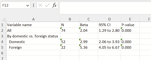
Frames were introduced in Stata 16 and are handy for (a) storing/manipulating multiple datasets simultaneously and (b) building datasets on the fly. I’ve had good luck making a table using frames. This strategy includes (1) making a new frame with as many columns as you need, specifying they are long strings (strL), and printing the top row, (2) running regressions or whatnot, (3) saving components of the regression as local macros that print as text, (4) making “display” macros for each column, (5) saving those “display” local macros to the new frame, repeating steps 2-5 as many times as needed, and (6) exporting the new frame as an Excel file.

Stata has recently introduced “tables” and “collect” features that allow you to do similar things. I find those features overly confusing, so I’ve developed this approach. I hope you find it useful! Here’s what we are trying to make:

Note: these details depend on use of concepts discussed on this other post (“return list” “ereturn list” “matrix list r(table)”, local macros, etc.). Make sure to familiarize yourself with that post.

Problems you might run into here:

  • This uses local macros, which disappear when a do file stops running. You need to run the entire do file from top to bottom every time, not line by line.
  • Stata’s -frames post- functionality is finicky. It expects exactly as many posted variables as there are variables in the new frame, and that each posted format matches the predefined format on the frame’s variable.
  • Three forward slashes (“///”) extends things across lines. Two forward slashes (“//”) allows commenting but does not continue to the next line. Check your double and triple forward slashes.
  • Stata can’t write to an open excel file. Close the excel file before re-running.

Code

* Reset frames and reload data
frames reset
sysuse auto, clear
*
* STEP 1 - Make a new frame with long strings
*
* Make new frame called "table" and 
* define all columns/variables as being strings.
* Name all variables as col#, starting with col1.
* You can extend this list as long as you'd like.
frame create table /// <--TRIPLE SLASH
strL col1 /// name 
strL col2  /// n
strL col3 /// beta
strL col4 /// 95% CI
strL col5 // <-- DOUBLE SLASH, P-value 
* If you want to add more col#s, make sure you change 
* the last double slashes to triple slashes, all new 
* col#s should have triple slashes except the last,
* which should have double (or no) slashes
*
* Prove to yourself that you have made a new frame
* called "table" in addition to the "default" one
* with the auto dataset. 
frames dir
* You could switch to the new table frame with 
* the "cwf table" command, if interested. To switch
* back, type "cwf default". 
*
* STEP 1B - print out your first row
* 
frame post table /// <--TRIPLE SLASH
("Variable name") /// col1
("N") /// col2
("Beta") /// col3
("95% CI") /// col4
("P-value") // <--DOUBLE SLASH col5 
*
* You can repeat this step as many times as you want 
* to add as many rows of custom text as needed. 
* Note that if you want a blank column, you need
* to still include the quotations within the parentheses.
* eg, if you didn't want the first column to have 
* "variable name", you'd put this instead:
* strL ("") /// col1
*
* If you wanted to flip over to the table frame and 
* see what's there, you'd type:
*cwf table 
*bro
*
* ...and to flip back to the default frame, type:
*cwf default
*
* STEP 2 - run your regression and look where the 
* coefficients of interest are stored 
* and
* STEP 3 - saving components of regression as local
* macros
*
regress price weight
*
ereturn list
* The N is here under e(N), save that as a local macro
local n1_1 = e(N)
*
matrix list r(table)
* The betas is at [1,1], the 95% thresholds
* are at [5,1] and [6,1], the se is
* at [2,1], and the p-value is at [4,1].
* We weren't planning on using se in this table,
* but we'll grab it anyway in case we change our minds
local beta1_1 = r(table)[1,1]
local ll1_1 = r(table)[5,1]
local ul1_1 = r(table)[6,1]
local se1_1 = r(table)[2,1]
local p1_1 = r(table)[4,1]
*
* STEP 4 - Making "display" macros
* 
* We are going to use local macros to grab things
* by column with a "display" commmand. Note that 
* column 1 is name, which we are going to call "all" here. 
* You could easily grab the variable name here with 
* the "local lab:" command detailed here:
* https://www.stata.com/statalist/archive/2002-11/msg00087.html
* or: 
*local label_name: variable label foreign 
* ...then call `label_name' instead of "all"
* 
* Now this is very important, we are not going to just
* capture these variables as local macros, we are going
* to capture a DISPLAY command followed by how we
* want the text to be rendered in the table. 
* Immediately after defining the local macro, we are going
* to call the macro so we can see what it will render 
* as in the table. This is what it will look like:
*local col1 di "All"
*`col1'
*
* IF YOU HAVE A BLANK CELL IN THIS ROW OF YOUR TABLE, 
* USE TWO EMPTY QUOTATION MARKS AFTER THE "di" COMMAND, eg: 
* local col1 di ""
* 
* now we will grab all pieces of the first row, 
* column-by-column, at the same time:
local col1 di "All" // name
`col1'
local col2 di `n1_1' // n
`col2'
local col3 di %4.2f `beta1_1' // betas
`col3'
local col4 di %4.2f `ll1_1' " to " %4.2f `ul1_1' // 95% ci
`col4'
local col5 di %4.3f `p1_1' // p-value
`col5' 
*
* note for the P-value, you can get much fancier in 
* formatting, see my script on how to do that here: 
* https://blog.uvm.edu/tbplante/2022/10/26/formatting-p-values-for-stata-output/
*
* STEP 5 - Posting the display macros to the table frame
* 
* Now post all columns row-by-row to the table frame
frame post table ///
("`: `col1''") ///
("`: `col2''") ///
("`: `col3''") ///
("`: `col4''") ///
("`: `col5''") // <-- DOUBLE SLASH
*
* Bonus! Insert a text row
*
frame post table /// <--TRIPLE SLASH
("By domestic vs. foreign status") /// col1
("") /// col2
("") /// col3
("") /// col4
("") // <--DOUBLE SLASH col5 
* Now repeat by foreign status
* domestic
regress price weight if foreign ==0 
ereturn list
local n1_1 = e(N)
*
matrix list r(table)
local beta1_1 = r(table)[1,1]
local ll1_1 = r(table)[5,1]
local ul1_1 = r(table)[6,1]
local se1_1 = r(table)[2,1]
local p1_1 = r(table)[4,1]
*
* note: you could automate col1 with the following command,
* which would grabe the label from the foreign==0 value of
* foreign:
*local label_name: label foreign 0
* ... then call `label_name' in the "local col1 di". 
local col1 di "  Domestic" // name, with 2 space indent
`col1'
local col2 di `n1_1' // n
`col2'
local col3 di %4.2f `beta1_1' // betas
`col3'
local col4 di %4.2f `ll1_1' " to " %4.2f `ul1_1' // 95% ci
`col4'
local col5 di %4.3f `p1_1' // p-value
`col5' 
*
frame post table ///
("`: `col1''") ///
("`: `col2''") ///
("`: `col3''") ///
("`: `col4''") ///
("`: `col5''") // <-- DOUBLE SLASH
*
* foreign
regress price weight if foreign ==1
ereturn list
local n1_1 = e(N)
*
matrix list r(table)
local beta1_1 = r(table)[1,1]
local ll1_1 = r(table)[5,1]
local ul1_1 = r(table)[6,1]
local se1_1 = r(table)[2,1]
local p1_1 = r(table)[4,1]
*
local col1 di "  Foreign" // name, with 2 space indent
`col1'
local col2 di `n1_1' // n
`col2'
local col3 di %4.2f `beta1_1' // betas
`col3'
local col4 di %4.2f `ll1_1' " to " %4.2f `ul1_1' // 95% ci
`col4'
local col5 di %4.3f `p1_1' // p-value
`col5' 
*
frame post table ///
("`: `col1''") ///
("`: `col2''") ///
("`: `col3''") ///
("`: `col4''") ///
("`: `col5''") // <-- DOUBLE SLASH
*
* STEP 6 - export the table frame as an excel file
* 
* This is the present working directory, where this excel
* file will be saved if you don't specify a directory:
pwd
*
* Switch to the table frame and take a look at it:
cwf table
bro 
* Now export it to excel
export excel using "table.xlsx", replace
*
* That's it!

Part 7: Making a table for your outcome of interest (Table 2?)

As we learned in part 5, Table 1 describes your analytical population at baseline by your exposure. For those using a continuous variable as an exposure, it’s by quantile (e.g., tertile, quartile) of the exposure. I propose a table known as “Table 2” that describes the outcome of interest by the exposure used in Table 1. You might have seen something along the lines of this in papers before, and we are going to call it “Table 2”. It’s not a universal table in observational epidemiology, so calling it “Table 2” is a bit much. But we’ll call it “Table 2” for our purposes.

Columns

The columns should be identical to that in your Table 1. (I suggest having an “All” column if you don’t have one in your Table 1 though.)

Rows

In Table 1, I suggested having an N and range for continuous variables of your quantiles. I suggest not including those in your Table 2 if they are already in your Table 1, since it’s duplicative. I suppose it might be helpful for error checking to have them in table 2, and confirming that they are identical to your Table 1. But, I suggest not including a row for Ns and ranges in your Table 2 that is included in the manuscript.

In a very simple Table 2, there might be a single row: the outcome in the analytical population. It might look like this:

AllTertile 1Tertile 2Tertile 3
All

BUT! There might be a stratification of interest in your table. in the REGARDS study, we often stratify by Black vs. White race or by sex. So, you might also include rows for each subsequent group, like this:

AllTertile 1Tertile 2Tertile 3
All
Black participants
White participants

Finally, for subgroups, you might opt to include a minimally-adjusted regression comparing your strata. in this example, we could use a modified Poisson regression (i.e., Poisson regression with sandwich or robust variance estimators, Zou’s method) to compare risk of the outcome overall an in each tertile. I’d just adjust for age and sex in this example. So:

AllTertile 1Tertile 2Tertile 3
All
Black participants
White participants
RR, Black vs. White (ref)

Cell

Here, I suggest presenting # with event/# at risk (percentage with event) in each cell, except in the RR row, which would present RR and the 95% confidence interval. Example (totally made up numbers here and some placeholder ##’s, as FYI):

AllTertile 1Tertile 2Tertile 3
All1200/3000 (40%)300/1000 (30%)400/1000 (40%)500/1000 (50%)
Black participants500/1000 (50%)##/## (##%)##/## (##%)##/## (##%)
White participants700/2000 (35%)##/## (##%)##/## (##%)##/## (##%)
RR, Black vs. White (ref)1.42 (1.30-1.55)1.20 (1.15-1.25)1.22 (1.18-1.30)1.21 (1.19-1.28)

That’s it! Even if you don’t include this table, it’s super handy to have to describe the outcome in the text.

Time to event analyses

For time to event analyses, this should be modified a bit. Instead, this should focus on events, follow-up (in person-years), and incident rate (e.g., events in 1000 person-years).

Part 6: Visualizing your continuous exposure at baseline

Visualization of your continuous exposure in an observational epidemiology research project

As we saw in Part 5, it’s important to describe the characteristics of your baseline population by your exposure. This helps readers get a better understanding of internal validity. For folks completing analyses with binary exposures, part 6 isn’t for you. If your analysis includes continuous exposures or ordinal exposures with at least a handful of options, read on.

I think it’s vitally important to visualize your exposure before moving any further forward with your analyses. There are a few reasons that I do this:

  1. Understand the distribution of your exposure. Looking at the raw spread of your data will help you understand if it has a relatively normal distribution, if it’s skewed, if it is multimodal (eg, has several peaks), or if it’s just plain old weird looking. If your exposure is non-normally distributed, then you’ll need to consider the implications of the spread in your analysis. This may mean log-transforming, square root-transforming (if you have lots of zeros in your exposure’s values), or some other sort of transformation.
    • Note: make sure to visualize your transformed exposure value!
  2. Look for patterns that need exploring. You might notice a huge peak at a value of “999”. This might represent missing values, which will need to be recoded. You might notice that values towards the end of the tails of the bell curve might spike up at a particular value. This might represent values that were really above or below the lower limit of detection. You’ll need to think about how to handle such values, possibly recoding them following the NHANES approach as the limit of detection divided by the square root of 2.
  3. Understand the distribution of your exposure by key subgroups. In REGARDS, our analyses commonly focus on racial differences in CVD events. Because of this, I commonly visualize exposures with overlaid histograms for Black and White participants, and see how these exposure variables differ by race. This could easily be done for other sociodemgraphics (notably, by sex), anthropometrics, and disease states.

Ways to depict your continuous exposure

  1. Stem and leaf plots
  2. Histograms
  3. Kernel density plots
  4. Boxplots

1. Stem and leaf plots

Stem and leaf plots are handy for quickly visualizing distributions since the output happens essentially instantaneously, whereas other figures (e.g., histograms) take a second or two to render. Stem and leaf plots are basically sideways histograms using numbers. The Stata command is –stem–.

* load the sysuse auto dataset and clear all data in memory
sysuse auto, clear
* now render a stem and leaf plot of weight
stem weight

Here’s what you get in Stata’s output window. You’ll see a 2 digit number (eg “17**”) followed by a vertical bar then another 2 digit number (eg “60”). That means that 1 person has a value of 1760. If there are multiple numbers after the bar, then that means that there are more than 1 number in that group. For example, the “22**” stem has “00”, “00”, “30”, “40”, and “80” leaves, meaning that there is 2200, 2200, 2230, and 2280 as values in this dataset.

Stem-and-leaf plot for weight (Weight (lbs.))

  17** | 60
  18** | 00,00,30
  19** | 30,80,90
  20** | 20,40,50,70
  21** | 10,20,30,60
  22** | 00,00,30,40,80
  23** | 70
  24** | 10
  25** | 20,80
  26** | 40,50,50,70,90
  27** | 30,50,50
  28** | 30,30
  29** | 30
  30** | 
  31** | 70,80
  32** | 00,10,20,50,60,80
  33** | 00,10,30,50,70,70
  34** | 00,20,20,30,70
  35** | 
  36** | 00,00,70,90,90
  37** | 00,20,40
  38** | 30,80
  39** | 00
  40** | 30,60,60,80
  41** | 30
  42** | 90
  43** | 30
  44** | 
  45** | 
  46** | 
  47** | 20
  48** | 40

For stems with a huge amount of values, you’ll see some other characters appear to split up the stem into multiple stems. For example, here’s the output for stem of MPG:

. stem mpg

Stem-and-leaf plot for mpg (Mileage (mpg))

  1t | 22
  1f | 44444455
  1s | 66667777
  1. | 88888888899999999
  2* | 00011111
  2t | 22222333
  2f | 444455555
  2s | 666
  2. | 8889
  3* | 001
  3t | 
  3f | 455
  3s | 
  3. | 
  4* | 1

You’ll notice that the 10-place stem is split into 4 different stems, “1t”, “1f”, “1s”, and “1.”. I’m guessing that *=0-1, t=2-3, f=4-5, s=6-7, .=8.9.

2. Histograms

A conventional histogram splits continuous data into several evenly-spaced discrete groups called “bins”, and visualizes these discrete groups as a bar graph. These are commonly used but in Stata can’t be used with pweighting. See kernel density plots below for consideration of how to use pweighting.

Let’s see how to do this in Stata, with some randomly generated data that approximates a normal distribution. While we’re at it, we’ll make a variable called “group” that’s 0 or 1 that we’ll use later. (Also note that this dataset doesn’t use discrete values, so I’m not specifying the discrete option in my “hist” code. If you see spaces in your histogram because you are using discrete values, add “, discrete” after your variable name in the histogram line.)

clear all
// set observations to be 1000:
set obs 1000
// set a random number seed for reproducibility: 
set seed 12345
// make a normally-distributed variable, with mean of 5 and SD of 10:
gen myvariable = rnormal(5,10)
// make a 0 or 1 variable for a group, following instructions for "generate ui":
// https://blog.stata.com/2012/07/18/using-statas-random-number-generators-part-1/
gen group = floor((1-0+1)*runiform() + 0)
// now make a histogram
hist myvariable

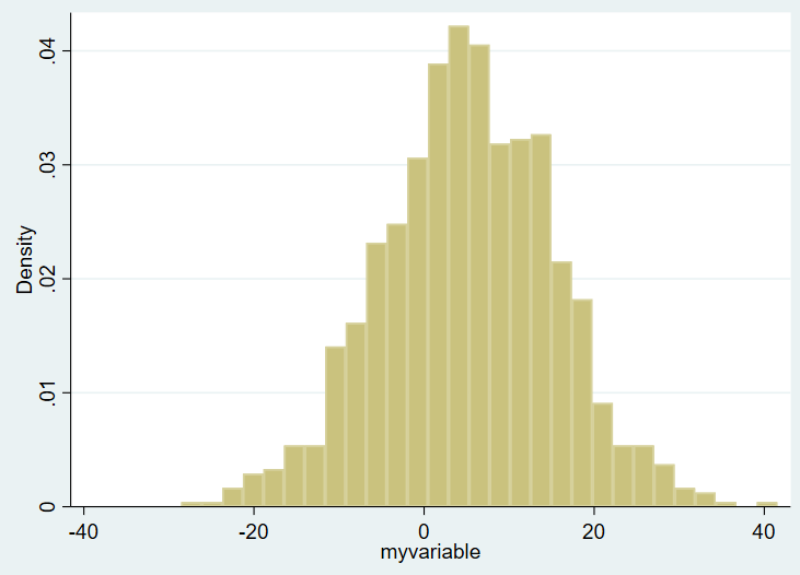
Here’s the overall histogram:

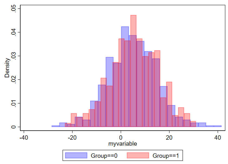
On the X axis you see the ranges of the values of variable of interest, from around -30 to about +40. On the Y axis you see the density plot. I want to show this same figure by group, however, and the bins are not currently transparent. You won’t be able to tell one group from another. So, in Stata, you need to use the “twoway histogram” option instead of just “histogram” and specify transparent colors of the figure using the %NUMBER notation. We’ll also add a legend. We’ll set the scheme to s1mono to get rid of the ugly default blue surrounding box as well. Example:

// set the scheme to s1mono:
set scheme s1mono
// now make your histogram:
twoway ///
(hist myvariable if group==0, color(blue%30)) ///
(hist myvariable if group==1, color(red%30)) ///
, ///
legend(order(1 "Group==0" 2 "Group==1"))

Here’s what you get:

You can modify things as needed. Something you might consider is changing the density to count or frequency, which is done by adding “frequency” or “percent” after the commas but before the colors. You might also opt to select different colors, which you can read about selection of colors in this editorial I wrote with Mary Cushman.

Considerations for designing histograms

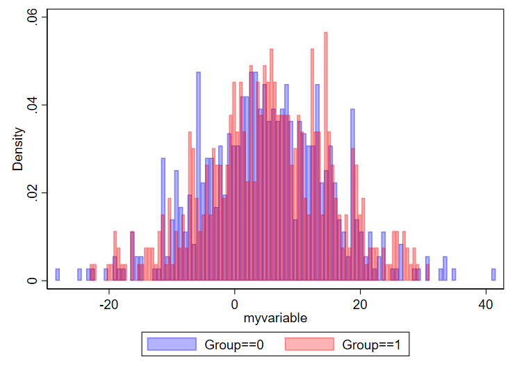
One question is how many bins you want. I found this nice 2019 article by Regina L. Nuzzo, PhD (PDF link, PubMed listing) that goes over lots of considerations for the design of histograms. I specifically like the Box, which lists equations to determine number of bins and bid width. In general, if you have too many bins, your data will look choppy:

// using 100 bins here
twoway ///
(hist myvariable if group==0, color(blue%30) bin(100)) ///
(hist myvariable if group==1, color(red%30)  bin(100)) ///
, ///
legend(order(1 "Group==0" 2 "Group==1"))

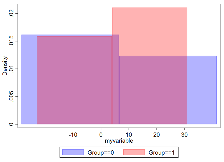
And if you have too few, you won’t be able to make sense of the overall structure of the data.

// using 2 bins here
twoway ///
(hist myvariable if group==0, color(blue%30) bin(2)) ///
(hist myvariable if group==1, color(red%30)  bin(2)) ///
, ///
legend(order(1 "Group==0" 2 "Group==1"))

Be thoughtful about how thinly you want to splice your data.

What about histograms on a log scale?

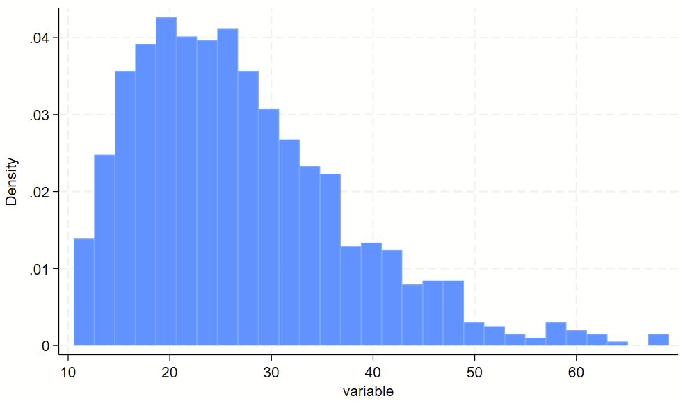
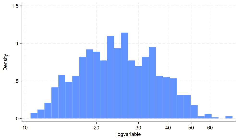
You might have some sort of skewed variable that you want to show on a log scale. The easiest way to do this is to (1) make a log-transformed variable of this, and (2) make a histogram of the log-transformed variable. For part #2, you’ll want to print the labels of the original variable in their log-transformed spot, otherwise you’ll wind up with labels for the log-transformed variable, which are usually not easy to interpret. See the `=log(number)’ trick below for how to drop non-log transformed labels in log-transformed spots.

// clear dataset and make skewed variable
clear all 
set obs 1000
gen variable = 10+ ((rbeta(2, 10))*100)

// visualize non-log transformed data
twoway /// 
(hist variable) ///
, ///
xlab(10 "10" 20 "20" 30 "30" 40 "40" 50 "50" 60 "60")

// make a long-transformed variable
gen logvariable=log(variable)

// visualize non-log transformed data
// plop the labels in the spots where the "original" labels should be
twoway ///
(hist logvariable) ///
, ///
xlab(`=log(10)' "10" `=log(20)' "20" `=log(30)' "30" `=log(40)' "40" `=log(50)' "50" `=log(60)' "60")

Here’s the raw variable.

Here is the histogram of the log transformed variable. Notice that the 10-60 labels are printed in the correct spots with the `=log(NUMBER)’ code above.

3. Kernel density plots

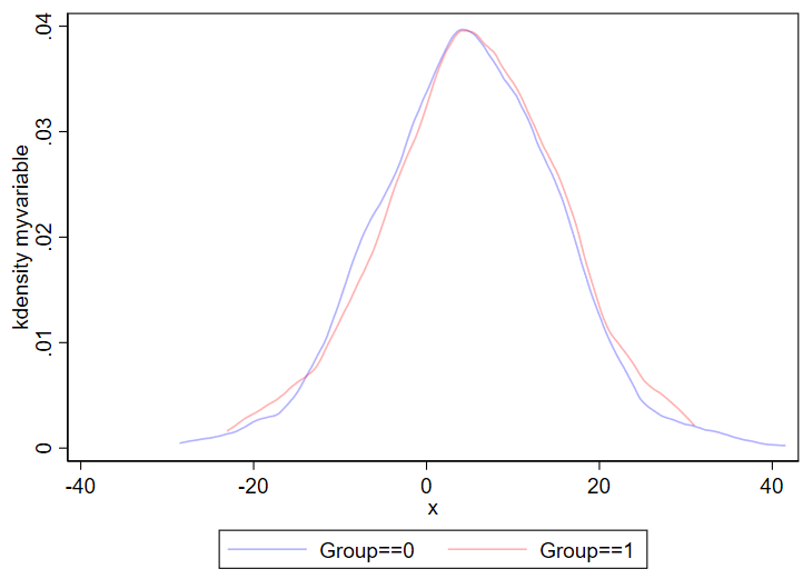
Kernel density plots are similar to histograms, except it shows a smoothed line over your data’s distribution. Histograms are less likely to hide outliers since kernel density plots can smooth over outliers. The code for a kernel density plot in Stata is nearly identical to the “twoway hist” code above.

twoway ///
(kdensity myvariable if group==0, color(blue%30)) ///
(kdensity myvariable if group==1, color(red%30)) ///
, ///
legend(order(1 "Group==0" 2 "Group==1"))

Output:

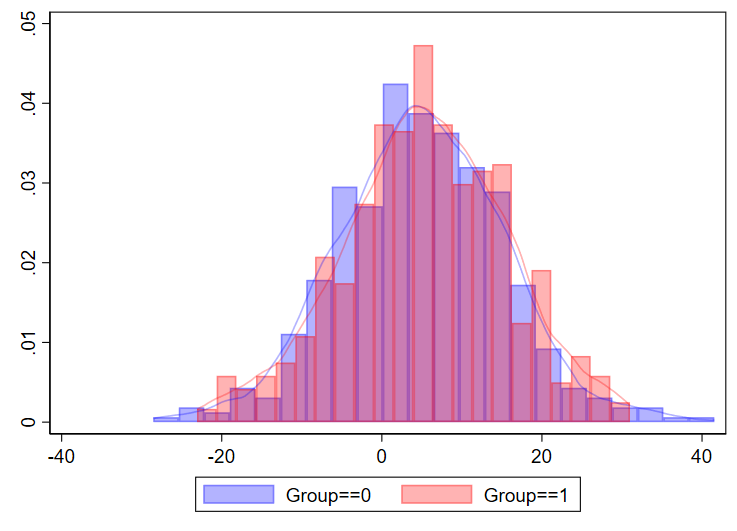
You can even combine histograms and kernel density plots!

twoway ///
(hist myvariable if group==0, color(blue%30)) ///
(hist myvariable if group==1, color(red%30)) ///
(kdensity myvariable if group==0, color(blue%30)) ///
(kdensity myvariable if group==1, color(red%30)) ///
, ///
legend(order(1 "Group==0" 2 "Group==1"))

I’ve never done this myself for a manuscript, but just showing that it’s possible.

Using kdens to make kernel density plots that use pweights

You might need to make kernel density plots that use pweighting. There’s a –kdens– package that allows you to do that, which requires –moremata– to be installed. Here’s how you can make a pweighted kernel density plot with kdens.

 // only need to install once:
ssc install moremata
ssc install kdens
// load nhanes demo code
webuse nhanes2f, clear
// now svyset the data and use kdens to make a weighted plot
svyset psuid [pw=finalwgt], strata(stratid)
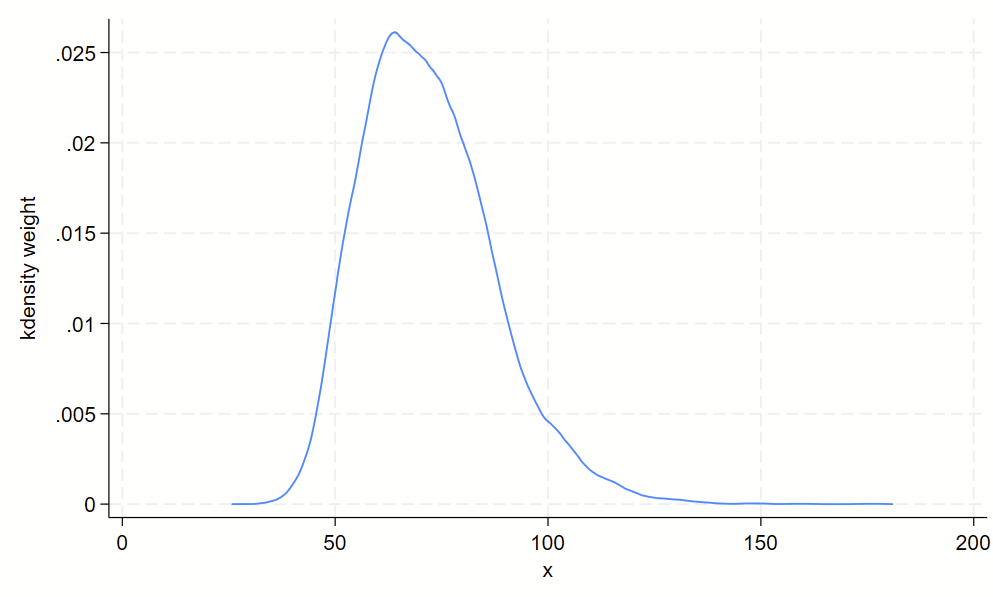
twoway kdens weight [pw=finalwgt]

And you’ll get this!

4. Boxplots

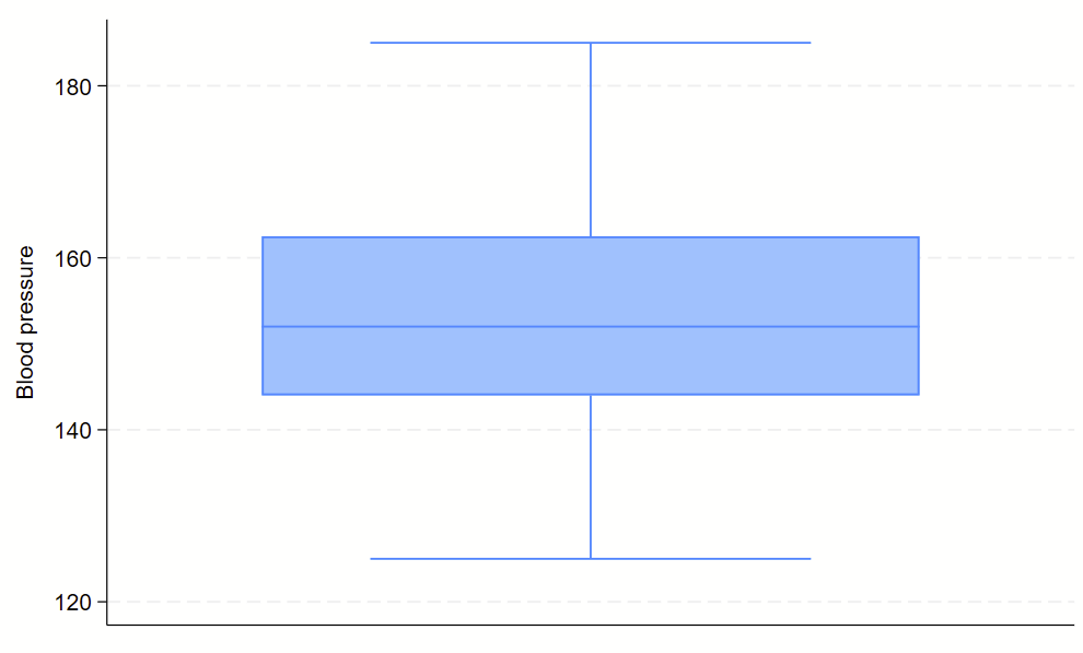
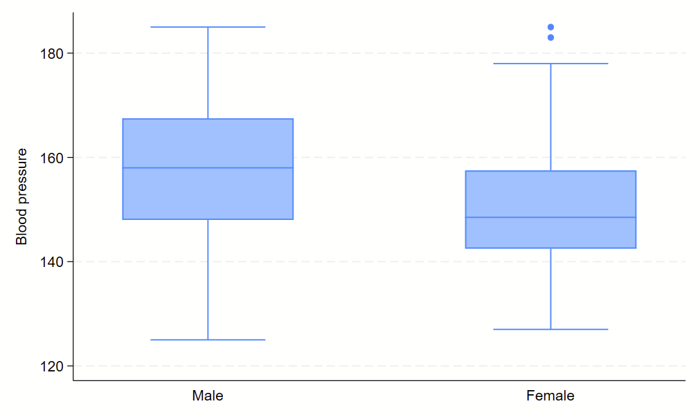
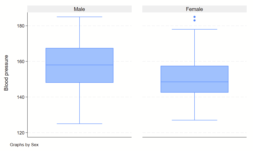
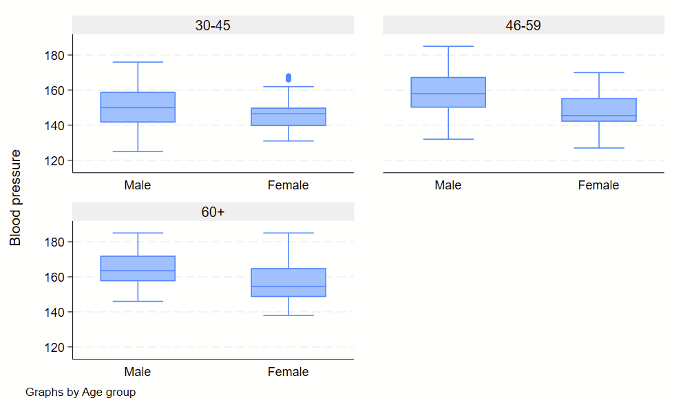
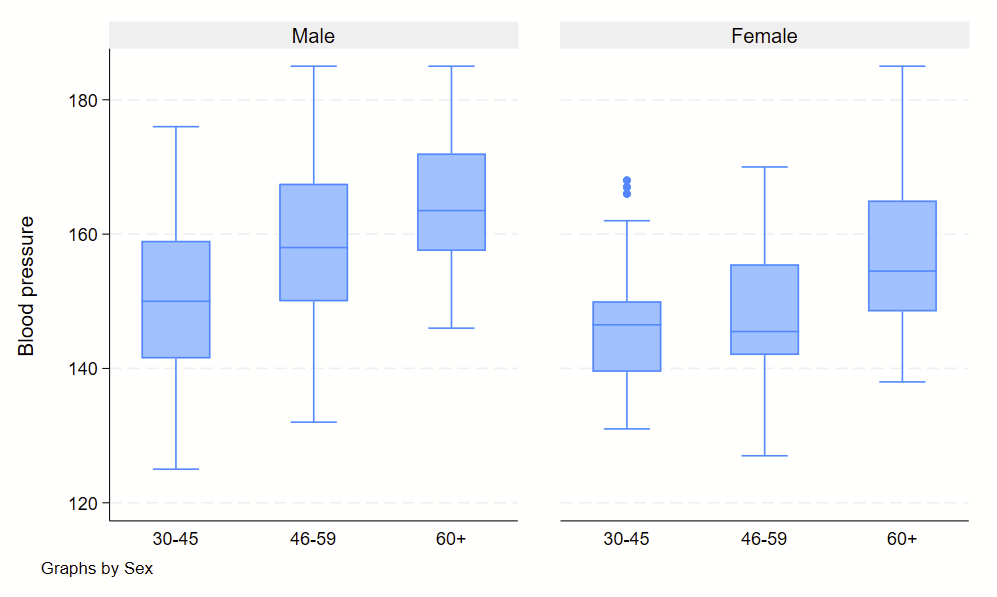
Boxplots are handy at showing distributions of multiple groups all at once. This is a nice overview of what all of the bits of the figure means. Briefly, there’s a box that is the median and IQR. There are some lines sticking out that are the upper and lower adjacent lines, which are the 75th percentile + (1.5*the width of the IQR range) and 25th percentile – (1.5*the width of the IQR range). Dots outside these ranges are the outliers.

Making boxplots is simple in stata using the –graph box– command. My one piece of advice is to be aware of the by() and over() commands since they can help you stitch together boxplots in interesting ways. Example code follows.

sysuse bplong, clear

graph box bp
graph box bp, over(sex) 
graph box bp, by(sex) 
graph box bp, by(agegrp) over(sex)  
graph box bp, by(sex) over(agegrp) 

No subcommands

Subcommand: , over(sex)

Subcommand: , by(sex)

Subcommand: , by(agegrp) over(sex)

Subcommand: , by(sex) over(agegrp)

Part 5: Baseline characteristics in a Table 1 for a prospective observational study

What’s the deal with Table 1?

Tables describing the baseline characteristics of your analytical sample are ubiquitous in observational epidemiology manuscripts. They are critical to help the reader understand the study population and potential limitations of your analysis. A table characterizing baseline characteristics is so important that it’s typically the first table that appears in any observational epidemiology (or clinical trial) manuscript, so it’s commonly referred to as a “Table 1“. Table 1s are critically important because they help the readers understand internal validity of your study. If your study has poor internal validity, then your results and findings aren’t useful.

The details here are specific to prospective observational studies (e.g., cohort studies), but are generalizable to other sorts of studies (e.g., RCTs, case-control studies).

If you are a Stata user, you might be interested into my primer of using Table1_mc to generate a Table 1. If you are using P-weighted data, use this program that I put together.

Guts of a Table 1

There are several variations of the Table 1, here’s how I do it.

COLUMNS: This is your exposure of interest (i.e., dependent variable). This is not the outcome of interest. There’s a few way to divvy up these columns, depending on what sort of data you have:

  • Continuous exposure (e.g., baseline LDL-cholesterol level): Cut this up into quantiles. I commonly use tertiles (3 groups) or quartiles (4 groups). People have very, very strong opinions about whether you use tertiles or quartiles. I don’t see much of a fuss in using either. Of note, there usually is no need to transform your data prior to splitting into quantiles. (And, log transforming continuous data that includes values of zero will replace those zeros with missing data!)
  • Discrete exposure:
    • Dichotomous/binary exposure (e.g., prevalent diabetes status as no/0 or yes/1): This is easy, column headers should be 0 or 1. Make sure to use a descriptive column header like “No prevalent diabetes” and “Prevalent diabetes” instead of numbers 0 and 1.
    • Ordinal exposure, not too many groups (e.g., never smoker/0, former smoker/1, current smoker/2): This is also easy, column headers should be 0, 1, or 2. Make sure to use descriptive column headers.
    • Ordinal exposure, a bunch of groups (e.g., extended Likert scale ranging from super unsatisfied/1 to super satisfied/7): This is a bit tricker. On one hand, there isn’t any real limitation on how wide a table can be in a software package so you could have columns 1, 2, 3, 4, 5 ,6 and 7. This is a bit unwieldy for the reader, however. I personally think it’s better to collapse really wide groupings into a few groups. Here, you could collapse all of the negative responses (1, 2 and 3), leave the neutral response as its own category (4), and collapse all of the positive responses (5, 6, and 7). Also use descriptive column headers, but also be sure to describe how you collapsed groups in the footer of the table.
    • Nominal exposure, not too many groups (e.g., US Census regions of Northeast, Midwest, South, and West): This is easy, just use the groups. Be thoughtful about using a consistent order of these groups throughout your manuscript.
    • Nominal exposure, a bunch of groups (e.g., favorite movie): As with ‘Ordinal data, a bunch of groups’ above, I would collapse these into groups that relate to each other, such as genre of movie.
  • (Optional) Additional first column showing “Total” summary statistics. This presents summary statistics for the entire study population as a whole, instead of by quantile or discrete groupings. I don’t see much value in these and typically don’t include them.
  • (Optional) Additional first column showing count of missingness for each row. This presents a count of missing values for that entire row. I think these are nice to include, but they don’t show missingness by column so are an imperfect way to show missingness. See the section below on ‘cell contents’ for alternative strategies to show missingness.
    • Note: Table1_mc for Stata cannot generate a “missingness” row.
  • (Optional, but suggest to avoid) Following P-value column that shows comparisons across rows. These have fallen out of favor for clinical trial Table 1s. I see little value of them for prospective observational studies and also avoid them.

ROWS: These include the N for each column, the range of values for continuous exposures, and baseline values. Note that the data here are from baseline.

  • N for each group. Make sure that these Ns add up to the expected N in your analytical population at the bottom of your inclusion flow diagram. If it doesn’t match, you’ve done something wrong.
  • (For continuous exposures) Range of values for your quantiles and yes I mean minimum and maximum for each quantile, not IQRs.
  • Sociodemographics (age, sex, race, ± income, ± region, ± education level, etc.)
  • Anthropometrics (height, weight, waist circumference, BMI, etc.)
  • Medical problems as relevant to your study (eg, proportion with hypertension, diabetes, etc.)
  • Medical data as relevant to your study (eg, laboratory assays, details with radiological imaging, details from cardiology reports)
  • Suggest avoiding the outcome(s) of interest as additional rows. I think that presenting the outcomes in this table is inadequate. I prefer to have a separate table or figure dedicated to the outcome of interest that goes much more in-depth than a Table 1 does. Plus, the outcome isn’t ascertained at baseline in a prospective observational study, and describing the population at baseline is the general purpose of Table 1.
  • And for the love of Pete, please make sure that all covariates in your final model appear as rows. If you have a model that adjusts for Epworth Sleepiness Score, for example, make sure that fits in somewhere above.

The first column of your Table 1 will describe each row. The appearance of this row will vary based upon the type of data you have.

  • Overall style of row descriptions as it appears in the first column:
    • N row – I suggest simply using “N”, though some folks use N (upper case) to designate the entire population and n (lower case) to designate subpopulations, so perhaps you might opt to put “n”.
    • Continuous variables (including the row for range)– I suggest a descriptive name and the units. Eg, “Height, cm”
    • Discrete variables – I suggest a descriptive name alone. Some opt to put a hint to the contents of the cell here (eg, adding a percentage sign such as “Female sex, %“), but I think that is better included in the footer of the table. This will probably be determined by the specific journal you are submitting to.
      • Dichotomous/binary values – In this example, sex is dichotomous (male vs. female) since that’s how it has historically been collected in NIH studies. For dichotomous variables, you can include either (1) a row for ‘Male’ and a row for ‘Female’, or (2) simply a row for one of the two sexes (eg, just ‘Female’) since the other row will be the other sex.
      • Other discrete variables (eg, ordinal or nominal) – In this example, we will consider the nominal variable of Race. I suggest having a leading row that provides description of the following rows (eg, “Race group”) then add two spaces before each following race group so the nominal values for the race groups seem nested under the heading.
    • (Optional) Headings for groupings of rows – I like including bold/italicized headings for groupings of data to help keep things organized.

Here’s an example of how I think a blank table should appear:

Table 1 – Here is a descriptive title of your Table 1 followed by an asterix that leads to the footer. I suggest something like “Sociodemographics, anthropometrics, medical problems, and medical data ascertained baseline among [#] participants in [NAME OF STUDY] with [BRIEF INCLUSION CRITERIA] and without [BRIEF EXCLUSION CRITERIA] by [DESCRIPTION OF EXPOSURE LIKE ‘TERTILE OF CRP’ OR ‘PREVALENT DIABETES STATUS’]*”

(Optional)
Missing, N
(Optional)
Total
Exposure
Variable
Tertile 1
Exposure
Variable
Tertile 2
Exposure
Variable
Tertile 3
(Optional,
suggest
avoiding)
P-value
N
Range, ng/mL
Sociodemographics
Age, y
Female sex
Race group
Black
White
Asian
Anthropometrics
Height, cm
Weight, kg
BMI, kg/m²
Medical problems
[List out here]
Medical data
[List out here]

*Footer of your Table 1. I suggest describing the appearance of the cells, eg “Range is minimum and maximum of the exposure for each quantile. Presented as mean (SD) for normally distributed and median (IQR) for skewed continuous variables. Discrete data are presented as column percents.”

Cell contents

The cell contents varies by type of variable and your goal in this table:

  • Simplicity as goal:
    • Normally distributed continuous variables: Mean (SD)
    • Non-normally distributed continuous variables: Median (IQR)
    • Discrete variables: Present column percentages. Not row percentages. For example we’ll consider “income >$75k” by tertile of CRP. A column percentage would show the % of participants in that specific quantile have an income >$75k. A row percentage would show the percentage of participants with income >$75K who were in that specific tertile.
  • Clarity of completeness of data as goal (would not also include “missing” column if doing this)
    • Continuous variables: Present as mean (SD) or median (IQR) as outlined above based upon normality, but also include an ‘n’. Example for age: “75 (6), n=455”
      • Note: Table1_mc in Stata cannot report an ‘n’ with continuous variables.
    • Dichotomous variables: Present column percentage plus ‘n’. Example for female sex: “45%, n=244”.

A word on rounding: I think there is little value on including numbers after the decimal place. I suggest aggressively rounding at the decimal for most things. For example, for BMI, I suggest showing “27 (6)” and not “26.7 (7.2)”. For things that are obtained at the decimal place, I strongly recommend reporting at the decimal. For example, BP is always measured as a whole number, so reporting out a tenth place for BP isn’t of much value. For example, systolic BP is measured as 142, 112, and 138 — not 141.8, 111.8 and 138.4. For discrete variables, I always round the proportion/percentage at the decimal, but clarify very small proportions to be “<1%" if there are any in that group, but it would round to zero or "0%" if there are none in that group.

The one exception to my aggressive “round at the decimal place” strategy is variables that are commonly reported past the decimal place, such as many laboratory values. Serum creatinine is commonly reported to the hundredths place (e.g., “0.88”), so report the summary statistic for that value to the hundredths place, like 0.78 (0.30).

Descriptive labels of metrics assessing discrimination

Discrimination and calibration of models predicting risk

Risk prediction is common in medicine, eg the Framingham Risk Score and the Pooled Cohort Equation/10-year ASCVD risk prediction models. Machine learning models that also predict risk are growing in popularity.

Discrimination and calibration are discussed in this excellent JAMA article. In brief, discrimination relates to how a model divvies up low and high risk individuals. So, in a population of folks of various risk levels, high discriminating models will score higher risk folks higher than low risk folks. For example, a CVD model should say that a 60 year old with hypertension, hyperlipidemia, and diabetes has a higher risk of CVD than a 20 year old with none of those conditions. Calibration, on the other hand, describes how well a model predicts risk for an individual person.

Discrimination descriptive labels

I have to look this up every time, so I am putting this here. Here’s a widely-used labeling for discrimination, which in this manuscript, we called it the “Hosmer-Lemeshow criteria”. These authors applied this to ROC curves, but I think it’s also fair to apply to C-statistics.

  • 0.5: No discrimination
  • 0.5 to <0.7: Poor discrimination
  • 0.7 to <0.8: Acceptable discrimination
  • 0.8 to <0.9: Excellent discrimination
  • ≥0.9: Outstanding discrimination

The reference is here:

Hosmer JD, Lemeshow S, Sturdivant R. Applied Logistic Regression. Hoboken, NJ, USA: John Wiley & Sons Inc; 2013. 

Here’s the Google Books listing for this, in case you want to grab the metadata for this reference using Zotero or whatnot. You’ll see the above labels on page 177 — you can see this with the “Preview” view.

Mediation analysis in Stata using IORW (inverse odds ratio-weighted mediation)

Mediation is a commonly-used tool in epidemiology. Inverse odds ratio-weighted (IORW) mediation was described in 2013 by Eric J. Tchetgen Tchetgen in this publication. It’s a robust mediation technique that can be used in many sorts of analyses, including logistic regression, modified Poisson regression, etc. It is also considered valid if there is an observed exposure*mediator interaction on the outcome.

There have been a handful of publications that describe the implementation of IORW (and its cousin inverse odds weighting, or IOW) in Stata, including this 2015 AJE paper by Quynh C Nguyen and this 2019 BMJ open paper by Muhammad Zakir Hossin (see the supplements of each for actual code). I recently had to implement this in a REGARDS project using a binary mediation variable and wanted to post my code here to simplify things. Check out the Nguyen paper above if you need to modify the following code to run IOW instead of IOWR, or if you are using a continuous mediation variable, rather than a binary one.

A huge thank you to Charlie Nicoli MD, Leann Long PhD, and Boyi Guo (almost) PhD who helped clarify implementation pieces. Also, Charlie wrote about 90% of this code so it’s really his work. I mostly cleaned it up, and clarified the approach as integrated in the examples from Drs. Nguyen and Hossin from the papers above.

IORW using pweight data (see below for unweighted version)

The particular analysis I was running uses pweighting. This code won’t work in data that doesn’t use weighting. This uses modified Poisson regression implemented as GLMs. These can be swapped out for other models as needed. You will have to modify this script if you are using 1. a continuous exposure, 2. more than 1 mediator, 3. a different weighting scheme, or 4. IOW instead of IORW. See the supplement in the above Nguyen paper on how to modify this code for those changes.

*************************************************
// this HEADER is all you should have to change
// to get this to run as weighted data with binary
// exposure using IORW. (Although you'll probably 
// have to adjust the svyset commands in the 
// program below to work in your dataset, in all 
// actuality)
*************************************************
// BEGIN HEADER
//
// Directory of your dataset. You might need to
// include the entire file location (eg "c:/user/ ...")
// My file is located in my working directory so I just list
// a name here. Alternatively, can put URL for public datasets. 
global file "myfile.dta"
//
// Pick a title for the table that will output at the end.
// This is just to help you stay organized if you are running
// a few of these in a row. 
global title "my cool analysis, model 1"
//
// Components of the regression model. Outcome is binary,
// the exposure (sometimes called "dependent variable" or 
// "treatment") is also binary. This code would need to be modified 
// for a continuous exposure variable. See details in Step 2.
global outcome mi_incident
global exposure smoking
global covariates age sex
global mediator c.biomarker
global ifstatement if mi_prevalent==0 & biomarker<. & mi_incident <.
//
// Components of weighting to go into "svyset" command. 
// You might have 
global samplingweight mysamplingweightvar
global id id_num // ID for your participants
global strata mystratavar
//
// Now pick number of bootstraps. Aim for 1000 when you are actually 
// running this, but when debugging, start with 50.
global bootcount 50
// and set a seed. 
global seed 8675309
// END HEADER
*************************************************
//
//
//
// Load your dataset. 
use "${file}", clear
//
// Drop then make a program.
capture program drop iorw_weighted
program iorw_weighted, rclass
// drop all variables that will be generated below. 
capture drop predprob 
capture drop inverseoddsratio 
capture drop weight_iorw
//
*Step 1: svyset data since your dataset is weighted. If your dataset 
// does NOT require weighting for its analysis, do not use this program. 
svyset ${id}, strata(${strata}) weight(${samplingweight}) vce(linearized) singleunit(certainty)
//
*Step 2: Run the exposure model, which regresses the exposure on the
// mediator & covariates. In this example, the exposure is binary so we are 
// using logistic regression (logit). If the exposure is a normally-distributed 
// continuous variable, use linear regression instead. 
svy linearized, subpop(${ifstatement}): logit ${exposure} ${mediator} ${covariates}
//
// Now grab the beta coefficient for mediator. We'll need that to generate
// the IORW weights. 
scalar med_beta=e(b)[1,1]
//
*Step 3: Generate predicted probability and create inverse odds ratio and its 
// weight.
predict predprob, p
gen inverseoddsratio = 1/(exp(med_beta*${mediator}))
// 
// Calculate inverse odds ratio weights.  Since our dataset uses sampling
// weights, we need to multiply the dataset's weights times the IORW for the 
// exposure group. This step is fundamentally different for non-weighted 
// datasets. 
// Also note that this is for binary exposures, need to revise
// this code for continuous exposures. 
gen weight_iorw = ${samplingweight} if ${exposure}==0
replace weight_iorw = inverseoddsratio*${samplingweight} if ${exposure}==1
//
*Step 4: TOTAL EFFECTS (ie no mediator) without IORW weighting yet. 
// (same as direct effect, but without the IORW)
svyset ${id}, strata(${strata}) weight(${samplingweight}) vce(linearized) singleunit(certainty)
svy linearized, subpop(${ifstatement}): glm ${outcome} ${exposure} ${covariates}, family(poisson) link(log) 
matrix bb_total= e(b)
scalar b_total=bb_total[1,1] 
return scalar b_total=bb_total[1,1]
//
*Step 5: DIRECT EFFECTS; using IORW weights instead of the weighting that
// is used typically in your analysis. 
svyset ${id}, strata(${strata}) weight(weight_iorw) vce(linearized) singleunit(certainty)
svy linearized, subpop(${ifstatement}): glm ${outcome} ${exposure} ${covariates}, family(poisson) link(log)
matrix bb_direct=e(b)
scalar b_direct=bb_direct[1,1]
return scalar b_direct=bb_direct[1,1]
//
*Step 6: INDIRECT EFFECTS
// indirect effect = total effect - direct effects
scalar b_indirect=b_total-b_direct
return scalar b_indirect=b_total-b_direct
//scalar expb_indirect=exp(scalar(b_indirect))
//return scalar expb_indirect=exp(scalar(b_indirect))
//
*Step 7: calculate % mediation
scalar define percmed = ((b_total-b_direct)/b_total)*100
// since indirect is total minus direct, above is the same as saying:
// scalar define percmed = (b_indirect)/(b_total)*100
return scalar percmed = ((b_total-b_direct)/b_total)*100
//
// now end the program.
end
//
*Step 8: Now run the above bootstraping program
bootstrap r(b_total) r(b_direct) r(b_indirect) r(percmed), seed(${seed}) reps(${bootcount}): iorw_weighted
matrix rtablebeta=r(table) // this is the beta coefficients
matrix rtableci=e(ci_percentile) // this is the 95% confidence intervals using the "percentiles" (ie 2.5th and 97.5th percentiles) rather than the default normal distribution method in stata. The rational for using percentiles rather than normal distribution is found in the 4th paragraph of the "analyses" section here (by refs 37 & 38): https://bmjopen.bmj.com/content/9/6/e026258.long
//
// Just in case you are curious, here are the the ranges of the 95% CI, 
// realize that _bs_1 through _bs_3 need to be exponentiated:
estat bootstrap, all // percentiles is "(P)", normal is "(N)"
//
// Here's a script that will display your beta coefficients in 
// a clean manner, exponentiating them when required. 
quietly {
noisily di "${title} (bootstrap count=" e(N_reps) ")*"
noisily di _col(15) "Beta" _col(25) "95% low" _col(35) "95% high" _col(50) "Together"
local beta1 = exp(rtablebeta[1,1])
local low951 = exp(rtableci[1,1])
local high951 = exp(rtableci[2,1])
noisily di "Total" _col(15) %4.2f `beta1' _col(25) %4.2f `low951' _col(35) %4.2f `high951' _col(50) %4.2f `beta1' " (" %4.2f `low951' ", " %4.2f `high951' ")"
local beta2 = exp(rtablebeta[1,2])
local low952 = exp(rtableci[1,2])
local high952 = exp(rtableci[2,2])
noisily di "Direct" _col(15) %4.2f `beta2' _col(25) %4.2f `low952' _col(35) %4.2f `high952' _col(50) %4.2f `beta2' " (" %4.2f `low952' ", " %4.2f `high952' ")"
local beta3 = exp(rtablebeta[1,3])
local low953 = exp(rtableci[1,3])
local high953 = exp(rtableci[2,3])
noisily di "Indirect" _col(15) %4.2f `beta3' _col(25) %4.2f `low953' _col(35) %4.2f `high953' _col(50) %4.2f `beta3' " (" %4.2f `low953' ", " %4.2f `high953' ")"
local beta4 = (rtablebeta[1,4])
local low954 = (rtableci[1,4])
local high954 = (rtableci[2,4])
noisily di "% mediation" _col(15) %4.2f `beta4' "%" _col(25) %4.2f `low954' "%"_col(35) %4.2f  `high954' "%" _col(50) %4.2f `beta4' "% (" %4.2f `low954' "%, " %4.2f `high954' "%)"
noisily di "*Confidence intervals use 2.5th and 97.5th percentiles"
noisily di " rather than default normal distribution in Stata."
noisily di " "
}
// the end.

IORW for datasets that don’t use weighting (probably the one you are looking for)

Here is the code above, except without consideration of weighting in the overall dataset. (Obviously, IORW uses weighting itself.) This uses modified Poisson regression implemented as GLMs. These can be swapped out for other models as needed. You will have to modify this script if you are using 1. a continuous exposure, 2. more than 1 mediator, 3. a different weighting scheme, or 4. IOW instead of IORW. See the supplement in the above Nguyen paper on how to modify this code for those changes.

*************************************************
// this HEADER is all you should have to change
// to get this to run as weighted data with binary
// exposure using IORW. 
*************************************************
// BEGIN HEADER
//
// Directory of your dataset. You might need to
// include the entire file location (eg "c:/user/ ...")
// My file is located in my working directory so I just list
// a name here. Alternatively, can put URL for public datasets. 
global file "myfile.dta"
//
// Pick a title for the table that will output at the end.
// This is just to help you stay organized if you are running
// a few of these in a row. 
global title "my cool analysis, model 1"
// Components of the regression model. Outcome is binary,
// the exposure (sometimes called "dependent variable" or 
// "treatment") is also binary. This code would need to be modified 
// for a continuous exposure variable. See details in Step 1.
global outcome  mi_incident
global exposure smoking
global covariates age sex
global mediator c.biomarker
global ifstatement if mi_prevalent==0 & biomarker<. & mi_incident <.
//
// Now pick number of bootstraps. Aim for 1000 when you are actually 
// running this, but when debugging, start with 50.
global bootcount 50
// and set a seed. 
global seed 8675309
// END HEADER
*************************************************
//
//
//
// Load your dataset. 
use "${file}", clear
//
// Drop then make a program.
capture program drop iorw
program iorw, rclass
// drop all variables that will be generated below. 
capture drop predprob 
capture drop inverseoddsratio 
capture drop weight_iorw
//
//
*Step 1: Run the exposure model, which regresses the exposure on the
// mediator & covariates. In this example, the exposure is binary so we are 
// using logistic regression (logit). If the exposure is a normally-distributed 
// continuous variable, use linear regression instead. 
logit ${exposure} ${mediator} ${covariates} ${ifstatement}
//
// Now grab the beta coefficient for mediator. We'll need that to generate
// the IORW weights. 
scalar med_beta=e(b)[1,1]
//
*Step 2: Generate predicted probability and create inverse odds ratio and its 
// weight.
predict predprob, p
gen inverseoddsratio = 1/(exp(med_beta*${mediator}))
// 
// Calculate inverse odds ratio weights. 
// Also note that this is for binary exposures, need to revise
// this code for continuous exposures. 
gen weight_iorw = 1 if ${exposure}==0
replace weight_iorw = inverseoddsratio if ${exposure}==1
//
*Step 3: TOTAL EFFECTS (ie no mediator) without IORW weighting yet. (same as direct effect, but without the IORW)
glm ${outcome} ${exposure} ${covariates} ${ifstatement}, family(poisson) link(log) vce(robust)
matrix bb_total= e(b)
scalar b_total=bb_total[1,1] 
return scalar b_total=bb_total[1,1]
//
*Step 4: DIRECT EFFECTS; using IORW weights
glm ${outcome} ${exposure} ${covariates} ${ifstatement} [pweight=weight_iorw], family(poisson) link(log) vce(robust)
matrix bb_direct=e(b)
scalar b_direct=bb_direct[1,1]
return scalar b_direct=bb_direct[1,1]
//
*Step 5: INDIRECT EFFECTS
// indirect effect = total effect - direct effects
scalar b_indirect=b_total-b_direct
return scalar b_indirect=b_total-b_direct
//scalar expb_indirect=exp(scalar(b_indirect))
//return scalar expb_indirect=exp(scalar(b_indirect))
//
*Step 6: calculate % mediation
scalar define percmed = ((b_total-b_direct)/b_total)*100
// since indirect is total minus direct, above is the same as saying:
// scalar define percmed = (b_indirect)/(b_total)*100
return scalar percmed = ((b_total-b_direct)/b_total)*100
//
// now end the program.
end
//
*Step 7: Now run the above bootstraping program
bootstrap r(b_total) r(b_direct) r(b_indirect) r(percmed), seed(${seed}) reps(${bootcount}): iorw
matrix rtablebeta=r(table) // this is the beta coefficients
matrix rtableci=e(ci_percentile) // this is the 95% confidence intervals using the "percentiles" (ie 2.5th and 97.5th percentiles) rather than the default normal distribution method in stata. The rational for using percentiles rather than normal distribution is found in the 4th paragraph of the "analyses" section here (by refs 37 & 38): https://bmjopen.bmj.com/content/9/6/e026258.long
//
// Just in case you are curious, here are the the ranges of the 95% CI, 
// realize that _bs_1 through _bs_3 need to be exponentiated:
estat bootstrap, all // percentiles is "(P)", normal is "(N)"
//
// Here's a script that will display your beta coefficients in 
// a clean manner, exponentiating them when required. 
quietly {
noisily di "${title} (bootstrap count=" e(N_reps) ")*"
noisily di _col(15) "Beta" _col(25) "95% low" _col(35) "95% high" _col(50) "Together"
local beta1 = exp(rtablebeta[1,1])
local low951 = exp(rtableci[1,1])
local high951 = exp(rtableci[2,1])
noisily di "Total" _col(15) %4.2f `beta1' _col(25) %4.2f `low951' _col(35) %4.2f `high951' _col(50) %4.2f `beta1' " (" %4.2f `low951' ", " %4.2f `high951' ")"
local beta2 = exp(rtablebeta[1,2])
local low952 = exp(rtableci[1,2])
local high952 = exp(rtableci[2,2])
noisily di "Direct" _col(15) %4.2f `beta2' _col(25) %4.2f `low952' _col(35) %4.2f `high952' _col(50) %4.2f `beta2' " (" %4.2f `low952' ", " %4.2f `high952' ")"
local beta3 = exp(rtablebeta[1,3])
local low953 = exp(rtableci[1,3])
local high953 = exp(rtableci[2,3])
noisily di "Indirect" _col(15) %4.2f `beta3' _col(25) %4.2f `low953' _col(35) %4.2f `high953' _col(50) %4.2f `beta3' " (" %4.2f `low953' ", " %4.2f `high953' ")"
local beta4 = (rtablebeta[1,4])
local low954 = (rtableci[1,4])
local high954 = (rtableci[2,4])
noisily di "% mediation" _col(15) %4.2f `beta4' "%" _col(25) %4.2f `low954' "%"_col(35) %4.2f  `high954' "%"  _col(50) %4.2f `beta4' " (" %4.2f `low954' ", " %4.2f `high954' ")"
noisily di "*Confidence intervals use 2.5th and 97.5th percentiles"
noisily di " rather than default normal distribution in Stata."
noisily di " "
}
// the end.

ZIP code and county data sets for use in epidemiological research

Everyone knows their (5-digit) ZIP and it can be linked to population-level data. ZIP Codes have limitations since they were designed for mail delivery and not for population details. You can easily get county data from these data as well.

In epidemiological studies (especially EMR and survey data), you’ll almost certainly have a ZIP code or county, and almost never a census tract. It’s easy to find census data sets, but finding the analogous ZIP code dataset is a bit tricker. Every time I try to do a project with ZIP codes, I kick myself for not keeping a list of ZIP code data sets. So, this page will keep a running list of ZIP code-linked datasets. It’ll be updated periodically. If there’s a useful resource that I have missed, please email me at timothy.plante@uvm.edu and I’ll add it.

A few technical notes:

  • US Postal Service (USPS) ZIP codes – It seems that some datasets use a variation of USPS’s active ZIP codes. These are constantly being updated by the US Postal Service. ZIP codes are either the ‘standard’ 5-digit ZIP code or ZIP+4 (e.g., 9 digit). You can narrow down a lot further with the ZIP+4 version, but often times you only have the 5-digit ZIP.
  • ZCTA stands for ZIP Code Tabulation Area and is the US Census’s take on representing the topology of ZIP codes. These are produced for the q10y census. There are different ZCTAs for the 2000 Census and 2010 Census (as of 12/2020). Details about the US Census’s approach to developing ZCTAs can be found here.
    • You can read about the differences between ZCTA and USPS ZIP codes here: https://www.ncbi.nlm.nih.gov/pmc/articles/PMC1762013/
    • The 2010 ZCTA to county, subdivision, tract, congressional district, metropolitan and micropolitan statistical area, and New England City and Town Area can be found here.
    • Note, there is also a non-ZCTA 5-digit ZIP code standard used by the US Census are specific to the ZIP Code Business Patterns Survey. So, these relate to businesses, not people. Details are here.
  • USPS ZIP code to ZCTA crosswalk – this is provided by UDS at this website: https://udsmapper.org/zip-code-to-zcta-crosswalk/
  • The US Housing and Urban Development (HUD) also has its own ZIP linkage, which can be found here. You can read about the details of the HUD ZIP crosswalk here. This is not the same as ZCTA. The nice thing about the HUD ZIP crosswalk is that it’s updated quarterly, it links to 2000 or 2010 US Census county or tract GEOID via FIPS code, and the OMB’s core-based statistical area (CBSA; basically definitions of urban groups), and congressional districts. It also provides some details about residential vs. business vs. other addresses in that zip code.

Linking ZIP to county and FIPS

There’s a dataset on the HUD website here, on the “select crosswalk type” dropdown, select ZIP-County. From my read, this is ZCTA ZIP code for more recent datasets, but that isn’t explicitly stated. There’s also this resource from Dan Ofer that I haven’t had the chance to use but looks promising.

Cartography

Here are some resources if you want to make a map.

US Census (ZCTA)

Here’s some mapping files provided by the US Census.

Here’s a great Stata-specific page with both the ZCTA and US Postal Service ZIP files. I recommend the ZCTA if you will be using US census data.

HUD-ZIP linkage

Details are here.

USPS ZIP code

Here’s a commonly-used dataset from Esri’s ArcGIS.

Here’s the USPS ZIP code for Stata.

Distance between zip codes

Can be found here from the NBER here.

Health outcomes, prevention, health risk behaviors, disability, health status, and SDOH at CDC Places/500 Cities (ZCTA)

The RWJF/CDC 500 cities and Places database provides a huge collection of data linked to ZIP, with data originating from BRFSS and ACS/Census. Data can be downloaded at CDC places (ZCTA).

Commercial datasets

You might want to take a look at datasets available, some for free, some for a fee, on the AWS marketplace here (this is a link to the search term “Zip”). There are at least a few companies that sell datasets with things like demographics for Zip+4 (eg V12 on AWS), which you might be interested in. While you’re at it, you might also opt to look at Census files on this marketplace here.

Demographics

US Census (ZCTA)

The US Census used to distribute their summary files via FTP for their 2000 census and 2010 census. [Note: those are links to the Summary File 1, which doesn’t include rurality. Those are in Summary File 2.] These 39 and 47 files that must be merged by some convoluted process that I’m not going to try to figure out. Fortunately, the National Bureau of Economic Research (NBER) generated Summary File 1-ZCTA linked files for Stata, SAS, and CSV files that can be downloaded here:

As an example of how to use the NBER files, let’s look at the 2010 files. Files are indexed in this Census Summary File 1 (SF1) document. Search for “File 03” in that PDF to find the details for File 03 on page 184. Note that “P0030002” through “P0030008” are variables for race in the entire population. File 04 then has race and ethnicity among adults (male sex is “P0120002”, female sex is “P0120026”). File 07 has sex by race/ethnicity and age, and so on. You’ll want to save the specific variables from each of these files and generate your own dataset, depending on what you are attempting to do.

But what about rurality? That’s in the Summary File 2 (SF2) document. The US Census data used to be on a website called American Fact Finder, which was simple to use and wasn’t annoying. More recently it was moved to data.census.gov, which is a spiffy looking website that is in all actuality, quite terrible and I want it to go away. I can’t figure out how to download what I want. I tried to make a walkthrough of how to download urban/rurality by ZCTA but it gave me a blank table. Fortunately, I had downloaded it from American Fact Finder before it went offline. You can download the version that I saved here.

An alternative to data.census.gov in the wake of the loss of American Fact Finder is the NHGIS website. You can also try IPUMS, which also has data related to global health, GIS, time use, health surveys (NHIS and MEPS), and higher education information. Finally, there are a whole host of free Census files on AWS, I haven’t tried these but you might want to take a look here.

Social Determinants of Health

Take a look at this handy review of SDoH definitions by Lori Dean and Roland Thorpe at JHU. Before I go any further, I recommend looking at the PhenX toolkit for their resources on SDoH. There are a few conceptual frameworks for SDOH. Here’s Healthy People 2030. Here’s the WHO one. I like the KFF’s Figure 1 here, which defines the following factors (note there’s plenty of overlap between Healthy People 2030 and KFF). Here’s a working list of resources that I’ll keep adding to, organized by KFF’s figure 1 overview:

As I expand these, I will do my best to cover as many of these as possible, as how they apply to ZIP code and county.

Social Deprivation Index or SDI (ZCTA)

Derived from the American Community Survey 5-year estimates. Details include overall SDI score, income, education, employment, housing (% living in crowded rentals), household characteristics (% of single parent households with dependents who are minors), transportation (% car non-ownership), demographics (% black population, % high needs population). Details and download files can be found here.

Here’s the original description, prior to the use of ZCTA. This manuscript only discusses the Primary Care Service Areas (PCSAs), from the Dartmouth Atlas: https://pubmed.ncbi.nlm.nih.gov/22816561/

Area Deprivation Index or ADI (ZIP+4)

More to come. Download site is here. You need to make a free account to access the data. You have to download each state individually, as an FYI.

HUD datasets on housing, income, etc. (can use the HUD-ZIP crosswalk)

Here is the website: https://hudgis-hud.opendata.arcgis.com/

I haven’t explored these data files much, but some details are below. The only file that natively includes the ZCTA is the Difficult Development Areas, under Community Development below.

  • Agency administration – How the HUD is divided. Yawn.
  • Community development – Community development block grant, LIHTC Qualified Census Tracts (aka low income), Difficulty Development Areas for Low Income Housing Tax Credit (LIHTC; high cost of living relative to Area Median Gross Income; interestingly using the ZCTA for metropolitan areas), Neighborhood Stabilization Program (purchase of abandoned buildings), Empowerment Zone/Enterprise Community/Renewal Community (economic growth tax incentives), Revitalization Areas.
  • Community indicators – Details by American Community Survey, self-reported perceived rural/urban status (see Rurality section below), low-to-moderate income population by tract from the American Community Survey, Location Affordability Index from the American Community Survey, extreme temperatures by 1 degree latitude and longitude.
  • Fair housing – More to come.
  • Housing counseling – More to come.
  • Initiatives and demonstrations – More to come.
  • Location affordability – More to come.
  • Mortgage insurance programs – More to come.
  • Rental assistance programs – More to come.
  • Disaster recovery – More to come.

Rurality

RUCA codes (Unclear ZIP type)

There was a bug in the 2010 US Census-derived RUCA-ZIP and the linkage was updated in 2020, and can be found here. I’m trying to figure out whether RUCA is most similar to ZCTA or USPS ZIP Codes. I’ll come back and update what I find out. Update: I didn’t get a response to my inquiry. Since this is linked to the Census data, it’s possibly ZCTA.

American Housing Survey (AHS) from HUD

Urbanization Perceptions Small Area Index. This was self-reported neighborhood as urban, suburban, or rural. Link is here.

US Census (ZCTA)

The US Census details their take on rurality here. The actual rurality details for the 2010 census are in “Summary File 2”, details of which can be found here. As documented above, data.census.gov is a barrier to downloading census data. Fortunately, I grabbed rurality by ZCTA from American Fact Finder before it was shut down. You can grab my file here.

NCHS Urban-Rural Classification (Counties)

This is a very popular classification methodology people frequently use this scheme so I’m including it here. Details are here.

Health data

County health rankings (county)

Much county-level data can be obtained from the excellent County Health Rankings website from UWI, sponsored by RWJF. These include “ranked” and “unranked” data, the sources of these datapoints are listed in the Excel files that you can download on the website (eg, Vermont’s is here). Ranked includes premature death (deaths <75y), poor fair health, poor physical health, poor mental health, low birthweight, adult smoking adult obesity, food environment index, physical inactivity, access to exercise opportunities, excessive drinking alcohol-impaired driving deaths, STIs, teen births, % uninsured <65, ratio of population to PCPs, ratio of population to dentists, preventable health stays, mammography screening, flu vaccinations, level of education, unemployment, % children in poverty, income inequality, children in single-parent households, social associations, violent crime, injury deaths, air pollution by particulate matter, drinking water violations, households with overcrowding/high housing costs/lack of kitchen facilities/lack of plumbing facilities, % that drive to work alone, long commutes. Unranked includes life expectancy, premature age-adjusted mortality, child mortality, infant mortality, quality of life metrics (frequent physical distress, frequent mental distress, diabetes and HIV prevalence), food insecurity, limited access to healthy foods, drug overdose deaths, motor vehicle crash deaths, insufficient sleep, uninsured adults, uninsured children, ratio of population to primary care providers, disconnected youth (% of 16-19 yo not in school or working), reading scores, math scores, median income, % children eligible for free or reduced price lunch, residential segregation, homicides, suicidies, ,firearm fatalities, juvenile arrests, traffic volume, home ownership, severe housing cost burden, and specific census details.

I can’t find a “download all” option, but the datasets use a preserved naming structure in the download directory, so if you copy the link for one state, you can replace it with the name for another state (replacing spaces with percent sign 20 if spaces if needed) to get that download. It’d be easy to build a loop in Stata to automate the download for all of these datasets.

Ecology

The Ecolo-Zip project includes global postal codes and US ZIP codes to provide “Combining two large-scale satellite image resources (ASTER; SRTM) and a customised customized geospatial sampling model, we provide high-resolution indicators of physical topography (elevation, mountainousness, distance to sea), vegetation (normalized difference vegetation index) and climate (surface temperature). A cross-validation between ASTER and SRTM elevation data demonstrated high concordance (ICC = 0.999).” H/t to the Data Is Plural email for this head’s up.

Other

CBSA – Core-based statistical area

The White House’s OMB defines the CBSA, which is broadly metropolitan areas. So NYC has NYC itself as well as the suburban areas of NYC (NJ, Westchester, etc.) HUD provides USPS ZIP crosswalk here.