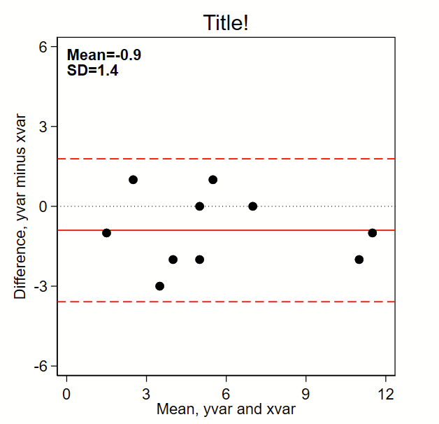
The below code outputs this Bland-Altman plot figure, which prints the mean and SD and puts a solid line for mean difference and red dotted lines for mean difference +/- 1.96*SD. (Note: the original BA paper used +/- 2*SD, but it’s reasonable to use +/-1.96*SD given it’s commonality in estimating the bounds of 95% confidence intervals of a normally-distributed plot). By the way, see the related page on making a scatterplot here, which should probably be shown alongside this figure in any publication.
Here’s the code:
// note this uses local macros so you need to run this entire thing
// top to bottom in a do file, not line by line.
//
// Step 1: input some fake data:
// Note: for comparing tests (e.g., lab tests), I make x the "gold standard"
//       test and y the investigational test
clear all

input id yvar xvar
1 2 5
2 3 5
3 6 5
4 7 7
5 3 2
6 10 12
7 1 2
8 11 12
9 4 6
10 5 5
end

// Step 2a: make difference (to go on y axis) and mean (x axis) variables
gen diff= yvar - xvar
gen mean = (yvar+xvar)/2

// Step 2b: Grab the difference (y axis) mean and sd
sum diff, d
local diffmean= r(mean)
local diffsd = r(sd)

// Step 3: graph!
set scheme s1mono // I like this scheme

twoway ///
(scatter diff mean, msymbol(O) msize(medium) mcolor(black)) ///
, ///
/// black dotted line at zero:
yline(0, lcolor(black) lpattern(dot) lwidth(medium)) ///
/// red solid line at mean:
yline(`=`diffmean'',lcolor(red) lpattern(solid) lwidth(medium)) ///
/// red dashed lines at mean +/- 1.96*sd
yline(`=`diffmean'+1.96*`diffsd''  , lcolor(red) lpattern(dash) lwidth(medium)) ///
yline(`=`diffmean'-1.96*`diffsd''  , lcolor(red) lpattern(dash) lwidth(medium)) ///
aspect(1) /// force output to be square
/// here's the text box with mean and sd,
/// you'll need to tweak the first two numbers so the y,x
/// coordinates drop the text where you want it
text(6 0 "{bf:Mean=`:di %3.1f `=`diffmean'''}" "{bf:SD=`:di %3.1f `=`diffsd'''}", placement(se) justification(left)) ///
legend(off) /// Shut off the legend
/// Now tweak the ranges of the axes to your liking.
/// I like to make them the same width. In this example, the x axis is from
/// 0 to 12 so is 12 units wide. So I set the y axis to also be
/// 12 units wide, going from -6 to +6.
xla(0(3)12) /// you'll need to tweak range for your data
yla(-6(3)6, angle(0)) /// you'll need to tweak range for your data
ytitle("Difference, yvar minus xvar") ///
xtitle("Mean, yvar and xvar") ///
title("Title!")