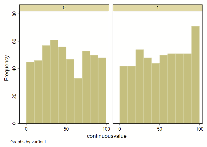
I recently had a dataset with two groups (0 or 1), and a continuous variable. I wanted to show how the overall deciles of that continuous variable varied by group. Step 1 was to generate an overall decile variable with an –xtile– command. Step 2 was to make a frequency histogram. BUT! I wanted these histograms to overlap and not be side-by-side. Stata’s handy –histogram– is a quick and easy way to make histograms by groups using the –by– command, but it makes them side-by-side like this, and not overlapping. (Note: see how to use –twoway histogram– to make overlapping histograms at the end of this post.)
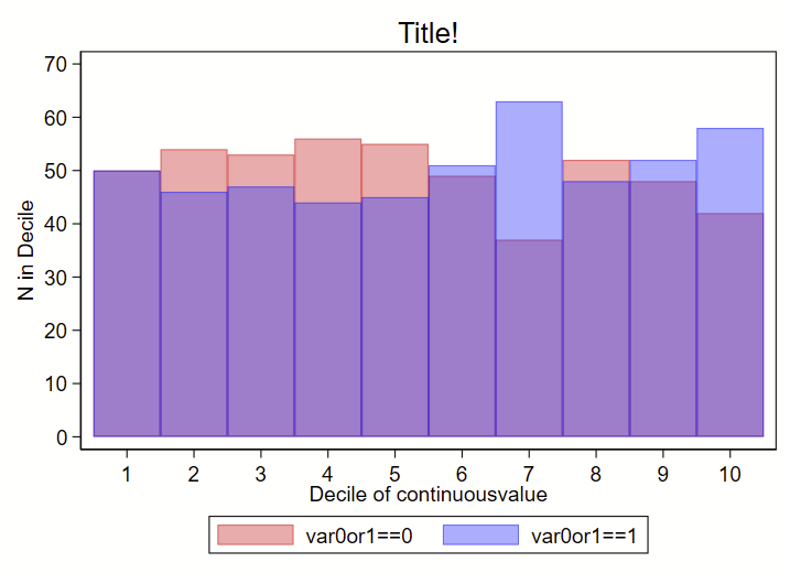
I instead used a collapse command to generate a count of # in each decile by group (using the transparent color command as color percent sign number), like this:
Here’s the code to make both:
clear all
// make fake data
set obs 1000
set seed 8675309
gen id=_n // ID of 1 though 100
gen var0or1 = round(runiform())
gen continuousvalue = 100*runiform()
// make overall deciles of continuousvalue
xtile decilesbygroup = continuousvalue, nq(10)
// now make a frequency histogram of those deciles
set scheme s1color // I like this scheme
hist decilesbygroup, by(var0or1) frequency bin(10)
// make a variable equal to 1 that we will sum in collapse
gen countbygroup = 1
// now sum that variable by the 0 or 1 indicator and deciles
collapse (sum) countbygroup, by(var0or1 decilesbygroup)
// now render the count from above as a bar graph:
set scheme s1color // I like this scheme
twoway ///
(bar countbygroup decilesbygroup if var0or1==0, vertical color(red%40)) ///
(bar countbygroup decilesbygroup if var0or1==1, vertical color(blue%40)) ///
, ///
legend(order(1 "var0or1==0" 2 "var0or1==1")) ///
title("Title!") ///
xtitle("Decile of continuousvalue") ///
xla(1(1)10) ///
yla(0(10)70, angle(0)) ///
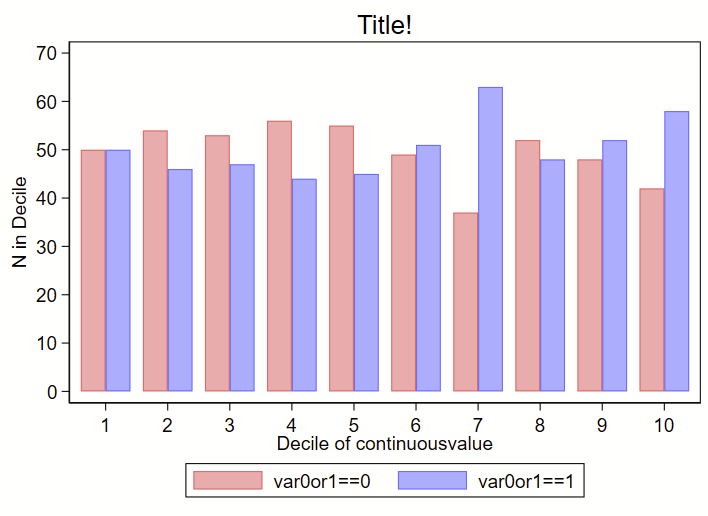
ytitle("N in Decile")You could also offset the deciles by the var0or1 and shrink the bar width a bit to get a frequency histogram where the bars are next to each other, like this:
clear all
// make fake data
set obs 1000
set seed 8675309
gen id=_n // ID of 1 though 100
gen var0or1 = round(runiform())
gen continuousvalue = 100*runiform()
// make overall deciles of continuousvalue
xtile decilesbygroup = continuousvalue, nq(10)
// now make a frequency histogram of those deciles
set scheme s1color // I like this scheme
hist decilesbygroup, by(var0or1) frequency bin(10)
// offset the decilesbygroup by var0or1 a bit:
replace decilesbygroup = decilesbygroup - 0.2 if var0or1==0
replace decilesbygroup = decilesbygroup + 0.2 if var0or1==1
// make a variable equal to 1 that we will sum in collapse
gen countbygroup = 1
// now sum that variable by the 0 or 1 indicator and deciles
collapse (sum) countbygroup, by(var0or1 decilesbygroup)
// now render the count from above as a bar graph:
set scheme s1color // I like this scheme
twoway ///
(bar countbygroup decilesbygroup if var0or1==0, vertical color(red%40) barwidth(0.4)) ///
(bar countbygroup decilesbygroup if var0or1==1, vertical color(blue%40) barwidth(0.4)) ///
, ///
legend(order(1 "var0or1==0" 2 "var0or1==1")) ///
title("Title!") ///
xtitle("Decile of continuousvalue") ///
xla(1(1)10) ///
yla(0(10)70, angle(0)) ///
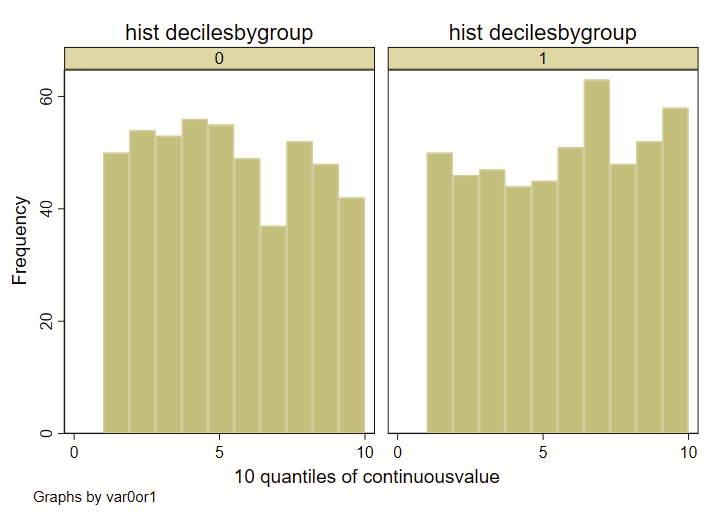
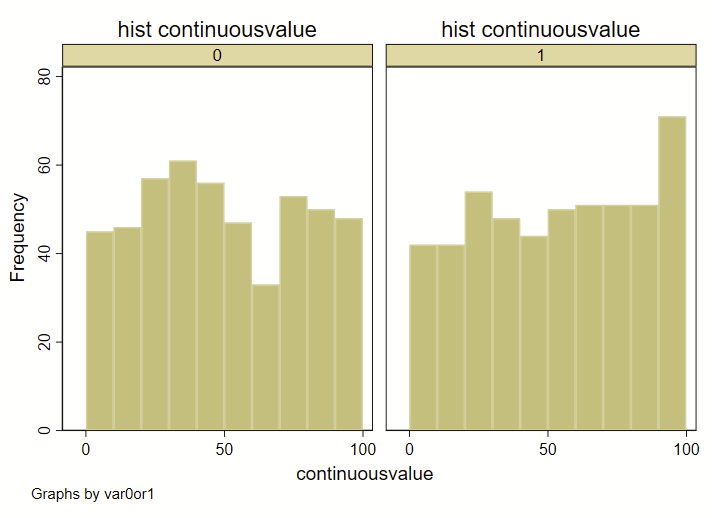
ytitle("N in Decile")A few quick notes here: The way that I am specifying the “bins” for the histograms here is different than how Stata specifies bins for histograms, since I’m forcing it to render by decile. If you were to generate a histogram of the “continuousvalue” instead of the above example using “decilebygroup”, you’ll notice that the resulting histograms looks a bit different from each other:
clear all

// make fake data
set obs 1000
set seed 8675309
gen id=_n // ID of 1 though 100
gen var0or1 = round(runiform())
gen continuousvalue = 100*runiform()

// make overall deciles of continuousvalue
xtile decilesbygroup = continuousvalue, nq(10)

// now make a frequency histogram of those deciles
set scheme s1color // I like this scheme
hist decilesbygroup, title("hist decilesbygroup") by(var0or1) frequency bin(10) name(a)
hist continuousvalue, title("hist continuousvalue") by(var0or1)  frequency bin(10) name(b)
Also, this code will only render frequency histograms, not density histograms, which are the default in Stata. You can also use the –twoway hist– command to overlay two bar graphs, but these might not perfectly align with the deciles. But, using the –twoway hist– allows you to use density histograms instead. See the example that follows. I suspect that most people will get what they need with the –twoway hist– command in Stata.
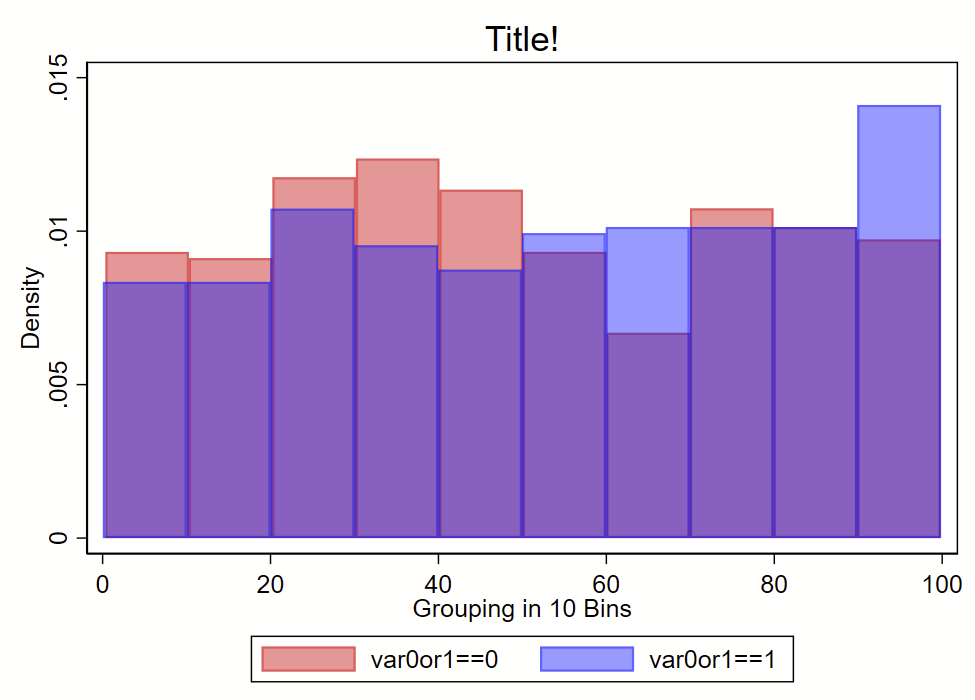
clear all

// make fake data
set obs 1000
set seed 8675309
gen id=_n // ID of 1 though 100
gen var0or1 = round(runiform())
gen continuousvalue = 100*runiform()

set scheme s1color // I like this scheme
twoway ///
(hist continuousvalue if var0or1==0, bin(10) color(red%40) density) ///
(hist continuousvalue if var0or1==1, bin(10) color(blue%40) density) ///
, ///
legend(order(1 "var0or1==0" 2 "var0or1==1")) ///
title("Title!") ///
xtitle("Grouping in 10 Bins")