
This post is a bit dated but is a nice primer on KM curves. For a more recent one that includes printing the HR results on the KM curve, see this post.
In the early Winter of 2019, we had a paper published in JAMA: Network Open using the TOPCAT trial dataset looking at association between beta-blocker use at baseline and incident heart failure admissions. We obtained the data from the NIH/NHLBI BioLINCC repository. This is an incredible resource for datasets. With a quick application, IRB, and DUA, you can get world-class datasets from landmark clinical trials like ACCORD, SPRINT, TOPCAT, etc..
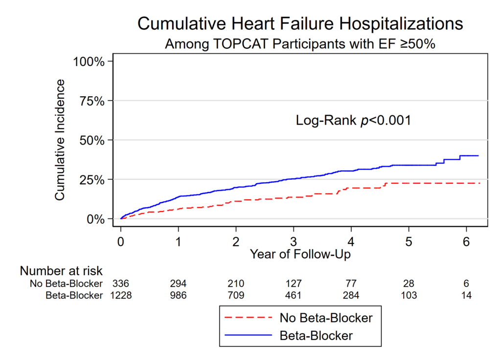
In this analysis we needed to put together a Kaplan-Meier plot for Figure 2 (sometimes called a survival plot). Well, technically it’s a cumulative incidence plot since the line starts a 0% and creeps up as events happen rather than starting at 100% and dropping down as events happen.
Features of this plot that are somewhat unique:
- Lines are not only different colors, one is dashed and one is solid. This is key to avoiding color publication costs in some journals as it can be made greyscale and folks can still figure out which line is which. Even if there wasn’t an issue with color costs, including differing line patterns helps folks who may be colorblind. This is done with the -plot1opts- and -plot2opts- commands.
- Text label for Log-Rank!
- Bonus example of how to use italics in text. It’s {it:YOUR TEXT}. This could also have been bold using {bf:YOUR TEXT} instead.
- Survival table that lines up with the years on the x axis!
- Pretty legend on 2 rows with custom labels.
Of course, the JAMA folks remade my figure for the actual publication. Womp, womp. I still like how it came out.
What the figure looks like
Code to make this figure
// STEP 1: tell stata that it's time to event data.
// Use the -stset- command. Syntax:
// stset [time], failure([thing that is 0 or 1 for the event of outcome]) ...
// id([participant id, useful if doing time varying covariates]) ...
// scale([time scale, here 365.25 days=1 year)

stset days_hfhosp, f(hfhosp) id(id) scale(365.25)

// STEP 2: Set the color scheme.
// I don't like the default stata color scheme.
// Try s1color or s1mono

set scheme s1color

// STEP 3: Here's the actual figure!

sts graph if efstratus50==1 ///
, /// this was a subset of patients with EF >=50%
fail /// this makes the line starts at the bottom of the Y axis instead of the top
by(baselinebb0n1y) /// this is the variable that defines the two groups, bb use at baseline or none
title("Cumulative Heart Failure Hospitalizations") /// Title!
t1title("Among TOPCAT Participants with EF ≥50%") /// subtitle!
xtitle("Year of Follow-Up") /// x label!
ytitle("Cumulative Incidence") /// y label!
yla(0 "0%" .25 "25%" .5 "50%" .75 "75%" 1 "100%", angle(0)) /// Y-label values! Angle(0) rotates them.
xla(0(1)6) /// X-label values! From 0 to 6 years with 1 year intervals in between
text(0.63 3 "Log-Rank {it:p}<0.001", placement(e) size(medium)) /// floating label with italics!
legend(order(1 "No Beta-Blocker" 2 "Beta-Blocker") rows(2)) /// Legend, forced on two rows
plot1opts(lpattern(dash) lcolor(red)) /// this forces the first line to be dashed and red
plot2opts(lpattern(solid) lcolor(blue)) /// this forces the second line to be solid and blue
risktable(0(1)6 , size(small) order(1 "No Beta-Blocker" 2 "Beta-Blocker")) // the numbers under the X axis

// STEP 4: Export the graph as a tiny PNG file for the draft and
// tif file to upload with the manuscript submission.
graph export "Figure 2.png", replace width(2000)
graph export "Figure 2.tif", replace width(2000)