Getting your grant below the page limit using built-in MS Word features

It’s just a little too long!

You’ve toiled on your grant day in and out for weeks on end, and despite chopping out loads of overly verbose text, it’s still over the length. It turns out that there are some built-in settings in MS Word to help you get below the length limit without removing additional text. This post is focused on NIH grant formatting but details here are relevant for most grants. This also assumes that you are already using narrow margins. I made up a 4 page ‘ipsum lorem’ document for this so I can give actual quantifications of what this does to document length.

Hyphenation and justification

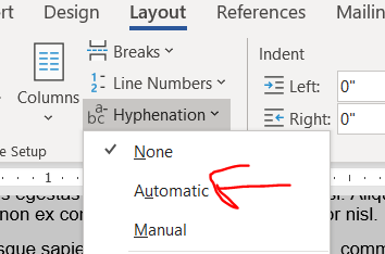
I only just learned about hyphens from Jason Buxbaum in this tweet. Hyphenation breaks longer words across lines with a hyphen in the style commonly used in novels. Hyphenation will get you a few lines in a 4 page document.

Justification makes words reach from the left to rightmost extremes of the margin, stretching or compressing the width of the spacing between words to make it fit. Justification’s effect on length is unpredictable. Sometimes it shortens a lot, sometimes it stays the same, sometimes it’s a smidge longer. In my 4 page ipsum lorem document, the length didn’t change. It’s worked to shorten some prior grants, so it’s worth giving a try. (Also, try combining justification with different fonts, see below.)

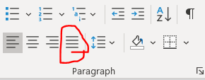
Here is the button to turn on justification.

Personally, I like ragged lines (“align left”) and not justified lines because I find justified text harder to read. I have colleagues who really like justification because it looks more orderly on a page. If you are going to use justification, please remember to apply it to the entirety of the text and not just a subset of paragraphs for the same reason that you don’t wear a tie with a polo shirt.

You can try combining hyphenation and justification, though I’m not sure it will gain anything. It didn’t in my demo document.

Modifying your size 11 font

Try Georgia, Palatino Linotype, or Helvetica fonts instead of Arial

The NIH guidelines specify size 11 Arial, Georgia, Helvetica, and Palatino Linotype fonts as acceptable options. (Note: Helvetica doesn’t come pre-installed on Windows. It’s pre-installed on Mac.) There were not major differences in length in my aligned-left ipsum lorem document between any of the fonts when the lines were aligned-left. But, try combining different fonts with justification. In the ipsum lorem document, justified Georgia was a couple of lines shorter than any other combinations of aligned-left/justification and NIH-approved fonts in Windows.

Condensing fonts

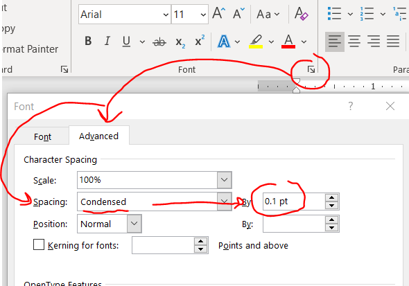
Kudos to Jason Buxbaum for this one. You can shrink the space between your letters without actually changing the font size/size of the letters. Highlight your text then home –> font little arrow –> advanced –> spacing becomes condensed then change the selecter menu to 0.1 pt.

This change will give you a few lines back in a 4 page document.

I can’t tell the difference in the letter spacing before and after using 0.1. If you increase to a number larger than 0.1, it might start looking weird, so don’t push it to far.

A word of advice with this feature: If you are too aggressive, you might run amok with NIH guidelines, which specify 15 characters per linear inch, so double check the character count in an inch (view –> ruler will allow you to manually check). FYI: all NIH-approved fonts are proportional fonts so narrow characters like lowercase L (“l”) take up less width than an uppercase W, and a random sample of text that happens to have a lot of narrow letters might have more than 15 characters/linear inch. You might need to sample a few inches to get a better idea of whether you or not are under the 15 character limit. (In contrast, Courier is a monospaced font and every character is exactly the same width.)

Adjust line and paragraph spacing

Both line and paragraph spacing affect the amount of white space on your page. Maintaining white space in your grant is crucial to improve its readability, so don’t squeeze it too much. In my opinion folks will notice shrunken paragraph spacing but not shrunken line spacing. So if you have to choose between modifying line or paragraph spacing, do line spacing first.

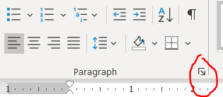
You can modify line and paragraph spacing by clicking this tiny checkbox under home tab –> “paragraph”.

Remember to highlight text before changing this (or if you are using MS Word’s excellent built-in Styles, just directly edit the style).

Line spacing

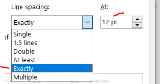
As long as you have 6 or fewer lines per vertical inch (view –> ruler will allow you to manually check), you are set by NIH guidelines. The default line spacing in MS Word is 1.08. Changing it to “single” will give you back about and eighth of a page in a 4 pg document. Today I learned that there’s ANOTHER option called “exactly” that will get you even more than a quarter of a page beyond single spacing. Exact spacing is my new favorite thing. Wow. Thanks to Michael McWilliams for sharing exact line spacing in this tweet. I wouldn’t go below “exactly” at 12 pt because that gets you at about 6.5 lines per inch, which goes against NIH standards of 6 lines per inch.

Paragraph spacing

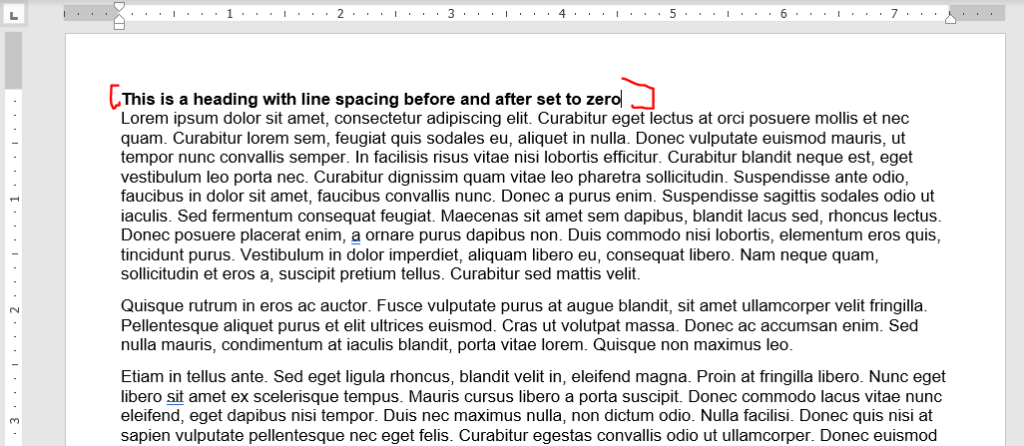
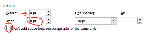
The default in MS Word is 0 points before and 8 points after the paragraph. I don’t see a need to have any gaps between a heading and the following paragraph, so set the line spacing before and after headings to be zero. Looks nice here, right?

Now you can tweak the spacing between paragraphs. I like leaving the before to zero and modifying the after. If you modify the before and not the after, you’ll re-introduce the space after the header. Also, leave the “don’t add space between paragraphs of the same style” box unchecked of you’ll have no spacing between most paragraphs.

Here’s the same document from above changing the after spacing from 8 to 6 points.

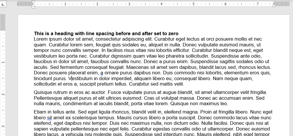
Looks about the same, right? This got us about 3 lines down on a 4 pg document. Don’t be too greedy here, if you go too far, it’ll look terrible (unless you also indent the first line, but then you run the risk of it looking like a high school essay).

Play around with modifying both paragraph and line spacing. Again, I recommend tweaking line spacing before fiddling with paragraph spacing.

Window/orphan control, or how to make paragraphs break at the maximum page length

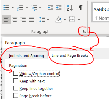
MS Word tries to keep paragraphs together if a small piece of it extends across pages. For example, if the first line of a paragraph is on page 2 and the rest of the paragraph is on page 3, it’ll bring that first line so that it ALSO starts on page 3, leaving valuable space unused on page 2. This is called window/orphan control, and it’s easy to disable. Highlight your text and shut it off under home –> paragraph tiny arrow –> line and page breaks then uncheck the window/orphan control button.

This gives a couple of lines back in our 4 page document.

Modifying the format of embedded tables of figures

Tables and figures can take up some serious real estate! You might want to nudge a figure or table out of the margin bounds, but that will get you in some serious trouble with the NIH — Stay inside the margins! Try these strategies instead.

Note: I have a separate post that goes in-depth into optimizing tables in MS word and PPT, here. Check it out if you are struggling with general formatting issues for tables.

Wrap text around your tables or figures

Note: In 3/2024, I discovered a better way to get tables and figures to behave that is described at the end of this section. I’m keeping the older pieces here since I think they are still relevant.

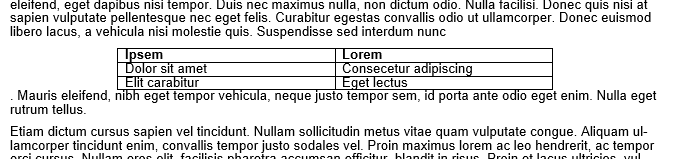
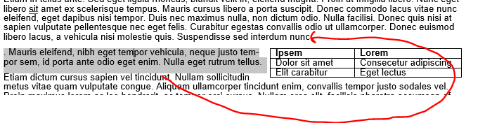
Consider reclaiming some unused real estate by wrapping the text around tables or figures. Be warned! Wrapping text unearths the demons of MS Word formatting. For this example, we’ll focus on just wrapping text around a table to make a ‘floating table’. Below is an example of a table without text wrapping.

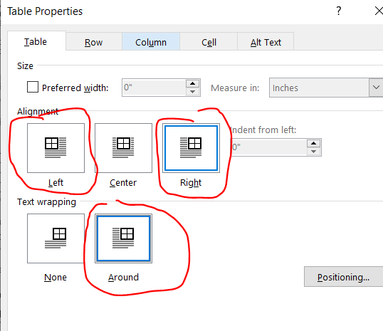
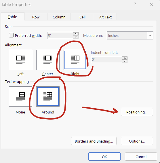
Right click on your table and select “Table Properties” then click right or left alignment and set text wrapping to around. (For figures, right click your figure and click “size and position”, which is analogous to the table options. For simplicity, I’ll focus on tables only here.).

Adjust your row width a bit and now you have a nice compact table! But wait, what’s this? The table decided to insert itself between a word and a period! That’s not good.

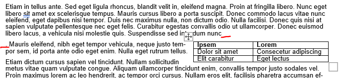
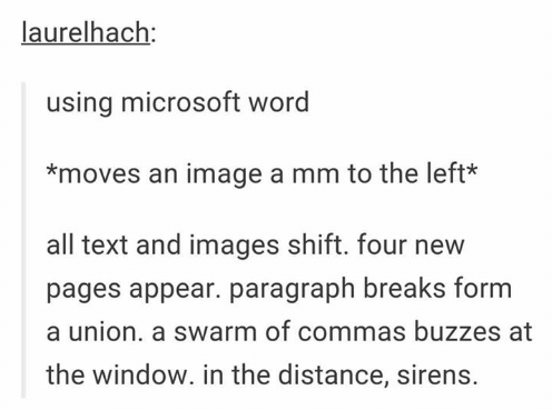
When MS Word wraps text around a table, it decides the placement of the now floating table by inserting an invisible anchor followed by a line break. Here, there’s an invisible anchor is placed between “nunc” and the period. Your instinct will be to move the table to fix this problem, and that is the wrong thing to do. Avoid moving the table because the anchor will do unpredictable things to your document’s formatting. This is so well known to create havoc that it led to a viral Tumblr post from user laurelhach:

laurelhach: using microsoft word *moves an image a mm to the left* all text and images shift. four new pages appear. paragraph breaks form a union. a swarm of commas buzzes at the window. in the distance, sirens. Text Font Line

Moving tables is pointless in MS word because it doesn’t do what you think it does and you will be sad. Move the text instead. Here, highlight that stray period and the rest of the paragraph starting with “Mauris eleifend” and move it where that weird line break occurred after “nunc”.

There will be a new line break to erase, but the table should now follow the entire paragraph.

If you are hopelessly lost in fighting the MS Word Floating Table Anchor Demon, and the table decides that it doesn’t want to move ever or is shifted way to the right (so much so that it’s sitting off screen on the right), then the invisible anchor might be sitting to the right of the final word in a heading or paragraph. I recommend reverting the floating table to a non-text wrapped table to figure out what’s wrong and fix everything. Right-click the table and open up the “table properties” option again and change the text wrapping to “none”. The table will appear where the invisible anchor is and now you can shift around the text a bit to get it away from the end of a sentence. Now turn back on text wrapping. This usually fixes everything.

Note: I actually made the table intentionally insert between ‘nunc” and the period for this example. This was just a re-enactment so it’s not MS Word’s fault — this time. BUT this really happens. It’s very problematic if you have >1 table or figure on a page because the Floating Table Anchor Demons will fight with each other and your grant’s formatting will pay.

Update 3/2024: There’s actually a simpler way to fight the demons of embedded tables and figures: Setting the position relative to the margin. Setting relative to the margin not only makes anchors disappear, it also ensures that your figures don’t extend outside of the margin. We’ve all heard horror stories about grants being rejected because some table or figure snuck beyond the margin limits.

To set the positioning of your table or figure relative to the margin, right click on your table/figure and select “table properties”, set alignment to “right” (or center or left) and text wrapping to “around” then hit the “positioning” button:

You can then set the horizontal and vertical position relative to the margin rather than the paragraph. Then the anchors go away completely! You can set it all the way to the extremes (left/right, top/bottom) or put in a measurement (eg replacing “bottom” with “5 in” in the vertical “position” box will put your figure or table about 2/3rds of the way down a page).

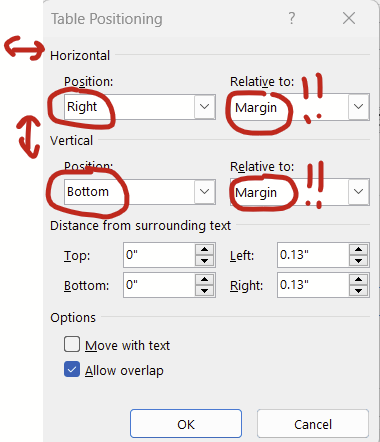
Tables and figures behave much better when you set the positioning relative to the margin.

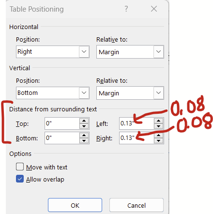
Changing cell padding *around* your tables and figures

Continuing with the window above (right click table –> table properties –> position), there’s this “distance from the surrounding text” section at the bottom that changes how much white space padding there is around the table/figure. The default padding is 0.13 inches, which I think is a bit too generous. Try changing this to 0.08 inches and you might get to squeeze in a few extra words in the surrounding text before a new line break.

For figures, there’s an analogous series of options that you can get to by right clicking your figure –> size and position. Under “size and position”, set the wrapping to “tight” and then have at it.

Reduce cell padding *inside* your tables

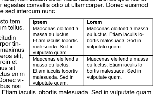
This is especially helpful for tables with lots of cells. Reducing the cell padding shrinks the white space between the text in a cell and borders of the tables. In contrast with the “save the whitespace” principle of lines and paragraph spacing, I personally think that less white space in tables improves readability. Here’s before, with default cell margins of 0.08:

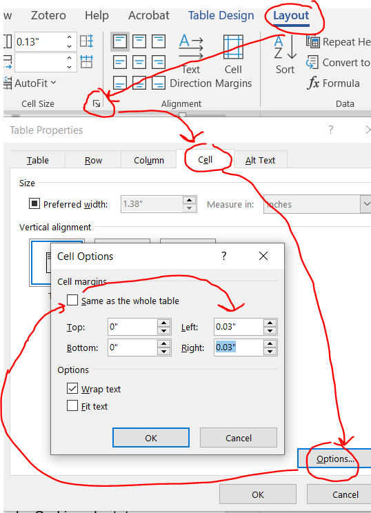
Highlight your entire table and you’ll notice a new contextual ribbon with “design” and “layout” tabs appear. Click layout –> cell size little arrow –> cell –> options –> uncheck the box next to same size as the whole table then reduce the cell margins.

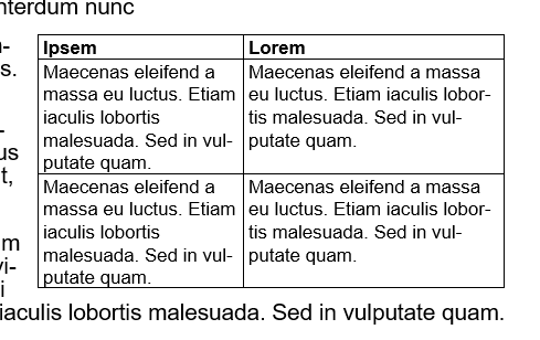
Here’s that same table reduced with cell margins reduced from 0.08 to 0.03.

Now you can strategically adjust the column size to get back some space.

Also note that you can also apply justification and adjust the line and paragraph spacing within your tables, which might also help shrink these things down a bit.

Shrink the font in your tables

AFAIK, NIH guidelines don’t specify a font size to use in tables, just something that can be read. I typically use size 8 or 9 font.

Did I miss anything?

If I did, shoot me an email at timothy.plante@uvm.edu!

Part 3: Introduction to Stata

Note in 2023: We are using R and not Stata this summer so this post doesn’t apply to this year’s projects.

Stata is a popular commercial statistical software package that was first released 30+ years ago. It has some really nice features, loads of top-rate documentation, a very active community, and approachable syntax. For beginners, I think it’s the simplest to learn.

Learning how to use Stata

Stata has really, really, really good documentation.

The documentation is outstanding. Let’s say that you want to learn how to use the –destring– command. In the command line (1a under “Stata’s Interface” below), type:

help destring

…and up will pop a focused help file. There’s the “View complete PDF manual entry” option that has EXTENSIVE documentation of the command. (Note: This file seems to only work well with Adobe PDF reader, not alternative PDF readers like Sumatra). If the focused help file isn’t sufficient to answer your questions, try the complete PDF manual.

The focused help file has multiple parts, but the syntax example is gold. Further down you’ll see example uses of the command.

Web searches will find even more answers

Odds are that someone has already hit the same problem you have in using Stata. Queries in your favorite search engine are likely to find answers on the Statalist archive or UCLA’s excellent website.

You can install Stata programs that other users have written

There are MANY MANY MANY user-written programs out there that can be installed and used in your code. You only need to install them once. Most are on BU’s repository called SSC. I use the table1_mc program extensively (it makes pretty table 1s, you can read about it here). To install table1_mc from SSC, you type:

ssc install table1_mc

…and Stata will download it and install it for you. It’s ready to use when it finishes installing. And, there’s no need to re-install it, it will load each time you start Stata.

Quirks of Stata

Stata only works with rectangular datasets

Think of a rectangular dataset as a single spreadsheet in Excel. It has vertical columns and horizontal rows. There’s no data on a Z axis coming out of the computer at your face.

A rectangular dataset is the only type that Stata works with. Other statistical software like R or Python can handle many more complex data structures. For learners, forcing data to fit within a rectangular dataset is a huge advantage in my mind since that structure is intuitive, and you can always browse your data with the built-in data browser (see 3c under Stata’s Interface, below).

Stata only works with one dataset at a time*

One dataset in Stata is akin to one spreadsheet in a workbook in Excel. In Excel, you can have multiple spreadsheets in one .xlsx workbook file, with each spreadsheet appearing on a different tab at the bottom. All spreadsheets are in the memory at the same time. You can do math across spreadsheets in a workbook in excel, summarize costs in one column in spreadsheet A and have the result appear in one cell on spreadsheet B. In Stata, you can only have one spreadsheet (here, dataset) open at a time.* Because of this, Stata users spend a good deal of time merging and appending multiple datasets to make a single dataset that has all of the necessary variables in the best format from the get-go.

A big problem historically with Stata was that datasets are loaded in the RAM, and big datasets would be too big for conventional computers. That’s not an issue anymore since even cheap computers have several gigabytes of RAM.

*This isn’t true anymore. Starting in version 16, Stata can actually now have multiple datasets in memory, each stored in its own frame. These frames can be very useful in certain scenarios, but for our purposes, we are going to pretend that you can have just one dataset open at a time.

Data are either string or numeric. Their color changes in the data browser

Strings are basically text that are thought to be words and not numbers. But sometimes a dataset will be imported wrong and things that are actually numbers (“1.5”, “2.5” in different rows of the same column) will be imported and considered to be strings and not numbers. This might be because they were imported incorrectly. This might be that later down in the list there is a word in a different cell (“1.5”, “2.5”, “Specimen error”). If any row of a variable contains something that isn’t a number, Stata makes the entire column, and with it the variable, a string.

IMPORTANT: When viewing strings in the data browser (3c under “Stata’s Interface” below), they appear in RED text. When specifying strings in commands, you need to enclose them in quotations (eg count if name==”Old”). Missing strings are two quotes with nothing in between them (eg count if name==””).

In order to do math, you need to have things be numbers. There are several different numerical formats that you can read about here. If something is an integer (nothing after the decimal), it can be byte, int, and long. If something has a decimal point, it’s float or double. Stata does a nice job selecting which numerical format your data should be in, so you probably don’t need to think much about the difference between byte, int, long, float, or double again.

IMPORTANT: When viewing numeric variables in the data browser, they appear in BLACK text (or BLUE if they have a label applied). When specifying strings in commands, no quotations are needed (eg count if quartile==1). Missing strings are periods (eg count if quartile==.), and a period is positive infinity (a missing value is bigger than a value of one billion).

To convert from a string to a numerical value (change the “1” to a 1), you use the –destring– command. You might need to include the force and replace options, but read up on those by typing –help destring–.

To convert from a numerical value to a string (change the “1” to a 1), use the –tostring– command. Note that missing numerical values will go from a dot to a dot in quotations (. becomes “.”), which is not the same as a missing value for a string, which is just empty quotations (“”). It’s a good idea to follow up a –tostring– command with a command that replaces “.” values with “” values.

Stata’s output is only 255 characters wide, max

The output window of Stata will print (“display”) the inputted command and results from that command. It will clip the output at up to 255 characters, and insert a line break to the next row. You can specify:

set linesize 255

…so that the output is always 255 characters wide. Otherwise, it’ll adjust the output to match how wide your output window is.

The working directory is your “documents folder” unless you manually set the working directory with the cd command or open up Stata by double clicking on a .do file in Windows explorer

The working directory is where Stata is working from. If you save a dataset with the –save– command, it’ll save it in the working directory unless you specify all of the files from the C: drive on. If you double click on the Stata icon to open it up in Windows and type the present working directory command to see where it’s working from (that’s –pwd–), it’ll print out:

. pwd 
C:\Users\USERNAME\Documents

So, if you type:

save "dataset.dta", replace

…it’ll save dataset.dta in C:\Users\USERNAME\Documents

Let’s say that you really want to be working in your OneDrive folder because that’s secure and backed up and your Documents folder isn’t. The directory for your desired folder is:

C:\Users\USERNAME\OneDrive\Research project\Analysis

In order to save your file there, you’d type:

save "C:\Users\USERNAME\OneDrive\Research project\Analysis\dataset.dta", replace

Note that there’s a space in the Research project folder name so the directory needs to be in quotations. If there was no space anywhere in the directory, you could omit the quotations. I’m including quotations everywhere here because it’s good practice.

One option is to change your working directory to the OneDrive folder. You use the –cd– command to do that then any save command will automatically save in that folder:

cd "C:\Users\USERNAME\OneDrive\Research project\Analysis\"
save "dataset.dta", replace

Alternatively, you can save your project’s Do file in the “C:\Users\USERNAME\OneDrive\Research project\Analysis\” folder. Rather than opening Stata by clicking on the icon, find the Do file in your OneDrive folder in Windows Explorer and double click on it. It’ll open Stata AND set that folder as the working directory!! For a new project, this means opening Stata by clicking on its icon, opening a blank do file, saving that do file in your OneDrive folder, closing the Do File Editor and Stata, then reopening stata by double clicking on your blank do file in Windows Explorer.

Stata is most effectively used with with command-line input, specifically through the Do File Editor. There is a graphical user interface that can be handy.

I think that everything in Stata should be completed through Do files. These are text files with sequential lines of codes that make Stata perform commands in order.

I strongly, strongly, strongly recommend having a set number of do files, the first (“01 cleanup.do”) will merge original data files, generate new variables, print out your inclusion flow diagram, and save your analytical dataset (“analytical.dta”). The rest of the files all do just one thing, like make a table or render a figure. All other files except for the first (“01 cleanup.do”) will first (a) open your analytical dataset (“analytical.dta”) then (b) run some sort of stats without modifying the analytical dataset. I also have one last miscellaneous one for random things that you might need from the text (“99 misc things for text.do”), like estimating median and IQR follow up or some one-off t-tests. If you realize in a later do file (say “02 table 1.do”) that you need to generate a new variable or merge in another raw dataset that you didn’t realize that you needed when you first built your “analytical.dta” dataset, resist the impulse to make new variables in your “02 table 1.do” file and instead go back and rework your “01 cleanup.do” file to generate that variable or merge in another raw dataset. Then, rerun your “01 cleanup.do” file it so it overwrites your “analytical.dta” dataset, and then go back and continue working on your “02 table 1.do” file.

So, your do file directory might look like this:

  • 01 cleanup.do – (a) Merge original data files, (b) generate new variables, (c) print out an inclusion flow diagram and (d) also builds your “analytical.dta” analytical dataset that all other do files will use.
  • 02 table 1.do – Opens “analytical.dta” then uses table1_mc or something similar to make a table 1.
  • 03 histogram of exposure.do – Opens “analytical.dta” then uses the –histogram– command to draw a distribution of your exposure.
  • 04 event table.do – Opens “analytical.dta” then uses some sum commands to print out the # of events by group of interest.
  • 05 regressions.do – Opens “analytical.dta” then runs your regressions.
  • 06 spline.do – Opens “analytical.dta” then runs some code to make restricted cubic splines.
  • 99 misc things for text.do – Opens “analytical.dta” then runs one-off code for random details that you might need for the text (e.g., median and IQR follow-up).

GUI in Stata

There is a graphical user interface (GUI) with clickable menus. You can click through commands and it’ll generate the code and run the command of interest, and these can be handy for stealing syntax to run an annoying command. The command from the GUI will appear in the Command History (1c below) and you can right click and copy/paste it into your do file.

I find –import excel– to be frustrating and use the GUI probably 90% of the time to generate that command then copy/paste the syntax into my do file.

You’ll be much better off if you use a do file for nearly everything. Try to minimize the use of the GUI.

Stata won’t let you close a dataset in the memory or overwrite an existing dataset without some effort

The –use– command will open up a dataset in the memory. If you don’t have a dataset opened yet, this will open one:

use dataset.dta

Remember that Stata can only have one dataset opened at a time, so any time you open one when you already have a different dataset opened in memory, Stata will need to drop the open dataset. If you spent a lot of time on the open dataset creating new variables or merging with other datasets, closing it will make you lose all of your work unless you have also saved it. Stata doesn’t want you to make this mistake so if you already have a dataset opened and you type in the above command, Stata will say “No” and you won’t be opening the new dataset.

Instead, you need to put “–, clear–” at the end of the command, like this:

use dataset.dta, clear

And now Stata will drop whatever you have open. It’s really just a nice check to keep you from discarding your work accidentally.

Similarly, if you are trying to save a dataset with the –save– command into an empty folder, you just need to type:

save newdataset.dta

…and Stata will save it no problem. HOWEVER if you are trying to overwrite an existing dataset with that same name, Stata will say “No” and you won’t be saving your dataset today. This is another check. instead, you just need to use “–, replace–” to overwrite. Example:

save newdataset.dta, replace

Stata’s interface

Here’s a quick overview of the Stata interface in Windows.

  1. Ways to input and interact with commands:
    1a. Command line – This is where you type command by command. Unless you are just poking around in your data, you should avoid using this. Anything that you want to reproduce in your analysis should be done in the Do file editor.
    1b. Open Do file editor button – The Do File Editor is the most important part of Stata in my opinion. A do file is a long text file saving command after command. This is where you should do all of your analytical work.
    1c. Command history – If you use the command line or GUI to make a command, it’ll be saved here. You can right click on old commands and copy/paste them into your do file.
  2. Output window – Your command will appear here with a preceding dot (“. sysuse auto” means that I had previously typed in “sysuse auto”). The output from your do file or command will appear immediately below.
  3. Ways to interact with data
    3a. Variable list – This is a list of variables in the open dataset. You can double click on them and the variable name will be copied to the command line. You can ctrl+click and select multiple and then copy them to the clipboard. This is quite handy.
    3b. Variable and dataset properties – This will let you see details about a selected variable in the variable list and the current dataset in memory.
    3c. Data browser – You can also pop this open with the –bro– command. this views all data in a spreadsheet format that looks like Excel.

Table 1 with pweights in Stata

The very excellent table1_mc program will automate generation of your Table 1 for nearly all needs (read about it here), except for datasets using pweight. I’ve been toying around with automating Excel table generation using Stata v16+ Frames features. I recently started working on a database that requires pweighting for analyses, and opted to use this to as an opportunity to use Frames to generate the automation of a pweight adjusted Table 1.

v1.3 of my code (updated 2024-2) to automate this lives here: https://www.uvm.edu/~tbplante/p_weight_table1_v1_3.do

You can just put:

do https://www.uvm.edu/~tbplante/p_weight_table1_v1_3.do

…in your Stata do file and it’ll pull in the entire script! Note that full instructions will show up in the Stata output window when you run the above line. The instructions below are incomplete. This code does not produce P-values.

How to use this do file

// Step 1a: close all open frames, drop all macros, 
//          and open your dataset
frames reset
macro drop _all
webuse multistage, clear
//
// Step 1b: Figure out where your present working directory is, 
//          this is where the excel spreadsheet will be saved. 
//          Change the working directory with the "cd"
//          command as needed. 
pwd
//
// Step 2: Declare your data to be pweighted
svyset county [pweight=sampwgt], strata(state) fpc(ncounties) || school, fpc(nschools)
//
// Step 3: If your columns require the generation of pweighted 
//         tertiles, quartiles, or whatnot, do that now. 
//         For this example, we'll do by quartile of weight. 
// note: per this website: https://www.stata.com/support/faqs/statistics/percentiles-for-survey-data/
//       ...Only the pweight needs to be specified when making 
//        weighted quartiles. 
xtile weightquart=weight [pweight=sampwgt], n(4) 
//
// Step 4: Recode binary variables so they are 0 and 1 (if needed)
// Note: in this dataset, it's 1 and 2 for male and female, 
//       respectively. 
gen female = 1 if sex==2 // recode sex to female, where 1 is female
replace female=0 if sex==1 // male is now 0
//
// Step 5: Name your variables and options for multiple options
// Note: The variables are already labeled but we are doing it 
//       again for completeness' sake. 
//
// Continuous variables
label variable weight "Weight in lbs"
label variable height "Height in in" // I don't know why people are 400 in tall. that's 33 ft.
// Nominal variables (same process would happen for ordinal or continuous varibles)
label variable race "Race" // Race is nominal so need to also define values of race
label define racelabels 1 "White" 2 "Black" 3 "Other"
label values race racelabels // Apply the labels!!!
// Binary variables, no need to apply labels
label variable female "Female sex"
//
// Step 6: Call the do file
// Note: Instructions on this program's use will show right 
//       after it's called. Look at the Stata output window. 
do https://www.uvm.edu/~tbplante/p_weight_table1_v1_3.do
//
// Step 7: Now follow the instructions! That are in the stata 
//         output window!
table1pweight_start table1 1 4 weightquart weight %10.1f
table1pweight_contn_sd  table1 1 4 weightquart height %10.1f
table1pweight_bin  table1 1 4 weightquart female %10.0f
table1pweight_cat  table1 1 4 weightquart race %10.0f
table1pweight_end table1 1 4 weightquart weight %10.2f
//
// CLOSE THE NEW EXCEL FILE OR YOU'LL GET AN ERROR WHEN 
// RUNNING STEP 7.
//
// Step 8: Look at the excel output! Here, it's a file called 
//         table1.xlsx that's sitting in  your pwd (see step 
//         1b above). You might notice blanks for the 2nd and 
//         3rd columns, but that's because of a strata with a single
//         sampling unit. You can confirm numbers using the survey
//         tools.
// remember! This is where your excel file is saved:
pwd

Summer medical student research project series Part 1: Getting set up

Summer goals and expectations

Hi there! Thanks for expressing interest in working on an epidemiology project with me this summer. This project will entail:

  • Using cohort study or clinical trial data trying to extend knowledge of cardiovascular disease (CVD).
  • You getting your hands dirty with statistical coding (e.g., R or Stata).

My expectations for all LCOM summer students are:

  • You have a computer that works and internet that is dependable enough to allow Zoom conferences. You don’t have to be in VT.
  • In advance of the summer, you will submit a manuscript proposal to the cohort that will be used, and apply for funding through the CVRI or LCOM (typically due in February). If we need an IRB proposal (which we likely don’t since there’s probably an existing IRB), then you’ll lead the completion of that.
  • We’ll meet weekly via Zoom for an hour or so during the summer to review the project’s progress. I’ll be available in between meetings via email, Zoom, or whatnot.
  • If we’re working with a biostatistician and using R, you’ll meet with them to learn R pointers.
  • You’ll complete the analysis, with help from me in learning the ins and outs of coding.
  • If doing a REGARDS/LCBR-related project, you’ll attend lab meetings.
  • At the end of the summer you will have: (1) A complete first draft of a manuscript and (2) a completed abstract that can be submitted to a conference.

Things to set up now.

Zotero

I use Zotero as a reference manager. It’s the bomb diggity. We will share references in a private group library that we can both edit. Only the people who have this library shared with them can see its contents.

To install Zotero, do the following:

  1. A free Zotero account. Sign up here. Please tell me your username so I can start a group library with you.
  2. Zotero’s desktop app. Make sure to log into your account in the desktop app. It’s under edit –> preferences.
  3. The Zotero web browser plugin for your web browser of choice. You need to have the Zotero desktop app open for this to work.
  4. The Zotero MS Word plugin (in Zotero desktop app, click Edit –> Preferences –> Cite –> Word Processors). This has been finicky with the specific MS Office install on the LCOM laptops so it might take some working to get it to work. But! It’ll work.

I’ll send you a shared library invitation. To accept the group library invite, do the following:

  • Go to zotero.org, log in.
  • In the top right, click on your username. A menu should drop down, click “inbox”.
  • Accept the group library invitation.
  • Open up the Zotero desktop app and let it sync (again, you need to be signed in on the desktop app, seen #2 above). The group library folder should appear in the left column all the way on the bottom.

Group libraries are awesome because we can compile references that either of us can insert into a document. Please keep the group library organized. If you add a new reference, please make a subfolder to stick it in so you don’t have to search for references one by one.

How to use Zotero

This is covered in a separate post, here.

Microsoft OneDrive

This is through LCOM. Not UVM, not your personal account.

  1. Open the OneDrive on your computer and sign in with your LCOM credentials if you aren’t already.
  2. I’ll share a research folder with you. You’ll need to sync it with your computer. To do that, go to onedrive.com, log in with your LCOM credentials (firstname dot lastname at med dot uvm dot edu).
    • After you log in, you’ll be on the landing page for OneDrive. Click “Shared” on the left column.
    • If you see a mix of files and folders, limit the view to just folders by clicking the icon of a folder to the right of “With You”.
    • Find the research folder and select it. On the top bar click “Add shortcut to My Files” (you might need to make the window full screen to see this option).
    • Allow the OneDrive desktop app to sync. Now all of the files should be available offline in the Onedrive folder on your computer.

Microsoft Word

Unfortunately, writing papers in Google Drive is a bit too onerous. Please download this manuscript file, which you will be using to draft your manuscript.

Your statistical software, option 1: Statanote: this is what we are using for the 2024 summer session.

At this point you should know if you are using Stata or R. I use Stata. UVM has an institutional subscription to Stata. You can download and install it from the UVM Software page, here. For this you will log in with your UVM (not LCOM) credentials. To download it, hit the down arrow (1) then download. After it’s installed, you’ll need the serial number, code, and authorization to activate it. That’s under “more info” (2).

<– Two steps to install Stata from UVM

Your statistical software, option 2: R – we aren’t using it in the 2023 summer session.

R is a free and open source computer language intended for use in statistics. RStudio is a commercial software that makes using R much more user-friendly. I have only used R a few times and don’t have expertise in the language.

Research credentialing things

CITI training and directory modification

You need to complete the CITI training (both “human subjects training/IRB” and “GCP” trainings) in advance of starting the summer so you can be added to our human subjects IRB, see details at these links:

And please modify your directory listing so you can be added to the IRB as described here: https://www.uvm.edu/sites/default/files/media/Students_-_How_To_Sign_Up_to_Do_Research_at_UVM_2.pdf

Once you have finished these steps, let me know so we can add you to the IRB. There is a delay between when we request you to be added to the IRB and when you are added to the IRB, fyi.

Cornerstone research training

Historically, students have been required to do an online research training session in Cornerstone by the end of the first week. Details from this come from the Student Services office. I don’t have details about how to complete this. IIRC this is specifically for students doing projects that involve interacting with patients or patient data at UVMMC, which isn’t what we are doing. But, look for those details coming your way.

ZIP code and county data sets for use in epidemiological research

Everyone knows their (5-digit) ZIP and it can be linked to population-level data. ZIP Codes have limitations since they were designed for mail delivery and not for population details. You can easily get county data from these data as well.

In epidemiological studies (especially EMR and survey data), you’ll almost certainly have a ZIP code or county, and almost never a census tract. It’s easy to find census data sets, but finding the analogous ZIP code dataset is a bit tricker. Every time I try to do a project with ZIP codes, I kick myself for not keeping a list of ZIP code data sets. So, this page will keep a running list of ZIP code-linked datasets. It’ll be updated periodically. If there’s a useful resource that I have missed, please email me at timothy.plante@uvm.edu and I’ll add it.

A few technical notes:

  • US Postal Service (USPS) ZIP codes – It seems that some datasets use a variation of USPS’s active ZIP codes. These are constantly being updated by the US Postal Service. ZIP codes are either the ‘standard’ 5-digit ZIP code or ZIP+4 (e.g., 9 digit). You can narrow down a lot further with the ZIP+4 version, but often times you only have the 5-digit ZIP.
  • ZCTA stands for ZIP Code Tabulation Area and is the US Census’s take on representing the topology of ZIP codes. These are produced for the q10y census. There are different ZCTAs for the 2000 Census and 2010 Census (as of 12/2020). Details about the US Census’s approach to developing ZCTAs can be found here.
    • You can read about the differences between ZCTA and USPS ZIP codes here: https://www.ncbi.nlm.nih.gov/pmc/articles/PMC1762013/
    • The 2010 ZCTA to county, subdivision, tract, congressional district, metropolitan and micropolitan statistical area, and New England City and Town Area can be found here.
    • Note, there is also a non-ZCTA 5-digit ZIP code standard used by the US Census are specific to the ZIP Code Business Patterns Survey. So, these relate to businesses, not people. Details are here.
  • USPS ZIP code to ZCTA crosswalk – this is provided by UDS at this website: https://udsmapper.org/zip-code-to-zcta-crosswalk/
  • The US Housing and Urban Development (HUD) also has its own ZIP linkage, which can be found here. You can read about the details of the HUD ZIP crosswalk here. This is not the same as ZCTA. The nice thing about the HUD ZIP crosswalk is that it’s updated quarterly, it links to 2000 or 2010 US Census county or tract GEOID via FIPS code, and the OMB’s core-based statistical area (CBSA; basically definitions of urban groups), and congressional districts. It also provides some details about residential vs. business vs. other addresses in that zip code.

Linking ZIP to county and FIPS

There’s a dataset on the HUD website here, on the “select crosswalk type” dropdown, select ZIP-County. From my read, this is ZCTA ZIP code for more recent datasets, but that isn’t explicitly stated. There’s also this resource from Dan Ofer that I haven’t had the chance to use but looks promising.

Cartography

Here are some resources if you want to make a map.

US Census (ZCTA)

Here’s some mapping files provided by the US Census.

Here’s a great Stata-specific page with both the ZCTA and US Postal Service ZIP files. I recommend the ZCTA if you will be using US census data.

ZIP-core-based statistical area (CBSA) linkage

The CBSA is grouping of a geographical region in and around metropolitan and micropolitan areas. Read about CBSA here: https://en.wikipedia.org/wiki/Core-based_statistical_area

You can download a ZIP-CBSA linkage from this Stanford website. It requires a free account. Download from the ‘tables’ tab.

HUD-ZIP linkage

Details are here.

USPS ZIP code

Here’s a commonly-used dataset from Esri’s ArcGIS.

Here’s the USPS ZIP code for Stata.

Distance between zip codes

Can be found here from the NBER here.

Health outcomes, prevention, health risk behaviors, disability, health status, and SDOH at CDC Places/500 Cities (ZCTA)

The RWJF/CDC 500 cities and Places database provides a huge collection of data linked to ZIP, with data originating from BRFSS and ACS/Census. Data can be downloaded at CDC places (ZCTA).

Commercial datasets

You might want to take a look at datasets available, some for free, some for a fee, on the AWS marketplace here (this is a link to the search term “Zip”). There are at least a few companies that sell datasets with things like demographics for Zip+4, which you might be interested in. While you’re at it, you might also opt to look at Census files on this marketplace here.

Demographics

US Census (ZCTA)

The US Census used to distribute their summary files via FTP for their 2000 census and 2010 census. [Note: those are links to the Summary File 1, which doesn’t include rurality. Those are in Summary File 2.] These 39 and 47 files that must be merged by some convoluted process that I’m not going to try to figure out. Fortunately, the National Bureau of Economic Research (NBER) generated Summary File 1-ZCTA linked files for Stata, SAS, and CSV files that can be downloaded here:

As an example of how to use the NBER files, let’s look at the 2010 files. Files are indexed in this Census Summary File 1 (SF1) document. Search for “File 03” in that PDF to find the details for File 03 on page 184. Note that “P0030002” through “P0030008” are variables for race in the entire population. File 04 then has race and ethnicity among adults (male sex is “P0120002”, female sex is “P0120026”). File 07 has sex by race/ethnicity and age, and so on. You’ll want to save the specific variables from each of these files and generate your own dataset, depending on what you are attempting to do.

But what about rurality? That’s in the Summary File 2 (SF2) document. The US Census data used to be on a website called American Fact Finder, which was simple to use and wasn’t annoying. More recently it was moved to data.census.gov, which is a spiffy looking website that is in all actuality, quite terrible and I want it to go away. I can’t figure out how to download what I want. I tried to make a walkthrough of how to download urban/rurality by ZCTA but it gave me a blank table. Fortunately, I had downloaded it from American Fact Finder before it went offline. You can download the version that I saved here.

An alternative to data.census.gov in the wake of the loss of American Fact Finder is the NHGIS website. You can also try IPUMS, which also has data related to global health, GIS, time use, health surveys (NHIS and MEPS), and higher education information. Finally, there are a whole host of free Census files on AWS, I haven’t tried these but you might want to take a look here.

Social Determinants of Health

Take a look at this handy review of SDoH definitions by Lori Dean and Roland Thorpe at JHU. Before I go any further, I recommend looking at the PhenX toolkit for their resources on SDoH. There are a few conceptual frameworks for SDOH. Here’s Healthy People 2030. Here’s the WHO one. I like the KFF’s Figure 1 here, which defines the following factors (note there’s plenty of overlap between Healthy People 2030 and KFF). Here’s a working list of resources that I’ll keep adding to, organized by KFF’s figure 1 overview:

As I expand these, I will do my best to cover as many of these as possible, as how they apply to ZIP code and county.

Social Deprivation Index or SDI (ZCTA)

Derived from the American Community Survey 5-year estimates. Details include overall SDI score, income, education, employment, housing (% living in crowded rentals), household characteristics (% of single parent households with dependents who are minors), transportation (% car non-ownership), demographics (% black population, % high needs population). Details and download files can be found here.

Here’s the original description, prior to the use of ZCTA. This manuscript only discusses the Primary Care Service Areas (PCSAs), from the Dartmouth Atlas: https://pubmed.ncbi.nlm.nih.gov/22816561/

Area Deprivation Index or ADI (ZIP+4)

More to come. Download site is here. You need to make a free account to access the data. You have to download each state individually, as an FYI.

HUD datasets on housing, income, etc. (can use the HUD-ZIP crosswalk)

Here is the website: https://hudgis-hud.opendata.arcgis.com/

I haven’t explored these data files much, but some details are below. The only file that natively includes the ZCTA is the Difficult Development Areas, under Community Development below.

  • Agency administration – How the HUD is divided. Yawn.
  • Community development – Community development block grant, LIHTC Qualified Census Tracts (aka low income), Difficulty Development Areas for Low Income Housing Tax Credit (LIHTC; high cost of living relative to Area Median Gross Income; interestingly using the ZCTA for metropolitan areas), Neighborhood Stabilization Program (purchase of abandoned buildings), Empowerment Zone/Enterprise Community/Renewal Community (economic growth tax incentives), Revitalization Areas.
  • Community indicators – Details by American Community Survey, self-reported perceived rural/urban status (see Rurality section below), low-to-moderate income population by tract from the American Community Survey, Location Affordability Index from the American Community Survey, extreme temperatures by 1 degree latitude and longitude.
  • Fair housing – More to come.
  • Housing counseling – More to come.
  • Initiatives and demonstrations – More to come.
  • Location affordability – More to come.
  • Mortgage insurance programs – More to come.
  • Rental assistance programs – More to come.
  • Disaster recovery – More to come.

Rurality

Rural-urban commuting area (RUCA) codes (Unclear ZIP type)

RUCA is nice because it considers communities and travel between communities. It’s been linked to ZIP codes too. For RUCA-ZIP, there are primary codes (before the decimal) and a secondary code (after the decimal). There was a bug in the 2010 US Census-derived RUCA-ZIP and the linkage was updated in 2020, and can be found here. I’m trying to figure out whether RUCA is most similar to ZCTA or USPS ZIP Codes. I’ll come back and update what I find out. Update: I didn’t get a response to my inquiry. Since this is linked to the Census data, it’s possibly ZCTA.

FYI: there are multiple ways to implement RUCA codes to determine rurality vs. urbanicity. if you consider the primary and secondary codes, see documentation here for multiple ways to apply them. I usually use dichotomous definitions specifically, and here are the ones that I like:

For dichotomous, might opt for categorization c:

  • Urban: 1.0, 1.1, 2.0, 2.1, 3.0, 4.1, 5.1, 7.1, 8.1, and 10.1
  • Rural: 4.0, 4.2, 5.0, 5.2, 6.0, 6.1, 7.0, 7.2, 7.3, 7.4, 8.0, 8.2, 8.3, 8.4, 9.0, 9.1, 9.2, 10.0, 10.2, 10.3, 10.4, 10.5, and 10.6

…Or categorization D:

  • Urban: 1.0, 1.1, 2.0, 2.1, 4.1, 5.1, 7.1, 8.1, and 10.1
  • Rural: 3.0, 4.0, 4.2, 5.0, 5.2, 6.0, 6.1, 7.0, 7.2, 7.3, 7.4, 8.0, 8.2, 8.3, 8.4, 9.0, 9.1, 9.2, 10.0, 10.2, 10.3, 10.4, 10.5, and 10.6

There are also multiple ways to implement RUCA codes if you just use the primary codes. Some dichotomize 1-3 as urban and 4-10 as rural, eg this paper. See this HRSA page as well for additional considerations.

American Housing Survey (AHS) from HUD

Urbanization Perceptions Small Area Index. This was self-reported neighborhood as urban, suburban, or rural. Link is here.

US Census (ZCTA)

The US Census details their take on rurality here. The actual rurality details for the 2010 census are in “Summary File 2”, details of which can be found here. As documented above, data.census.gov is a barrier to downloading census data. Fortunately, I grabbed rurality by ZCTA from American Fact Finder before it was shut down. You can grab my file here.

NCHS Urban-Rural Classification (Counties)

This is a very popular classification methodology people frequently use this scheme so I’m including it here. Details are here.

Health data

County health rankings (county)

Much county-level data can be obtained from the excellent County Health Rankings website from UWI, sponsored by RWJF. These include “ranked” and “unranked” data, the sources of these datapoints are listed in the Excel files that you can download on the website (eg, Vermont’s is here). Ranked includes premature death (deaths <75y), poor fair health, poor physical health, poor mental health, low birthweight, adult smoking adult obesity, food environment index, physical inactivity, access to exercise opportunities, excessive drinking alcohol-impaired driving deaths, STIs, teen births, % uninsured <65, ratio of population to PCPs, ratio of population to dentists, preventable health stays, mammography screening, flu vaccinations, level of education, unemployment, % children in poverty, income inequality, children in single-parent households, social associations, violent crime, injury deaths, air pollution by particulate matter, drinking water violations, households with overcrowding/high housing costs/lack of kitchen facilities/lack of plumbing facilities, % that drive to work alone, long commutes. Unranked includes life expectancy, premature age-adjusted mortality, child mortality, infant mortality, quality of life metrics (frequent physical distress, frequent mental distress, diabetes and HIV prevalence), food insecurity, limited access to healthy foods, drug overdose deaths, motor vehicle crash deaths, insufficient sleep, uninsured adults, uninsured children, ratio of population to primary care providers, disconnected youth (% of 16-19 yo not in school or working), reading scores, math scores, median income, % children eligible for free or reduced price lunch, residential segregation, homicides, suicidies, ,firearm fatalities, juvenile arrests, traffic volume, home ownership, severe housing cost burden, and specific census details.

I can’t find a “download all” option, but the datasets use a preserved naming structure in the download directory, so if you copy the link for one state, you can replace it with the name for another state (replacing spaces with percent sign 20 if spaces if needed) to get that download. It’d be easy to build a loop in Stata to automate the download for all of these datasets.

Ecology

The Ecolo-Zip project includes global postal codes and US ZIP codes to provide “Combining two large-scale satellite image resources (ASTER; SRTM) and a customised customized geospatial sampling model, we provide high-resolution indicators of physical topography (elevation, mountainousness, distance to sea), vegetation (normalized difference vegetation index) and climate (surface temperature). A cross-validation between ASTER and SRTM elevation data demonstrated high concordance (ICC = 0.999).” H/t to the Data Is Plural email for this head’s up.

Other

CBSA – Core-based statistical area

The White House’s OMB defines the CBSA, which is broadly metropolitan areas. So NYC has NYC itself as well as the suburban areas of NYC (NJ, Westchester, etc.) HUD provides USPS ZIP crosswalk here.

Getting Python and Jupyter to work with Stata in Windows

Note: this post was written prior to Stata 17, which now allows Python to control Stata and vice versa. In Stata 16, Python could not control Stata but Stata could control Python. Because of this functionality, there’s a more streamlined approach to getting Jupyter to play nicely with Stata 17, detailed here. You’ll still need to install Python and Jupyter, so this post is still helpful.

Stata 16 now integrates with Python. I’m pretty stoked about using some of the Python figure packages. Getting it up and running has been a bit of a challenge. Here’s how I got it to work.

Of note, since I started this post, Stata’s blog has started a series on using Python, which you should check out here.

Install part 1:

Installing Anaconda (free for individuals, not for institutions)

Anaconda comes with many built-in statistical packages. The (free) individual version of Anaconda from here. Just make sure to check the “set as path” button during the Anaconda install!

Installing the (universally free) traditional Python distribution

As of July 2020, Python apparently has two versions that are commonly used, the 2.x version and the 3.x version. The end-of-life of 2.x versions is this year, so I wouldn’t recommend using it (current highest version is 2.7). Instead, use the 3.x version, currently the 3.8 version. You can find it at the Windows Python Download Page.

Make sure to install the version matching your Stata install! Stata comes as 32 bit or 64 bit. In Stata, type –about– to see what version you have. You’ll see that mine is running the 64-bit version of Stata. If you have a relatively modern computer, you are probably running the 64-bit version of Stata. Windows can actually run either 32-bit or 64-bit versions if you have a 64-bit processor, so do yourself a favor and just check. Type -about- in Stata to confirm your version.

Make sure that you install the corresponding version of Python. The highlighted one (x86-64) is the 64 bit. The other one (x86) is the 32-bit version. For this example, since I have the 64-bit version of stata, I installed the x86-64, 64-bit version of Python.

I had originally installed the 32-bit version of Python and Stata couldn’t load it. Installing the 64-bit version of Python solved that. There’s actually a big “download now” button on the main Python webpage that will give you the 32-bit version. Make sure to select the specific stable release in the picture above.

For the love of Pete, check this PATH box when you install it.

PATH is a list of commands that can be run from the Windows command line, and where their relative program exists.

See this check box right here? Select it. If you don’t, you’ll have a heck of a time getting anything to run from the command line. This should be checked on default, I have no idea why it’s not. If you forgot to check this box, uninstall Python and reinstall it after checking this box.

Also, notice that it says “64 bit” on the installer screen above. If it says “32 bit”, you probably downloaded the wrong version. Go back and try again!

What the heck did I just install?

There are two Python shell apps/programs that came along with the default Python setup. IDLE is a more user-friendly Python shell. It resembles the command line in Stata, but it has the syntax highlighting of the Do file editor.

The app called “Python 3.8 (64-bit)” is the shell without any markup. If you want to play around with Python, I recommend using IDLE.

Making your first program in IDLE

Anything you run in Python should be from a script, or a *.py file. Pop one open from within IDLE by hitting Ctrl+N. Enter the following:

print("Hello world!")

Then save it and run it (by pressing F5) and you’ll get the hello world!

How does that look in Stata?

Let’s do the same thing in a Stata do file. In order to open up the Python shell within Stata, you have to type –python– on its own line, your intended python code, then –end– on its own line. Here, I have entered:

python
print("hello world!")
end

Then just hit ctrl+d or the run button to get it to work in Stata!

Install Part 2: How do I get the Pandas, Matplotlib, SciPy, Sklearn, and NumPy libraries installed in Python?

Note: Anaconda comes with all of these except sklearn. For below, just complete the sklearn step.

Python by itself can do some stuff, but the heavy lifting for stats and visualization is from add-in libraries that aren’t included with the default Python and must be added in before doing much of anything else. (Note: Anaconda does come with those and is a Python installation geared towards science, but we’re doing the classic install here.) Installing these additional libraries can be done with the included pip library, which automates all downloads and installations. BUT pip it has to be called from the Windows command line, not in a Python shell (i.e., not in IDLE). You’ll know you’re in the shell if the line starts with this:

>>>

So if you type “pip install pandas” in the shell (after the “>>>”), you’ll get an error and you will not be getting pandas.

To pop up the Windows command line, hit the Start button then type “cmd” to open it up. Or hit windows key+r and type “cmd” to open it up. If you correctly checked the PATH checkbox in the install, you should get the version reported if you type the following in:

python --version

If you get some sort of error, it’s probably because you didn’t check the PATH box during the install. Uninstall Python then reinstall it and make for sure you check that stupid PATH box.

A note about the Windows 10 command line: If you type “Python” and hit enter, Windows pops up the Windows store and tries to get you to install the version of Python that they host. This is by far the dumbest Windows feature ever, and I have seen BOB. So, avoid ever typing the word “python” in the command line. Instead, use the handy “py” command, which does everything you’ll need it to do. Py is the python launcher.

To call pip, you want to type in “py” then “-m” then “pip” and its commands. the “-m” allows you to run library commands as a script. If it’s been a while since you updated pip, now’s a good time to update it in the command line to show how to call pip:

py -m pip install --upgrade pip

Now let’s install the core packages for Python:

py -m pip install pandas
py -m pip install matplotlib
py -m pip install numpy
py -m pip install scipy
py -m pip install sklearn

You’ll see a screen like this, and it’ll let

You only need to do this installation step once.

How do I use Pandas, Matplotlib, NumPy, Scikit-learn (sklearn), and SciPy in Stata?

Once the libraries are installed, you can then integrate them into your scripts. Each time you want to use them, you need to import them so you can call them. The convention is to import these using common so you don’t have to type “pandas” over and over again, you can just use “pd”. Ditto for other libraries:

python
import pandas as pd
import matplotlib.pyplot as plt
import numpy as np
import scipy as sp
import sklearn as sk
end

Install part 3: How do I install Jupyter Lab and get it to work with Stata? (This is the updated version of Jupyter Notebook)

Note: Jupyter lab comes installed with Anaconda, but node.js, npm, and stata_kernel still must be installed.

Jupyter is a super popular way to cleanly complete analyses. Its origins were in Python, but it now works in R and Stata. Details on installing Jupyter are here. Specific instructions for getting it to interface with Stata are here. Here’s how I got it installed:

First: install node.js (warning: this takes a long time and requires a reboot)

Make sure that you have the current version of Python installed! Node.js will install the current version and if your version is outdated, it’ll create a huge headache.

First, install node.js. Download here. I checked the box in the node.js install to also install additional software. At the end of the install, it pops open Windows powershell window and installed a bunch of stuff, including Python if you do not have the current version. It also installs Chocolatey and a few other things. NOW STOP HERE AND REBOOT YOUR COMPUTER. Come back when it restarts.

Next: install other npm, jupyterlab, and Stata plugins (warning: this also takes a while)

First, it’s always good habit to make sure you have the newest version of pip!

py -m pip install --upgrade pip

Then, type the following in the Windows command line:

py -m pip install npm
py -m pip install jupyterlab
py -m pip install stata_kernel
py -m stata_kernel.install
jupyter labextension install jupyterlab-stata-highlight

When later trying to run jupyter lab, I got an error saying “Exception: Jupyter command jupyter-lab not found.” I updated pip then uninstalled and reinstalled npm, jupyterlab, and stata_kernel (just replace the word “install” with “uninstall” above) then installed everything again. This fixed things.

Finally, you need to do a last step described under “windows specific steps” here to get this to work in Windows. I found my Stata executable at “C:\Program Files\Stata16\StataSE-64.exe”, not Program Files (x86). You can delete the new Stata desktop shortcut once you run it as an administrator one time.

You might also need to configure Jupyter to work with your Stata install. Details are here. I found the configuration file named .stata_kernel.conf sitting in this folder: C:\Users\MYUSERNAME\.stata_kernel.conf

In reviewing the configuration file, it seems to have correctly identified my Stata SE 16 setup. I changed the graph format from svg to png, but left the rest unchanged.

Now that I have Jupyter Lab installed, how do I open and use it?

In Anaconda Navigator, just click the “Jupyter lab” button. For a traditional Python install, open the Windows command line, type:

jupyter lab

It should open up your web browser to a Jupyter page. Keep the Windows Command line terminal open in the background. If you close it, Jupyter will cease to work. (Note: This isn’t true for anaconda if you open Jupyter from the GUI.) Click the “Stata” notebook button to start.

It’ll open up a scripting page for your code. At the bottom it should say “stata idle”. That’s how you know you set it up correctly.

Now you can use traditional Stata code!

There are additional programs called “Magics” detailed here that help Stata integrate more seamlessly with Jupyter. Each of these commands begins with a % symbol. There are specific ways to modify these commands.

  • %browse – lists the first 200 rows
  • %head – first 10 rows
  • %tail – last 10 rows
  • %set – can change the graph_format, graph_scale, graph_width, and graph_height

How do I use SFI to interface Stata and Python?

Stata and Python talk to each other using the Stata function interface, or SFI. MORE TO COME ON THIS.

Making a new, blank Stata do file within Windows Explorer

Simplify your do file creation!

I figured out how to add Stata Do-Files to the list of new files to create on the right-click menu within Windows explorer! Now you can create a blank Do file from within Windows Explorer. I hope Stata decides to build this into future versions. This is incredibly helpful.

Why is something like this useful?

I do 99% of my Stata work from within do files. There is one huge advantage to opening up Stata by clicking on a do file within Windows Explorer: It sets the working directory as the folder that the do file is in. For example, if your do file here:

C:\users\MYID\research\BP_project\project.do

Double clicking that do file in Windows Explorer to open up a new Stata session will set your working directory as:

C:\users\MYID\research\BP_project\

Now let’s say you have a subfolder with your data here:

C:\users\MYID\research\BP_project\data\baseline.dta

Since Stata has set your working directory as “C:\users\MYID\research\BP_project\”, all you need to type to open this dataset is:

use data\baseline.dta, clear

This is great because now you can move around your research folder and not worry about your new directory tree being different.

Currently, the only way to make a new Do file is from within Stata’s Do file editor. This means you need to open Stata, open the Do File Editor, save a blank Do file in the desired folder, close Stata, then double click on the new Do file to re-open Stata with the correct directory as the working directory. By adding it to the “new file” menu in Windows Explorer, you can just right-click your research folder and make a blank do file with your desired name.

How to do this?

Full disclosure, this is a modification of a blog post that I found here on howtogeek.com written by Lori Kaufman. You need to have administrator privileges to do this, btw.

Step 1: Open the registry editor from the start menu

Hit the Start button then type “regedit”.

Step 2: Navigate to HKEY_CLASSES_ROOT –> .do

Step 3: Right-click the .do folder and make a new Key

Step 4: Name that key “ShellNew”

Step 5: In the ShellNew key, make a new String Value

Step 6: Name it “FileName”

Step 7: Close the registry editor

That’s it! It’d be nice for this to be built in with Stata in a future version. Enjoy!

Making Restricted Cubic Splines in Stata

I love restricted cubic splines, made famous by Frank Harrell (see his approach starting on page 58 here). Dr. Harrell made a package for automating these in R. I’m not aware of an equivalent package for Stata. Here’s my approach to making this specific restricted cubic spline in Stata.

The model here is modified Poisson regression using the Zou 2004 method since the outcome is binary. Since it’s coded as a GLM, it’ll be relatively easy to swap out this one specific model for other models, like logistic regression using the appropriate link & family. It’s good habit to have the probability density of the outcome across the continuum of exposure, so that is plopped on the bottom here. It wouldn’t take much work to replace with a histogram.

This is for two groups (group1=blue, group2=red). It wouldn’t be too hard to make this for just one group, deleting everything having to do with group 2 or having the number 2 in it. Or, duplicate lines for a group 3. Also, sometimes folks like to present a kernel density plot for each outcome, so you’d just duplicate the kdensity lines and add some code to specify that one of each is for folks with outcome==0 then outcome==1.

One quirk is that the xbrcspline code depends on a list of all of the possible options for the exposure, which is brought in from listof to xbrcspline as a numlist. As you can see in –help limits–, numlists are capped at 2,500 numbers. If you get an error saying “values() invalid — invalid numlist has too many elements”, then you have too many individual options for your exposure. This might be because your exposure is an integer with a huge amount of digits after the decimal place, so your >2,500 observations all come with their own unique value for the exposure. Rounding can help reduce this count, if it analytically and clinically makes sense. (This is okay for BMI, for example, because there isn’t clinically relevant difference between a bmi of 27.0400558235 and 27.04). To generate a rounded value, plop —gen bmi_round=round(bmi, 0.01)– in the first few lines, right after opening your data. Then use “bmi_round” as your exposure variable rather than “bmi”.

You also should consider centering your exposure variables at the mean. To do this, use the –sum– command for each variable then –gen [variable’s name]_center = [variable’s name]/r(mean)–. Then use the “[variable’s name]_center” as exposures variables.

This code is a mostly rewritten version of one that is used at the Welch Center at Hopkins, where it has been handed down through generations of doctoral students and post-docs.

I’ve recently needed to make these figures using pweights, so I put some comments throughout to simplify that process.

Note: One glitch with WordPress (the blog that hosts this) is that it can’t render certain code below unless it’s the final line in a block of code, so I’ve had to chop it up this script, which should be a single block of code, into several blocks of code. If you copy and paste this into a do file and try to run it, you’ll notice some blank lines in the “Make a Figure” section that you’ll need to delete.

Enjoy!

Code to make the figure above

*************************************************
***************load data!************************
****************and drop any open graphs*********
*************************************************
webuse fvex, clear
graph drop _all
macro drop _all
// if weighted, declare weighting here
*************************************************
**************define variables here**************
*************************************************
// Define the OUTCOME, = to 0 or 1, after the (first) word "outcome"
global outcome outcome // this database's outcome is called outcome...
// Define the EXPOSURE following the word "exposure"
global exposure age // this has to be a continuous variable
// Define the COVARIATES following word "covariate"
global covariates sex distance
// Define what makes GROUP 1 here after "thing1" (blue)
global thing1 if arm==1 
// Define what makes GROUP 2 here after "thing2" (red)
global thing2 if arm==2

*************************************************
************auto-generate subgroups and**********
*****************local macros needed*************
********************for spline*******************
*************************************************
// need to make the exposure by group for the kernel density plots. 
gen exposuresubgroup1 = ${exposure} ${thing1}
gen exposuresubgroup2 = ${exposure} ${thing2}

// The xbrcspine command below needs the middle value of the exposure 
// for each group. This is often times the median, but if there are 
// an even number of values for the exposure, the median will be an 
// average of the two middle values of the exposure variable. The following 
// code defines the median as a local macro (median1temp) then grabs the
// actual value for the exposure closest to that number (median_1). 
// _pctile can be used with pweight, if needed.
//
_pctile exposuresubgroup1, p(50)
// _pctile exposuresubgroup1 [pweight=samplingweight], p(50)
local median1temp = r(r1)
gen mediandiff1=abs(exposuresubgroup1-`median1temp')
gsort mediandiff1
local median_1 = ${exposure}[_n==1]
//
_pctile exposuresubgroup2, p(50)
// _pctile exposuresubgroup2 [pweight=samplingweight], p(50)
local median2temp = r(r1)
gen mediandiff2=abs(exposuresubgroup2-`median2temp')
gsort mediandiff2
local median_2 = ${exposure}[_n==1]
//
// get rid of these variables, since they are not needed anymore
drop mediandiff1 mediandiff2

*************************************************
*************make splines and view knots!********
*************************************************
// NOTE: look at the stata output here, the knots will be displayed
// you'll need to list these in the footer
// 
// Harrell's method recommends using the # of knots ('k') as 3, 4 or 5
// with n >=100 as 5 and n<30 as 3. It's just a guideline. 
// Details start on page 58 here: https://web.archive.org/web/20240327112002/https://biostat.app.vumc.org/wiki/pub/Main/BioMod/notes.pdf
// 
mkspline ${exposure}_spline1=exposuresubgroup1, nknots(4) cubic displayknots
mat knots1=r(knots)
mkspline ${exposure}_spline2=exposuresubgroup2, nknots(4) cubic displayknots
mat knots2=r(knots)
// above won't work for pweight weighted data. instead, you need 
// to specifically define the percentiles from the table on pg 5 here:
// https://www.stata.com/manuals13/rmkspline.pdf
// But basically, 
// 3 knots, percentiles are at: 10 50 90
// 4 knots, percentiles are at: 5 35 65 95
// 5 knots, percentiles are at: 5 27.5 50 72.5 95 <- if using this
//             and you consider the median to be another knot, then 
//             need to specify the 4 knots that aren't 50th percentile
// 6 knots, percentiles are at: 5 23 41 59 77 95
// 7 knots, percentiles are at: 2.5 18.33 34.17 50 65.83 81.67 97.5
// the code for 4 knots follows in hidden code:
//
//_pctile exposuresubgroup1 [pweight=samplingweight], p(5 27.5 72.5 95) 
//return list
//local gr1knot1 = r(r1)
//local gr1knot2 = r(r2)
//local gr1knot3 = r(r3)
//local gr1knot4 = r(r4)
//di "Knots for group 1 are at " `gr1knot1' ", " `gr1knot2' ", " ///
//`gr1knot3' ", " `gr1knot4' "."
//
//
//mkspline ${exposure}_spline1=exposuresubgroup1,  ///
//knots(`gr1knot1' `gr1knot2' `gr1knot3' `gr1knot4' ) ///
//cubic displayknots
//
//mat knots1=r(knots)
//
//_pctile exposuresubgroup2 [pweight=samplingweight], p(5 27.5 72.5 95) 
//return list
//local gr2knot1 = r(r1)
//local gr2knot2 = r(r2)
//local gr2knot3 = r(r3)
//local gr2knot4 = r(r4)
//
//di "Knots for group 2 are at " `gr2knot1' ", " `gr2knot2' ", " ///
// `gr2knot3' ", " `gr2knot4' "."
//
//
//mkspline ${exposure}_spline2=exposuresubgroup2,  ///
//knots(`gr2knot1' `gr2knot2' `gr2knot3' `gr2knot4') ///
//cubic displayknots
//
//mat knots2=r(knots)
*************************************************
********Generate models to use in splines********
*************************************************
// model time!
// the models here are modified poisson regressions using sandwich variance estimators
// which is the Zou method from this classic paper:
// https://pubmed.ncbi.nlm.nih.gov/15033648/
// GLMs can be used with pweight, if needed.
//
// First group 
glm ${outcome} c.${exposure}_spline1* ${covariates}  ${thing1},  ///
fam(poisson) link(log) eform robust
// robust is required for modified poisson regression by zou's method 
// (i.e., modified poisson regression with sandwich variance estimators)
// for pweight or survey data, use:
// svy: glm ${outcome} c.${exposure}_spline1* ${covariates}  ${thing1},  ///
// fam(poisson) link(log) eform
levelsof(${exposure})  ${thing1}  // generates r(levels) for next line
xbrcspline ${exposure}_spline1, values(`r(levels)') ///
ref(`median_1') matknots(knots1) /// 
eform gen(lpnt1 hr1 lb1 ub1)

// Second group
glm ${outcome} c.${exposure}_spline2* ${covariates} ${thing2}, ///
fam(poisson) link(log) eform robust
// for pweight or survey data, use:
// svy: glm ${outcome} c.${exposure}_spline2* ${covariates}  ${thing2},  ///
// fam(poisson) link(log) eform
//
levelsof(${exposure}) ${thing2} // generates r(levels) for next line
xbrcspline ${exposure}_spline2, values(`r(levels)') ///
ref(`median_2') matknots(knots2) /// 
eform gen(lpnt2 hr2 lb2 ub2)

*************************************************
***********generate extremes to drop*************
*************************************************
// should drop the extremes, here the 0.5 and 99.5th percentiles
// but need to define these as local macros.
// _pctile can be used with pweight, if needed.
_pctile exposuresubgroup1, p(0.5 99.5)
return list
local cut_a1 = r(r1)
local cut_b1 = r(r2)

_pctile exposuresubgroup2, p(0.5 99.5)
return list
local cut_a2 = r(r1)
local cut_b2 = r(r2)
*************************************************
***************make the figure*******************
*************************************************
set scheme s1mono // my favorite scheme
twoway ///
/// spline for one group
(line  hr1 lpnt1 if lpnt1 > `cut_a1' & ///
lpnt1 < `cut_b1' , yaxis(1) lp(solid) lc(blue) lwidth(medthick) ) ///
(rarea lb1 ub1 lpnt1 if lpnt1 > `cut_a1' & ///
lpnt1 < `cut_b1' , yaxis(1) color(blue%5)) ///
(line  lb1 lpnt1 if lpnt1 > `cut_a1' & ///
lpnt1 < `cut_b1', yaxis(1)  lp(dash) lc(blue) lwidth(thin) ) ///
(line  ub1 lpnt1 if lpnt1 > `cut_a1' & ///
lpnt1 < `cut_b1' , yaxis(1) lp(dash) lc(blue) lwidth(thin) ) ///
/// spline for other group
(line  hr2 lpnt2 if lpnt2 > `cut_a2' & ///
lpnt2 < `cut_b2' , yaxis(1) lp(solid) lc(red) lwidth(medthick) ) ///
(rarea lb2 ub2 lpnt2 if lpnt2 > `cut_a2' & ///
lpnt2 < `cut_b2' , yaxis(1) color(red%5)) ///
(line  lb2 lpnt2 if lpnt2 > `cut_a2' & ///
lpnt2 < `cut_b2' , yaxis(1)  lp(dash) lc(red) lwidth(thin) ) ///
(line  ub2 lpnt2 if lpnt2 > `cut_a2' & ///
lpnt2 < `cut_b2' , yaxis(1) lp(dash) lc(red) lwidth(thin) ) ///
/// kernel density for one group
/// note: can alternatively install kdens and moremata to 
/// use pweighting in kernel density.
(kdensity exposuresubgroup1 if exposuresubgroup1 > `cut_a1' & ///
exposuresubgroup1 < `cut_b1' , yaxis(2) lp(shortdash) lcolor(blue)) ///
/// kernel density for other group
(kdensity exposuresubgroup2 if exposuresubgroup2 > `cut_a2' & ///
exposuresubgroup2 < `cut_b2' , yaxis(2) lp(shortdash) lcolor(red)) ///
, ///
yline(1, lpattern(solid) lcolor(black) axis(1)) ///
/// labels for the left axis, hide the following line if you aren't sure 
/// of what the range should be:
ylabel(0.25 "0.25" 0.5 "0.5" 1 "1" 2.5 "2.5" 5 "5", axis(1) angle(0)) ///
/// range for the left axis. the BOTTOM of this range has to be WAAAY lower 
/// than the bottom ylabel in the line above in order for it to sit 
/// on the way top of the figure. 
yscale(r(0.001 2) log axis(1)) /// log scale here
/// ditto for the right axis, but the TOP of the range on the yscale needs 
/// to be WAAAY higher than the top ylabel
ylabel(0 "0" 0.01 "0.01" 0.02 "0.02" 0.03 "0.03" 0.04 "0.04" 0.05 "0.05", ///
axis(2) labsize(vsmall) angle(0)) ///
yscale(r(0.0 .2) axis(2)) /// not log scale here
/// you'll notice that the x label doesn't span the entire 
/// range of the exposure because the local macro cuts above. 
///xlabel(20(5)60) in case you want to specify the x axis
/// for the titles, need to put a bunch of spaces so things align
ytitle("                {bf:Risk Ratio (95% CI)}", axis(1)) ///
ytitle("{bf:Probability Density}                                          ", ///
 justification(left) axis(2)) ///
xtitle("{bf:Exposure Here}") ///
title("{bf:The Title}") ///
legend(order(1 "Group 1" 5 "Group 2")) ///
name(mygraph1)
			
*************************************************
*****************Save figure!********************
*************************************************
// save as png, change to tif if needed for submission			
graph export "mygraph1.png", replace width(1000)

Writing your first epidemiology scientific manuscript? Here’s a generic MS Word document to get you started.

Your first manuscript will be be very hard

The first manuscript you’ll ever write is probably best described as a ‘slog’. It’ll take 2-3 times longer than you expect. This’ll be from a few different reasons:

  • Unfamiliarity with typical structure
  • Lack of a structured approach to writing a first draft
  • Developing the analysis too late in the drafting of the manuscript (i.e., not as a first step in drafting)
  • Deciding the tables and figures to include too late in the manuscript (i.e., after completing the analysis)
  • Not knowing how to use MS Word’s advanced features that can help optimize drafting

Here’s a resource that can help

I developed this generic research manuscript over several years of slogging through first drafts of epidemiology manuscripts. It attempts to address the common problems and includes recommendations for the first drafts.

Here’s what it contains:

  • Page 1 – Helpful hints
  • Page 2 – Suggested steps to bring this to publication
  • Page 3 – ‘fill in the blanks’ cover letter
  • Page 4 – ‘fill in the blanks’ title page
  • Pages 5+ – ‘fill in the blanks’ for the rest of the manuscript

Download:

Click here to download (updated 2023-07-13).

I hope it helps!

Use Stata to download the NY Times COVID-19 database and render a Twitter-compatible US mortality figure

Note: this code probably doesn’t work anymore with changes in the NY Times database. I’m keeping it here for historical purposes (4/22/2022).

Here’s the figure!

Code follows

Comments are in-line below. Some unique strategies in this code:

  • This will automatically download the latest NY Times dataset, but the date of “last day of follow-up” needs to be specifically defined. I find that the label locations need to be tweaked every day, and this process isn’t simple to automate.
  • The colors are defined by global macros once and are applied multiple times by calling those macros.
  • Text blocks are rendered next to the last day of follow-up with a translucent white background and non-translucent colored border that matches the dotted line.
  • Twitter figures should be output at 1100 x 628, per this blog. This script does that. Twitter clips images that aren’t this size.
****************************************************
// step 1: download  and save NY times database
****************************************************
version 15.1 // my version of Stata when this was written

import delimited using ///
"https://raw.githubusercontent.com/nytimes/covid-19-data/master/us-states.csv", ///
varn(1) clear

// Now make the date a stata date. Load this handy date-fixing program 
// I wrote. The syntax is 'fixdate [variable name] [mdy, ymd, etc]
do https://www.uvm.edu/~tbplante/fixdate_v1_0.do
fixdate date ymd
// rename state to state_fullname
rename state state_fullname
****************************************************
// step 2: keep 50 states+DC, apply abbreviations
****************************************************
gen state=" " 
replace state="AL" if state_fullname=="Alabama"
replace state="AK" if state_fullname=="Alaska"
replace state="AZ" if state_fullname=="Arizona"
replace state="AR" if state_fullname=="Arkansas"
replace state="CA" if state_fullname=="California"
replace state="CO" if state_fullname=="Colorado"
replace state="CT" if state_fullname=="Connecticut"
replace state="DE" if state_fullname=="Delaware"
replace state="FL" if state_fullname=="Florida"
replace state="GA" if state_fullname=="Georgia"
replace state="HI" if state_fullname=="Hawaii"
replace state="ID" if state_fullname=="Idaho"
replace state="IL" if state_fullname=="Illinois"
replace state="IN" if state_fullname=="Indiana"
replace state="IA" if state_fullname=="Iowa"
replace state="KS" if state_fullname=="Kansas"
replace state="KY" if state_fullname=="Kentucky"
replace state="LA" if state_fullname=="Louisiana"
replace state="ME" if state_fullname=="Maine"
replace state="MD" if state_fullname=="Maryland"
replace state="MA" if state_fullname=="Massachusetts"
replace state="MI" if state_fullname=="Michigan"
replace state="MN" if state_fullname=="Minnesota"
replace state="MS" if state_fullname=="Mississippi"
replace state="MO" if state_fullname=="Missouri"
replace state="MT" if state_fullname=="Montana"
replace state="NE" if state_fullname=="Nebraska"
replace state="NV" if state_fullname=="Nevada"
replace state="NH" if state_fullname=="New Hampshire"
replace state="NJ" if state_fullname=="New Jersey"
replace state="NM" if state_fullname=="New Mexico"
replace state="NY" if state_fullname=="New York"
replace state="NC" if state_fullname=="North Carolina"
replace state="ND" if state_fullname=="North Dakota"
replace state="OH" if state_fullname=="Ohio"
replace state="OK" if state_fullname=="Oklahoma"
replace state="OR" if state_fullname=="Oregon"
replace state="PA" if state_fullname=="Pennsylvania"
replace state="RI" if state_fullname=="Rhode Island"
replace state="SC" if state_fullname=="South Carolina"
replace state="SD" if state_fullname=="South Dakota"
replace state="TN" if state_fullname=="Tennessee"
replace state="TX" if state_fullname=="Texas"
replace state="UT" if state_fullname=="Utah"
replace state="VT" if state_fullname=="Vermont"
replace state="VA" if state_fullname=="Virginia"
replace state="WA" if state_fullname=="Washington"
replace state="WV" if state_fullname=="West Virginia"
replace state="WI" if state_fullname=="Wisconsin"
replace state="WY" if state_fullname=="Wyoming"

replace state="DC" if state_fullname=="District of Columbia"

drop if state==" " // drop guam, VI, PR. would be reasonable to add them back
// would need to get their populations for the list below. 
****************************************************
// step 3: apply population by state
****************************************************
// ref: 
// https://www.census.gov/data/tables/time-series/demo/popest/2010s-state-total.html
// http://www2.census.gov/programs-surveys/popest/datasets/2010-2019/national/totals/nst-est2019-alldata.csv?#
gen statepop=.
replace statepop=4903185 if state=="AL"
replace statepop=731545 if state=="AK"
replace statepop=7278717 if state=="AZ"
replace statepop=3017804 if state=="AR"
replace statepop=39512223 if state=="CA"
replace statepop=5758736 if state=="CO"
replace statepop=3565287 if state=="CT"
replace statepop=973764 if state=="DE"
replace statepop=705749 if state=="DC"
replace statepop=21477737 if state=="FL"
replace statepop=10617423 if state=="GA"
replace statepop=1415872 if state=="HI"
replace statepop=1787065 if state=="ID"
replace statepop=12671821 if state=="IL"
replace statepop=6732219 if state=="IN"
replace statepop=3155070 if state=="IA"
replace statepop=2913314 if state=="KS"
replace statepop=4467673 if state=="KY"
replace statepop=4648794 if state=="LA"
replace statepop=1344212 if state=="ME"
replace statepop=6045680 if state=="MD"
replace statepop=6892503 if state=="MA"
replace statepop=9986857 if state=="MI"
replace statepop=5639632 if state=="MN"
replace statepop=2976149 if state=="MS"
replace statepop=6137428 if state=="MO"
replace statepop=1068778 if state=="MT"
replace statepop=1934408 if state=="NE"
replace statepop=3080156 if state=="NV"
replace statepop=1359711 if state=="NH"
replace statepop=8882190 if state=="NJ"
replace statepop=2096829 if state=="NM"
replace statepop=19453561 if state=="NY"
replace statepop=10488084 if state=="NC"
replace statepop=762062 if state=="ND"
replace statepop=11689100 if state=="OH"
replace statepop=3956971 if state=="OK"
replace statepop=4217737 if state=="OR"
replace statepop=12801989 if state=="PA"
replace statepop=1059361 if state=="RI"
replace statepop=5148714 if state=="SC"
replace statepop=884659 if state=="SD"
replace statepop=6829174 if state=="TN"
replace statepop=28995881 if state=="TX"
replace statepop=3205958 if state=="UT"
replace statepop=623989 if state=="VT"
replace statepop=8535519 if state=="VA"
replace statepop=7614893 if state=="WA"
replace statepop=1792147 if state=="WV"
replace statepop=5822434 if state=="WI"
replace statepop=578759 if state=="WY"

****************************************************
// step 4: make daily death count per capita
****************************************************
// now make variables for cases and deaths per capita in each state (per million persons)
gen statepopave_deaths = (deaths/statepop) *1000000

****************************************************
// step 5: make a variable for when the death rate is 
// >=1/1,000,000 people in each state, and count days
// following that
****************************************************
sort state date
gen days_1_death=.
replace days_1_death=0 if statepopave_deaths < 1 
replace days_1_death=1 if (statepopave_deaths >= 1 & statepopave_deaths[_n-1] <1 ) ///
& (state==state[_n-1])
//
replace days_1_death = days_1_death[_n-1]+1 if state==state[_n-1] ///
& days_1_death[_n-1]!=0
****************************************************
// step 6: save database
****************************************************

save nytimes_state_fu.dta, replace

****************************************************
// step 7: specify last day of follow-up and 
// get rank of states and location
// to put state names in x,y location for the 
// last day of follow-up
****************************************************
// reload
use nytimes_state_fu.dta, clear

// ****THIS NEEDS TO BE EDITED EVERY DAY.****
// Set the final date of follow-up. 
// as of today (3/29/2020), 3/27/2020 is the most
// recent day of data in the NY times database.
// 
// This is intentionally not automated because I want to manually adjust
// labels and range each time. 
global month Mar // needs to be in 3 letter abbreviation for month
global date 27 // 2 number day in month

// drop any day beyond the specified date
drop if date>date("${date}${month}2020", "DMY")

// this global will make the x axis 1 day longer than the current follow-up
sum days_1_death
global maxdate = r(max)+1

// actually determine the order of states on the last day of follow-up,
// which is how the labels and colors are applied.
// need to drop all but the last date of follow-up
keep if date==date("${date}${month}2020", "DMY")
gsort -statepopave_deaths // sort in reverse order
gen n=_n // make variable that contains order based upon sort
drop if n >10 // drop those not in the top 10

// need to figure out where to put the labels of state names
// this loop plucks out the state name and x&y coordinates for the last
// day of follow-up. 
// it also prints the order of the states. 
foreach x in 1 2 3 4 5 6 7 8 9 10 {
global statename`x'=state[`x'] // pull state name
global datecount`x' = days_1_death[`x'] + 0.2 // x axis, need to offset by 0.2 
//                                      so the label isn't on top of the dot
global statedeath`x' = statepopave_deaths[`x'] // yaxis

di "State rank #`x': ${statename`x'}"
di "(x axis) # of days: ${datecount`x'}" 
di "(y axis) deaths/million: ${statedeath`x'}"
di " "
}
//
// The labels might overlap each other. This you can manually readjust the 
// location on the y axis following here. This won't alter data in the 
// figure, just the location of the labels. 

global statedeath1 = ${statedeath1} // don't need to move label
global statedeath2 = ${statedeath2} // don't need to move label 
global statedeath3 = ${statedeath3}  // don't need to move label
global statedeath4 = ${statedeath4}  // don't need to move label
global statedeath5 = ${statedeath5}  // don't need to move label
global statedeath6 = ${statedeath6}  // don't need to move label
global statedeath7 = ${statedeath7}  // don't need to move label
global statedeath8 = ${statedeath8}+1.5 // move GA up on y axis
global statedeath9 = ${statedeath8}-2 // move DC down on y axis
global statedeath10 = ${statedeath10} // don't need to move label
****************************************************
// step 8: specify colors, make figure, save figure
// in size compatible with twitter
****************************************************

// reload the full dataset
use nytimes_state_fu.dta, replace
// drop any day beyond the specified date. 
drop if date>date("${date}${month}2020", "DMY")

// I like the s1mono scheme. Default stata theme is ugly. 
set scheme s1mono
// colors for these states, taken from colorbrewer website
// ref: https://colorbrewer2.org/#type=diverging&scheme=RdYlBu&n=10
// these are RGB triads
global color1 165 0 38
global color2 215 48 39
global color3 244 109 67
global color4 253 174 97
global color5 254 224 144
global color6 224 243 248
global color7 171 217 233
global color8 116 173 209
global color9 69 117 180
global color10 49 54 149

// the actual graphic!
// note: you need to put 'sort' after the 'twoway scatter' command so the line doesn't loop back around. 
twoway ///
(scatter statepopave_deaths days_1_death if state=="${statename1}" & days_1_death>=1 & date>=1, ///
mcolor("${color1}") msymbol(O) lpattern(solid) lcolor("${color1}") connect(L) sort) ///
(scatter statepopave_deaths days_1_death if state=="${statename2}" & days_1_death>=1 & date>=1, ///
mcolor("${color2}") msymbol(O) lpattern(solid) lcolor("${color2}") connect(L) sort) ///
(scatter statepopave_deaths days_1_death if state=="${statename3}" & days_1_death>=1 & date>=1, ///
mcolor("${color3}") msymbol(O) lpattern(solid) lcolor("${color3}") connect(L) sort) ///
(scatter statepopave_deaths days_1_death if state=="${statename4}" & days_1_death>=1 & date>=1, ///
mcolor("${color4}") msymbol(O) lpattern(solid) lcolor("${color4}") connect(L) sort) ///
(scatter statepopave_deaths days_1_death if state=="${statename5}" & days_1_death>=1 & date>=1, ///
mcolor("${color5}") msymbol(O) lpattern(solid) lcolor("${color5}") connect(L) sort) ///
(scatter statepopave_deaths days_1_death if state=="${statename6}" & days_1_death>=1 & date>=1, ///
mcolor("${color6}") msymbol(O) lpattern(solid) lcolor("${color6}") connect(L) sort) ///
(scatter statepopave_deaths days_1_death if state=="${statename7}" & days_1_death>=1 & date>=1, ///
mcolor("${color7}") msymbol(O) lpattern(solid) lcolor("${color7}") connect(L) sort) ///
(scatter statepopave_deaths days_1_death if state=="${statename8}" & days_1_death>=1 & date>=1, ///
mcolor("${color8}") msymbol(O) lpattern(solid) lcolor("${color8}") connect(L) sort) ///
(scatter statepopave_deaths days_1_death if state=="${statename9}" & days_1_death>=1 & date>=1, ///
mcolor("${color9}") msymbol(O) lpattern(solid) lcolor("${color9}") connect(L) sort) ///
(scatter statepopave_deaths days_1_death if state=="${statename10}" & days_1_death>=1 & date>=1, ///
mcolor("${color10}") msymbol(O) lpattern(solid) lcolor("${color10}") connect(L) sort) ///
, ///
yline(30, lcolor(gs14)) ///will need at add additional horizontal lines as figure grows
yline(20, lcolor(gs14)) ///
yline(10, lcolor(gs14)) ///
title("COVID-19 Cumulative Mortality by US State") ///
t1title("Top 10 states, through $month $date, 2020") ///
xla(1(2)$maxdate) ///
yla(0(5)40) ///
yti("# COVID19 Deaths/Million Persons") ///
xti("Day Since ≥1 Death/Million Persons") ///
legend(off) ///
/// the following will render each label with a surrounding box that's the same color as the line. 
text(${statedeath1} ${datecount1} "${statename1}", ///
size(small) place(e) just(left) box bcolor(white%40) lcolor("${color1}%100") lstyle(solid) lwidth(thin)) ///
text(${statedeath2} ${datecount2} "${statename2}", ///
size(small) place(e) just(left) box bcolor(white%40) lcolor("${color2}%100") lstyle(solid) lwidth(thin)) ///
text(${statedeath3} ${datecount3} "${statename3}", ///
size(small) place(e) just(left) box bcolor(white%40) lcolor("${color3}%100") lstyle(solid) lwidth(thin)) ///
text(${statedeath4} ${datecount4} "${statename4}", ///
size(small) place(e) just(left) box bcolor(white%40) lcolor("${color4}%100") lstyle(solid) lwidth(thin)) ///
text(${statedeath5} ${datecount5} "${statename5}", ///
size(small) place(e) just(left) box bcolor(white%40) lcolor("${color5}%100") lstyle(solid) lwidth(thin)) ///
text(${statedeath6} ${datecount6} "${statename6}", ///
size(small) place(e) just(left) box bcolor(white%40) lcolor("${color6}%100") lstyle(solid) lwidth(thin)) ///
text(${statedeath7} ${datecount7} "${statename7}", ///
size(small) place(e) just(left) box bcolor(white%40) lcolor("${color7}%100") lstyle(solid) lwidth(thin)) ///
text(${statedeath8} ${datecount8} "${statename8}", ///
size(small) place(e) just(left) box bcolor(white%40) lcolor("${color8}%100") lstyle(solid) lwidth(thin)) ///
text(${statedeath9} ${datecount9} "${statename9}", ///
size(small) place(e) just(left) box bcolor(white%40) lcolor("${color9}%100") lstyle(solid) lwidth(thin)) ///
text(${statedeath10} ${datecount10} "${statename10}", ///
size(small) place(e) just(left) box bcolor(white%40) lcolor("${color10}%100") lstyle(solid) lwidth(thin)) ///
caption("Using NY Times COVID19 database"  ///
"https://github.com/nytimes/covid-19-data/blob/master/us-states.csv",  ///
size(small)) ///
xsize(15.3) ysize(9.0) 
// twitter default width & height is 1100x628 pixels. 
//This last line sets the corresponding height and width in inches using 72 dpi. 

graph export "COVID_mortality_2020_${month}_${date}_continuous.png", replace width(1100) 
// width(1100) sets the output to be default width on twitter, or 1100 dpi.