Rounding/formatting a value while creating or displaying a Stata local or global macro

If you are looking to automate the printing of values from macros/regressions or whatnot on your figures, make sure to check out this post.

I love Stata’s macro functionality. It allows you to grab information from r- or e-level data after executing a Stata command then calling that back later. (Local macros are temporary, global macros are more persistent.) This is particularly useful when generating summary statistics collected in macros after the –sum– command, or displaying a subset of components from a regression, such as the beta coefficient and 95% confidence intervals, or P-values (details on how to manipulate regression function results with macros are here).

One problem in using macros is that raw r- or e-level data are really long and not amenable to output in tables for publication without formatting. I’ve hadn’t previously been able to apply formatting (eg %4.2f) while generating macros, outside of applying the “round” command. (I don’t like the round command because it’s tricky to code in a program for reasons I won’t get into.) Instead, I have applied the number formatting when displaying the macro. That creates issues when generating string output from numerical macros, since my prior strategy of applying numerical formatting (eg %4.2f) didn’t work when displaying a numerical macro in a string (i.e., embedding it within quotations). Instead, I wanted to apply the format while also generating the macro itself.

I came across this post on the Stata List by Nick Cox, which details how to do just that: https://www.stata.com/statalist/archive/2011-05/msg00269.html

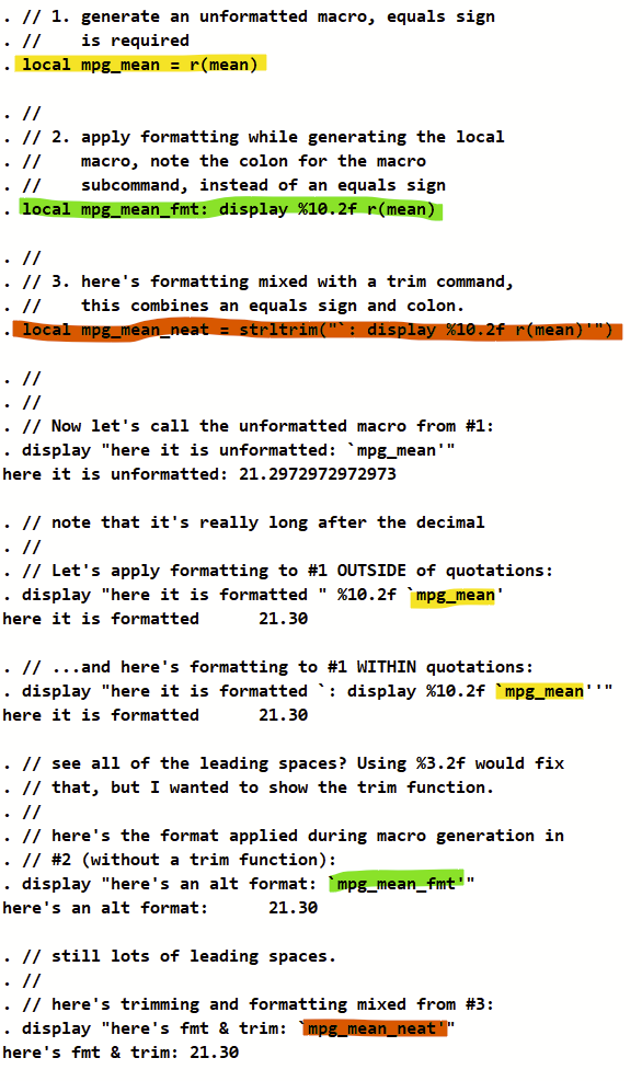
It turns out that not only can you apply formatting while generating a macro with the “: display” subcommand, you can also trim extra spaces from the generated macro at the same time. (Note that the “trim” command has been replaced by “strltrim” and a lot of other related commands that you can find in –help string functions–.) As a bonus, it turns out that you can also apply formatting (e.g., %4.2f) of a macro when displaying within a string using the “: display” subcommand strategically surrounded by opening and closing tick marks.

Here’s a demo script of what I’m getting at.

(Note: I strongly recommend against formatting/rounding/reducing precision of any macros that you are generating if you will later do math on them. Formatting during generation of macros is only useful for macros intended to be displayed later on.)

sysuse auto, clear
sum mpg
//
// 1. generate an unformatted macro, equals sign 
//    is required
local mpg_mean = r(mean) 
// 
// 2. apply formatting while generating the local 
//    macro, note the colon for the macro 
//    subcommand, instead of an equals sign
local mpg_mean_fmt: display %10.2f r(mean)
//
// 3. here's formatting mixed with a trim command,
//    this combines an equals sign and colon. 
local mpg_mean_neat = strltrim("`: display %10.2f r(mean)'")
//
//
// Now let's call the unformatted macro from #1:
display "here it is unformatted: `mpg_mean'"
// note that it's really long after the decimal
//
// Let's apply formatting to #1 OUTSIDE of quotations:
display "here it is formatted " %10.2f `mpg_mean'
// ...and here's formatting to #1 WITHIN quotations:
display "here it is formatted `: display %10.2f `mpg_mean''"
// see all of the leading spaces? Using %3.2f would fix 
// that, but I wanted to show the trim function.
//
// here's the format applied during macro generation in 
// #2 (without a trim function):
display "here's an alt format: `mpg_mean_fmt'"
// still lots of leading spaces.
//
// here's trimming and formatting mixed from #3:
display "here's fmt & trim: `mpg_mean_neat'"
// Bingo!

Extracting variable labels and categorical/ordinal value labels in Stata

Stata allows the labeling of variables and also the individual values of categorical or ordinal variable values. For example, in the –sysuse auto– database, “foreign” is labeled as “Car origin”, 0 is “Domestic”, and 1 is “Foreign”. It isn’t terribly intuitive to extract the variable label of foreign (here, “Car origin”) or the labels from the categorical values (here, “Domestic” and “Foreign”).

Here’s a script that you might find helpful to extract these labels and save them as macros that can later be called back. This example generates a second string variable that applies those labels. I use this sort of code to automate the labeling of figures with the value labels, but this is a pretty simple example for now.

Remember to run the entire script from top to bottom or else Stata might drop your macros. Good luck!

sysuse auto, clear
// Note: saving variable label details at 
//       --help macro--, under "Macro functions 
//       for extracting data attributes"
// 
// 1. Extract the label for the variable itself.
//    If we look at the --codebook-- for the 
//    variable "foreign", we see...
//
codebook foreign
//
//    ...that the label for "foreign" is "Car 
//    origin" (see it in the top right of 
//    the output).  Here's how we grab the 
//    label of "foreign", save it as a macro, 
//    and print it.
//
local foreign_lab: variable label foreign
di "`foreign_lab'"
//
// 2. Extract the label for the values of the variable.
//    If we look at --codebook-- again for "foreign", 
//    we see...
//
codebook foreign
// 
//    ...that 0 is "Domestic" and 1 is "Foreign". 
//    Here's how to grab those labels, save macros, 
//    and print them
//
local foreign_vallab_0: label (foreign) 0 
local foreign_vallab_1: label (foreign) 1 
di "The label of `foreign_lab' 0 is `foreign_vallab_0' and 1 is `foreign_vallab_1'"
//
// 3. Now you can make a variable for the value labels.
//  
gen strL foreign_vallab = "" // this makes a string 
replace foreign_vallab="`foreign_vallab_0'" if foreign==0
replace foreign_vallab="`foreign_vallab_1'" if foreign==1
// 
// 4. You can also label this new string variable 
//    using the label from #1
// 
label variable foreign_vallab "`foreign_lab' as string"
// 
// BONUS: You can automate this with a loop, using 
//    --levelsof-- to extract options for each 
//    categorical variable. There is only one 
//    labeled categorical variable in this dataset 
//    (foreign) so this loop only uses the single one. 
// 
sysuse auto, clear
foreach x in foreign {
	local `x'_lab: variable label `x' // #1 from above
	gen strL `x'_vallab = "" // start of #3
	label variable `x'_vallab "``x'_lab' string"
	levelsof `x', local(valrange)
	foreach n of numlist `valrange' { 
		local `x'_vallab_`n': label (`x') `n' // #2 from above
		replace `x'_vallab = "``x'_vallab_`n''" if `x' == `n' // end of #3
	}
}

Part 4: Defining your population, exposure, and outcome

Getting the population, exposure, and outcome correct in your analytical dataset, and being able to come back and fix goofs later

Defining a study population, exposure variable, and outcome variable is a critical early step after determining your analysis plan. Most epidemiology projects come as a huge set of datasets, and you’ll probably need to join multiple files into one when defining your analytical population. Defining your analytical population is an easy place to make errors so you’ll want to have a specific script that you can come back and edit again if and when you find goofs.

For the love of Pete — Please generate your population, exposure, and outcome variables using a script so you can go back and reproduce these variables and fix any bugs you might find!

When you make these variables, you’ll likely need to combine several datasets. This will require mastery of importing datasets (if not in the native format for your statistical program) and combining datasets. For Stata, this means using –import– and –save– commands to bring everything over into Stata format, and then using –merge– commands to combine multiple datasets.

Make a variable for your population that is 0 (not included) or 1 (included)

One option in generating your dataset is to drop everyone who isn’t in your dataset. I recommend against dropping individuals who aren’t in your dataset. Instead, create a variable to define your population. Name it something simple like “included”, “primary population”, “group_a” or whatnot. If you will have multiple populations (say, one defined by prevalent hypertension using JNC7 vs. ACC/AHA 2017 hypertension thresholds), then you should have a variable for each addended with a simple way to tell them apart. Like “group_jnc7” and “group_aha2017”.

Useful code in R and Stata to do this:

  • Count
  • Generate and replace (Stata), mutate (R)
  • Combine these with assigning single equals sign “=” (Stata & R, I say out loud “assign” when using this) and “<-" (R)
  • use –if–, –and–, & –or– statements
  • Tests of equality: >, =, <=, != (not), == ("equals exactly"), not single equal sign

Example Stata code to count # of people with diabetes, generate a variable for group_a and assign someone to group_a if they have diabetes.

count if diabetes==1
gen group_a=0
replace group_a=1 if diabetes==1

Here’s example R code to do the same (df=data frame).

nrow( df %>% filter(diabetes == 1) )
df = df %>% mutate(group_a = ifelse(diabetes == 1, 1, 0) )

Make an inclusion flowchart

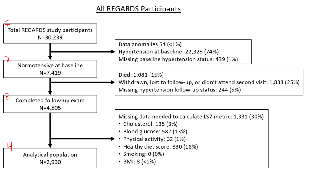
These are essential charts in observational epidemiology. As you define your population, generate this sort of figure. Offshoots of the nodes define why folks are dropped from the subsequent node. Here’s how I approach this, folks might have different approaches:

  • Node 1 is the overall population.
  • Node 2 is individuals who you would not drop for baseline eligibility reasons (had prior event that discounts them or missing data to prevent assessment of their eligibility)
  • Node 3 is individuals who you would not drop because you can assess them for necessary follow-up (incomplete follow-up, died before required follow-up time, missing data)
  • Node 4 is individuals who you would not drop because they had all required exposure covariates (if looking at stroke by cholesterol level, people who all have cholesterol). This is your analytical population.

If you have two separate populations (eg, different hypertension populations by JNC7 or ACC/AHA 2017), you might opt to make two entirely separate figures. If you have slightly different populations because of multiple exposures (e.g., 3 different inflammatory biomarkers, but you have different missingness between the 3), you might have the last node fork off into different nodes, like this:

I generate these via text output in Stata then manually generate them in PowerPoint.

Defining exposure and outcome

This seems simple, but define clearly what your exposure is and your outcome is. Each should have a simple 0 or 1 variable (if dichotomous) with an intuitive name. You might need 2 separate outcomes if you are using different definitions, like “incident_htn_jnc7” and “incident_htn_aha2017”.

Table 1

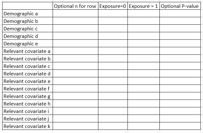
“Table 1” shows core features of the population by the exposure. Don’t include the outcome as a row, but include demographics and key risk factors/covariates for outcome (eg if CVD, then diabetes, blood pressure, cholesterol, etc.). Some folks include a 2nd column that presents the N for that row. Some folks also include a P-value comparison as a final row. I tend to generate the P value every time but only present it if the reviewers ask for it.

In Stata, I use the excellent table1_mc program to generate these, which you can read about here. For R, I am told that gtsummary works well.

Part 2: Effective collaborations in epidemiology projects

Pin down your authorship list

Determine authorship list before you lift a finger on any analysis and get buy-in from collaborators on that list.

Stay organized

Have one folder where you save everything, and have subfolders within that for groups of documents. I suggest these subfolders:

  • Manuscript
  • Abstract
  • Data and analysis
  • Paper proposal (for REGARDS projects & others with manuscript proposal documents)

…and keep relevant documents within each one. You might want to put an “archive” folder within each subfolder (e.g., manuscript\archive) and move old drafts into the archive folder to reduce clutter.

Give documents a descriptive name. Don’t call it “manuscript [versioning system].docx”– use terms for your projects. If you are doing a REGARDS paper looking at CRP and risk of hypertension, name it “regards crp htn abstract [versioning system].docx”.

Use an intuitive versioning system. I like revision # then version # (eg r00 v01). Many people use dates. If you use dates to keep track of versions, append your documents with the ISO8601 date convention of YYYY-MM-DD. Trust me. Lots of details on this post.

Have realistic goals and stick to deadlines

Come up with some firm deadlines and do your best to stick with them. Here are some goals to accomplish in moving a project forward, if you wanted an example.

  • Combine all existing written documents (eg, proposal) into one manuscript.
  • Draft blank tables and decide what figures you want to make. Write methods.
  • Generate baseline characteristics. Describe in results.
  • Generate descriptive statistics/histograms for your exposure and outcome(s). Describe in results.
  • Estimate primary and secondary outcome(s). Describe in results.
  • Complete secondary analyses. Describe in results.
  • Finish first draft. Send to your primary mentor or collaborator.
  • Integrate feedback from primary mentor or collaborator into a second draft. Circulate to coauthors.
  • Integrate feedback from coauthors into a document to be submitted to a journal.
  • Format your manuscript for a specific journal and submit it. (This takes a surprisingly large amount of time.)

Managing your mentor: Send reminder emails more frequently than you probably realize

I block off time to work on your stuff, but clinical priorities or other professional/parenting challenges might bump that time. I try to find other time to work on your stuff, but a big crisis might mean that I don’t have a chance to reschedule.

Please, please, please, please email me early and persistently about your projects. This will never annoy me — these emails are very helpful. Quick focused emails are helpful here, especially if you re-forward your prior email threads. Eg, “Hi Tim, wondering if you had a chance to take a look at that draft from last week, reforwarded here. Thanks, [name].”

Working on revisions

Use tracked changes

And remember to turn them on when you send around a draft!

Append your initials to the end of the document that you are editing for someone else

For me, I’ll change a name to “My cool document v1 tbp.docx”.

Stata-R integration with Rcall

Stata is great because of its intuitive syntax, reasonable learning curve, and dependable implementation. There’s some cutting edge functionality and graphical tools in R that are missing in Stata. I came across the Rcall package that allows Stata to interface with R and use some of these advanced features. (Note: I’m currently using Stata 16. I have no reason to think that this wouldn’t work with Stata 13 or newer.)

Installation of R, R packages, and Rcall (you only need to do this once)

Download and install R. Open R and install the readstata13 package, which is required to install Rcall. While you’re at it, install ggplot2 and ggstatsplot. Note: ggplot2 is included in the excellent multi-package collection called Tidyverse. We are going to install Tidyverse instead of ggplot2 alone. Tidyverse also installs several other packages useful in data science that you might need later. This includes dplyr, tidyr, readr, purrr, tibble, stringr, forcats, import, wrangle, program, and model. I have also gotten an error saying “‘Rcpp_precious_remove’ not provided by package ‘Rcpp'”, which was fixed by installing Rcpp, so install that too.

In R, type:

install.packages("readstata13")
install.packages("tidyverse")
install.packages("ggstatsplot")
install.packages("Rcpp")

It’ll prompt you to set up an install directory and choose your mirror/repository. Just pick one geographically close to you. After these finish installing, you can close R.

Rcall’s installation is within Stata (as usual for Stata programs) but originates from Github, not the usual SSC install. You need to install a separate package to allow you to install things from Github in Stata. From the Stata command line, type:

net install github, from("https://haghish.github.io/github/")

Now install Rcall itself from the Stata command line:

github install haghish/rcall, stable

If all goes well, it should install!

Using Rcall

You should read details on the Rcall help file (type –help rcall– in Stata) for an overview. Also read the Rcall overview on Github. In brief, you can send datasets from Stata to R using –rcall st.data()–. You can kick things back to stata with –st.load(name of R frame)–. –rcall clear– reboots R as a new instance.

There are four modes for using Rcall: vanilla, sync, interactive, and console. For our purposes, we are going to focus on the interactive mode since this allows you to manipulate R from within a do file.

Let’s make a figure in ggplot2 using Stata and Rcall

Here’s some demo code to make a figure with ggplot2, which is the standard for figures in R. There’s a handy cheat sheet here. This intro page is quite helpful. This overview is excellent. Check out the demo figures from this page as well. If your ggplot command extends across multiple lines, make sure to end each line (except the final line) with the three forward slash (“///”) line break notation that is used by Stata.

// load sysuse auto dataset
sysuse auto, clear
// set up rcall, clean session and load necessary packages
rcall clear // starts with a new instance of R
rcall: library(ggplot2) // load the ggplot2 library
// move Stata's auto dataset over to R and prove it's there.
rcall: data<- st.data() // move auto dataset to r
rcall: names(data) // prove that you can see the variables. 
rcall: head(data, n=10) // now look at the first 10 rows of the data in R
// now make a scatterplot with ggplot2, note the three slashes for line break
rcall: e<- ggplot(data, aes(x=mpg, y=weight)) + ///
       geom_point()
rcall: ggsave("ggtest.png", plot=e)
// figure out where that PNG is saved:
rcall: getwd()

Note: rather than using the three forward slashes, you can also change the delimiter to a semicolon, like the following. Just remember to change it back to normal (“cr”). Here’s an equivalent to above with semicolon delimiters. Note that the ggplot bit that spreads across two lines no longer has any slashes. This looks a bit more like “true R code”.

#delimit ;
rcall clear ; 
rcall: library(ggplot2) ; 
rcall: data<- st.data() ;
rcall: names(data) ;
rcall: head(data, n=10) ;
rcall: e<- ggplot(data, aes(x=mpg, y=weight)) + 
       geom_point() ;
rcall: ggsave("ggtest.png", plot=e) ; 
rcall: getwd() ; 
#delimit cr

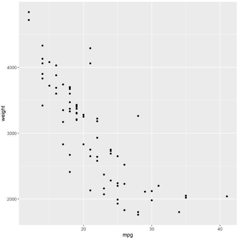
Here’s what it made! It was saved in my Documents folder, but check the output above to see where you working directory is.

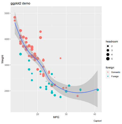
You can get much more complex with the figure, like specifying colors by foreign status, specifying dot size by headroom size, adding a loess curve with 95% CI, and adding some labels. You can swap out the “rcall: e <- ggplot(…)" bit above for the following. Remember to end every non-final line with the three forward slashes.

rcall: e<- ggplot(data, aes(x=mpg, y=weight)) + ///
	geom_point(aes(col=foreign, size=headroom)) + ///
	geom_smooth(method="loess") +   ///
	labs(title="ggplot2 demo", x="MPG", y="Weight", caption="Caption!")

Here’s what I got. Varying dot size by a third variable can be done in Stata using weighted markers, as FYI.

Let’s make a figure in ggstatsplot using Stata and Rcall

Here’s some demo code to make a figure with ggstatsplot (which is very awesome and you should check it out). If your ggstatsplot command extends across multiple lines, make sure to end each line (except the final line) with the three forward slash (“///”) line break notation that is used by Stata.

// load sysuse auto dataset
sysuse auto, clear
// set up rcall, clean session and load necessary packages
rcall clear // starts with a new instance of R
rcall: library(ggstatsplot) // load the ggstatsplot library
rcall: library(ggplot2) // need ggplot2 to save the png
// move Stata's auto dataset over to R and prove it's there.
rcall: data<- st.data() // move auto dataset to r
rcall: names(data) // prove that you can see the variables. 
rcall: head(data, n=10) // now look at the first 10 rows of the data in R
// let's make a violin plot using ggstatsplot
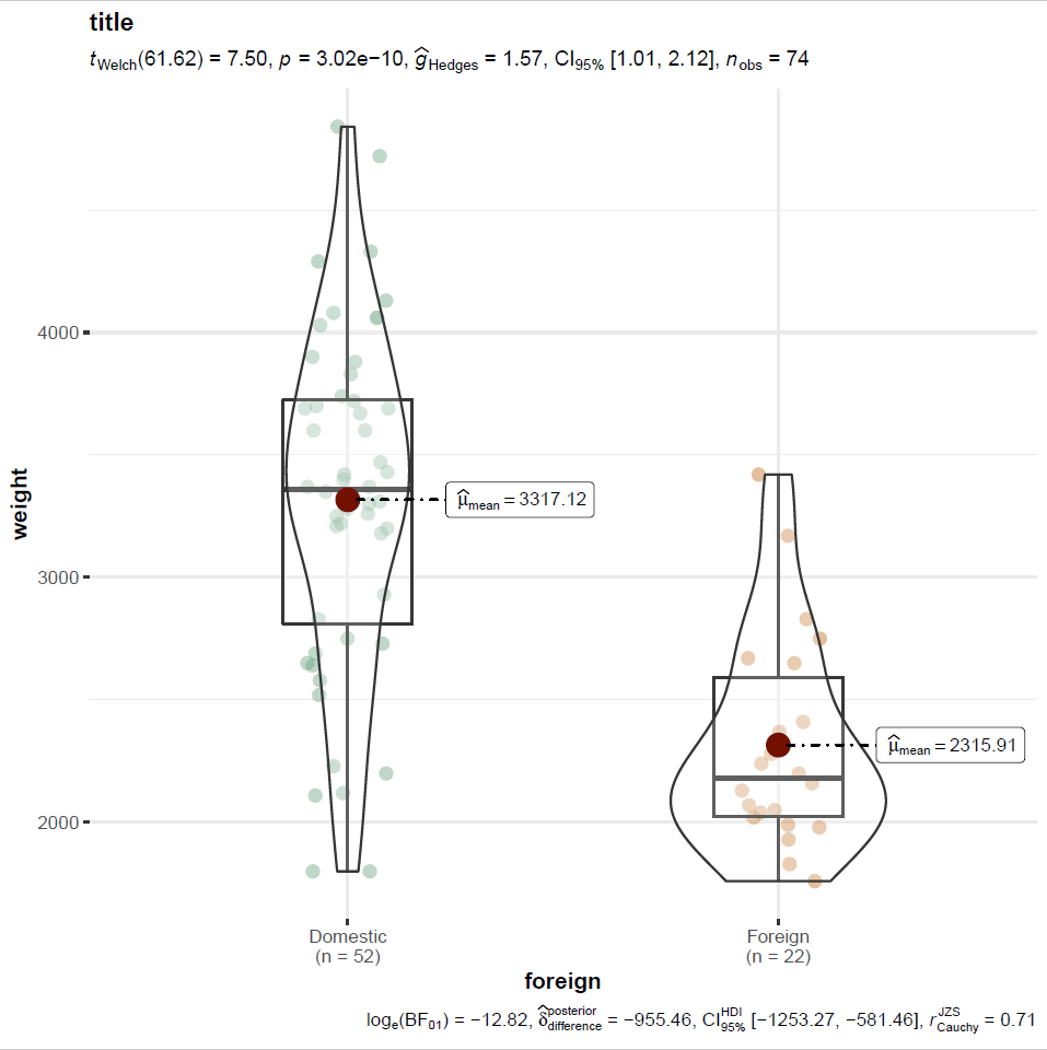
rcall: f <- ggbetweenstats( data = data, x=foreign, y=weight, title="title")
rcall: ggsave("ggstatsplottest.png", plot=f)
// figure out where that PNG is saved:
rcall: getwd()

If you check your working directory (it was my “Documents” folder in Windows), you’ll find this figure as a PNG:

You can automate the output of ggstatsplot figures by editing the ggplot2 components that make it up. You’d insert the following into the ggstats plot code in the parentheses following “ggbetweenstats” to make the y scale on a log axis, for example:

ggplot.component = ggplot2::scale_y_continuous(trans='log') 

Quick do file to automate R-Stata integration and make ggplot2 or ggstatsplot figures

I made a do file that simplifies the setup of Rcall. Specifically, it 1. Sets R’s working directory to match your current Stata working directory, 2. Starts with a fresh R install, 3. Loads your current Stata dataset in R, and 3. Loads ggplot2 and ggstatsplot in R.

To use, just load your data, run a “do” command followed by the URL to my do file, then run whatever ggplot2 or ggstatsplots commands you want.This assumes you have installed R, the required packages, and Rcall (see very top of this page). If you get an error, try using this alternative version of the do file that doesn’t try to match Stata and R’s working directory.

Example code:

// Step 1: open dataset
sysuse auto, clear
// Step 2: run the do file, hosted on my UVM directory:
do https://www.uvm.edu/~tbplante/rcall_ggplot2_ggstatsplot_setup_v1_0.do
// if errors with above, use this do file instead:
// do https://www.uvm.edu/~tbplante/rcall_ggplot2_ggstatsplot_setup_alt_v1_0.do
// Step 3: run whatever ggplot2 or ggstatsplot code you want:
rcall: e<- ggplot(data, aes(x=mpg, y=weight)) + ///
	geom_point(aes(col=foreign, size=headroom)) + ///
	geom_smooth(method="loess") +   ///
	labs(title="ggplot2 demo", x="MPG", y="Weight", caption="Caption!")
rcall: ggsave("ggtest.png", plot=e)

Bonus: Using “comorbidity” R package in Stata with Rcall to estimate Charlson comorbidity index or Elixhauser comorbidity score

Read all about this handy package here and in the PDF reference manual. In R, type:

install.packages("comorbidity") 

Here’s some semicolon delimited Stata code to run from a Stata do file apply the Charlson comorbidity index to some Stata data.

webuse australia10, clear // load a default stata dataset with an ICD10 variable
gen id=_n // make an ID by row as there's no ID variable in this dataset

#delimit ;
rcall clear ; 
rcall: library(comorbidity) ; // load comorbidity package
rcall: data<- st.data() ; // move data to r
rcall: names(data) ; // look at data
rcall: head(data, n=10) ; // look at rows
rcall: charlston <- comorbidity(x=data, id="id", code = "cause", 
		map = "charlson_icd10_quan", assign0 = FALSE) ;
rcall: score(x=charlston, weights = "charlson", assign0=FALSE) ;
rcall: mergeddata <- merge(data, charlston, by="id") ; // merge the original & new charlson data
rcall: head(mergeddata, n=10) ; // look at rows
rcall: st.load(mergeddata) ; // kick the merged data back to stata
#delimit cr

Getting your grant below the page limit using built-in MS Word features

It’s just a little too long!

You’ve toiled on your grant day in and out for weeks on end, and despite chopping out loads of overly verbose text, it’s still over the length. It turns out that there are some built-in settings in MS Word to help you get below the length limit without removing additional text. This post is focused on NIH grant formatting but details here are relevant for most grants. This also assumes that you are already using narrow margins. I made up a 4 page ‘ipsum lorem’ document for this so I can give actual quantifications of what this does to document length.

Hyphenation and justification

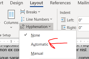
I only just learned about hyphens from Jason Buxbaum in this tweet. Hyphenation breaks longer words across lines with a hyphen in the style commonly used in novels. Hyphenation will get you a few lines in a 4 page document.

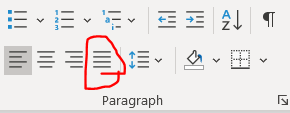
Justification makes words reach from the left to rightmost extremes of the margin, stretching or compressing the width of the spacing between words to make it fit. Justification’s effect on length is unpredictable. Sometimes it shortens a lot, sometimes it stays the same, sometimes it’s a smidge longer. In my 4 page ipsum lorem document, the length didn’t change. It’s worked to shorten some prior grants, so it’s worth giving a try. (Also, try combining justification with different fonts, see below.)

Here is the button to turn on justification.

Personally, I like ragged lines (“align left”) and not justified lines because I find justified text harder to read. I have colleagues who really like justification because it looks more orderly on a page. If you are going to use justification, please remember to apply it to the entirety of the text and not just a subset of paragraphs for the same reason that you don’t wear a tie with a polo shirt.

You can try combining hyphenation and justification, though I’m not sure it will gain anything. It didn’t in my demo document.

Modifying your size 11 font

Try Georgia, Palatino Linotype, or Helvetica fonts instead of Arial

The NIH guidelines specify size 11 Arial, Georgia, Helvetica, and Palatino Linotype fonts as acceptable options. (Note: Helvetica doesn’t come pre-installed on Windows. It’s pre-installed on Mac.) There were not major differences in length in my aligned-left ipsum lorem document between any of the fonts when the lines were aligned-left. But, try combining different fonts with justification. In the ipsum lorem document, justified Georgia was a couple of lines shorter than any other combinations of aligned-left/justification and NIH-approved fonts in Windows.

Condensing fonts

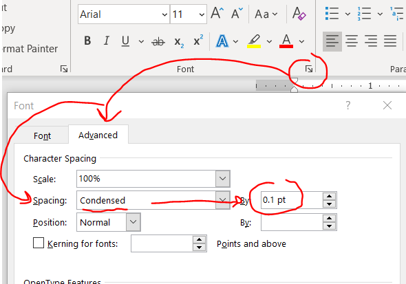
Kudos to Jason Buxbaum for this one. You can shrink the space between your letters without actually changing the font size/size of the letters. Highlight your text then home –> font little arrow –> advanced –> spacing becomes condensed then change the selecter menu to 0.1 pt.

This change will give you a few lines back in a 4 page document.

I can’t tell the difference in the letter spacing before and after using 0.1. If you increase to a number larger than 0.1, it might start looking weird, so don’t push it to far.

A word of advice with this feature: If you are too aggressive, you might run amok with NIH guidelines, which specify 15 characters per linear inch, so double check the character count in an inch (view –> ruler will allow you to manually check). FYI: all NIH-approved fonts are proportional fonts so narrow characters like lowercase L (“l”) take up less width than an uppercase W, and a random sample of text that happens to have a lot of narrow letters might have more than 15 characters/linear inch. You might need to sample a few inches to get a better idea of whether you or not are under the 15 character limit. (In contrast, Courier is a monospaced font and every character is exactly the same width.)

Adjust line and paragraph spacing

Both line and paragraph spacing affect the amount of white space on your page. Maintaining white space in your grant is crucial to improve its readability, so don’t squeeze it too much. In my opinion folks will notice shrunken paragraph spacing but not shrunken line spacing. So if you have to choose between modifying line or paragraph spacing, do line spacing first.

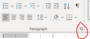
You can modify line and paragraph spacing by clicking this tiny checkbox under home tab –> “paragraph”.

Remember to highlight text before changing this (or if you are using MS Word’s excellent built-in Styles, just directly edit the style).

Line spacing

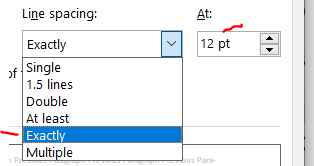
As long as you have 6 or fewer lines per vertical inch (view –> ruler will allow you to manually check), you are set by NIH guidelines. The default line spacing in MS Word is 1.08. Changing it to “single” will give you back about and eighth of a page in a 4 pg document. Today I learned that there’s ANOTHER option called “exactly” that will get you even more than a quarter of a page beyond single spacing. Exact spacing is my new favorite thing. Wow. Thanks to Michael McWilliams for sharing exact line spacing in this tweet. I wouldn’t go below “exactly” at 12 pt because that gets you at about 6.5 lines per inch, which goes against NIH standards of 6 lines per inch.

Paragraph spacing

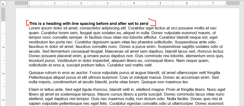
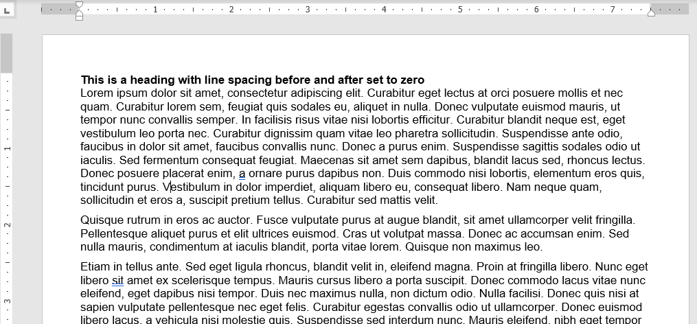
The default in MS Word is 0 points before and 8 points after the paragraph. I don’t see a need to have any gaps between a heading and the following paragraph, so set the line spacing before and after headings to be zero. Looks nice here, right?

Now you can tweak the spacing between paragraphs. I like leaving the before to zero and modifying the after. If you modify the before and not the after, you’ll re-introduce the space after the header. Also, leave the “don’t add space between paragraphs of the same style” box unchecked of you’ll have no spacing between most paragraphs.

Here’s the same document from above changing the after spacing from 8 to 6 points.

Looks about the same, right? This got us about 3 lines down on a 4 pg document. Don’t be too greedy here, if you go too far, it’ll look terrible (unless you also indent the first line, but then you run the risk of it looking like a high school essay).

Play around with modifying both paragraph and line spacing. Again, I recommend tweaking line spacing before fiddling with paragraph spacing.

Window/orphan control, or how to make paragraphs break at the maximum page length

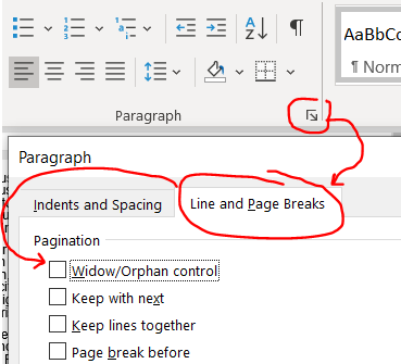
MS Word tries to keep paragraphs together if a small piece of it extends across pages. For example, if the first line of a paragraph is on page 2 and the rest of the paragraph is on page 3, it’ll bring that first line so that it ALSO starts on page 3, leaving valuable space unused on page 2. This is called window/orphan control, and it’s easy to disable. Highlight your text and shut it off under home –> paragraph tiny arrow –> line and page breaks then uncheck the window/orphan control button.

This gives a couple of lines back in our 4 page document.

Modifying the format of embedded tables of figures

Tables and figures can take up some serious real estate! You might want to nudge a figure or table out of the margin bounds, but that will get you in some serious trouble with the NIH — Stay inside the margins! Try these strategies instead.

Note: I have a separate post that goes in-depth into optimizing tables in MS word and PPT, here. Check it out if you are struggling with general formatting issues for tables.

Wrap text around your tables or figures

Note: In 3/2024, I discovered a better way to get tables and figures to behave that is described at the end of this section. I’m keeping the older pieces here since I think they are still relevant.

Consider reclaiming some unused real estate by wrapping the text around tables or figures. Be warned! Wrapping text unearths the demons of MS Word formatting. For this example, we’ll focus on just wrapping text around a table to make a ‘floating table’. Below is an example of a table without text wrapping.

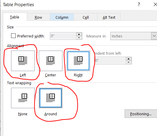
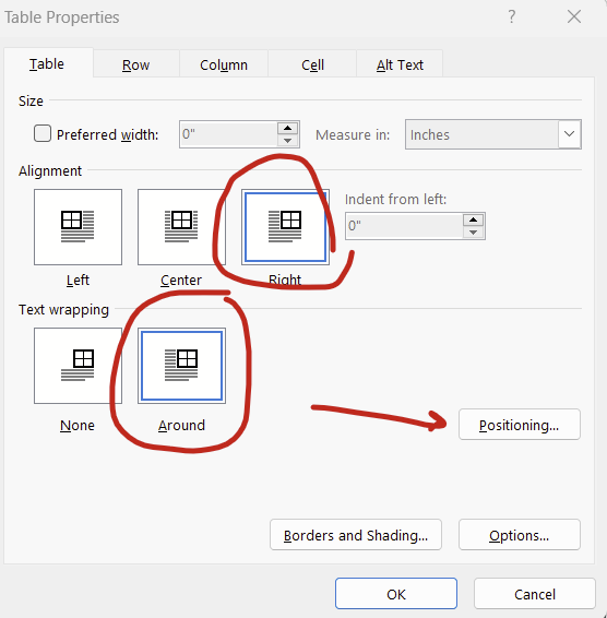
Right click on your table and select “Table Properties” then click right or left alignment and set text wrapping to around. (For figures, right click your figure and click “size and position”, which is analogous to the table options. For simplicity, I’ll focus on tables only here.).

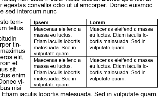
Adjust your row width a bit and now you have a nice compact table! But wait, what’s this? The table decided to insert itself between a word and a period! That’s not good.

When MS Word wraps text around a table, it decides the placement of the now floating table by inserting an invisible anchor followed by a line break. Here, there’s an invisible anchor is placed between “nunc” and the period. Your instinct will be to move the table to fix this problem, and that is the wrong thing to do. Avoid moving the table because the anchor will do unpredictable things to your document’s formatting. This is so well known to create havoc that it led to a viral Tumblr post from user laurelhach:

laurelhach: using microsoft word *moves an image a mm to the left* all text and images shift. four new pages appear. paragraph breaks form a union. a swarm of commas buzzes at the window. in the distance, sirens. Text Font Line

Moving tables is pointless in MS word because it doesn’t do what you think it does and you will be sad. Move the text instead. Here, highlight that stray period and the rest of the paragraph starting with “Mauris eleifend” and move it where that weird line break occurred after “nunc”.

There will be a new line break to erase, but the table should now follow the entire paragraph.

If you are hopelessly lost in fighting the MS Word Floating Table Anchor Demon, and the table decides that it doesn’t want to move ever or is shifted way to the right (so much so that it’s sitting off screen on the right), then the invisible anchor might be sitting to the right of the final word in a heading or paragraph. I recommend reverting the floating table to a non-text wrapped table to figure out what’s wrong and fix everything. Right-click the table and open up the “table properties” option again and change the text wrapping to “none”. The table will appear where the invisible anchor is and now you can shift around the text a bit to get it away from the end of a sentence. Now turn back on text wrapping. This usually fixes everything.

Note: I actually made the table intentionally insert between ‘nunc” and the period for this example. This was just a re-enactment so it’s not MS Word’s fault — this time. BUT this really happens. It’s very problematic if you have >1 table or figure on a page because the Floating Table Anchor Demons will fight with each other and your grant’s formatting will pay.

Update 3/2024: There’s actually a simpler way to fight the demons of embedded tables and figures: Setting the position relative to the margin. Setting relative to the margin not only makes anchors disappear, it also ensures that your figures don’t extend outside of the margin. We’ve all heard horror stories about grants being rejected because some table or figure snuck beyond the margin limits.

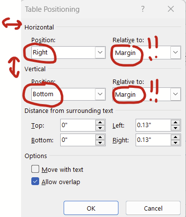
To set the positioning of your table or figure relative to the margin, right click on your table/figure and select “table properties”, set alignment to “right” (or center or left) and text wrapping to “around” then hit the “positioning” button:

You can then set the horizontal and vertical position relative to the margin rather than the paragraph. Then the anchors go away completely! You can set it all the way to the extremes (left/right, top/bottom) or put in a measurement (eg replacing “bottom” with “5 in” in the vertical “position” box will put your figure or table about 2/3rds of the way down a page).

Tables and figures behave much better when you set the positioning relative to the margin.

Changing cell padding *around* your tables and figures

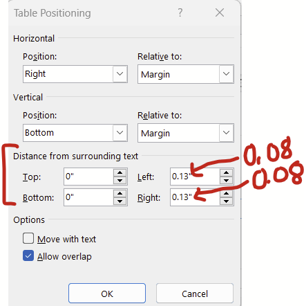
Continuing with the window above (right click table –> table properties –> position), there’s this “distance from the surrounding text” section at the bottom that changes how much white space padding there is around the table/figure. The default padding is 0.13 inches, which I think is a bit too generous. Try changing this to 0.08 inches and you might get to squeeze in a few extra words in the surrounding text before a new line break.

For figures, there’s an analogous series of options that you can get to by right clicking your figure –> size and position. Under “size and position”, set the wrapping to “tight” and then have at it.

Reduce cell padding *inside* your tables

This is especially helpful for tables with lots of cells. Reducing the cell padding shrinks the white space between the text in a cell and borders of the tables. In contrast with the “save the whitespace” principle of lines and paragraph spacing, I personally think that less white space in tables improves readability. Here’s before, with default cell margins of 0.08:

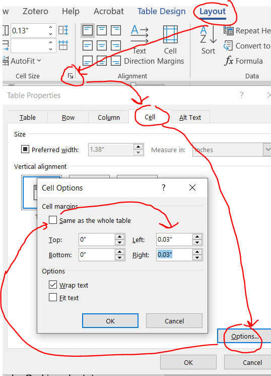
Highlight your entire table and you’ll notice a new contextual ribbon with “design” and “layout” tabs appear. Click layout –> cell size little arrow –> cell –> options –> uncheck the box next to same size as the whole table then reduce the cell margins.

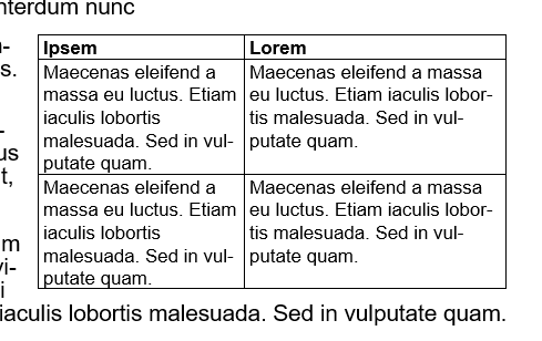
Here’s that same table reduced with cell margins reduced from 0.08 to 0.03.

Now you can strategically adjust the column size to get back some space.

Also note that you can also apply justification and adjust the line and paragraph spacing within your tables, which might also help shrink these things down a bit.

Shrink the font in your tables

AFAIK, NIH guidelines don’t specify a font size to use in tables, just something that can be read. I typically use size 8 or 9 font.

Did I miss anything?

If I did, shoot me an email at timothy.plante@uvm.edu!

Part 3: Introduction to Stata

Note in 2023: We are using R and not Stata this summer so this post doesn’t apply to this year’s projects.

Stata is a popular commercial statistical software package that was first released 30+ years ago. It has some really nice features, loads of top-rate documentation, a very active community, and approachable syntax. For beginners, I think it’s the simplest to learn.

Learning how to use Stata

Stata has really, really, really good documentation.

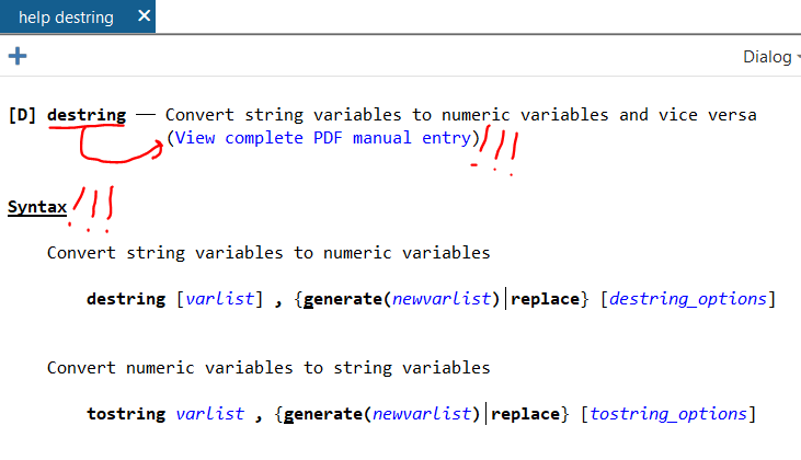
The documentation is outstanding. Let’s say that you want to learn how to use the –destring– command. In the command line (1a under “Stata’s Interface” below), type:

help destring

…and up will pop a focused help file. There’s the “View complete PDF manual entry” option that has EXTENSIVE documentation of the command. (Note: This file seems to only work well with Adobe PDF reader, not alternative PDF readers like Sumatra). If the focused help file isn’t sufficient to answer your questions, try the complete PDF manual.

The focused help file has multiple parts, but the syntax example is gold. Further down you’ll see example uses of the command.

Web searches will find even more answers

Odds are that someone has already hit the same problem you have in using Stata. Queries in your favorite search engine are likely to find answers on the Statalist archive or UCLA’s excellent website.

You can install Stata programs that other users have written

There are MANY MANY MANY user-written programs out there that can be installed and used in your code. You only need to install them once. Most are on BU’s repository called SSC. I use the table1_mc program extensively (it makes pretty table 1s, you can read about it here). To install table1_mc from SSC, you type:

ssc install table1_mc

…and Stata will download it and install it for you. It’s ready to use when it finishes installing. And, there’s no need to re-install it, it will load each time you start Stata.

Quirks of Stata

Stata only works with rectangular datasets

Think of a rectangular dataset as a single spreadsheet in Excel. It has vertical columns (like a y axis) and horizontal rows (like an x axis). There’s no data on a Z axis coming out of the computer at your face.

A rectangular dataset is the only type that Stata works with. Other statistical software like R or Python can handle many more complex data structures. For learners, forcing data to fit within a rectangular dataset is a huge advantage in my mind since that structure is intuitive, and you can always browse your data with the built-in data browser (see 3c under Stata’s Interface, below).

Stata only works with one dataset at a time*

One dataset in Stata is akin to one spreadsheet in a workbook in Excel. In Excel, you can have multiple spreadsheets in one .xlsx file, with each spreadsheet appearing on a different tab at the bottom. All spreadsheets are in the memory at the same time. You can do math across spreadsheets in a workbook in excel, summarize costs in one column in spreadsheet A and have the result appear in one cell on spreadsheet B. In Stata, you can only have one spreadsheet (here, dataset) open at a time.* Because of this, Stata users spend a good deal of time merging and appending multiple datasets to make a single dataset that has all of the necessary variables in the best format from the get-go.

A big problem historically with Stata was that datasets are loaded in the RAM, and big datasets would be too big for conventional computers. That’s not an issue anymore since even cheap computers have several gigabytes of RAM.

*This isn’t true anymore. Starting in version 16, Stata can actually now have multiple datasets in memory, each stored in its own frame. These frames can be very useful in certain scenarios, but for our purposes, we are going to pretend that you can have just one dataset open at a time.

Data are either string or numeric. Their color changes in the data browser

Strings are basically text that are thought to be words and not numbers. But sometimes a dataset will be imported wrong and things that are actually numbers (“1.5”, “2.5” in different rows of the same column) will be imported and considered to be strings and not numbers. This might be because they were imported incorrectly. This might be that later down in the list there is a word in a different cell (“1.5”, “2.5”, “Specimen error”). If any row of a variable contains something that isn’t a number, Stata makes the entire column, and with it the variable, a string.

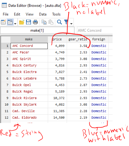
IMPORTANT: When viewing strings in the data browser (3c under “Stata’s Interface” below), they appear in RED text. When specifying strings in commands, you need to enclose them in quotations (eg count if name==”Old”). Missing strings are two quotes with nothing in between them (eg count if name==””).

In order to do math, you need to have things be numbers. There are several different numerical formats that you can read about here. If something is an integer (nothing after the decimal), it can be byte, int, and long. If something has a decimal point, it’s float or double. Stata does a nice job selecting which numerical format your data should be in, so you probably don’t need to think much about the difference between byte, int, long, float, or double again.

IMPORTANT: When viewing numeric variables in the data browser, they appear in BLACK text (or BLUE if they have a label applied). When specifying strings in commands, no quotations are needed (eg count if quartile==1). Missing strings are periods (eg count if quartile==.), and a period is positive infinity (a missing value is bigger than a value of one billion).

To convert from a string to a numerical value (change the “1” to a 1), you use the –destring– command. You might need to include the force and replace options, but read up on those by typing –help destring–.

To convert from a numerical value to a string (change the “1” to a 1), use the –tostring– command. Note that missing numerical values will go from a dot to a dot in quotations (. becomes “.”), which is not the same as a missing value for a string, which is just empty quotations (“”). It’s a good idea to follow up a –tostring– command with a command that replaces “.” values with “” values.

Stata’s output is only 255 characters wide, max

The output window of Stata will print (“display”) the inputted command and results from that command. It will clip the output at up to 255 characters, and insert a line break to the next row. You can specify:

set linesize 255

…so that the output is always 255 characters wide. Otherwise, it’ll adjust the output to match how wide your output window is.

The working directory is your “documents folder” unless you manually set the working directory with the cd command or open up Stata by double clicking on a .do file in Windows explorer

The working directory is where Stata is working from. If you save a dataset with the –save– command, it’ll save it in the working directory unless you specify all of the files from the C: drive on. If you double click on the Stata icon to open it up in Windows and type the present working directory command to see where it’s working from (that’s –pwd–), it’ll print out:

. pwd 
C:\Users\USERNAME\Documents

So, if you type:

save "dataset.dta", replace

…it’ll save dataset.dta in C:\Users\USERNAME\Documents

Let’s say that you really want to be working in your OneDrive folder because that’s secure and backed up and your Documents folder isn’t. The directory for your desired folder is:

C:\Users\USERNAME\OneDrive\Research project\Analysis

In order to save your file there, you’d type:

save "C:\Users\USERNAME\OneDrive\Research project\Analysis\dataset.dta", replace

Note that there’s a space in the Research project folder name so the directory needs to be in quotations. If there was no space anywhere in the directory, you could omit the quotations. I’m including quotations everywhere here because it’s good practice.

One option is to change your working directory to the OneDrive folder. You use the –cd– command to do that then any save command will automatically save in that folder:

cd "C:\Users\USERNAME\OneDrive\Research project\Analysis\"
save "dataset.dta", replace

Alternatively, you can save your project’s Do file in the “C:\Users\USERNAME\OneDrive\Research project\Analysis\” folder. Rather than opening Stata by clicking on the icon, find the Do file in your OneDrive folder in Windows Explorer and double click on it. It’ll open Stata AND set that folder as the working directory!! For a new project, this means opening Stata by clicking on its icon, opening a blank do file, saving that do file in your OneDrive folder, closing the Do File Editor and Stata, then reopening stata by double clicking on your blank do file in Windows Explorer.

Stata is most effectively used with with command-line input, specifically through the Do File Editor. There is a graphical user interface that can be handy.

I think that everything in Stata should be completed through Do files. These are text files with sequential lines of codes that make Stata perform commands in order.

There is a graphical user interface (GUI) with clickable menus. You can click through commands and it’ll generate the code and run the command of interest, and these can be handy for stealing syntax to run an annoying command. The command from the GUI will appear in the Command History (1c below) and you can right click and copy/paste it into your do file.

I find –import excel– to be frustrating and use the GUI probably 90% of the time to generate that command then copy/paste the syntax into my do file.

Stata won’t let you close a dataset in the memory or overwrite an existing dataset without some effort

The –use– command will open up a dataset in the memory. If you don’t have a dataset opened yet, this will open one:

use dataset.dta

Remember that Stata can only have one dataset opened at a time, so any time you open one when you already have a different dataset opened in memory, Stata will need to drop the open dataset. If you spent a lot of time on the open dataset creating new variables or merging with other datasets, closing it will make you lose all of your work unless you have also saved it. Stata doesn’t want you to make this mistake so if you already have a dataset opened and you type in the above command, Stata will say “No” and you won’t be opening the new dataset.

Instead, you need to put “–, clear–” at the end of the command, like this:

use dataset.dta, clear

And now Stata will drop whatever you have open. It’s really just a nice check to keep you from discarding your work accidentally.

Similarly, if you are trying to save a dataset with the –save– command into an empty folder, you just need to type:

save newdataset.dta

…and Stata will save it no problem. HOWEVER if you are trying to overwrite an existing dataset with that same name, Stata will say “No” and you won’t be saving your dataset today. This is another check. instead, you just need to use “–, replace–” to overwrite. Example:

save newdataset.dta, replace

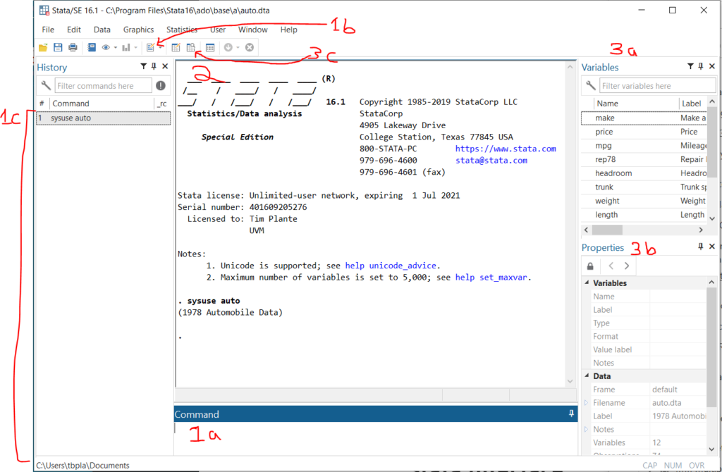
Stata’s interface

Here’s a quick overview of the Stata interface in Windows. Note: the Mac interface looks a bit different. There’s some way to make the Mac interface look like the Windows interface, but I don’t know how to do that. I’ll try to remember to update this page when I help a Mac user in the future.

  1. Ways to input and interact with commands:
    1a. Command line – This is where you type command by command. Unless you are just poking around in your data, you should avoid using this. Anything that you want to reproduce in your analysis should be done in the Do file editor.
    1b. Open Do file editor button – The Do File Editor is the most important part of Stata in my opinion. A do file is a long text file saving command after command. This is where you should do all of your analytical work.
    1c. Command history – If you use the command line or GUI to make a command, it’ll be saved here. You can right click on old commands and copy/paste them into your do file.
  2. Output window – Your command will appear here with a preceding dot (“. sysuse auto” means that I had previously typed in “sysuse auto”). The output from your do file or command will appear immediately below.
  3. Ways to interact with data
    3a. Variable list – This is a list of variables in the open dataset. You can double click on them and the variable name will be copied to the command line. You can ctrl+click and select multiple and then copy them to the clipboard. This is quite handy.
    3b. Variable and dataset properties – This will let you see details about a selected variable in the variable list and the current dataset in memory.
    3c. Data browser – You can also pop this open with the –bro– command. this views all data in a spreadsheet format that looks like Excel.

Table 1 with pweights in Stata

The very excellent table1_mc program will automate generation of your Table 1 for nearly all needs (read about it here), except for datasets using pweight. I’ve been toying around with automating Excel table generation using Stata v16+ Frames features. I recently started working on a database that requires pweighting for analyses, and opted to use this to as an opportunity to use Frames to generate the automation of a pweight adjusted Table 1.

v1.3 of my code (updated 2024-2) to automate this lives here: https://www.uvm.edu/~tbplante/p_weight_table1_v1_3.do

You can just put:

do https://www.uvm.edu/~tbplante/p_weight_table1_v1_3.do

…in your Stata do file and it’ll pull in the entire script! Note that full instructions will show up in the Stata output window when you run the above line. The instructions below are incomplete. This code does not produce P-values.

How to use this do file

// Step 1a: close all open frames, drop all macros, 
//          and open your dataset
frames reset
macro drop _all
webuse multistage, clear
//
// Step 1b: Figure out where your present working directory is, 
//          this is where the excel spreadsheet will be saved. 
//          Change the working directory with the "cd"
//          command as needed. 
pwd
//
// Step 2: Declare your data to be pweighted
svyset county [pweight=sampwgt], strata(state) fpc(ncounties) || school, fpc(nschools)
//
// Step 3: If your columns require the generation of pweighted 
//         tertiles, quartiles, or whatnot, do that now. 
//         For this example, we'll do by quartile of weight. 
// note: per this website: https://www.stata.com/support/faqs/statistics/percentiles-for-survey-data/
//       ...Only the pweight needs to be specified when making 
//        weighted quartiles. 
xtile weightquart=weight [pweight=sampwgt], n(4) 
//
// Step 4: Recode binary variables so they are 0 and 1 (if needed)
// Note: in this dataset, it's 1 and 2 for male and female, 
//       respectively. 
gen female = 1 if sex==2 // recode sex to female, where 1 is female
replace female=0 if sex==1 // male is now 0
//
// Step 5: Name your variables and options for multiple options
// Note: The variables are already labeled but we are doing it 
//       again for completeness' sake. 
//
// Continuous variables
label variable weight "Weight in lbs"
label variable height "Height in in" // I don't know why people are 400 in tall. that's 33 ft.
// Nominal variables (same process would happen for ordinal or continuous varibles)
label variable race "Race" // Race is nominal so need to also define values of race
label define racelabels 1 "White" 2 "Black" 3 "Other"
label values race racelabels // Apply the labels!!!
// Binary variables, no need to apply labels
label variable female "Female sex"
//
// Step 6: Call the do file
// Note: Instructions on this program's use will show right 
//       after it's called. Look at the Stata output window. 
do https://www.uvm.edu/~tbplante/p_weight_table1_v1_3.do
//
// Step 7: Now follow the instructions! That are in the stata 
//         output window!
table1pweight_start table1 1 4 weightquart weight %10.1f
table1pweight_contn_sd  table1 1 4 weightquart height %10.1f
table1pweight_bin  table1 1 4 weightquart female %10.0f
table1pweight_cat  table1 1 4 weightquart race %10.0f
table1pweight_end table1 1 4 weightquart weight %10.2f
//
// CLOSE THE NEW EXCEL FILE OR YOU'LL GET AN ERROR WHEN 
// RUNNING STEP 7.
//
// Step 8: Look at the excel output! Here, it's a file called 
//         table1.xlsx that's sitting in  your pwd (see step 
//         1b above). You might notice blanks for the 2nd and 
//         3rd columns, but that's because of a strata with a single
//         sampling unit. You can confirm numbers using the survey
//         tools.
// remember! This is where your excel file is saved:
pwd

Summer medical student research project series Part 1: Getting set up

Summer goals and expectations

Hi there! Thanks for expressing interest in working on an epidemiology project with me this summer. This project will entail:

  • Using cohort study or clinical trial data trying to extend knowledge of cardiovascular disease (CVD).
  • You getting your hands dirty with statistical coding via R. If we don’t have our expert biostatistician available to help, I’ll be teaching you Stata instead, since that’s what I use.

My expectations for all LCOM summer students are:

  • You have a computer that works and internet that is dependable enough to allow Zoom conferences. You don’t have to be in VT.
  • In advance of the summer, you will submit a manuscript proposal to the cohort that will be used, and apply for funding through the CVRI or LCOM (typically due in February). If we need an IRB proposal (which we likely don’t since there’s probably an existing IRB), then you’ll lead the completion of that.
  • We’ll meet weekly via Zoom for an hour or so during the summer to review the project’s progress. I’ll be available in between meetings via email, Zoom, or whatnot.
  • You’ll also meet with our biostatistician to learn R pointers
  • You’ll complete the analysis, with help from me in learning the ins and outs of coding.
  • If doing a REGARDS/LCBR-related project, you’ll attend lab meetings.
  • At the end of the summer you will have: (1) A complete first draft of a manuscript and (2) a completed abstract that can be submitted to a conference.

Things to set up now.

Zotero

I use Zotero as a reference manager. It’s the bomb diggity. We will share references in a private group library that we can both edit. Only the people who have this library shared with them can see its contents.

To install Zotero, do the following:

  1. A free Zotero account. Sign up here. Please tell me your username so I can start a group library with you.
  2. Zotero’s desktop app. Make sure to log into your account in the desktop app. It’s under edit –> preferences.
  3. The Zotero web browser plugin for your web browser of choice. You need to have the Zotero desktop app open for this to work.
  4. The Zotero MS Word plugin (in Zotero desktop app, click Edit –> Preferences –> Cite –> Word Processors). This has been finicky with the specific MS Office install on the LCOM laptops so it might take some working to get it to work. But! It’ll work.

I’ll send you a shared library invitation. To accept the group library invite, do the following:

  • Go to zotero.org, log in.
  • In the top right, click on your username. A menu should drop down, click “inbox”.
  • Accept the group library invitation.
  • Open up the Zotero desktop app and let it sync (again, you need to be signed in on the desktop app, seen #2 above). The group library folder should appear in the left column all the way on the bottom.

Group libraries are awesome because we can compile references that either of us can insert into a document. Please keep the group library organized. If you add a new reference, please make a subfolder to stick it in so you don’t have to search for references one by one.

How to use Zotero

This is covered in a separate post, here.

Microsoft OneDrive

This is through LCOM. Not UVM, not your personal account.

  1. Open the OneDrive on your computer and sign in with your LCOM credentials if you aren’t already.
  2. I’ll share a research folder with you. You’ll need to sync it with your computer. To do that, go to onedrive.com, log in with your LCOM credentials (firstname dot lastname at med dot uvm dot edu).
    • After you log in, you’ll be on the landing page for OneDrive. Click “Shared” on the left column.
    • If you see a mix of files and folders, limit the view to just folders by clicking the icon of a folder to the right of “With You”.
    • Find the research folder and select it. On the top bar click “Add shortcut to My Files” (you might need to make the window full screen to see this option).
    • Allow the OneDrive desktop app to sync. Now all of the files should be available offline in the Onedrive folder on your computer.

Microsoft Word

Unfortunately, writing papers in Google Drive is a bit too onerous. Please download this manuscript file, which you will be using to draft your manuscript.

Your statistical software, option 1: Statanote: we aren’t using this in 2023’s summer session. See R below.

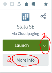
At this point you should know if you are using Stata or R. I use Stata. UVM has an institutional subscription. You can download and install it from the UVM Software page, here. For this you will log in with your UVM (not LCOM) credentials. To download it, hit the down arrow (1) then download. After it’s installed, you’ll need the serial number, code, and authorization to activate it. That’s under “more info” (2).

<– Two steps to install Stata from UVM

Your statistical software, option 2: R – we are using this in 2023’s summer session.

R is a free and open source computer language intended for use in statistics. RStudio is a commercial software that makes using R much more user-friendly. I have only used R a few times and don’t have expertise in the language.

Research credentialing things

CITI training and directory modification

You need to complete the CITI training (both “human subjects training/IRB” and “GCP” trainings) in advance of starting the summer so you can be added to our human subjects IRB, see details at these links:

And please modify your directory listing so you can be added to the IRB as described here: https://www.uvm.edu/sites/default/files/media/Students_-_How_To_Sign_Up_to_Do_Research_at_UVM_2.pdf

Once you have finished these steps, let me know so we can add you to the IRB. There is a delay between when we request you to be added to the IRB and when you are added to the IRB, fyi.

Cornerstone research training

Historically, students have been required to do an online research training session in Cornerstone by the end of the first week. Details from this come from the Student Services office. I don’t have details about how to complete this. IIRC this is specifically for students doing projects that involve interacting with patients or patient data at UVMMC, which isn’t what we are doing. But, look for those details coming your way.

ZIP code and county data sets for use in epidemiological research

Everyone knows their (5-digit) ZIP and it can be linked to population-level data. ZIP Codes have limitations since they were designed for mail delivery and not for population details. You can easily get county data from these data as well.

In epidemiological studies (especially EMR and survey data), you’ll almost certainly have a ZIP code or county, and almost never a census tract. It’s easy to find census data sets, but finding the analogous ZIP code dataset is a bit tricker. Every time I try to do a project with ZIP codes, I kick myself for not keeping a list of ZIP code data sets. So, this page will keep a running list of ZIP code-linked datasets. It’ll be updated periodically. If there’s a useful resource that I have missed, please email me at timothy.plante@uvm.edu and I’ll add it.

A few technical notes:

  • US Postal Service (USPS) ZIP codes – It seems that some datasets use a variation of USPS’s active ZIP codes. These are constantly being updated by the US Postal Service. ZIP codes are either the ‘standard’ 5-digit ZIP code or ZIP+4 (e.g., 9 digit). You can narrow down a lot further with the ZIP+4 version, but often times you only have the 5-digit ZIP.
  • ZCTA stands for ZIP Code Tabulation Area and is the US Census’s take on representing the topology of ZIP codes. These are produced for the q10y census. There are different ZCTAs for the 2000 Census and 2010 Census (as of 12/2020). Details about the US Census’s approach to developing ZCTAs can be found here.
    • You can read about the differences between ZCTA and USPS ZIP codes here: https://www.ncbi.nlm.nih.gov/pmc/articles/PMC1762013/
    • The 2010 ZCTA to county, subdivision, tract, congressional district, metropolitan and micropolitan statistical area, and New England City and Town Area can be found here.
    • Note, there is also a non-ZCTA 5-digit ZIP code standard used by the US Census are specific to the ZIP Code Business Patterns Survey. So, these relate to businesses, not people. Details are here.
  • USPS ZIP code to ZCTA crosswalk – this is provided by UDS at this website: https://udsmapper.org/zip-code-to-zcta-crosswalk/
  • The US Housing and Urban Development (HUD) also has its own ZIP linkage, which can be found here. You can read about the details of the HUD ZIP crosswalk here. This is not the same as ZCTA. The nice thing about the HUD ZIP crosswalk is that it’s updated quarterly, it links to 2000 or 2010 US Census county or tract GEOID via FIPS code, and the OMB’s core-based statistical area (CBSA; basically definitions of urban groups), and congressional districts. It also provides some details about residential vs. business vs. other addresses in that zip code.

Linking ZIP to county and FIPS

There’s a dataset on the HUD website here, on the “select crosswalk type” dropdown, select ZIP-County. From my read, this is ZCTA ZIP code for more recent datasets, but that isn’t explicitly stated. There’s also this resource from Dan Ofer that I haven’t had the chance to use but looks promising.

Cartography

Here are some resources if you want to make a map.

US Census (ZCTA)

Here’s some mapping files provided by the US Census.

Here’s a great Stata-specific page with both the ZCTA and US Postal Service ZIP files. I recommend the ZCTA if you will be using US census data.

HUD-ZIP linkage

Details are here.

USPS ZIP code

Here’s a commonly-used dataset from Esri’s ArcGIS.

Here’s the USPS ZIP code for Stata.

Distance between zip codes

Can be found here from the NBER here.

Health outcomes, prevention, health risk behaviors, disability, health status, and SDOH at CDC Places/500 Cities (ZCTA)

The RWJF/CDC 500 cities and Places database provides a huge collection of data linked to ZIP, with data originating from BRFSS and ACS/Census. Data can be downloaded at CDC places (ZCTA).

Commercial datasets

You might want to take a look at datasets available, some for free, some for a fee, on the AWS marketplace here (this is a link to the search term “Zip”). There are at least a few companies that sell datasets with things like demographics for Zip+4 (eg V12 on AWS), which you might be interested in. While you’re at it, you might also opt to look at Census files on this marketplace here.

Demographics

US Census (ZCTA)

The US Census used to distribute their summary files via FTP for their 2000 census and 2010 census. [Note: those are links to the Summary File 1, which doesn’t include rurality. Those are in Summary File 2.] These 39 and 47 files that must be merged by some convoluted process that I’m not going to try to figure out. Fortunately, the National Bureau of Economic Research (NBER) generated Summary File 1-ZCTA linked files for Stata, SAS, and CSV files that can be downloaded here:

As an example of how to use the NBER files, let’s look at the 2010 files. Files are indexed in this Census Summary File 1 (SF1) document. Search for “File 03” in that PDF to find the details for File 03 on page 184. Note that “P0030002” through “P0030008” are variables for race in the entire population. File 04 then has race and ethnicity among adults (male sex is “P0120002”, female sex is “P0120026”). File 07 has sex by race/ethnicity and age, and so on. You’ll want to save the specific variables from each of these files and generate your own dataset, depending on what you are attempting to do.

But what about rurality? That’s in the Summary File 2 (SF2) document. The US Census data used to be on a website called American Fact Finder, which was simple to use and wasn’t annoying. More recently it was moved to data.census.gov, which is a spiffy looking website that is in all actuality, quite terrible and I want it to go away. I can’t figure out how to download what I want. I tried to make a walkthrough of how to download urban/rurality by ZCTA but it gave me a blank table. Fortunately, I had downloaded it from American Fact Finder before it went offline. You can download the version that I saved here.

An alternative to data.census.gov in the wake of the loss of American Fact Finder is the NHGIS website. You can also try IPUMS, which also has data related to global health, GIS, time use, health surveys (NHIS and MEPS), and higher education information. Finally, there are a whole host of free Census files on AWS, I haven’t tried these but you might want to take a look here.

Social Determinants of Health

Take a look at this handy review of SDoH definitions by Lori Dean and Roland Thorpe at JHU. Before I go any further, I recommend looking at the PhenX toolkit for their resources on SDoH. There are a few conceptual frameworks for SDOH. Here’s Healthy People 2030. Here’s the WHO one. I like the KFF’s Figure 1 here, which defines the following factors (note there’s plenty of overlap between Healthy People 2030 and KFF). Here’s a working list of resources that I’ll keep adding to, organized by KFF’s figure 1 overview:

As I expand these, I will do my best to cover as many of these as possible, as how they apply to ZIP code and county.

Social Deprivation Index or SDI (ZCTA)

Derived from the American Community Survey 5-year estimates. Details include overall SDI score, income, education, employment, housing (% living in crowded rentals), household characteristics (% of single parent households with dependents who are minors), transportation (% car non-ownership), demographics (% black population, % high needs population). Details and download files can be found here.

Here’s the original description, prior to the use of ZCTA. This manuscript only discusses the Primary Care Service Areas (PCSAs), from the Dartmouth Atlas: https://pubmed.ncbi.nlm.nih.gov/22816561/

Area Deprivation Index or ADI (ZIP+4)

More to come. Download site is here. You need to make a free account to access the data. You have to download each state individually, as an FYI.

HUD datasets on housing, income, etc. (can use the HUD-ZIP crosswalk)

Here is the website: https://hudgis-hud.opendata.arcgis.com/

I haven’t explored these data files much, but some details are below. The only file that natively includes the ZCTA is the Difficult Development Areas, under Community Development below.

  • Agency administration – How the HUD is divided. Yawn.
  • Community development – Community development block grant, LIHTC Qualified Census Tracts (aka low income), Difficulty Development Areas for Low Income Housing Tax Credit (LIHTC; high cost of living relative to Area Median Gross Income; interestingly using the ZCTA for metropolitan areas), Neighborhood Stabilization Program (purchase of abandoned buildings), Empowerment Zone/Enterprise Community/Renewal Community (economic growth tax incentives), Revitalization Areas.
  • Community indicators – Details by American Community Survey, self-reported perceived rural/urban status (see Rurality section below), low-to-moderate income population by tract from the American Community Survey, Location Affordability Index from the American Community Survey, extreme temperatures by 1 degree latitude and longitude.
  • Fair housing – More to come.
  • Housing counseling – More to come.
  • Initiatives and demonstrations – More to come.
  • Location affordability – More to come.
  • Mortgage insurance programs – More to come.
  • Rental assistance programs – More to come.
  • Disaster recovery – More to come.

Rurality

RUCA codes (Unclear ZIP type)

There was a bug in the 2010 US Census-derived RUCA-ZIP and the linkage was updated in 2020, and can be found here. I’m trying to figure out whether RUCA is most similar to ZCTA or USPS ZIP Codes. I’ll come back and update what I find out. Update: I didn’t get a response to my inquiry. Since this is linked to the Census data, it’s possibly ZCTA.

American Housing Survey (AHS) from HUD

Urbanization Perceptions Small Area Index. This was self-reported neighborhood as urban, suburban, or rural. Link is here.

US Census (ZCTA)

The US Census details their take on rurality here. The actual rurality details for the 2010 census are in “Summary File 2”, details of which can be found here. As documented above, data.census.gov is a barrier to downloading census data. Fortunately, I grabbed rurality by ZCTA from American Fact Finder before it was shut down. You can grab my file here.

NCHS Urban-Rural Classification (Counties)

This is a very popular classification methodology people frequently use this scheme so I’m including it here. Details are here.

Health data

County health rankings (county)

Much county-level data can be obtained from the excellent County Health Rankings website from UWI, sponsored by RWJF. These include “ranked” and “unranked” data, the sources of these datapoints are listed in the Excel files that you can download on the website (eg, Vermont’s is here). Ranked includes premature death (deaths <75y), poor fair health, poor physical health, poor mental health, low birthweight, adult smoking adult obesity, food environment index, physical inactivity, access to exercise opportunities, excessive drinking alcohol-impaired driving deaths, STIs, teen births, % uninsured <65, ratio of population to PCPs, ratio of population to dentists, preventable health stays, mammography screening, flu vaccinations, level of education, unemployment, % children in poverty, income inequality, children in single-parent households, social associations, violent crime, injury deaths, air pollution by particulate matter, drinking water violations, households with overcrowding/high housing costs/lack of kitchen facilities/lack of plumbing facilities, % that drive to work alone, long commutes. Unranked includes life expectancy, premature age-adjusted mortality, child mortality, infant mortality, quality of life metrics (frequent physical distress, frequent mental distress, diabetes and HIV prevalence), food insecurity, limited access to healthy foods, drug overdose deaths, motor vehicle crash deaths, insufficient sleep, uninsured adults, uninsured children, ratio of population to primary care providers, disconnected youth (% of 16-19 yo not in school or working), reading scores, math scores, median income, % children eligible for free or reduced price lunch, residential segregation, homicides, suicidies, ,firearm fatalities, juvenile arrests, traffic volume, home ownership, severe housing cost burden, and specific census details.

I can’t find a “download all” option, but the datasets use a preserved naming structure in the download directory, so if you copy the link for one state, you can replace it with the name for another state (replacing spaces with percent sign 20 if spaces if needed) to get that download. It’d be easy to build a loop in Stata to automate the download for all of these datasets.

Ecology

The Ecolo-Zip project includes global postal codes and US ZIP codes to provide “Combining two large-scale satellite image resources (ASTER; SRTM) and a customised customized geospatial sampling model, we provide high-resolution indicators of physical topography (elevation, mountainousness, distance to sea), vegetation (normalized difference vegetation index) and climate (surface temperature). A cross-validation between ASTER and SRTM elevation data demonstrated high concordance (ICC = 0.999).” H/t to the Data Is Plural email for this head’s up.

Other

CBSA – Core-based statistical area

The White House’s OMB defines the CBSA, which is broadly metropolitan areas. So NYC has NYC itself as well as the suburban areas of NYC (NJ, Westchester, etc.) HUD provides USPS ZIP crosswalk here.