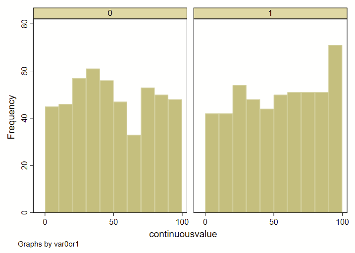
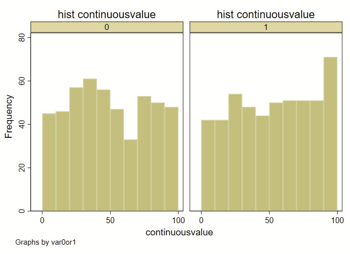
I recently had a dataset with two groups (0 or 1), and a continuous variable. I wanted to show how the overall deciles of that continuous variable varied by group. Step 1 was to generate an overall decile variable with an –xtile– command. Step 2 was to make a frequency histogram. BUT! I wanted these histograms to overlap and not be side-by-side. Stata’s handy –histogram– is a quick and easy way to make histograms by groups using the –by– command, but it makes them side-by-side like this, and not overlapping. (Note: see how to use –twoway histogram– to make overlapping histograms at the end of this post.)
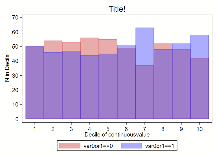
I instead used a collapse command to generate a count of # in each decile by group (using the transparent color command as color percent sign number), like this:
Here’s the code to make both:
clear all

// make fake data
set obs 1000
set seed 8675309
gen id=_n // ID of 1 though 100
gen var0or1 = round(runiform())
gen continuousvalue = 100*runiform()

// make overall deciles of continuousvalue
xtile decilesbygroup = continuousvalue, nq(10)

// now make a frequency histogram of those deciles
set scheme s1color // I like this scheme
hist decilesbygroup, by(var0or1) frequency bin(10)

// make a variable equal to 1 that we will sum in collapse
gen countbygroup = 1
// now sum that variable by the 0 or 1 indicator and deciles
collapse (sum) countbygroup, by(var0or1 decilesbygroup)
// now render the count from above as a bar graph:
set scheme s1color // I like this scheme
twoway ///
(bar countbygroup decilesbygroup if var0or1==0, vertical color(red%40)) ///
(bar countbygroup decilesbygroup if var0or1==1, vertical color(blue%40)) ///
, ///
legend(order(1 "var0or1==0" 2 "var0or1==1")) ///
title("Title!") ///
xtitle("Decile of continuousvalue") ///
xla(1(1)10) ///
yla(0(10)70, angle(0)) ///
ytitle("N in Decile")
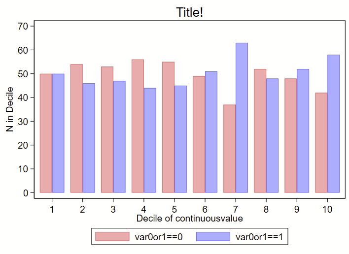
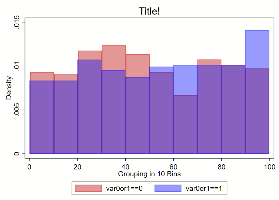
You could also offset the deciles by the var0or1 and shrink the bar width a bit to get a frequency histogram where the bars are next to each other, like this:
clear all

// make fake data
set obs 1000
set seed 8675309
gen id=_n // ID of 1 though 100
gen var0or1 = round(runiform())
gen continuousvalue = 100*runiform()

// make overall deciles of continuousvalue
xtile decilesbygroup = continuousvalue, nq(10)

// now make a frequency histogram of those deciles
set scheme s1color // I like this scheme
hist decilesbygroup, by(var0or1) frequency bin(10)

// offset the decilesbygroup by var0or1 a bit:
replace decilesbygroup = decilesbygroup - 0.2 if var0or1==0
replace decilesbygroup = decilesbygroup + 0.2 if var0or1==1

// make a variable equal to 1 that we will sum in collapse
gen countbygroup = 1
// now sum that variable by the 0 or 1 indicator and deciles
collapse (sum) countbygroup, by(var0or1 decilesbygroup)
// now render the count from above as a bar graph:
set scheme s1color // I like this scheme
twoway ///
(bar countbygroup decilesbygroup if var0or1==0, vertical color(red%40) barwidth(0.4)) ///
(bar countbygroup decilesbygroup if var0or1==1, vertical color(blue%40) barwidth(0.4)) ///
, ///
legend(order(1 "var0or1==0" 2 "var0or1==1")) ///
title("Title!") ///
xtitle("Decile of continuousvalue") ///
xla(1(1)10) ///
yla(0(10)70, angle(0)) ///
ytitle("N in Decile")
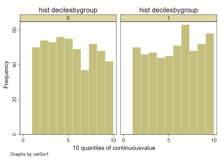
A few quick notes here: The way that I am specifying the “bins” for the histograms here is different than how Stata specifies bins for histograms, since I’m forcing it to render by decile. If you were to generate a histogram of the “continuousvalue” instead of the above example using “decilebygroup”, you’ll notice that the resulting histograms looks a bit different from each other:
clear all

// make fake data
set obs 1000
set seed 8675309
gen id=_n // ID of 1 though 100
gen var0or1 = round(runiform())
gen continuousvalue = 100*runiform()

// make overall deciles of continuousvalue
xtile decilesbygroup = continuousvalue, nq(10)

// now make a frequency histogram of those deciles
set scheme s1color // I like this scheme
hist decilesbygroup, title("hist decilesbygroup") by(var0or1) frequency bin(10) name(a)
hist continuousvalue, title("hist continuousvalue") by(var0or1)  frequency bin(10) name(b)
Also, this code will only render frequency histograms, not density histograms, which are the default in Stata. You can also use the –twoway hist– command to overlay two bar graphs, but these might not perfectly align with the deciles. But, using the –twoway hist– allows you to use density histograms instead. See the example that follows. I suspect that most people will get what they need with the –twoway hist– command in Stata.
clear all

// make fake data
set obs 1000
set seed 8675309
gen id=_n // ID of 1 though 100
gen var0or1 = round(runiform())
gen continuousvalue = 100*runiform()

set scheme s1color // I like this scheme
twoway ///
(hist continuousvalue if var0or1==0, bin(10) color(red%40) density) ///
(hist continuousvalue if var0or1==1, bin(10) color(blue%40) density) ///
, ///
legend(order(1 "var0or1==0" 2 "var0or1==1")) ///
title("Title!") ///
xtitle("Grouping in 10 Bins")
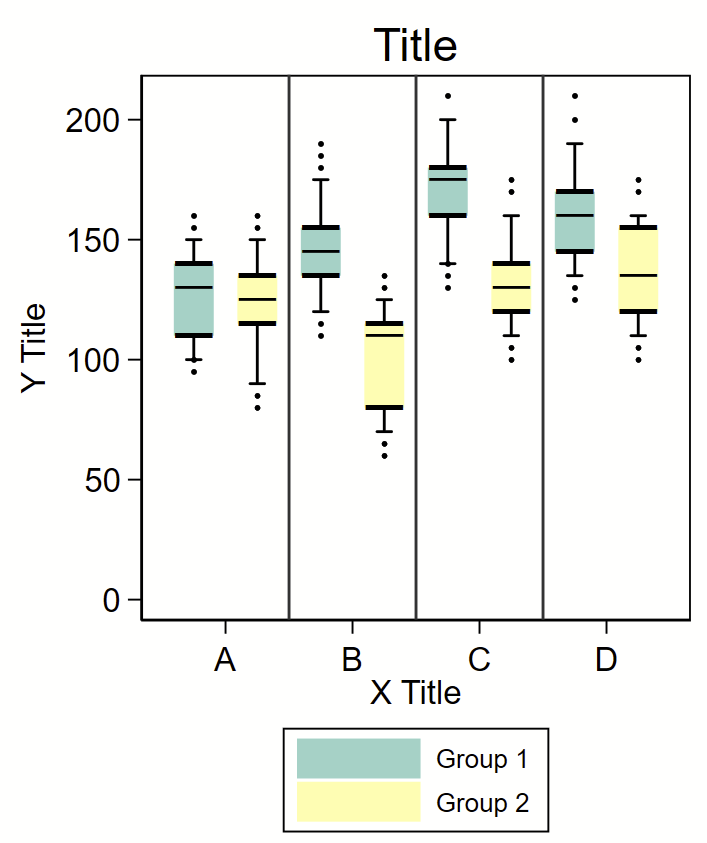
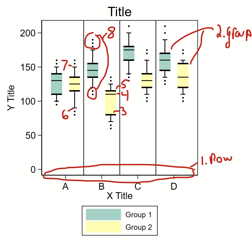
Stata has some handy built-in features to make boxplots. If you are trying to make a typical boxplot in Stata, go read up on the –graph box– command as described on this post.
I was asked to abstract a boxplot from an old paper and re-render it in Stata.
I used the excellent WebPlotDigitizer to abstract the points in these figure. It took me a few rounds of data abstraction to get all of the data. I generated the following variables
(1) “row” – rows 1-8 — the “A-D” labels on the x axis are offset at 1.5, 3.5, 5.5, and 7.5, respectively,
(2) “group” – an indicator for group 1 or 2,
(3-5) “boxlow” “boxmid” and “boxhigh” – the lower, mid, and upper bounds of the box,
(6-7) “bar1” and “bar2” – the low and upper end of the bars, and
(8) “dot” – extreme values.
I used “input” at the top of a do file to load these data. The colors were taken from ColorBrewer2. The “box” are just really wide pcspike lines with overlaying horizontal bars as floating text boxes to indicate the bottom, median, and top of the box. One problem is the placement of the horizontal lines on and above/below the box itself, since the “―” ascii character isn’t perfectly in the middle of the vertical space that is used to render it. To get around this, I included an offset value that could be modified to shift these lines up and down so they lined up with the boxes. The “whiskers” are an rcap. The extreme values are just scatterplot dots.
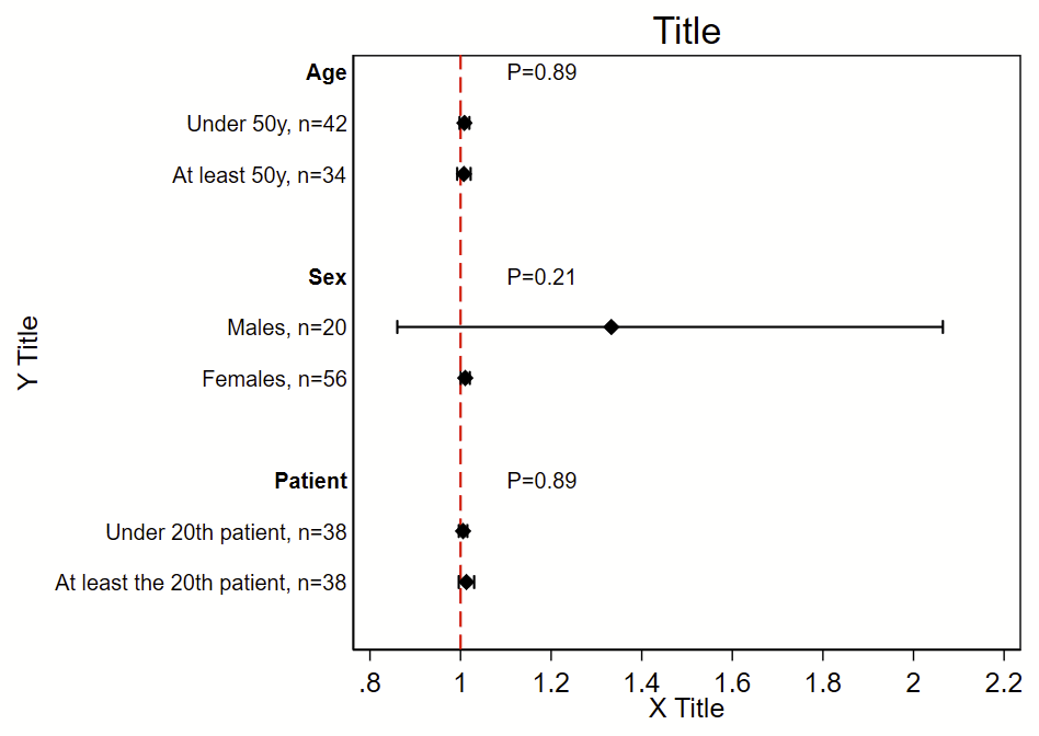
I was the analyst for the myPACE trial (published here in JAMA Cardiology), and needed to put together a subgroup analysis figure. I didn’t find any helpful stock code, so I wrote my own. The code uses the Frames feature that was introduced in Stata 16. It will (a) make a new frame with the required variables but no data, (b) generate a new dichotomous variable from continuous variables, (c) generate labels, (d) grab the Ns, point estimates, and 95% CI from a logistic regression, (e) grab the P-value for interaction for the primary exposure dependent variable*, (f) write the point estimate/95% CI/P-value for interaction to the new frame, then (g) switch to the new frame and make this figure. This script uses local macros so needs to be run all at once in a do file, not line by line.
This uses a stock Stata dataset called “catheter”. The outcome of interest/dependent variable is “infect”, the primary exposure/independent variable of interest is “time”, and the subgroups are age, sex, and patient number. This uses logistic regression, but you can easily swap this model out for any other model.
*You can get more complex code to format the P-values here.
Here’s the code!
frame reset // drop all existing frames and data
webuse catheter, clear // load analytical dataset
version 16 // need Stata version 16 or newer
*
* Make an empty frame with the variables we'll add later row by row
* The variables "rowname" and "pvalue" will be strings so when
* you add to these variables with the --frame post-- command,
* you need to use quotes.
frame create subgroup str30 rowname n beta low95 high95 str30 pval
*
*** Age
* Need to generate a dichotomous age variable
* You don't need to do this if the variable is already dichotomous,
* ordinal, or nominal
generate agesplit = (age>=50) if !missing(age) // below 50 is 0, 50 and above is 1
*
* Now generate a label for the overall grouping
local label_group "{bf:Age}"
*
* Group 0, below age 50
* Generate label for this subgroup
local label_subgroup_0 "Under 50y"
* Now run the model for this subgroup
logistic infect time if agesplit==0
* Now save the N, beta, and 95% CI as local macros.
* There's lots you can save after a regression, type --return list--,
* --ereturn list--, and --matrix list r(table)-- to see what's there
local n_0 = e(N)
local beta_0 = r(table)[1,1]
local low95_0 = r(table)[5,1]
local high95_0 = r(table)[6,1]
* print above local macros to prove you collected them correctly:
di "For `label_subgroup_0', n=" `n_0' ", beta (95% CI)=" %4.2f `beta_0' " (" %4.2f `low95_0' " to " %4.2f `high95_0' ")"
*
* Group 1, at least 50 years old
local label_subgroup_1 "At least 50y"
logistic infect time if agesplit==1
local n_1 = e(N)
local beta_1 = r(table)[1,1]
local low95_1 = r(table)[5,1]
local high95_1 = r(table)[6,1]
di "For `label_group', subgroup `label_subgroup_1', n=" `n_1' ", beta (95% CI)=" %4.2f `beta_1' " (" %4.2f `low95_1' " to " %4.2f `high95_1' ")"
*
* Now run the model with an interaction term between the primary exposure
* and the subgroup.
logistic infect c.time##i.agesplit
* Grab the p-value as a local macro saved as pval
local pval = r(table)[4,5]
* Print that local macro to see that you've grabbed it correctly
di "P-int = " %4.3f `pval'
* Format that P-value and save that as a new local macro called pvalue
local pvalue "P=`: display %3.2f `pval''"
di "`pvalue'"
*
* Now write your local macros to the the "subgroup" frame
* Each "frame post" command will add 1 additional row to the frame.
* We will graph these line by line.
* First line with overall group name a P-value for interaction:
frame post subgroup ("`label_group'") (.)  (.) (.) (.) ("`pvalue'")
* Now each subgroup by itself:
frame post subgroup ("`label_subgroup_0'") (`n_0')  (`beta_0') (`low95_0') (`high95_0') ("")
frame post subgroup ("`label_subgroup_1'") (`n_1')  (`beta_1') (`low95_1') (`high95_1') ("")
* Optional blank line:
frame post subgroup ("") (.) (.) (.) (.) ("")
*
*** Female sex
* This is already dichotomous, so don't need to create a new variable
* like we did for age.
local label_group "{bf:Sex}"
*group 0, males
local label_subgroup_0 "Males"
logistic infect time if female==0
local n_0 = e(N)
local beta_0 = r(table)[1,1]
local low95_0 = r(table)[5,1]
local high95_0 = r(table)[6,1]
*group 1, females
local label_subgroup_1 "Females"
logistic infect time if female==1
local n_1 = e(N) // N
local beta_1 = r(table)[1,1]
local low95_1 = r(table)[5,1]
local high95_1 = r(table)[6,1]
*interaction P-value
logistic infect c.time##i.female
local pval = r(table)[4,5]
local pvalue "P=`: display %3.2f `pval''"
*write to subgroup frame
frame post subgroup ("`label_group'") (.)  (.) (.) (.) ("`pvalue'")
frame post subgroup ("`label_subgroup_0'") (`n_0')  (`beta_0') (`low95_0') (`high95_0') ("")
frame post subgroup ("`label_subgroup_1'") (`n_1')  (`beta_1') (`low95_1') (`high95_1') ("")
frame post subgroup ("") (.) (.) (.) (.) ("")
*
*** patient
* need to generate a patient dichotomous variable
generate patientsplit = (patient>=20) if !missing(patient) // below 20 is 0, 20 and above is 1
local label_group "{bf:Patient}"
*group 0, below 20
local label_subgroup_0 "Under 20th patient"
logistic infect time if patientsplit==0
local n_0 = e(N)
local beta_0 = r(table)[1,1]
local low95_0 = r(table)[5,1]
local high95_0 = r(table)[6,1]
*group 1, 20 and above
local label_subgroup_1 "At least the 20th patient"
logistic infect time if patientsplit==1
local n_1 = e(N)
local beta_1 = r(table)[1,1]
local low95_1 = r(table)[5,1]
local high95_1 = r(table)[6,1]
*interaction P-value
logistic infect c.time##i.agesplit
local pval = r(table)[4,5]
local pvalue "P=`: display %3.2f `pval''"
*write to subgroup frame
frame post subgroup ("`label_group'") (.)  (.) (.) (.) ("`pvalue'")
frame post subgroup ("`label_subgroup_0'") (`n_0')  (`beta_0') (`low95_0') (`high95_0') ("")
frame post subgroup ("`label_subgroup_1'") (`n_1')  (`beta_1') (`low95_1') (`high95_1') ("")
frame post subgroup ("") (.) (.) (.) (.) ("")
*
*** Now make the figure. You'll have to modify this so the number of rows
*   in your subgroup frame matches the labels and whatnot
set scheme s1mono // I like this scheme
* Change frame to the subgroup frame
cwf subgroup
* Generate a row number by the current order of the data in this frame
gen row=_n
* Here's the code to make the figure
twoway ///
(scatter row beta, msymbol(d) mcolor(black) msize(medium)) ///
(rcap low95 high95 row, horizontal lcolor(black) lwidth(medlarge)) ///
, ///
legend(off) ///
xline(1, lcolor(red) lpattern(dash) lwidth(medium)) ///
title("Title") ///
yti("Y Title") ///
xti("X Title") ///
yscale(reverse) ///
yla( ///
1 "`=rowname[1]'" ///
2 "`=rowname[2]', n=`=n[2]'" ///
3 "`=rowname[3]', n=`=n[3]'" ///
4 " " /// blank since it's a blank row
5 "`=rowname[5]'" ///
6 "`=rowname[6]', n=`=n[6]'" ///
7 "`=rowname[7]', n=`=n[7]'" ///
8 " " /// blank since it's a blank row
9 "`=rowname[9]'" ///
10 "`=rowname[10]', n=`=n[10]'" ///
11 "`=rowname[11]', n=`=n[11]'" ///
12 " " /// blank since it's a blank row
, angle(0) labsize(small) noticks) ///
xla(0.8(.2)2.2) ///
text(1 1.1 "`=pval[1]'", placement(e) size(small)) /// these are the p-value labels
text(5 1.1 "`=pval[5]'", placement(e) size(small)) ///
text(9 1.1 "`=pval[9]'", placement(e) size(small))
*
* Now export your figure as a PNG file
graph export "myfigure.png", replace width(1000)
If you like automating your Stata output, you have probably struggled with how to format P-values so they display in a format that is common in journals, namely:
If P>0.05 and not close to 0.05, P has an equals sign and you round at the hundredth place
E.g., P=0.2777 becomes P=0.28
If P is close to 0.05 , P has an equals sign and you round at the ten thousandth place
E.g., P=0.05033259 becomes P=0.0503
E.g., P=0.0492823 become P=0.0493
If well below 0.05 but above 0.001, P has an equals sign and you round at the hundredth place
E.g., P=0.0028832 becomes P=0.003
if below 0.001, display as “P<0.001"
if below 0.0001, display as “P<0.0001"
Here’s a loop that will do that for you. This contains local macros so you need to run it all at once from a do file, not line by line. You’ll need to have grabbed the P-value as a from Stata as a local macro named pval. It will generate a new local macro called pvalue that you need to treat as a string.
local pval 0.05535235 // change me to play around with this
if `pval'>=0.056 {
	local pvalue "P=`: display %3.2f `pval''"
}
if `pval'>=0.044 & `pval'<0.056 {
	local pvalue "P=`: display %5.4f `pval''"
}
if `pval' <0.044 {
	local pvalue "P=`: display %4.3f `pval''"
}
if `pval' <0.001 {
	local pvalue "P<0.001"
}
if `pval' <0.0001 {
	local pvalue "P<0.0001"
}
di "original P is " `pval' ", formatted is " "`pvalue'"
Here’s how you might use it to format the text of a regression coefficient that you put on a figure.
sysuse auto, clear
regress weight mpg
// let's grab the P-value for the mpg
matrix list r(table) //notice that it's at [4,1]
local pval = r(table)[4,1]

if `pval'>=0.056 {
	local pvalue "P=`: display %3.2f `pval''"
}
if `pval'>=0.044 & `pval'<0.056 {
	local pvalue "P=`: display %5.4f `pval''"
}
if `pval' <0.044 {
	local pvalue "P=`: display %4.3f `pval''"
}
if `pval' <0.001 {
	local pvalue "P<0.001"
}
if `pval' <0.0001 {
	local pvalue "P<0.0001"
}
di "original P is " `pval' ", formatted is " "`pvalue'"

// now make a scatterplot and print out that formatted p-value
twoway ///
(scatter weight mpg) ///
(lfit weight mpg) ///
, ///
text(3500 35 "`pvalue'", size(large))
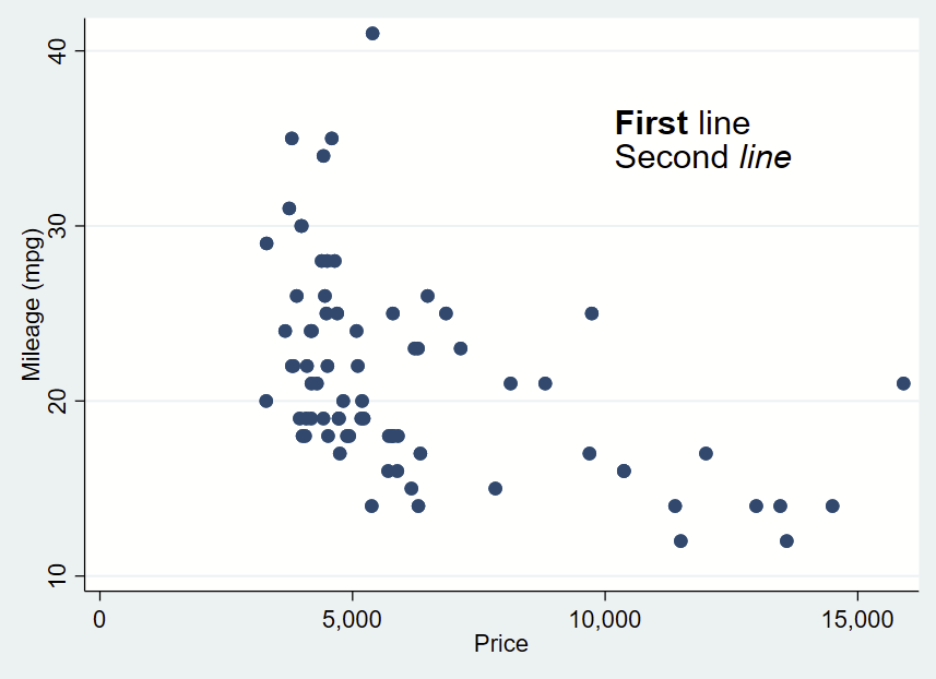
It’s handy to add text to your plots to orient your readers to specific observations in your figures. You might opt to highlight a datapoint, add percentages to bars, or say what part of a figure range is good vs. bad.
Adding text to Stata is relatively straightforward, once you get over the initial learning hump. Check out the added text help files by typing —help added_text_options— and —help textbox_options— for details.
Added text syntax
First, make your figure, then add your comma, then add your syntax. Like everything(?) in Stata, the location is specified as Y then X. Then add your text in quotes (or multiple quotes in a row if you want to insert a line break). You can bold or italicize by using the it: and bf: formatting and wrapping the text you want to apply it to in brackets. Then you drop a comma, specify placement as centered (c) or cardinal directions (e.g., ne, s, w) of that text box relative to the Y,X coordinates, justification of the text as left-aligned (left), centered (center), or right-aligned (right), and size of the text (vsmall, small, medsmall, medium, medlarge, large, vlarge, huge as shown in —help textsizestyle–).
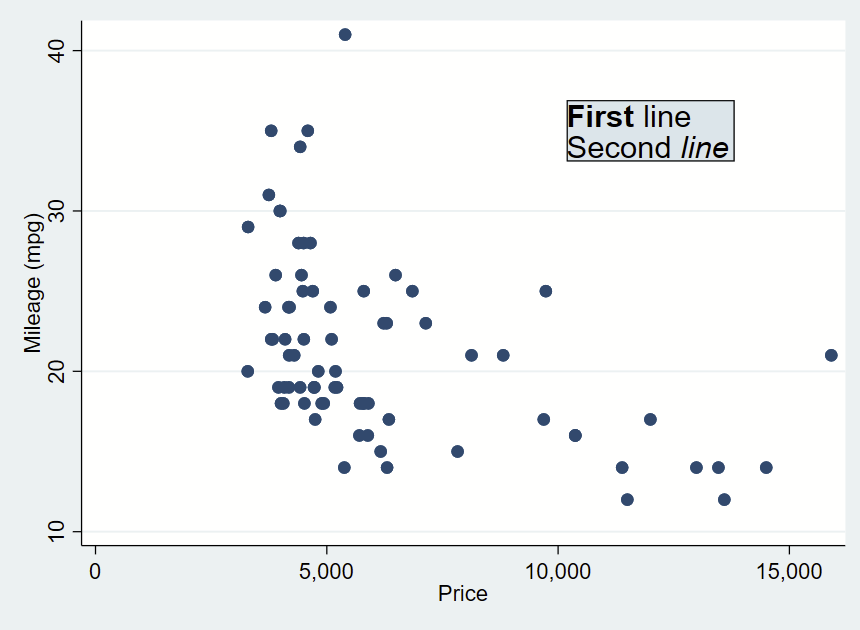
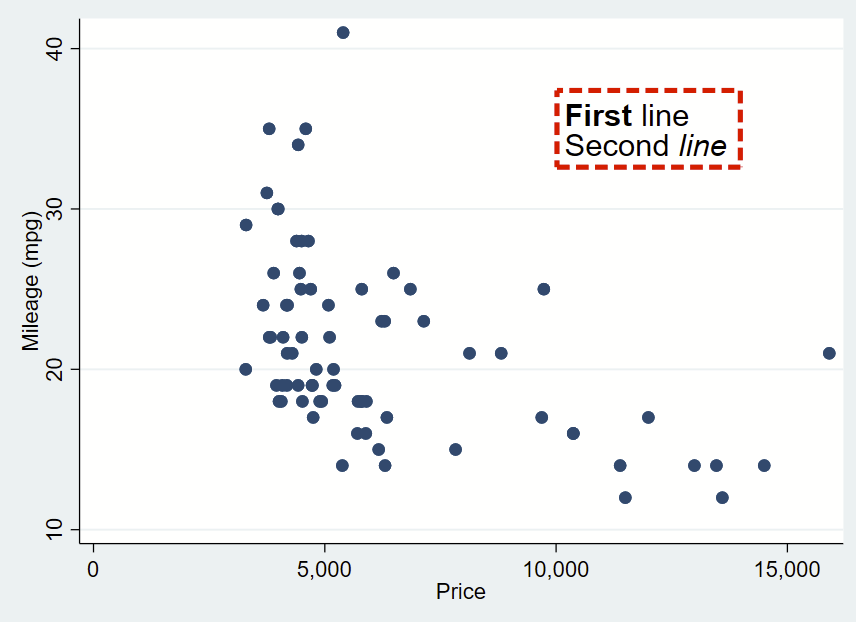
Text box without outline, playing around with bolding and italicizing:
You can further customize your box by specifying options shown under —help textbox_options–. Here, I’m making a box with no fill, and a thick/dashed/red outline with fcolor (fill color, which can be “none” for blank/see-through), lcolor (outline color), lpattern (outline pattern), and lwidth (thickness of outline).
That looks pretty cool, but I’d like there to be more space between the text and the border. That’s specified with “margin”. There’s lots of complex options for this command you can read about in —help marginstyle–, but specifying “small” margin will add just a little buffer.
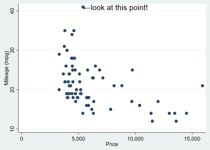
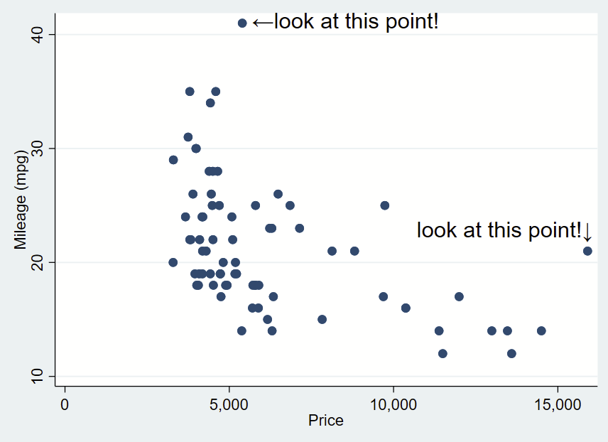
Here’s how you might use the above arrow. Here, I’ve changed the placement to “e” for “east” so the text is to the right and centered of the specified Y,X coordinates of this point (which I looked up, it’s 41,5397). I’ve dropped the box and it’s only one line. I need to manually specify the Y,X coordinates, so it’s a bit clunky still.
sysuse auto, clear
twoway ///
(scatter mpg price) ///
, ///
text(41 5397 "←look at this point!", placement(e) justification(left) size(large))
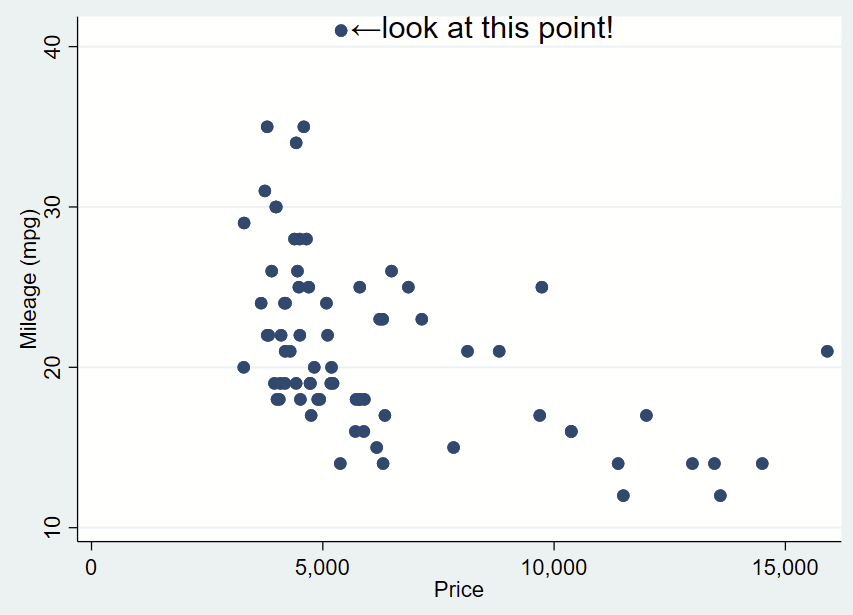
You’ll notice that the left pointing arrow is inside the point of interest. The left pointing arrow in Ariel text isn’t exactly vertically centered (that’s a quirk of Ariel). You can “nudge” the text box to the right and up by adding an offset to the Y and X coordinates. To do math on an x,y point and add an offset, you place the point in an opening tick (to the left of 1 on your keyboard) and an apostrophe, and putting an equal sign at the beginning. After a bit of trial and error, we want to add an offset of +0.3 to the Y coordinate and +200 to the X coordinate.
sysuse auto, clear
twoway ///
(scatter mpg price) ///
, ///
text(`=41+0.3' `=5397+200' "←look at this point!", placement(e) justification(left) size(large))
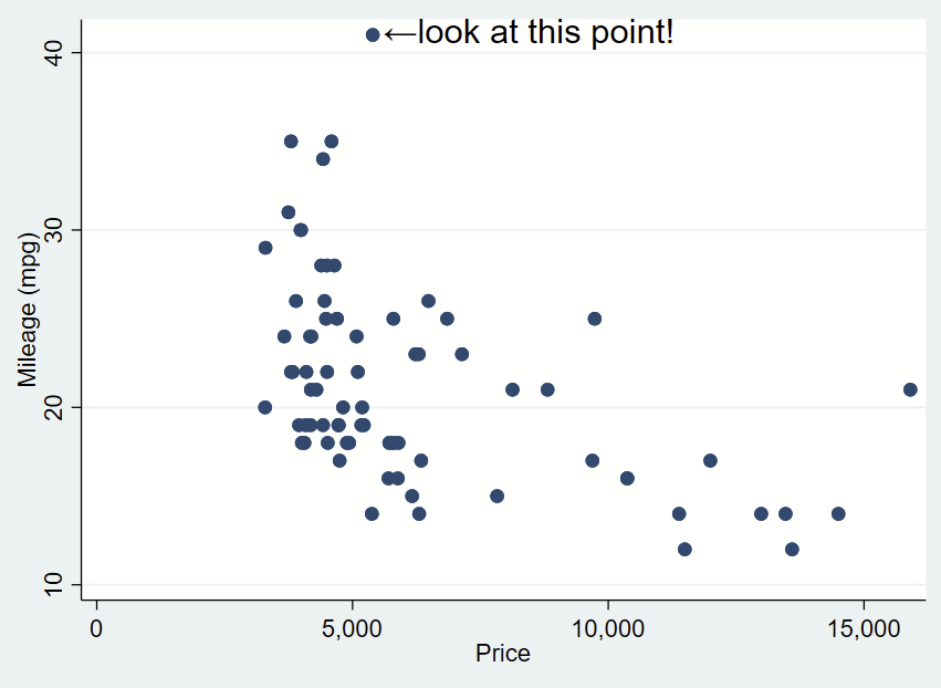
If we want to automate the extreme numbers on either axis, we can use the sum command to grab the maximum value aka r(max) of the Y axis and the corresponding x value for that extreme. We can make a local macro to grab that value. Since this uses local macros, you need to run all lines at once in a do file, not line by line.
sysuse auto, clear
// grab yaxis (mpg) extreme
sum mpg, d
// now look at the r-value scalars we can call.
// note that r(max) is 41 and is the maximum.
return list
// now save r(max) as a local macro
local ymax = r(max)
// now let's find the x value for that y value.
// remember that the x axis variable is "price"
sum price if mpg==`ymax', d
// now look at r-value scalars you can call.
// since there's only 1 value, the mean, min, max,
// and sum are all the same.
return list
// let's now grab the r(mean) of as a local macro
local ymax_x = r(mean)
// now you can prove that you grabbed the correct point
di "Y max =" `ymax' ", and that point is at X=" `ymax_x'
// now place those local macros in the Y and X, keeping
// the other offsets
twoway ///
(scatter mpg price) ///
, ///
text(`=`ymax'+0.3' `=`ymax_x'+200' "←look at this point!", placement(e) justification(center) size(large))
You can do the same for the x-axis extreme in the same script. for the X extreme, we’ll change the placement so it’s northwest and also tweak the Y,X coordinate offsets.
sysuse auto, clear
sum mpg, d
local ymax = r(max)
sum price if mpg==`ymax', d
local ymax_x = r(mean)
di "Y max =" `ymax' ", and that point is at X=" `ymax_x'
//
sum price, d
local xmax=r(max)
sum mpg if price==`xmax', d
local xmax_y=r(mean)
di "X max =" `xmax' ", and that point is at Y=" `xmax_y'

twoway ///
(scatter mpg price) ///
, ///
text(`=`ymax'+0.3' `=`ymax_x'+200' "←look at this point!", placement(e) justification(center) size(large)) ///
text(`=`xmax_y'+1' `=`xmax'+260' "look at this point!↓", placement(nw) justification(center) size(large))
What about adding text labels bar graphs?
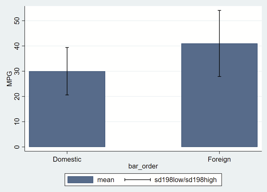
There’s a simple –graph bar– command, which isn’t terribly customizable. Here, we’ll be using the –twoway bar– bar graphs and add some fancy error bars with –twoway rcap–. The simplest way to do this is to make a new “dataset” from summary statistics in a separate frame. Frames are new in Stata 16, so if you are using an older version, this won’t work.
After making a frame with a bunch of summary statistics by group (most of which we won’t use here, but you might opt to later so we’ll keep it all there), you get this figure of mean and +/- 1.98*SD error bars.
// this has local macros so need to run from top to bottom in a do file!
// clear all frames
version 16
frames reset
sysuse auto, clear
// make a new frame called "bardata" that will store the values for bars.
frame create bardata str20 rowname n low95 high95 mean sd median iqrlow iqrhigh bar_order
//
// now grab summary statistics for foreign==0
// grab 2.5th and 95th %ile and save as local macros
// in case you might want them ever
_pctile mpg if foreign==0, percentiles(2.5 97.5)
local low95 = r(r1)
local high95= r(r2)
// now sum with detail one row
sum mpg if foreign==0, d
// post these to the new frame/bardata
// note the final row, which will be the x axis value that will correspond with bar placement
frame post bardata  ("Foreign==0") (r(N)) (r(mean)) (`low95') (`high95') (r(sd)) (r(p50)) (r(p25)) (r(p75)) (1)
//
// now repeat for foreign==1
_pctile mpg if foreign==1, percentiles(2.5 97.5)
local low95 = r(r1)
local high95= r(r2)
sum mpg if foreign==1, d
// note the final row is now 3, leaving a gap of between the prior row
frame post bardata  ("Foreign==1") (r(N)) (r(mean)) (`low95') (`high95') (r(sd)) (r(p50)) (r(p25)) (r(p75)) (3)

// now change to the frame with the summary statistics
cwf bardata
// let's make a new variable that's the mean +/- 1.98*sd
gen sd198low = mean-(sd*1.98)
gen sd198high = mean+(sd*1.98)

// now graph those data
twoway ///
(bar mean bar_order) ///
(rcap sd198low sd198high bar_order, vert lcolor(black)) ///
, ///
yla(0(10)50) ///
xla(1 "Domestic" 3 "Foreign") ///
ytitle("MPG")
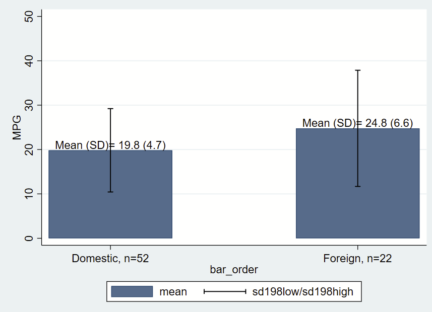
Let’s make things a bit more fancy with labels, and place a text box with the mean and SD immediately above/north of the bars, which themselves are means of MPG by group. One quirk of Stata is that when formatting printed text from stored values, you need to place the label in an opening and closing tick, put a colon, type display, then apply the formatting (e.g., %3.1f for 1 digit after the decimal) then the value you are trying to show. You’ll notice that formatting in the last two lines of the following code.
// clear all frames
version 16
frames reset
sysuse auto, clear
// make a new frame called "bardata" that will store the values for bars.
frame create bardata str20 rowname n mean low95 high95  sd median iqrlow iqrhigh bar_order
//
// now grab summary statisticis for foreign==0
// grab 2.5th and 95th %ile and save as local macros
_pctile mpg if foreign==0, percentiles(2.5 97.5)
local low95 = r(r1)
local high95= r(r2)
// now sum with detail one row
sum mpg if foreign==0, d
// post these to the new frame/bardata
// note the final row, which will be the x axis value that will correspond with bar placement
frame post bardata  ("Foreign==0") (r(N)) (r(mean)) (`low95') (`high95') (r(sd)) (r(p50)) (r(p25)) (r(p75)) (1)
//
// now repeat for foreign==1
_pctile mpg if foreign==1, percentiles(2.5 97.5)
local low95 = r(r1)
local high95= r(r2)
sum mpg if foreign==1, d
// note the final row is now 3, leaving a gap of between the prior row
frame post bardata  ("Foreign==1") (r(N)) (r(mean)) (`low95') (`high95') (r(sd)) (r(p50)) (r(p25)) (r(p75)) (3)

// now change to the frame with the summary statistics
cwf bardata
// let's make a new variable that's the mean +/- 1.98*sd
gen sd198low = mean-(sd*1.98)
gen sd198high = mean+(sd*1.98)

// let's grab the mean and SD for each group. This frame has only two
// rows of data, so we'll use the row notatition to generate a local from
// the first and second rows, with row number specified in brackets
local group0_mean = mean[1]
local group0_sd =sd[1]
local group0_n = n[1]
// print to check your work
di "for group 0, mean =" `group0_mean' ", SD=" `group0_sd' ", n=" `group0_n'
// do the other group
local group1_mean = mean[2]
local group1_sd =sd[2]
local group1_n = n[2]
// print to check your work
di "for group 1, mean =" `group1_mean' ", SD=" `group1_sd' ", n=" `group1_n'

// now graph those data
// we'll add labels for the mean and SD and also
// label the N in the xlabels
twoway ///
(bar mean bar_order) ///
(rcap sd198low sd198high bar_order, vert lcolor(black)) ///
, ///
yla(0(10)50) ///
xla(1 "Domestic, n=`group0_n'" 3 "Foreign, n=`group1_n'") ///
ytitle("MPG") ///
text(`group0_mean' 1 "Mean (SD)= `: display %3.1f `group0_mean'' (`: display %3.1f `group0_sd'')", placement(n)) ///
text(`group1_mean' 3 "Mean (SD)= `: display %3.1f `group1_mean'' (`: display %3.1f `group1_sd'')", placement(n))
Sometimes you want to combine two figures in Stata but the –graph combine– command isn’t doing it for you for whatever reason. I’ve run into this when I’ve already merged several figures (abcd), and want to combine that with another merged figure (1234):
[a]
[b]
[c]
[d]
...run graph combine then graph export in Stata and get:
[abcd].png

[1]
[2]
[3]
[4]
...graph combine and graph export to get:
[1234].png
But what I want is one image that looks like this, stacking one on top of the other:
[abcd
 1234].png
My previous workflow was to open up GIMP and manually combine them together. It turns out ImageMagick allows you to do this from the command line, so you can embed a couple of lines of code in your Stata do file to combine images together quickly. You can read details on the append command here (and also the related smush command here).
Getting started with Imagemagick & Stata, and example on how to combine/merge/append images
Note: I am doing this on Windows. The process might be slightly different for Mac or *nix.
Also note: The examples here use PNG files since they are smaller than TIFF files. You might opt to use TIFF files since they are uncompressed and won’t introduce compression artifact with multiple manipulations. Journals will probably want TIFF files anyway so perhaps do that from the start.
Also also note: Imagemagick doesn’t like extra spaces in code. If your code doesn’t run as expected, check that you don’t have extra spaces in your code.And also make sure you are also running the “local pwd=c(pwd)” command along with your other lines of code all at once.
Step 1: Download and install ImageMagick. Make sure to check the box next to “Add application directory to your system path”. This allows you to call ImageMagick from the command line so you can use it in Stata.
Step 2: From a do file, make some figures and use –graph export– to save them in your working directory as a common filetype (e.g., PNG, JPG, SVG). Let’s assume you have one figure called abcd.png and another called 1234.png.
Note: Type -pwd- to see where your working directory is.
Step 3: In your do file below the code that makes your two figures, call ImageMagick from the shell (“!” is the Stata command to call the shell), list out the names of the figures you want to combine, say you want to combine them, then tell it the name of the combined filetype.
To simplify the code, we’ll also grab the present working directory and put it before the filename as a local macro. Since this uses local macros, you need to run all lines at once from a do file and not one-by-one in Stata.
Combining figures using convert -append
Here’s some code that will vertically append a file “abcd.png” to “1234.png” and save as “abcd1234.png”:
Note that if you want to combine them horizontally instead of vertically, you’d use “+append” instead.
Combining figures using mosaic
Alternatively, you can use the mosaic command, and specify “concatenate” to do the same thing, specifying they are tiled in a 1×2 tiling (read about the mosaic command here). Note that adding -label “” before each figure name keeps any generated labels from appearing under each figure in the final mosaic:
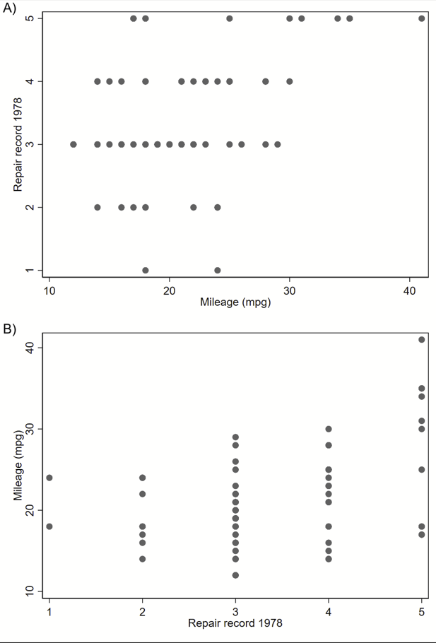
Adding text label on the figure itself with Convert -annotate
You can also add some labels right on your figure with the “convert -annotate” command (details here). Here we are adding a label “A)” and “B)” to the top left corner of each figure, or “Northwest” as defined by gravity (can use other cardinal directions too). You can move things up or down from the Northwest point if needed by changing the +0+0 (that’s +x+y) offset.
Adding text above your figure with convert -label, then combining figures with mosaic
This will add a label above your image, instead of on your image like convert -annotate. Here, the background is yellow so you can see it. Details are here.
This can be followed by a mosaic command so you can get a figure like this (with white label now).
Note that Imagemagick will try to append the labels that you generated in prior lines (“A) Figure Name” and “B) Figure Name”) under each image before combining unless you specify -label “”. Code to make the above figures:
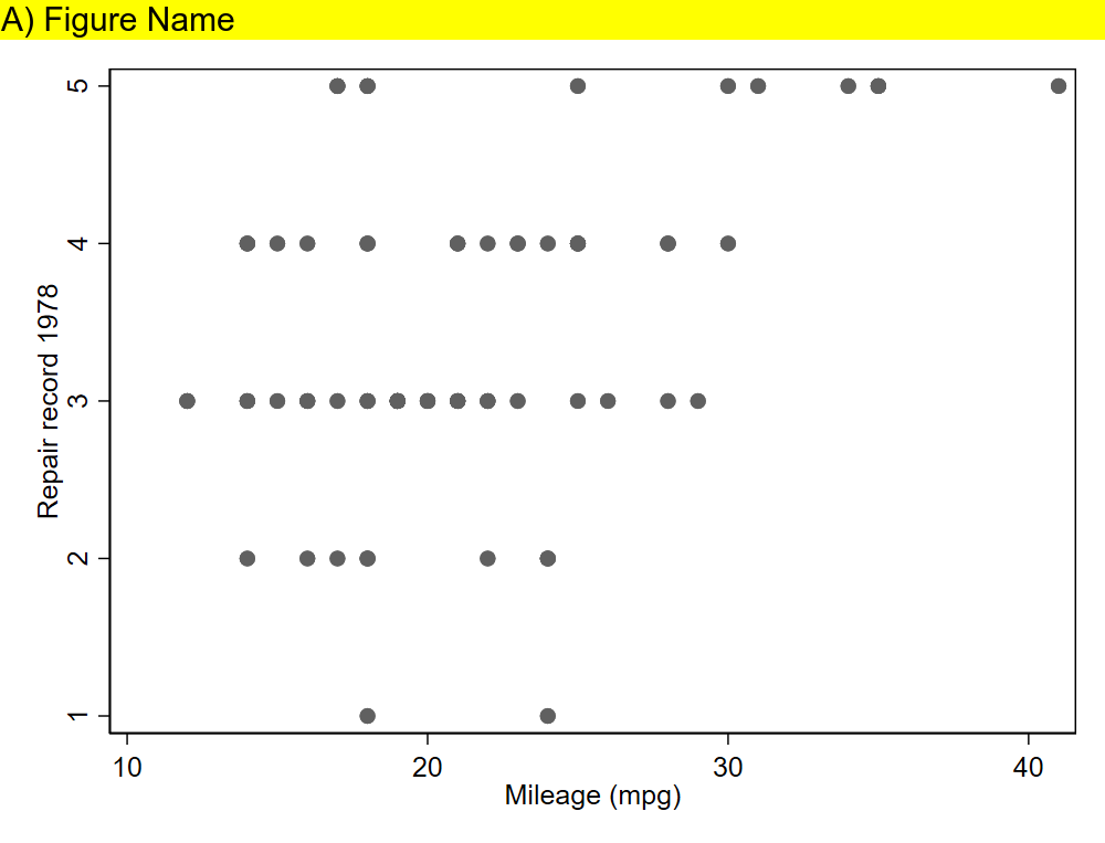
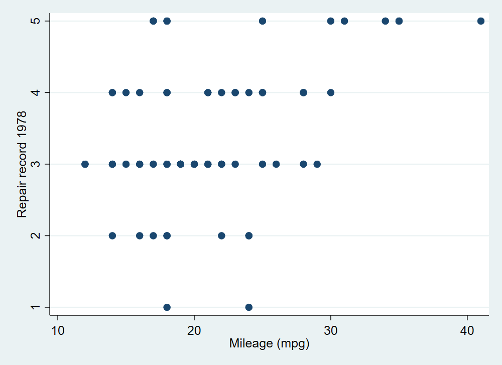
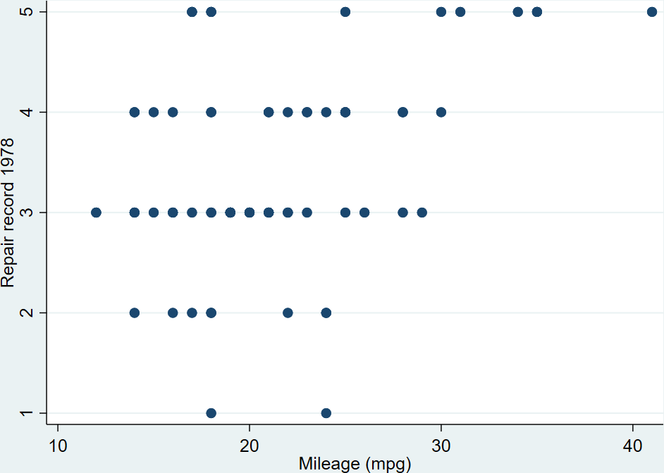
sysuse auto, clear

set scheme s1mono // I like this scheme
twoway scatter mpg rep78
graph export 1234.png, width(1000) replace

twoway scatter rep78 mpg
graph export abcd.png, width(1000) replace

local pwd = c(pwd) // pluck stata's working directory
// label
!magick ///
convert ///
"`pwd'/abcd.png" -background white -pointsize 30 label:"A) Figure Name" +swap -gravity West -append ///
"`pwd'/abcd_labeled.png"
//
!magick ///
convert ///
"`pwd'/1234.png" -background white -pointsize 30 label:"B) Figure Name" +swap -gravity West -append ///
"`pwd'/1234_labeled.png"
// combine as a montage
!magick ///
montage ///
-label "" "`pwd'/abcd_labeled.png" ///
-label "" "`pwd'/1234_labeled.png" ///
-mode Concatenate -tile 1x2 ///
"`pwd'/abcd1234_labeled_montage.png"
Generating an image with text then sticking that on top of your figures
ImageMagick will allow you to make an image that’s just text, which you can then stack on top of your figures using the montage feature. Just make sure to set the text width to be the same width as your figure, 1000 pixels here. You will stack them like this:
[abcd_label <-newly generated image of just text
abcd
1234_label <-newly generated image of just text
1234]
And you’ll get something like this:
sysuse auto, clear

set scheme s1mono // I like this scheme
twoway scatter rep78 mpg
graph export abcd.png, width(1000) replace

twoway scatter mpg rep78
graph export 1234.png, width(1000) replace

local pwd = c(pwd) // pluck stata's working directory
// make two separate text labels that you will later combine with your
// abcd and 1234 figures using montage
//
// first make the labels
// note: the caption option will use word wrap if it's too wide.
// This is 1000 pixels wide to match the other figures.
//
!magick ///
convert ///
-background none -size 1000x -fill black -font ariel -pointsize 30 caption:"A) Figure Name" ///
"`pwd'/abcdlabel.png"
//
!magick ///
convert ///
-background none -size 1000x -fill black -font ariel -pointsize 30 caption:"B) Figure Name" ///
"`pwd'/1234label.png"
//now use montage to put those labels on top of your other ones.
//combine as a montage
//
!magick ///
montage ///
-label "" "`pwd'/abcdlabel.png" ///
-label "" "`pwd'/abcd.png" ///
-label "" "`pwd'/1234label.png" ///
-label "" "`pwd'/1234.png" ///
-mode Concatenate -tile 1x4 ///
"`pwd'/abcd1234_labeled_montage.png"
Other useful functions of Imagemagick
Convert and -Trim
Trimming removes all of the extra border around your figure. The border is defined as whatever color the pixel in the corner is. So if you have a figure that looks like this:
Trimming will remove the small amount of blue space outside of your labels and around the figure, so you get this:
I’m not quite sure why you’d want to do this, but you can combine several figures without axis labels and use one overall label like specifying l1label and b1label in –graph combine–. This code makes 4 separate figures without labels then merges them together then generates text to go on the left side vertically and on the bottom horizontally. You get this figure in the end:
sysuse auto, clear
set scheme s1mono // I like this scheme
//
// Make 4 figures without labels
twoway scatter mpg weight if rep78==1 ///
, ///
xti("") ///
yti("")
//
graph export 1.png, width(1000) replace
//
twoway scatter mpg weight if rep78==2 ///
, ///
xti("") ///
yti("")
//
graph export 2.png, width(1000) replace
//
twoway scatter mpg weight if rep78==3 ///
, ///
xti("") ///
yti("")
//
graph export 3.png, width(1000) replace
//
twoway scatter mpg weight if rep78==4 ///
, ///
xti("") ///
yti("")
//
graph export 4.png, width(1000) replace
//
local pwd = c(pwd) // pluck stata's working directory
// now merge the 4 figures horizontally:
!magick ///
montage ///
-label "" "`pwd'/1.png" ///
-label "" "`pwd'/2.png" ///
-label "" "`pwd'/3.png" ///
-label "" "`pwd'/4.png" ///
-mode Concatenate -tile 4x1 ///
"`pwd'/1234_noaxislabel.png"
// now make a side label as a text block:
//
!magick ///
convert ///
-pointsize 50 label:"Side Label!" -rotate -90 ///
"`pwd'/1234sidelabel.png"
//
// ditto bottom label:
//
!magick ///
convert ///
-pointsize 50 label:"Bottom Label!" -rotate -0 ///
"`pwd'/1234bottomlabel.png"
//
// now combine them together:
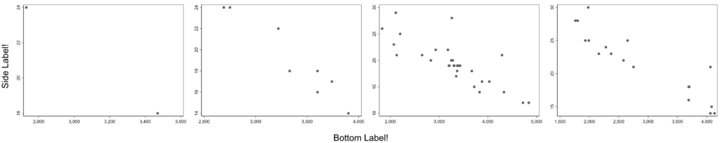
!magick convert \( "`pwd'/1234sidelabel.png" "`pwd'/1234_noaxislabel.png" -gravity Center +append \) \( "`pwd'/1234bottomlabel.png" \) -append 1234_labeled.png
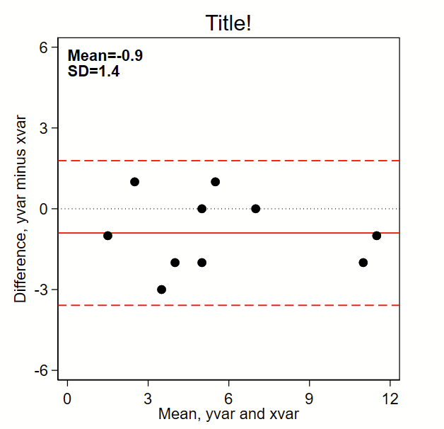
The below code outputs this Bland-Altman plot figure, which prints the mean and SD and puts a solid line for mean difference and red dotted lines for mean difference +/- 1.96*SD. (Note: the original BA paper used +/- 2*SD, but it’s reasonable to use +/-1.96*SD given it’s commonality in estimating the bounds of 95% confidence intervals of a normally-distributed plot). By the way, see the related page on making a scatterplot here, which should probably be shown alongside this figure in any publication.
Here’s the code:
// note this uses local macros so you need to run this entire thing
// top to bottom in a do file, not line by line.
//
// Step 1: input some fake data:
// Note: for comparing tests (e.g., lab tests), I make x the "gold standard"
//       test and y the investigational test
clear all

input id yvar xvar
1 2 5
2 3 5
3 6 5
4 7 7
5 3 2
6 10 12
7 1 2
8 11 12
9 4 6
10 5 5
end

// Step 2a: make difference (to go on y axis) and mean (x axis) variables
gen diff= yvar - xvar
gen mean = (yvar+xvar)/2

// Step 2b: Grab the difference (y axis) mean and sd
sum diff, d
local diffmean= r(mean)
local diffsd = r(sd)

// Step 3: graph!
set scheme s1mono // I like this scheme

twoway ///
(scatter diff mean, msymbol(O) msize(medium) mcolor(black)) ///
, ///
/// black dotted line at zero:
yline(0, lcolor(black) lpattern(dot) lwidth(medium)) ///
/// red solid line at mean:
yline(`=`diffmean'',lcolor(red) lpattern(solid) lwidth(medium)) ///
/// red dashed lines at mean +/- 1.96*sd
yline(`=`diffmean'+1.96*`diffsd''  , lcolor(red) lpattern(dash) lwidth(medium)) ///
yline(`=`diffmean'-1.96*`diffsd''  , lcolor(red) lpattern(dash) lwidth(medium)) ///
aspect(1) /// force output to be square
/// here's the text box with mean and sd,
/// you'll need to tweak the first two numbers so the y,x
/// coordinates drop the text where you want it
text(6 0 "{bf:Mean=`:di %3.1f `=`diffmean'''}" "{bf:SD=`:di %3.1f `=`diffsd'''}", placement(se) justification(left)) ///
legend(off) /// Shut off the legend
/// Now tweak the ranges of the axes to your liking.
/// I like to make them the same width. In this example, the x axis is from
/// 0 to 12 so is 12 units wide. So I set the y axis to also be
/// 12 units wide, going from -6 to +6.
xla(0(3)12) /// you'll need to tweak range for your data
yla(-6(3)6, angle(0)) /// you'll need to tweak range for your data
ytitle("Difference, yvar minus xvar") ///
xtitle("Mean, yvar and xvar") ///
title("Title!")
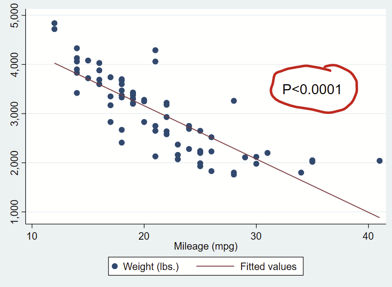
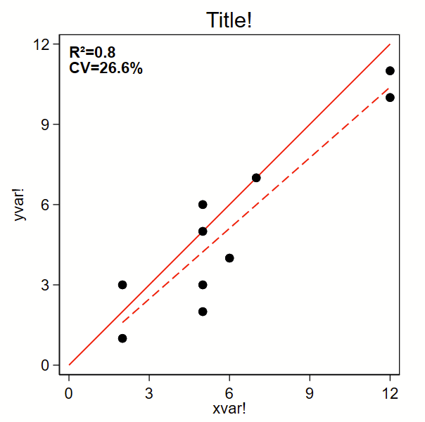
I recently had to make some scatterplots for Figure 3 of this paper. I decided to clean up the code in case it might be helpful to others.
The below code outputs a scatterplot with R-squared and %CV. I grabbed the %CV-from-a-regression code from Mehmet Mehmetoglu’s CV program. (Type –ssc install cv– to grab that one. It’s not needed for below.) By the way, you might also be interested in how to make a related Bland-Altman plot here.
Here’s the code:
// note this uses local macros so you need to run this entire thing
// top to bottom in a do file, not line by line.
//
// Step 1: input some fake data:
clear all

input id yvar xvar
1 2 5
2 3 5
3 6 5
4 7 7
5 3 2
6 10 12
7 1 2
8 11 12
9 4 6
10 5 5
end

// Step 2a: Grab the R2 from a regresssion
regress yvar xvar
local rsq = e(r2)
// Step 2b, from the same regression, calculate the percent CV
local  rmse= e(rmse)
local depvar = e(depvar)
sum `depvar' if e(sample), meanonly
local depvarmean = r(mean)
local cv = `rmse'/`depvarmean'*100

// Step 3: graph!
set scheme s1mono // I like this scheme

twoway ///
/// Line of unity, you'll need to tweak the range for your data.
/// note that 'y' and 'x' are not the same as 'yvar' and 'xvar'
/// but are instead what's required here to print the line of
/// unity:
(function y=x , range(0 12) lcolor(red) lpattern(solid) lwidth(medium)) ///
/// line of fit:
(lfit yvar xvar,  lcolor(red) lpattern(dash) lwidth(medium)) ///
/// Scatter plot dots:
(scatter yvar xvar, msymbol(O) msize(medium) mcolor(black)) ///
, ///
aspect(1) /// force output to be square
/// here's the text box with R2 and CV,
/// you'll need to tweak the first two numbers so the y,x
/// coordinates drop the text where you want it
text(12 0 "{bf:R²=`:di %3.1f `=`rsq'''}" "{bf:CV=`:di %4.1f `=`cv'''%}", placement(se) justification(left)) ///
legend(off) /// Shut off the legend
yla(0(3)12, angle(0)) /// you'll need to tweak range for your data
xla(0(3)12) /// you'll need to tweak range for your data
ytitle("yvar!") ///
xtitle("xvar!") ///
title("Title!")
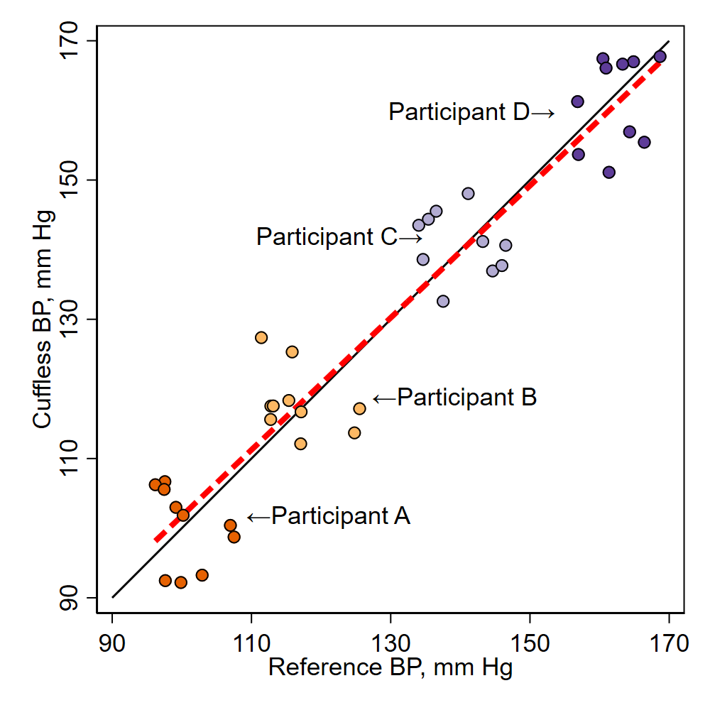
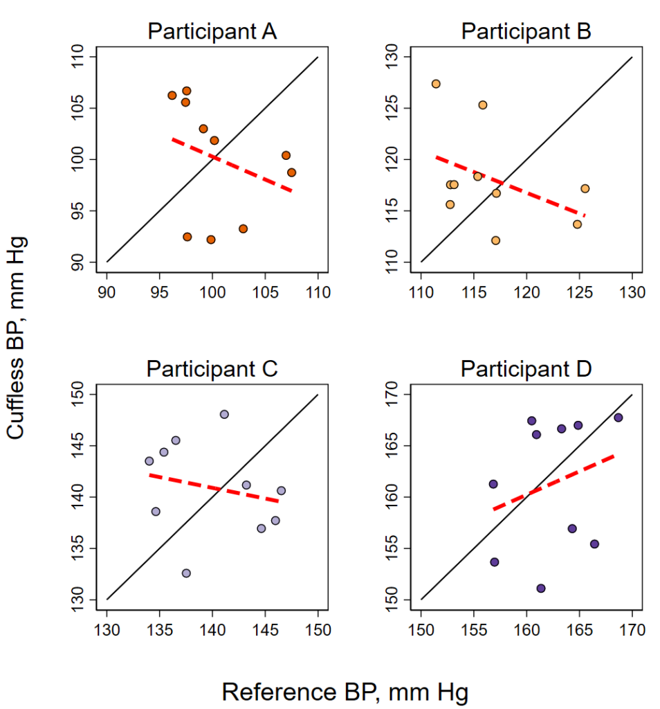
I recently made these two figures with a Stata do file that (A) generates some fake data, (B) plots the data overall with a fitted line, (C) plots each participant individually with fitted line, and (D) merges these four individual plots into one overall plot. One tricky piece of this was to get the –graph combine– command to get the four figures to be square, I had to fiddle with the –ysize– to get them to be square. I had originally tried using the –aspect– option, but it builds in lots of white space to between the figures. this way seemed to work.
Here’s the Stata code to make the above figures.
************************
*****clear data/graphs**
****set graph schemes***
************************
clear
graph drop _all
set scheme s1mono

************************
*****generate data******
************************
set seed 8675309
// generate 40 random values
set obs 40
//...called x and y that range from - to +9
gen y = runiform(-9,9)
gen x = runiform(-9,9)
// now make an indicator for each grouping of 10
gen n =.
replace n= 1 if _n>=0 & _n<=10
replace n= 2 if _n>10 & _n<=20
replace n= 3 if _n>20 & _n<=30
replace n= 4 if _n>30 & _n<=40
// now for each successive 10 rows, add 100, 120, 140, and 160
replace y = y+100 if n==1
replace x = x+100 if n==1

replace y = y+120 if n==2
replace x= x+120 if n==2

replace y= y+140 if n==3
replace x= x+140 if n==3

replace y= y+160 if n==4
replace x= x+160 if n==4
************************
*****single figure******
************************
twoway ///
/// line of unity (45 degree line):
(function y = x, ra(90 170) clpat(solid) clwidth(medium) clcolor(black)) ///
/// line of fit:
(lfit y x, lcolor(red) lpattern(dash) lwidth(thick)) ///
/// dots for each group, using colors from colorbrewer2
(scatter y x if n==1, mcolor("230 97 1") msymbol(O) mlcolor(black)) ///
(scatter y x if n==2, mcolor("253 184 99") msymbol(O) mlcolor(black)) ///
(scatter y x if n==3, mcolor("178 171 210") msymbol(O) mlcolor(black)) ///
(scatter y x if n==4, mcolor("94 60 153") msymbol(O) mlcolor(black)) ///
, ///
/// force size:
ysize(4) xsize(4) ///
/// axis titles and rows:
xtitle("Reference BP, mm Hg") ///
ytitle("Cuffless BP, mm Hg") ///
xla(90(20)170) ///
yla(90(20)170) ///
legend(off) ///
/// labels:
text(102 109 "←Participant A", placement(e)) ///
text(119 127 "←Participant B", placement(e)) ///
text(142 135 "Participant C→", placement(w)) ///
text(160 154 "Participant D→", placement(w))
/// export figure:
graph export figure1av2.png, replace width(1000)


************************
***four-piece figures***
*****to merge***********
************************
twoway ///
(function y = x if n==1, ra(90 110) clpat(solid) clwidth(medium) clcolor(black)) ///
(lfit y x if n==1, lcolor(red) lpattern(dash) lwidth(thick)) ///
(scatter y x if n==1, mcolor("230 97 1") msymbol(O) mlcolor(black)) ///
, ///
title("Participant A") ///
xtitle(" ") ///
ytitle(" ") ///
yla(90(5)110) ///
xla(90(5)110) ///
legend(off) ///
name(figure1b1)

twoway ///
(function y = x if n==2, ra(110 130) clpat(solid) clwidth(medium) clcolor(black)) ///
(lfit y x if n==2, lcolor(red) lpattern(dash) lwidth(thick)) ///
(scatter y x if n==2, mcolor("253 184 99") msymbol(O) mlcolor(black)) ///
, ///
title("Participant B") ///
xtitle(" ") ///
ytitle(" ") ///
yla(110(5)130) ///
xla(110(5)130) ///
legend(off) ///
name(figure1b2)

twoway ///
(function y = x if n==3, ra(130 150) clpat(solid) clwidth(medium) clcolor(black)) ///
(lfit y x if n==3, lcolor(red) lpattern(dash) lwidth(thick)) ///
(scatter y x if n==3, mcolor("178 171 210") msymbol(O) mlcolor(black)) ///
, ///
title("Participant C") ///
xtitle(" ") ///
ytitle(" ") ///
yla(130(5)150) ///
xla(130(5)150) ///
legend(off) ///
name(figure1b3)

twoway ///
(function y = x if n==4, ra(150 170) clpat(solid) clwidth(medium) clcolor(black)) ///
(lfit y x if n==4, lcolor(red) lpattern(dash) lwidth(thick)) ///
(scatter y x if n==4, mcolor("94 60 153") msymbol(O) mlcolor(black)) ///
, ///
title("Participant D") ///
xtitle(" ") ///
ytitle(" ") ///
yla(150(5)170) ///
xla(150(5)170) ///
legend(off) ///
name(figure1b4)

***********************
***combine figures*****
***********************
graph combine figure1b1 figure1b2 figure1b3 figure1b4 /*figure1b5*/, ///
b1title("Reference BP, mm Hg") ///
l1title("Cuffless BP, mm Hg") ///
/// this forces the four scatterplots to be the same height/width
/// details here:
/// https://www.stata.com/statalist/archive/2013-07/msg00842.html
cols(2) iscale(.7273) ysize(5.9) graphregion(margin(zero))

/// export to figure
graph export figure1bv2.png, replace width(1000)
I became a dad during fellowship and have had several other kids since then. From this experience, I wanted to jot down some advice for new parents looking for what to get in anticipation of a transition to parenthood. Note: My recommendations here represent my personal opinion and come from my experience as a dad who overengineers things and not as a doctor. (I am an internist and only take care of adults, and not kids anyway.) I don’t have vested interests in any of the products here and don’t receive any income from links or whatnot.
Diapers
Costco’s Kirkland Signature Diapers. These rock. They are on par with any high-end diaper company out there. (I think they have better performance than the super expensive environmentally-marketed ones that are free from bleaching and whatnot.) Kirkland Signature Diapers come in massive boxes and go on sale once or twice per year. We typically stock up in multiple sizes when they go on sale. They don’t have a newborn size, but our kids only wore newborn-size diapers for about 2 weeks, and honestly they could have all been in size 1 diapers from the get-go. If you are a new parent and your kid is ≥7 lbs (≥3,200 g) at delivery, maybe pick up a 20 pack of some other brand’s newborn size then anticipate flipping over to Size 1 diapers when you run out of newborn size.
Some online commenters have said that Kirkland Signature diapers have changed in quality in recent years. As of 8/2022, we have had ≥1 of our kids in these diapers continuously for 6+ years and I have not noticed any differences in this time. So, no I don’t think the quality has changed. If you don’t have a Costco nearby, it might be cost-effective to get a membership so you can order these online.
If we are traveling and run out of diapers, we get Huggies or Pampers as a backup.
If you go for cloth diapers, more power to you. They didn’t work for us.
Baby wipes
Unlike Costco’s diapers, which I think are equivalent to other high end diapers, Costco’s Kirkland Signature Baby Wipes are in a league of their own. They are far and away the best wipes we have ever used, and we have used pretty much all major brands, including the environmentally-marketed ones. These Kirkland Signature wipes also come in massive boxes. I don’t think they have changed in quality in the past 6+ years. We get the unscented ones.
Do yourself a favor and get the Oxo Tot Perfect Pull Wipes Dispenser too. It’ll allow you to get a wet wipe with one hand, which is essential when you are trying to clean up an angry, messy baby.
Baby bag
I had an old Timbuk2 medium-sized messenger bag that I used instead of a backpack in med school. It was big enough to fit a 14-inch laptop. This works flawlessly as a baby bag. We keep it packed by the door and grab it on the way out as a reflex — just make sure to restock it when you get back from an excursion! Other messenger bags will probably work just fine, but I’ve only had this Timbuk2 one. There a lot to love from a messenger bag form-factor as a baby bag, like ability to flip the cover open without putting it down or even needing to use either arm to carry it.
Either a small or medium messenger bag is reasonable, but if you aren’t sure, or if you might have >1 kid, get the medium. These are easy to find used online, and my recommendation is to get the cheapest, ugliest, most beat up messenger bag that you can find. It’ll be easier to spot in public/the airport, and will only get more beat up over time.
In one of the cubes, we kept (1) diapers and (2) a handful of baby wipes inside two separate quart or gallon freezer bags (the same kind of bag you probably already have in your kitchen drawer). We also kept (3) a tube of petroleum jelly, (4) hand sanitizer, and (5) dog poop cleanup bags for used diapers and other garbage, and yes I mean the type of dog bags that you see hooked to a leash.
In the other cube we kept changes of kid clothes inside a gallon freezer bag.
We also had some miscellaneous items, like acetaminophen, pacifiers, small books, small toys, etc. tucked in the front pouch.
Garbage can to put diapers in (“diaper pail”)
We have (a) a massive, expensive airtight diaper pail and (b) a smaller, non-airtight, 8 liter/2.1 gallon garbage can with a foot-triggered pop-up lid. The (a) big, fancy diaper pail is so big that you don’t have to change it as much, and the diapers get absolutely rancid in there. Every time you open it and it’s more than half full, you get this “puff” of disgusting air smell that will linger in the air for a while. I prefer our (b) little, non-airtight, 8 liter/2.1 gallon garbage can with a lid to the big expensive, airtight diaper pail. No, it’s not airtight, but I don’t think it matters since smaller size forces you to empty it out every few days so it doesn’t get too nasty. I wouldn’t get anything larger than 10.2 liters/2.7 gallons or else you’ll have a huge pile of gross diapers and the smell issue. I also wouldn’t go any smaller than 8 liters/2.1 gallons either since then you’ll be emptying it constantly. Here’s a search to get you going.
They annoyingly no longer sell small trash can liners at our local Costco, so instead I’m using the waaay oversized 13-gal bags. I actually like these bags for this use though, since they are very strong and give me an opportunity to empty other trash cans into the bag when taking out the diapers.
FYI: I asked my spouse which diaper pail they like and they like the (a) massive one more than the (b) small one. I still like the (b) small one better!
Baby and little kid clothing
When you are expecting, friends and family will get you newborn-sized clothing, which will be cute and all but your kid will grow out of these almost immediately. Make sure to guide potential gift-givers to 3-6 mo, 6-12 mo, and 12-18 mo clothing.
The older the kid is, the rougher they are on everything, including clothing. Starting at 1 year old, think about getting more durable brand clothing that will last long enough to be a hand-me-down within or between families. Clothing from box stores or mall chain stores don’t seem to dependably last through 1 kid aged ≥1 year, let alone a second kid. Brands that we have found durable include:
FYI: There’s an Hanna Andersson spinoff called “To the Moon and Back by Hanna Andersson” on Amazon. I think the quality of this spinoff is probably better than average kid clothing, but not as good as the “real” Hanna Andersson stuff.
Primary – Most of their stuff isn’t gendered, which is nice.
All of these brands are more expensive when not on sale or second hand. Since they are super durable, the second hand stuff is usually great. We’ve lucked out with some great sales over the years. You might want to sign up for their email advertisements so you catch sales when they pop up.
Baby and little kid shoes and boots
First things first, US-standard kids shoe sizing is really annoying since it’s a mix of numbers, letters, and words like “little kid” and “big kid”. The sizes for toddlers-grade school sometimes have an “m” next to them but not always (e.g., 4m) and go up to 12 or 13 (“toddler” or “little kid”) and then start over at 1 again (“big kid”). It’s confusing to know what size you are ordering. Shoes often have a “cm” size to help differentiate. If they are around or above 20 cm, then they are the bigger kids size (ie later grade school).
Kids grow really fast. Do yourself a favor and get a shoe sizer for home. We have this one from Squatchi. It’ll make life simpler when ordering shoes online.
Don’t sweat shoes and boots before your kids starts walking, get whatever is cheap or gifted. Once you have a toddler, it’s time to up your game. I haven’t found a pair of shoes that survives very long so don’t have recommendations for that (Saucony Jazz and See Kai Run are popular and are okay). On the rain boot front, Bogs “rain boots” are the only boots we’ve tried that survive long enough to be passed down. We’ve had good luck with buying them used as well.
I strongly, strongly, strongly recommend implementing a rule that your house doesn’t have toys that take batteries. Tell friends and family members about this rule and enforce it. That’s my only advice.
Miscellaneous items
Here are some items that I’ve been surprised to use as much as we do:
24-pack of white washcloths and 12-pack of white hand towels from Costco. These are in the style you’d find in a hotel. Thirsty and boring. We keep them in their own drawer in the kitchen and preferentially use them for cleanups instead of paper towels. We use washcloths for smaller messes and hand towels for bigger messes. These cloths/towels are easy to clean in a bleach load. Ours are discolored at this point from heavy use, but they have saved many trees since they keep us from using paper products.
A bouncy chair, like this Bright Stars one. We place this outside the bathroom so my spouse can put down our infant during a shower or whatnot. We also have one in the kitchen for when we are making meals or cleaning. Just don’t leave in a place where you’ll drop something on your kid or trip on your kid.
The Couchcoaster to hold drinks on the couch. Kids need somewhere to put their water bottles when they are older or else you’ll have a leaking upside down bottle on your couch. These are perfect.
Stick on Avery No Iron Clothing Labels. We lost 4 or 5 pairs of winter gloves at daycare until we started using these, now we never lose them. Just write your kid’s last name on these with a permanent marker and stick them on the clothing. (Using last names instead of first names is good practice if you think you might have multiple kids so you won’t have to relabel things.) They survive the washer and dryer no problem, but occasionally require a re-do of the name. We use them on hats, gloves, sweaters, sweat shirts, blankets, towels, boots, and whatnot. For most clothing, we put the label inside. For gloves, put it on the outside. Peeling off these labels from clothing leaves behind a goopy residue that won’t come off. Just stick a blank, similar sized label in the same spot after removing one. Easy fix.
A label maker. We stick our kids last name on all hard objects (bento boxes, water bottles, food storage, etc.). Having a label maker is surprisingly handy, since the labels don’t fade and survive dishwashers. And my handwriting is stereotypically bad for a doctor. We have an Epson one that isn’t made anymore as far as I can tell. This Brother model looks very similar.
Nalgene 4oz and 8oz plastic storage jars. These are made from “Tritan” material and are clear. Nalgene also makes some with PPCO/polypropylene, which are opaque/cloudy, we haven’t gotten those type as they are marketed for laboratory use and aren’t leakproof per some of the listings. The links above are to the Nalgene website, which is the cheapest source, but they are frequently out of stock. It might be prudent to sign up for their “stock alerts” email if they aren’t in stock. They are about 2x the cost on a website that rhymes with zamerzon. Why are they great? Just like the iconic Nalgene water bottles, these jars are seemingly indestructible and leak proof. They make packing lunches and snacks super easy since you don’t have to worry about them leaking or coming open. They store breast milk/formula in a pinch. (I wouldn’t freeze liquid in these.) With our first kid, we picked up about 10 of the 4 oz and 5 of the 8 oz to keep up with our usage. Put a label from your label maker on these to keep them from disappearing at daycare/school. Get these Oxo mini scrub brushes so you can get any crud that might build up in the inside of the lid. We also got one of these dishwasher baskets to hold the lids upright in our 2-rack dishwasher, but don’t need the baskets anymore with our new 3-rack dishwasher since the lids lie comfortably flat on the top rack.
White noise machine. We’ve tried a few different models and this is our favorite. It has a good balance of low power (running on 5v USB!) and good quality sound. We have this in our room and the kids rooms running all the time at a low volume with the deeper white noise sound (i.e., brown noise).
Cable (“zip”) ties. Sometimes you just need to tie some inanimate object down quickly and semi permanently. Zip ties are awesome for that. Get at least 18 inch long ones. This brand has been good.
House project supplies. I assume you have a basic set of tools. If you have drywall, you’ll be using oodles of drywall anchors while baby proofing. The anchors that come in baby proofing kits are usually terrible, so get these awesome drywall anchors (they require a matching drill bit to go with a power drill, as FYI). Get a stud finder too. I don’t really like ours so won’t recommend it.
Screw thread locker. Kids stuff seems to come unscrewed pretty easily. A dab of this blue Loctite Threadlocker on the side of a screw’s threading will keep it from coming undone. This is a cheat code.
Protip: Pick up some Oxiclean powder. Use it to get used or otherwise dirty kids clothing looking brand new.
Doing an “Oxiclean soak” in a dishpan is remarkably effective at getting nasty stains out. We have a great outdoor gear consignment shop in Burlington, VT (Outdoor Gear Exchange). Some of the high-end consignment kids winter gear (e.g., Patagonia) has really caked in dirt/stains, but are otherwise in great shape. The price is usually dramatically lowered because of these stains. We have had 100% success in getting these stains out with an Oxiclean soak, getting these items looking more-or-less brand new. It also works well for other run-of-the-mill clothing stains and deodorant/antiperspirant stains.
There are instructions on how to do this soak on the back of the Oxiclean box, but our approach is to:
(A) put on nitrile gloves,
(B) fill the ~4 gallon/~15 liter dishpan about half-way with warm/hot water,
(C) put the dishpan on a junky old white towel on top of the not-running dryer (towel to catch any bubbles that might spill over), then
(D) add 1-2 full scoops (~1-2 cups/~250-500 mL) of Oxiclean.
(E) Mix the Oxiclean/water solution around a bit, then
(F) add the clothing items, gently agitating them without trying to spill out the liquid.
(G) Leave the batch for at least a couple of hours or overnight then
(H) dump everything in the dishpan in the washing machine (also put the junky towel in the washing machine), add some mild laundry detergent, and run a normal small-sized wash cycle. After it’s done, we usually then
(I) add in a full load of clothes on top of the just-Oxicleaned-then-washed items and run again with mild detergent. I’m not sure we need to do this re-wash, but it doesn’t take much more effort and it gives a nice piece of mind that the Oxiclean has washed out of the kids clothes.
Note: Make sure to use the nitrile gloves when handling this solution and the clothes before they get washed. Don’t mix Oxiclean with bleach or other solvents. Wipe up any spills with paper towels and discard the paper towels immediately. Don’t use the dishpan for other purposes after you’ve used it for Oxicleaning. This soak might discolor some things but we haven’t had that happen with any commercially-produced kids or adult clothing items. It unfortunately won’t remove paint or permanent marker.