This specific example works with figures and text made within PowerPoint, YMMV if you are trying to embed pictures (eg microscopy). For that, you might want to use Photoshop or GIMP or the excellent web-based equivalent, Photopea. Just remember to output a file that is 1772×1772 pixels and saved as a jpeg.
Step 1: Make a square PowerPoint slide.
Open PowerPoint, make a blank presentation
Design –> slide size –> custom slide size
Change width to 15 cm and height to 15 cm (it defaults to inches in the US version of PPT)
Make your graphical abstract.
Save the pptx file.
Note: Following this bullet point is the one I made if you want to use the general format. Obviously it’ll need to be heavily modified for your article. I selected the colors using https://colorbrewer2.org. I’m not sure I love the color palate in the end, but it worked:
Step 2: Output your PowerPoint slide as an SVG file. I use this format since it’s a vector format that uses curves and lines to make an image that can be enlarged without any loss in quality. It doesn’t use pixels.
While looking at your slide in PowerPoint, hit File –> export –> change file type –> save as another file type.
In the pop up, change the “save as type” drop down to “scalable vector graphics format (*.svg)” and click save.
Note: For some reason OneDrive in Windows wouldn’t let me save an SVG file to it at this step. I had to save to my desktop instead, which was fine.
If you get a pop up, select “this slide only”.
Step 3: Set resolution in Inkscape
Open Inkscape, and open your new SVG file.
Note: In the file browser, it might look like a Chrome html file if you have chrome installed since Windows doesn’t natively handle SVG files.
When you have the SVG file open in Inkscape, click file –> export. You will see the export panel open up on the right hand side. Change the file type to jpeg. Above, change the DPI to 300 and the width and height should automatically change to 1772 pixels.
Here’s my approach as someone who practices at UVMMC, within the UVMHN.
CareEverywhere to find records in outside/non-UVMHN Epic and *also* outside non-Epic EMRs
Epic’s CareEverywhere works well with other hospital’s Epic implementations. Regionally, that means Dartmouth and the MGH/BWH/Partner’s network in Boston. (Lahey/BIDMC is switching to Epic soon as well.) In the 2020s, it has started working with non-Epic shops as well, including Community Health Center of Burlington. Many of these non-Epic shops are vendors for 15,000+ clinics and medical centers (eg, athenahealth, surescript, nextgen, particlehealth), so linking with these vendors will ping a broad array of clinics across the country. You need to link outside clinics and hospitals within CareEverywhere as a one-time step for each patient. I never assume that this linkage step was done because it usually isn’t.
To do a linkage, in CareEverywhere, click the little “e” next to the patient’s name in the left hand column or under the tabs (eg chart review, results) –> ‘Request Outside Records’. This might be hidden under ‘Rarely Used’. Once there, click the link that says ‘Find Outside Charts’. High-yield linkages to try are below. Bonus: click the star next to the names of these so they’ll show up as a favorite and you don’t have to search for them in other records!
Community Health Center of Burlington, inc – by searching “Community Health Center of Burlington”
Note: CHCB is sometimes listed as using NextGen or ParticleHealth, which you’ll see below. I usually ping them directly because one of those two vendors doesn’t work and I can’t remember which one it is.
Practices using athenahealth EHR – by searching “athenahealth” (not aetna, it’s like the Greek goddess Athena)
Note: This is what the private cardiology group in Timber Lane uses
Surescripts record locator gateway – by searching “surescripts”
Note: This is what the private OB group in Tilley uses
NextGen Share – by searching “nextgen”
ParticleHealth – By searching “particlehealth”.
Vermont Information Technology Leaders – aka VITL, which as of 2/2024 is broken (see the separate VITL section below) by searching “Vermont Information Technology Leaders”
Dartmouth Health – by searching “dartmouth”
Mass General Brigham – aka Partners by searching “mass general”
PRIMARY CARE HEALTH PARTNERS – a consortia of pediatric and adult primary care practices headquartered in Williston, search “primary care health partners”
Veterans Affairs/Department of Defense Joint HIE – aka the VA. Search “Veterans Affairs”.
A few regional hospitals to consider, based upon where they live:
Northwest Medical Center
Northeastern Vermont Regional Hospital
Rutland Regional Medical Center
For outside Epics: Finding information on CareEverywhere is pretty straightforward for other sites using Epic. In fact as of 2024, I’ve noticed that outside notes show up in-line with our notes in Chart Review! Super cool.
For non-Epic EMRs: There is usually one really ugly note from each group called “Summarization of episode note” or something like that in CareEverywhere –> Documents. These summarization notes are basically a snapshot of the entire medical record of these non-Epic linkages! Take a look: You’ll find labs, vitals, problem lists, notes, radiology reports, etc. They are unwieldy and usually ugly, but have lots of good info included. Keep scrolling all the way to the bottom.
Again, as of 2/2024, VITL’s CareEverywhere linkage is broken so those summarization notes for VITL don’t populate with anything useful.
VITL, aka VT’s HIE – An outstanding resource
The Vermont Information Technology Leaders (VITL) service is our regional health information exchange (HIE) for the state of VT and provides near real-time summary of notes, labs, radiology, etc from the state of Vermont. I can’t overstate how incredible this service is, especially getting outside hospital records and structured data from patients transferred from non-UVMHN hospitals in VT (eg NWMC, RRMC, NEVRH). Here’s the login: https://vitlaccess.vitl.net/login
Unfortunately, as of 2/2024, you need a separate login to get into VITL — it’s not a ‘single click’ from within Epic like HIXNY (see below). To get an account, please email vhiesupport@vitl.net with (1) name, (2) email address, and (3) location/department that the person works. I guess in theory you can do this for entire departments all at once. The VITL folks then apparently reach out to a Trained Security Officer within UVMHN (Jennifer Parks, the chief compliance officer) who verifies things and then VITL folks will grant access. I’m guessing you then get an email to set up an account afterwards. (Perhaps cc Jennifer Parks in the initial email to the vhiesupport email to expedite things? Who knows. Seems like it would save a step.)
Anyway, nearly everything of value within VITL exists within the All Results tab in their web portal. This includes notes, labs, radiology reports, etc. If you poke around in other tabs, you’ll find problem lists, medication lists, billing codes, etc. But the best bang-for-the-buck is in the All Results tab.
HIXNY, aka NY’s HIE
HIXNY is New York’s HIE (well, it looks like it’s the eastern part of NY north of NYC per the map here). You can find it under epic –> chart review –> encounters –> HIXNY (one of the buttons at the top next to Epiphany). This will pop up HIXNY is a separate window. Whether a patient is included is a bit hit-or-miss as I guess it’s an opt in for patients? I’ve had pretty good luck with patients having active accounts if they are middle aged or a senior. I bet that primary care practices across the lake must have some mechanism to get patients signed up HIXNY as part of their care. It looks like there is some sort of consent form that institutions can have patients complete. I’m not sure that UVMHN is actively having patients complete this form.
Legacy Chart, aka pre-Epic, “old records” from hospitals in UVMHN
When UVMHN brought other hospitals into the network, it saved much of the scanned/dictated prior records in this funny app linked within in Epic called ‘Legacy Chart’. This is very helpful for finding old records from Porter, CVMC, CVPH, Etown, Ti, etc. You will find it next to the HIXNY and Epiphany buttons under epic –> chart review –> encounters –> Legacy Chart. When you click on it, it will pull open this weird file structure (if there are old records to be found). I’ve found critical information from old echocardiograms, colonoscopies/endoscopies, PFTs, op notes, consult notes, H&Ps, etc that has changed management.
Pre-Epic notes using a Notes Filter
This isn’t a setting or linkage as much as it is setting filters strategically within Epic’s Chart Review –> Notes tab to pull up things from the pre-Epic time (Epic turned on 10/2010). Before Epic there was our super old EMR called HISSPROD and later a pseudo EMR called Maple. Lots of HISSPROD discharge summaries and notes from Maple were brought into Epic.
When you are in a patient’s chart who had lots of care pre-2010, you can build this filter. (You unfortunately can’t build this filter unless old notes of the below type exist since they won’t appear as filter options.) Go to epic –> chart review –> notes –> filters –> type then select as many of these as appear:
Amb Consult
Amb Eval
Amb General Summary
Amb Letter
Amb Procedure
Amb Progress Note
Brief Procedure Op Note
Clinical Progress Notes
Communications
Emergency Room Record
H&P – (this unfortunately also will give recent H&Ps, but also gives old H&Ps, back then called ‘History and Physical’)
HISSPROD Discharge Summary
Op Procedure Note
Update Letter
You might need to try to build this shortcut in a few separate patients with pre-Epic documents. The list above will (mostly) pull in records from pre-Epic times.
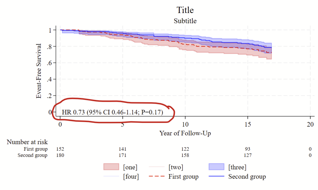
I recently made a figure that estimates a hazard ratio and renders it right on top of a Kaplan Meier curve in Stata. Here’s some example code to make this.
Good luck!
// Load example dataset. I got this from the --help stset-- file
webuse diet, clear

// First, stset the data.
stset dox /// dox is the event or censor date
, ///
failure(fail) /// "fail" is the failure vs censor variable
scale(365.25)


// Next, estimate a cox ph model by "hienergy"
stcox hienergy
// now grab the bits from output of this
local hrb=r(table)[1,1]
local hrlo=r(table)[5,1]
local hrhi=r(table)[6,1]
local pval = r(table)[4,1]
// now format the p-value so it's pretty
if `pval'>=0.056 {
	local pvalue "P=`: display %3.2f `pval''"
}
if `pval'>=0.044 & `pval'<0.056 {
	local pvalue "P=`: display %5.4f `pval''"
}
if `pval' <0.044 {
	local pvalue "P=`: display %4.3f `pval''"
}
if `pval' <0.001 {
	local pvalue "P<0.001"
}
if `pval' <0.0001 {
	local pvalue "P<0.0001"
}

di "original P is " `pval' ", formatted is " "`pvalue'"
di "HR " %4.2f `hrb' " (95% CI " %4.2f `hrlo' "-" %4.2f `hrhi' "; `pvalue')"

// Now make a km plot. this example uses CIs
sts graph ///
, ///
survival ///
by(hienergy) ///
plot1opts(lpattern(dash) lcolor(red)) /// options for line 1
plot2opts(lpattern(solid) lcolor(blue)) /// options for line 2
ci /// add CIs
ci1opts(color(red%20)) /// options for CI 1
ci2opts(color(blue%20)) /// options for CI 2
/// Following this is the legend, placed in the 6 O'clock position.
/// Only graphics 5 and 6 are needed, but all 6 are shown so you
/// see that other bits that can show up in the legend. Delete
/// everything except for 5 and 6 to hide the rest of the legend components
legend(order(1 "[one]" 2 "[two]" 3 "[three]" 4 "[four]" 5 "First group" 6 "Second group") position(6)) ///
/// Risk table to print at the bottom:
risktable(0(5)20 , size(small) order(1 "First group" 2 "Second group")) ///
title("Title") ///
t1title("Subtitle") ///
xtitle("Year of Follow-Up") ///
ytitle("Event-Free Survival") ///
/// Here's how you render the HR. Change the first 2 numbers to move it:
text(0 0 "`: display "HR " %4.2f `hrb' " (95% CI " %4.2f `hrlo' "-" %4.2f `hrhi' "; `pvalue')"'", placement(e) size(medsmall)) ///
yla(0(0.2)1)
I recently needed to make a figure for publication and the publisher didn’t like the resolution of the figure that I provided. One option is to increase the number of pixels of the rendered figure (eg increasing the width and height), the other is to create a figure using vectors that can be zoomed in as much as you want without losing quality so the journal can render the figure however they want. When you generate a PNG, JPEG, or TIFF figure, it renders/rasterizes the figure using pixels. Vectors instead embed lines using mathematical formulas, so the rendering of the figure isn’t tied to a specific resolution, and zooming in and out will redraw the lines at the current resolution of the screen. The widely-adopted SVG vector format should be universally accepted as a figure format by publishers, but isn’t for some dumb reason. PDFs and PS/EPS files can also handle vectors and are sometimes accepted by journals but require proprietary software (usually) to render. PS/EPS files are also annoying in that they don’t embed non-standard characters correctly (e.g., beta, gamma, alpha, delta characters).
Stata and R can easily output SVG files. The excellent and free Inkscape app/program can manipulate these to create merged SVG, PS, EPS, or PDFs that can then be provided to a journal. Inkscape is also nice because it will help you get around the problems with non-standard characters not rendering correctly in PS/EPS files since you can export nonstandard characters from SVG files as paths in PS/EPS files. I’m a GIMP proponent for most things but think Inkscape blows GIMP out of the water for manipulating vector images.
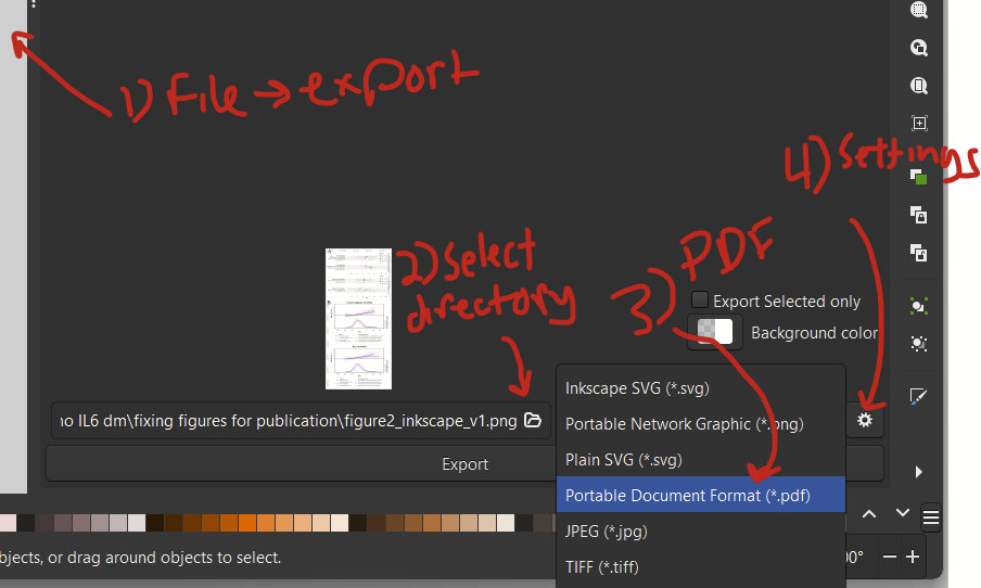
Here’s how I manipulated SVG files to make an EPS file to submit to a journal.
Step 1: In Stata or R, export your figure as an SVG file
In Stata, after making your figure, you type –graph export “MYFILENAME.svg”, replace fontface(“YOUR PREFERRED FONT”) — For my figure, I needed to provide Times New Roman, so the fontface was “Times New Roman”. Note that you can’t specify a width for an SVG file. Type –help graph export– to view general export details and details specific for exporting SVG figures.
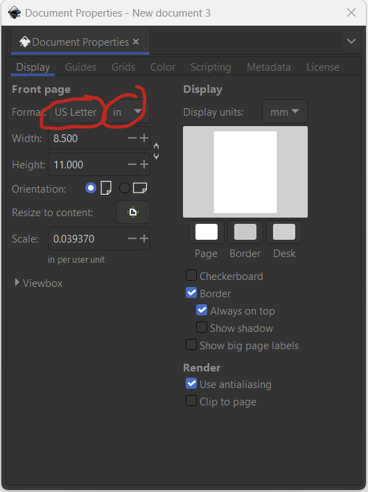
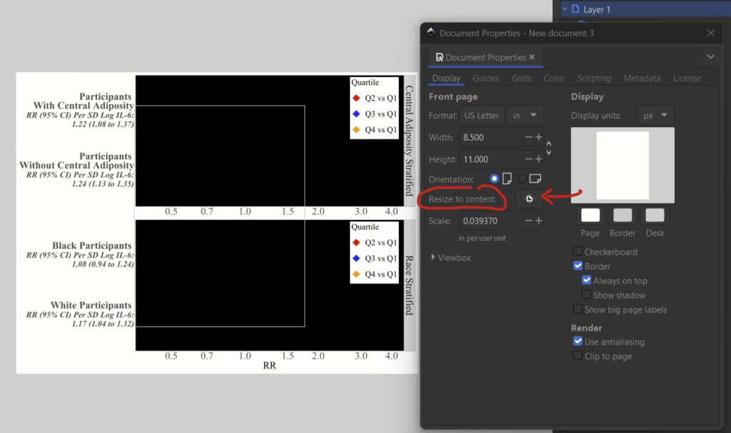
Download and install Inkscape if you haven’t already. To begin, make a new document by clicking File –> New. Change the dimensions under File –> Document Properties. I’m arbitrarily selecting US Letter and changing the format from mm to in, so I have an 8.5×11 in figure. I can change this later.
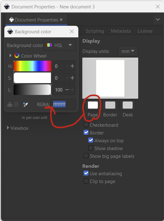
Now set the background as White, clicking the page button and then typing in 6 f letters in a row (ffffff) if it isn’t already like this. That’s the hexadecimal code for white in RGB.
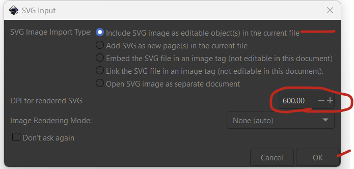
Now import your figures under file –> import. If you have an R figure, do that one first. After you select your figure, you’ll see this pop up. I set the rendered SVG DPI to 600 and left everything else as default.
You’ll see that you’ve imported your figure, but it might be a bit bigger than your layer. That’s fine, just go back to file –> document properties and select the “resize to content” button to fix this.
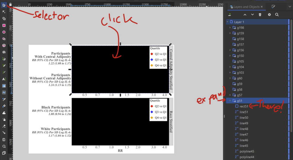
You’ll notice that these R figures have black boxes where the main graphic should be. This is apparently a bug in how R outputs SVG files (I didn’t make these specific files so I’m not sure if it’s also a bug with the svglite package). It’s pretty simple to fix, and is detailed here. It turns out that there’s a layer piece of the figure that R doesn’t specify should be transparent, so Inkspace renders it as black. if you have this problem, follow these steps:
Click on your figure then ungroup with shift+ctrl+g (or object –> ungroup).
Now open layers window on the right (if you don’t see it, open it up with layer –> layers and objects).
With the “selector tool” (the mouse), click the black box and see which layer is selected. Expand that layer and find the “rect” in it.
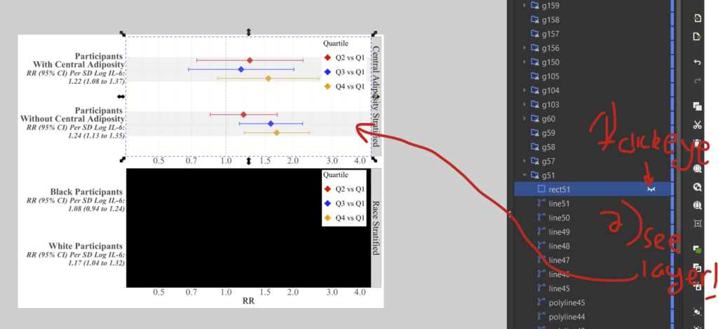
4. If you hover over the “rect” object, you’ll see a little eye icon. This will hide the layer to prove that it’s the offending layer. You’ll be able to see the underlying object.
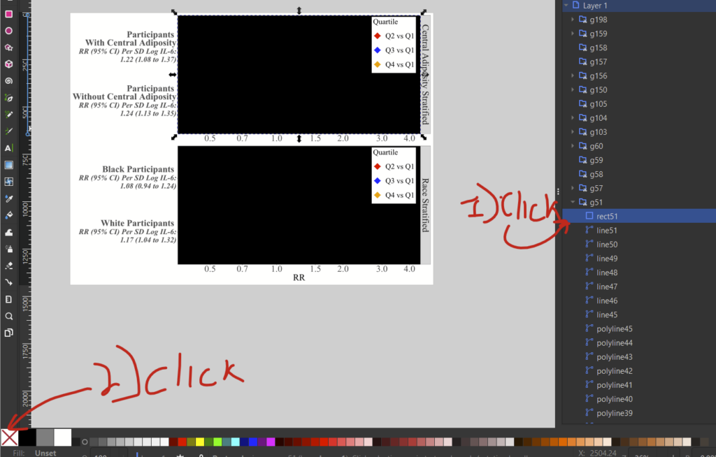
5. Now click it again to unhide it. Then, make sure you have selected that rect layer in the layers window, and click the “no fill” option in the bottom left of the screen (the white box with a red X).
6. (Optional) Drag a box over your figure to select the entire figure and then regroup it (object –> group or ctrl+g).
Now you should be set. I had to repeat the fill color steps for the other box in this figure before regrouping BTW.
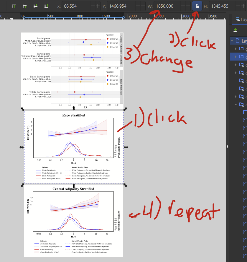
Now that I’ve fixed the R bug (hopefully this doesn’t happen to you), I’ve imported my Stata file. It comes in waaay smaller than the R one, which is fine. I’ve placed it below the other file and then (1) click on the new image so I see in/outward facing arrows, then (2) hold down CTRL+shift and select and drag the corner arrow to expand it while preserving the ratio.
I’ve imported another figure below that one. I’ve more-or-less eyeballed the layout and size of these layers, but I can fine-tune the size so they match each other. (1) click on the first figure you want to resize, then (2) click on the little deadbolt figure to lock the proportions — aka so width and height change at the same time, then (3) manually change the width to whatever you want. Then (4) repeat those steps for the other figure, and specify the same width as in step 3. Now you can move around the images so they are placed nicely.
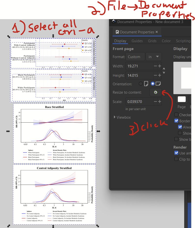
Now you’ll want to expand the document layer so it’s the size of all of the added figures. To do that, (1) select all layers with ctrl-a or edit –> select all, then (2) go to file –> document properties, and (3) click on the “resize to content” button.
Now your layer should perfectly match the size of your figures.
Step 3: Adding overlaying text
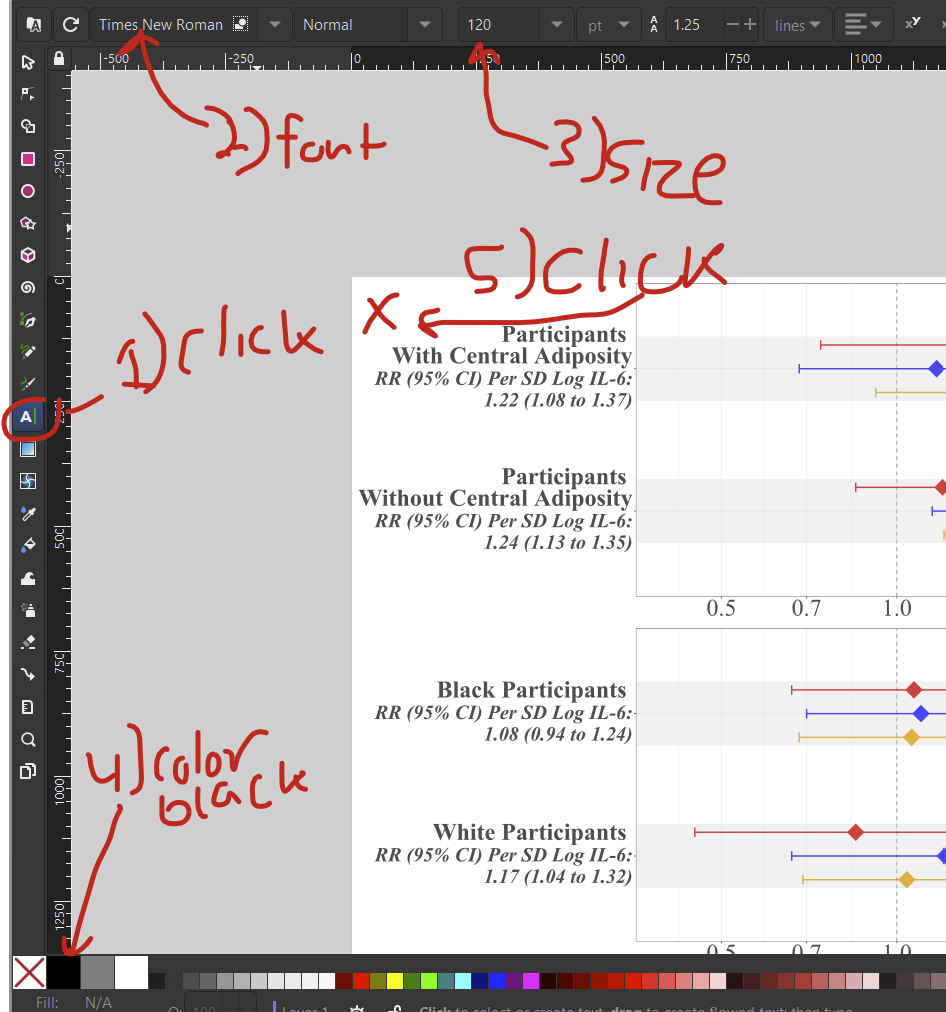
I want to add the letters “A” and “B” to this figure since it’s two separate panels. The text tool on the left (capital “A”) allows to add text. So, (1) click the text tool, then (2) choose your font, (3) choose the text size, here 120, (4) select the font color in the bottom left, here black, then (5) click where you want to add your text, and start typing.
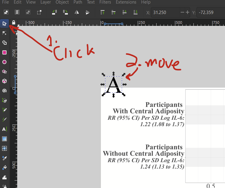
You might not get the placement perfect the first time. If you need to move it around, click the selector tool/mouse cursor icon on the top left to move the added text layer around. If you want to edit the text, select the text tool again and re-select your added text.
If your text is outside of the bounds of your document layer, you might want to “resize to content” button one more time (hit ctrl-a then go to file –> document properties, and hit the “resize to content” button).
Step 4: Saving and exporting
Step 4a: Saving as SVG for future editing with Inkscape
Inkscape’s default file format is an SVG, so I recommend saving your file as an SVG to start. Do that with ctrl+s or file –> save.
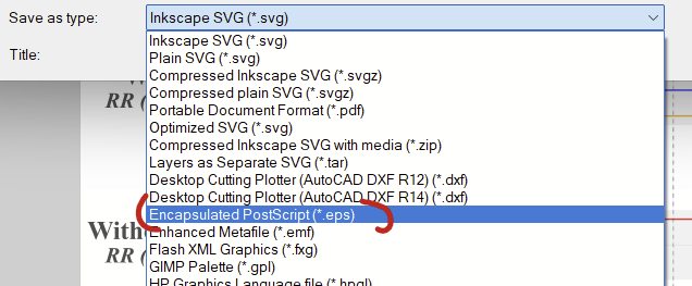
Step 4b: Saving as EPS, which is the file you’ll want to send to the publisher
The semi-proprietary EPS format is typically accepted by publishers, so you’ll want to generate this one to send off to the journal. This is done under the file –> “save as…” option (or shift+ctrl+s). In the dropdown, select “encapsulated post script (*.eps)”.
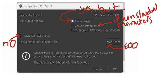
On this popup, I unchecked the button next to rasterize filter effects, I selected embed fonts. If you are using nonstandard characters (e.g., alpha, beta, gamma, delta), instead check the “convert text to paths” button. This will change the text so that it’s vectors drawn on the image and not actual font-based text. Set the resolution for rasterization to 600 DPI. Hopefully nothing is actually rasterized since avoiding rasterization was the point of this little exercise.
Note that you’ll now have 2 separate files, one SVG and one EPS (if you did both steps 4a and 4b), so for any additional edits, you’ll want to remember to overwrite your SVG and your EPS files.
Step 4c (optional): Export as PDF so you can share the figure with coauthors
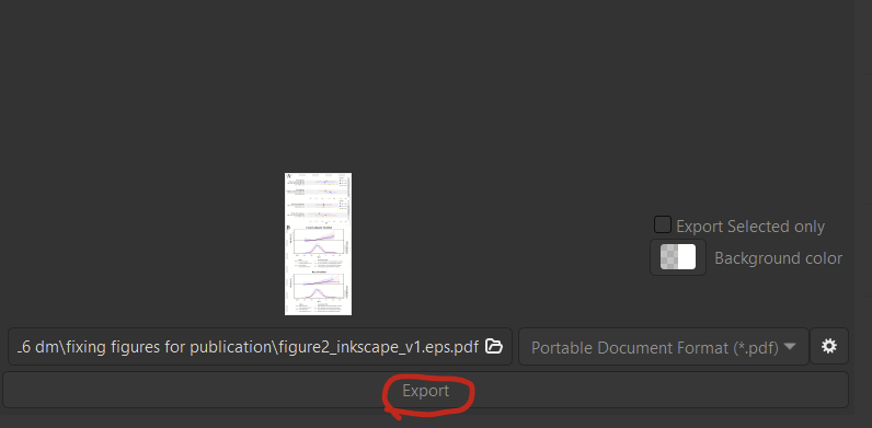
You might want to also save as a PDF since people are familiar with these. I don’t know that I would provide a PDF to a journal, probably just an EPS file. It’s nice to have PDFs to share with coauthors since they are such universally-accepted file formats. Instead of using the “save as…” option, I recommend using the file –> export option (shift+ctrl+e) to export. This will pop up an export window on the bottom right. Set your directory, select file type as PDF, then click on the little settings icon.
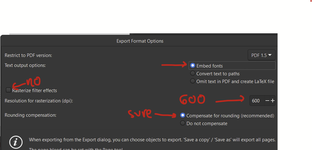
On the settings pop-up, I selected “no” for rasterize filter effects. Embedding the fonts might be preferable to converting text to paths since it will retain compatibility with screen reading software. Set the DPI to 600. I also left the default for compensating for rounding. Whatever that means.
Then pop out of that window and click the big export button and you’re done!
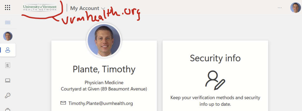
Those of us with accounts at both the Larner College of Medicine (hereafter, “med.uvm”) and UVM Health Network (hereafter, “uvmhealth.org”) know the frustration of trying to access uvmhealth.org resources from the web on anything but a medical center-owned computer or the Virtual Desktop. For me, I notice the uvmhealth.org account auto-logs out on my home computer after about 10 minutes whereas my med.uvm account stays logged in basically forever. And for whatever reason, this breaks the “usual” uvmhealth.org login prompt.
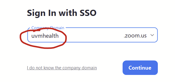
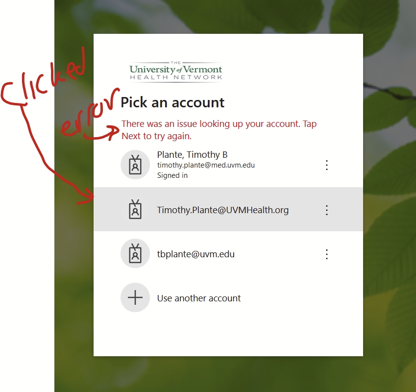
The classic scenario is that I’ll try to log into some uvmhealth.org resource on my personal laptop (say, signing into uvmhealth.org’s Zoom account with the “sign in with SSO” option, typing in “uvmhealth” at the prompt in the Zoom app, which pops up a web-based login page) and I’ll see a list of my Microsoft 365 accounts that I’ve logged in with previously. The uvmhealth.org one will be right there. If I click on it, I get this weird error saying “There was an issue looking up your account. Tap Next to try again.”. This is because I’m not already logged into uvmhealth.org in my browser so it can’t even find my account. I can’t log in. Super frustrating.
It turns out that Microsoft has a handy but not-well-known My Account website that allows you to directly control which Microsoft 365 accounts your browser is currently logged into. As a bonus, if you log into your uvmhealth.org account on the Microsoft My Account website, you can easily access Office 365 resources (e.g., Outlook, Sharepoint, OneDrive) and a few other uvmhealth.org web-based resources (eg Workday) with a few clicks. Very simple.
So, when I want to access uvmhealth.org’s Zoom web-based login, I first log into my uvmhealth.org account at the Microsoft My Account website and then I log into uvmhealth.org’s Zoom account using the “sign in with SSO” option. It always lets me right in.
Here’s how to do this.
Using the Microsoft My Account website to manage access to uvmhealth.org sites in your web browser
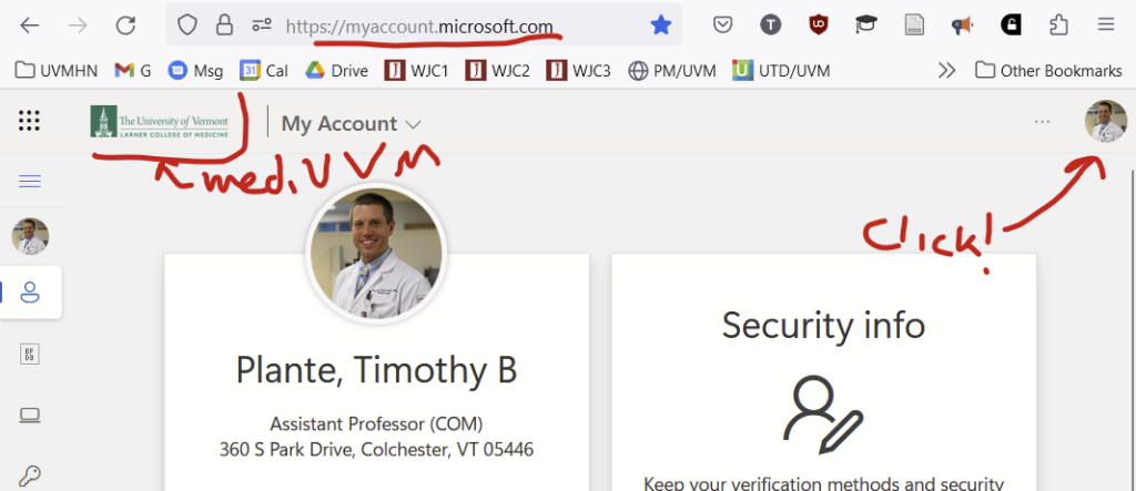
This Microsoft My Account website is located at https://myaccount.microsoft.com/ — Please bookmark this website somewhere obvious in your browser. If you are like me, you’ll use it a lot.
Head over to that website. (If you try to access the Microsoft My Accounts website and you aren’t already logged in persistently with some Microsoft 365 account, it might just prompt you to log in with your uvmhealth.org account and you might be all set. If this is the case, skip down to the next section that starts with “Things that you can do now that you are logged into…”.)
I’m persistently logged in with my med.uvm account so the homepage for my Microsoft My Accounts website loads with details from my med.uvm account.
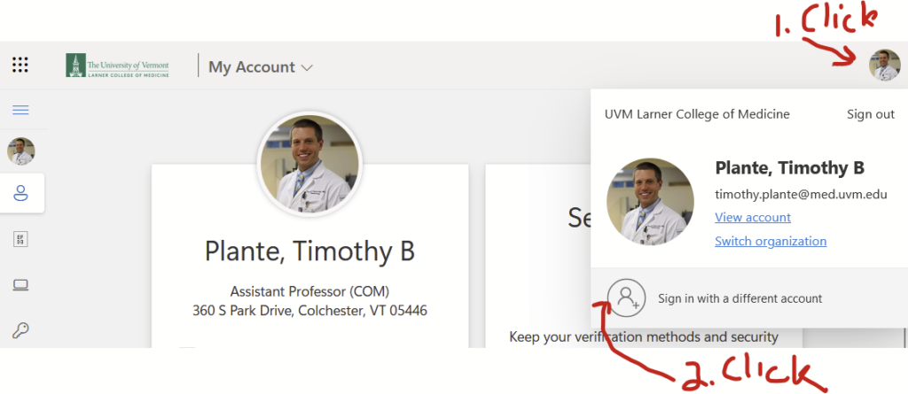
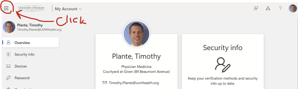
Let’s now use the Microsoft My Account website to log into my uvmhealth.org account. In the top right corner, you’ll see a smaller version of your photo or user initials. Click on that…
…and you’ll see the option to “Sign in with a different account”. Click that.
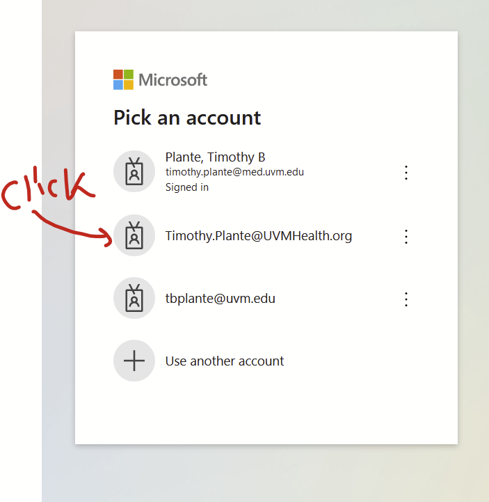
Now you’ll see a Microsoft 365 login screen that doesn’t have med.uvm or uvmhealth.org branding. Select the account you want to log into. Here, that’s my uvmhealth.org account. It will bring you to the uvmhealth.org login page. It should actually let you log in this time.
Things that you can do now that you are logged into the Microsoft My Account website with your uvmhealth.org account
You should be back on your Microsoft My Account homepage. DO NOT CLOSE THE BROWSER AT THIS POINT. The Microsoft My Account looks different since it shows details from my uvmhealth.org account. Quite the ancient photo of me before I had multiple kids and a lot more grey hair:
Now go back to whatever uvmhealth.org website you are trying to access and attempt to log in again. For me, that was the logging into uvmhealth.org’s Zoom account in the Zoom app, which prompts a web-based sign-inso I can start my telemedicine clinic. It should let you right in. If it doesn’t, make sure that you used Microsoft My Account in the browser that Zoom opens to log in.
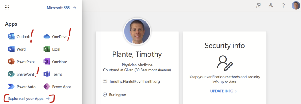
Bonus: Simple access to your uvmhealth.org Outlook, SharePoint, OneDrive, and a few other resources from within the Microsoft My Account webpage
Now that you are logged into your uvmhealth.org account, you can easily access your Office 365 resources from within the Microsoft My Account webpage. Click the square of dots in the upper left corner…
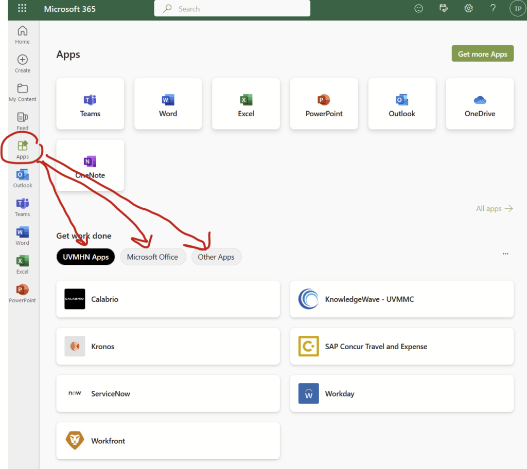
And you’ll see a menu of Outlook, OneDrive, SharePoint, and more. Click on those and it will bring you right to the web-based version of those resources without an additional login. If you click on the “Explore all of your Apps –>” link…
…you’ll find “UVMHN Apps”, including Calabrio, KnowledgeWave, Kronos, Concur, ServiceNow, Workday, and Workfront. I honestly don’t know what half of those apps do. I requested IT to add Zoom here but they declined for reasons that I don’t at all understand. There’s also an expanded list of “Microsoft Office” apps. There’s also “Other Apps”, which adds a few other apps that have other indecipherable names.
We have 2 separate email accounts at UVM if you are on the medical faculty: (1) the College of Medicine aka med.uvm.edu and (2) the hospital aka uvmhealth.org. They don’t integrate. (There’s actually a 3rd one with the University aka uvm.edu without the med, but that easily forwards to the College of Medicine email.) Having two separate inboxes is kind of a pain but is somewhat manageable. Having two separate calendars is nonsense. I use my College of Medicine email as my primary and only calendar.
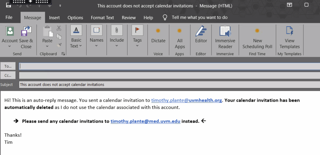
To keep my hospital calendar from being used accidentally by well-meaning people trying to send me calendar invites, I set up a rule in my hospital Outlook account that automatically sends a reply to all calendar invitations. This reply says that the invite was deleted and to send the invite to my College of Medicine account instead. Works like a charm.
Here’s how I did it.
Step 1: Open up the desktop version of Outlook for the calendar you don’t want to use
This won’t work with the internet browser version of Outlook. For med.uvm.edu, use your desktop version of Outlook, which you can install on any device.
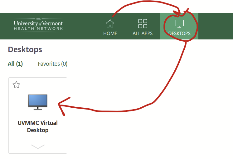
For uvmhealth.org, accessing the Outlook desktop app is a bit more complicated. On campus, log into a hospital-owned desktop and open up Outlook. Off campus, log into the Citrix Workspace portal using your hospital credentials then open up the virtual desktop that’s under the “Desktops” tab.
Wait for the virtual desktop to open then open up the desktop version of Outlook.
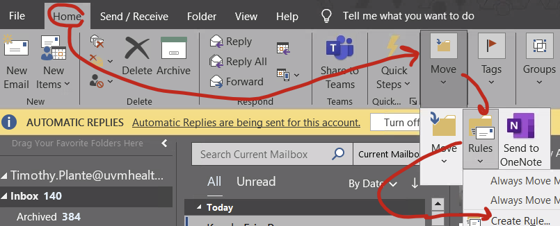
Step 2: Open up the “Rules” function
This is hidden under the Home –> Move –> Rules –> “Create rule…” if your window isn’t all the way expanded or Home –> Rules –> “Create rule…” if your window is really big.
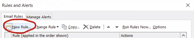
Step 3: Make a rule
In the Rules and Alerts pop-up, select “new rule…”
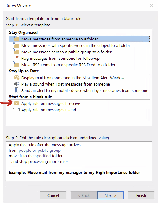
On the Rules Wizard, select “Start from a blank rule… Apply rule on messages I receive” and click next.
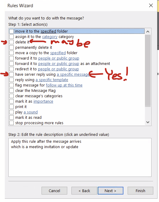
In your new rule, select for Select Conditions, scroll way down and select “Which is a meeting invitation or update” and click next
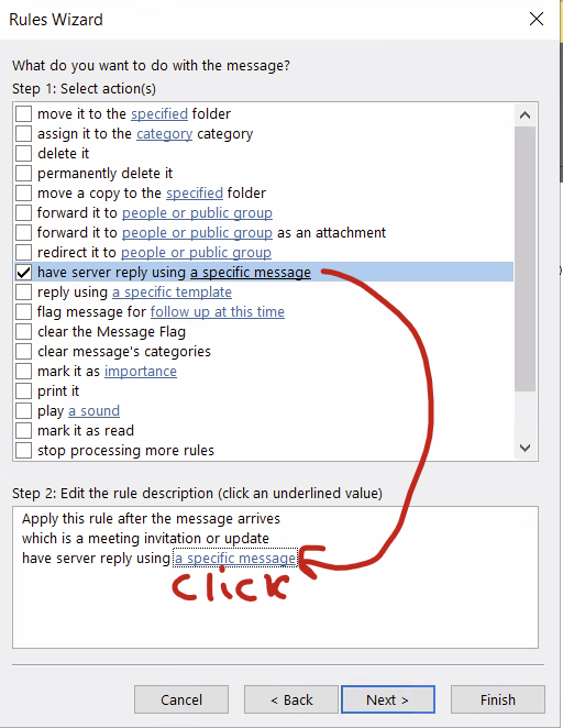
For Select actions, select “have server reply using a specific message” at the very least. You can also select “delete it” if you want to really delete it but you can also just pretend you are deleting it and folks will assume you really did delete it. It’s the same effect in my opinion.
After checking at least the “have the server reply…” option, click at the link in the bottom half of the window to pop up the “specific message” to reply with.
This pops up a blank message that you can fill out. Make sure to fill out a very clear subject line as well as the actual message that will go back to the person who sent you the calendar invite. Hit “save and close” when done. Then click “next” on the Select Options menu.
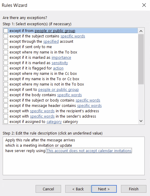
For Exceptions, I didn’t include any exceptions so this was blank and I clicked next.
Then turn the rule on and you should be good to go! Give it a test by sending a calendar invite from your other account.
A student shared this paper by Blakeway and colleagues. It shows the leads of the heart color-coded by region. It’s awesome. I’m posting it here mostly so I can find it again. Link to the PDF, look at the figure on Page 2: https://www.resuscitationjournal.com/article/S0300-9572(12)00053-6/pdf
Citation: Blakeway E, Jabbour RJ, Baksi J, Peters NS, Touquet R. ECGs: colour-coding for initial training. Resuscitation. 2012 May;83(5):e115-6. doi: 10.1016/j.resuscitation.2012.01.034. Epub 2012 Feb 2. PMID: 22306667. https://pubmed.ncbi.nlm.nih.gov/22306667/
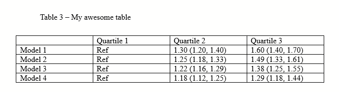
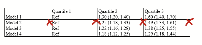
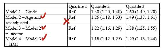
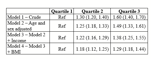
Tables can render weirdly in MS Word and Powerpoint, and you can have a hard time figuring out why. Here’s few steps to fix them so they are snappy.
First: MS Word example (see Powerpoint below)
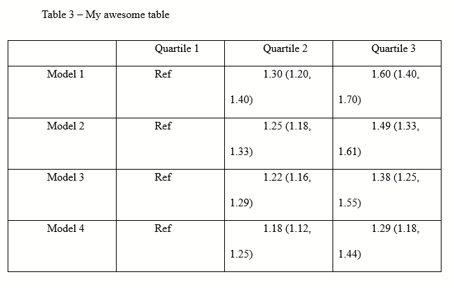
You get a table that looks like this. You start pulling your hair.
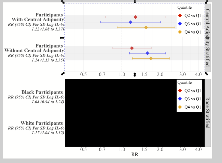
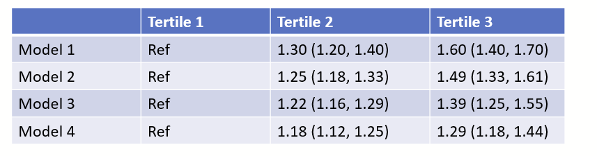
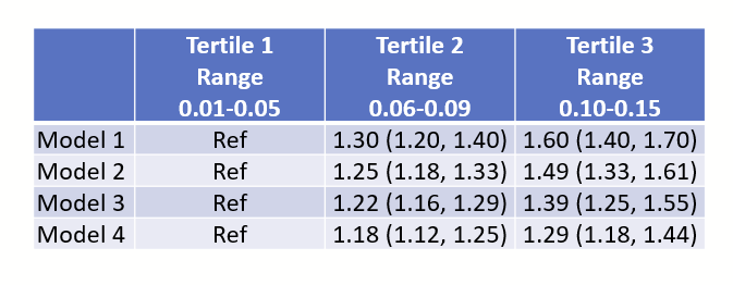
(Ignore that there are only 3 quartiles, I should have written tertile and made all of the figures in this post before I realized that typo.)
Step 1: fix the “paragraph” settings.
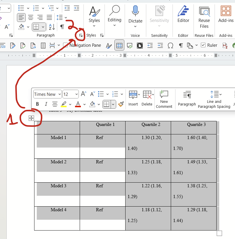
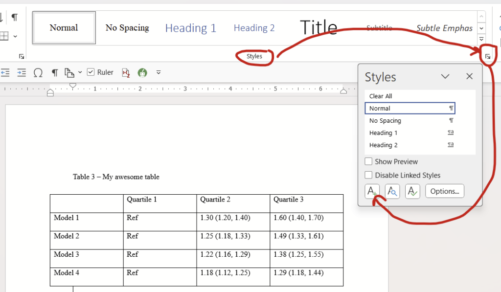
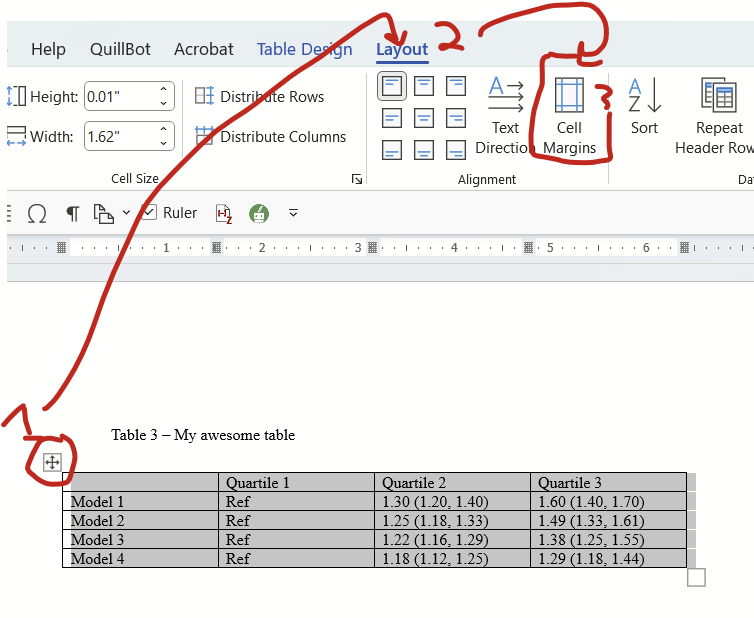
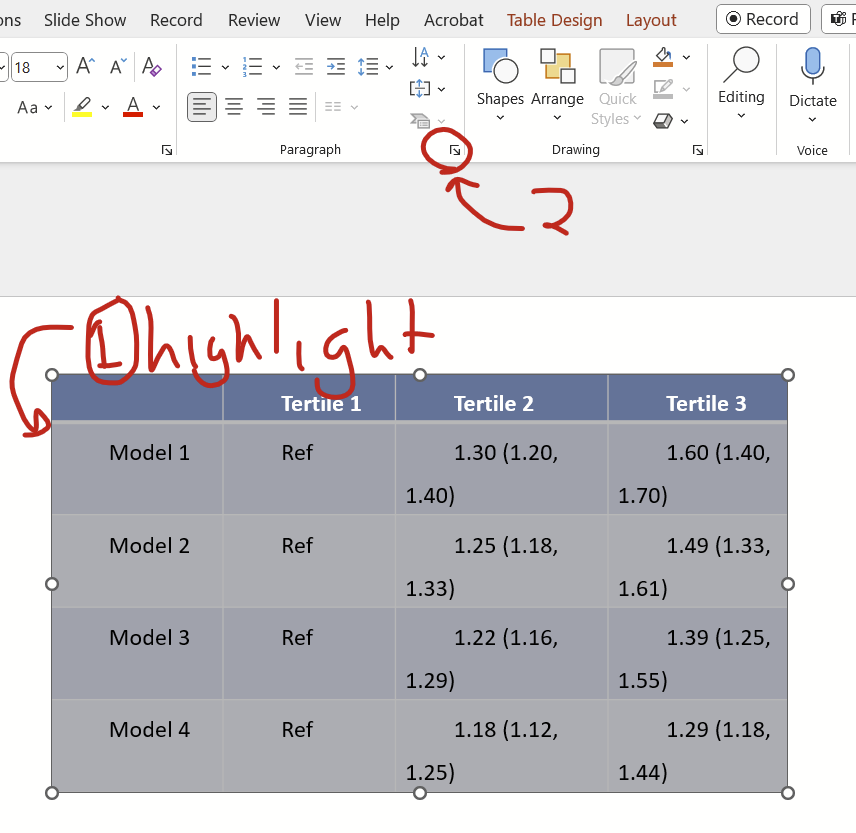
Select the entire table by clicking this symbol in the top left, then click the tiny little arrow at the bottom right of the paragraph options on the home tab:
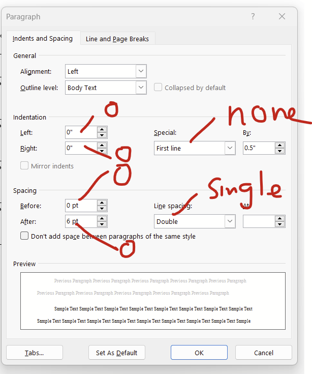
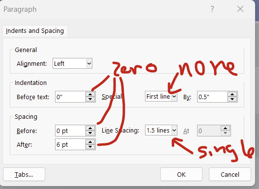
This paragraph dialogue will open up. Change indentations to zero on left and right, for the dropdown of “special”, change it to “none”, and change spacing to zero for before and after, and change line spacing to single.
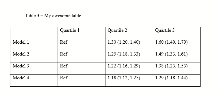
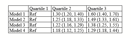
Now we go back to our table and see that it looks a little better.
Step 1B (optional): Save the fixed paragraph formatting as a new Style
For bonus points: Save this paragraph format as a new style called “Tables” that you can apply and edit as needed! While on the “Home” tab, click this little box at the bottom right of the Styles section, then click the A+ button that appears.
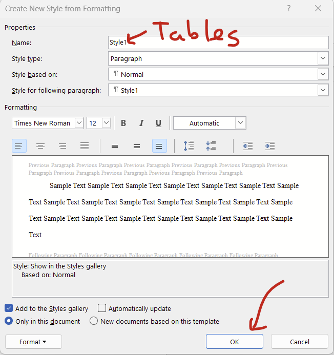
On the pop-up screen, name the style “Tables”, leave everything else unchanged, then hit “okay”.
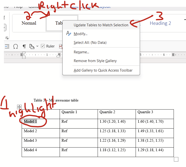
Now highlight some text in your table, right click the “Tables” style in the home/Styles block, and click “update tables to match selection”.
Now to fix the paragraph settings for future tables all you need to do is select the entire table (top left symbol on table) and click the “Tables” style. You can also edit the font and paragraph settings of all tables that have your Table style applied simultaneously by editing the Tables style directly (right click on “Tables” style then click “Modify”). This is handy if you want to change the fonts from Times New Roman to Arial all at once, for example.
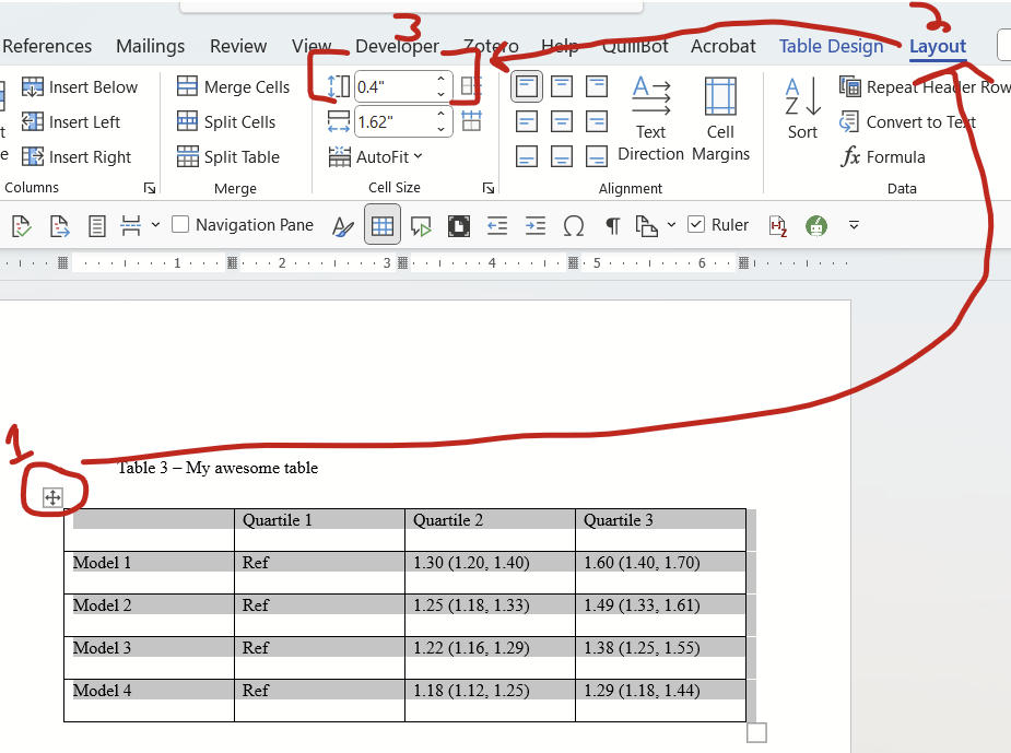
Step 2: Change cell size minimums
The cells are still pretty tall. Let’s see if we can fix that. Click on the symbol on the top left again to highlight the entire table, go to the layout tab, then find the cell size box for HEIGHT (we don’t care about width now). Change this to zero. (It will change itself to 0.01″ and that’s fine.)
There we go! A much neater table. We can do one better though, there’s still a bit of extra spacing in the cell margins that can probably be removed.
Step 3: Narrowing the margins
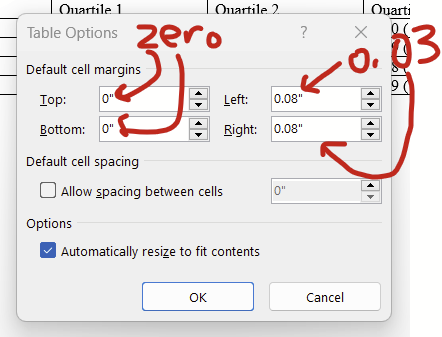
Select the entire table by clicking the symbol on the top left, go to the Layout tab, then click “Cell Margins”.
In the window that pops up, change the left and right margin to 0.03 or 0.04. The top and bottom should be zero if they aren’t already.
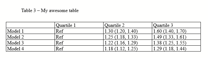
Now the text is a little closer to the cell border. It’s subtle, but it’s there! Notice how the “M” in “Model” is pretty close to the left border. This example uses 0.03 as left and right, you might opt to use 0.04 instead if this is too narrow for you.
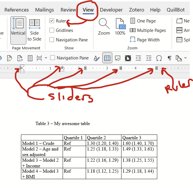
Step 4: Resizing your columns
This is pretty straightforward. Double click on the column borders (where I drew x marks) to shrink the column to be the maximum width of the contents of the cells.
Now you have this:
But let’s say that you have some sort of really wide cell for some reason?
Notice that the first column has long labels. If you click on the borders of the columns (starting with the right most, moving left), you get this:
…But let’s say that you wanted to have the text wrap a bit more neatly, rather than be stretched out? In this scenario, I recommend strategically inserting line breaks (“hitting enter or return”, red checks in this picture) so the text wraps at the maximum width of the cell that you want. THEN click the right border of the first column to shrink it down:
…and you get this:
If you want even more control over column width, you can directly adjust them using the sliders on the ruler. If you don’t see the ruler, you need to turn it on under “View” tab then check the box next to “Ruler”. Then click anywhere on your table and you’ll see the grey sliders appear on the ruler.
Step 5 (optional): Final tweaks
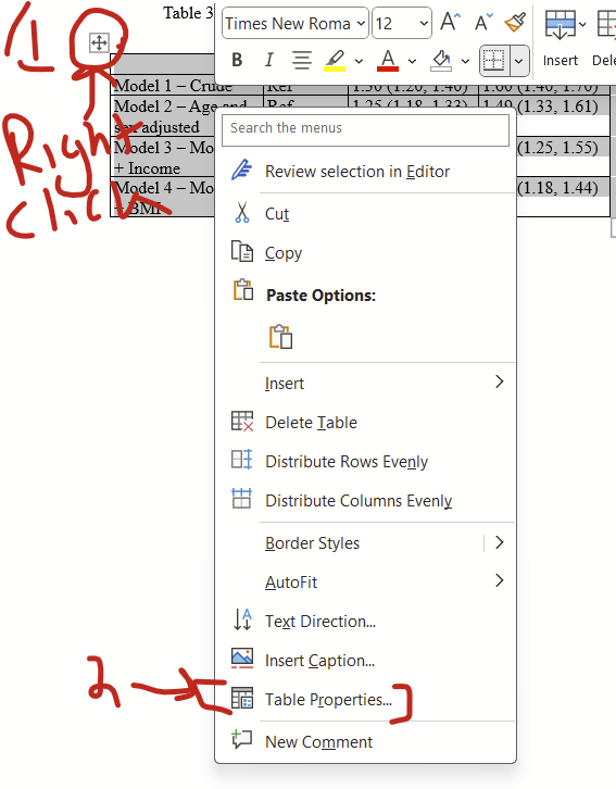
I think all cells should have the text floating in the middle (rather than all the way at the top, which is default), which can be changed by RIGHT clicking on the top left symbol then selecting table properties…
…and then selecting the “Cell” tab and clicking the “Center” option.
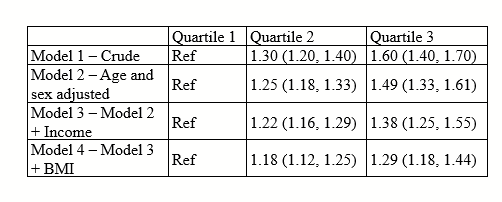
Now notice that things are floating nicely with vertical centering.
I also like to make the top row’s font bolded, and center all columns except the first.
Now you can fiddle with the font type and size as needed. And there you are! What I think is a nicely optimized table.
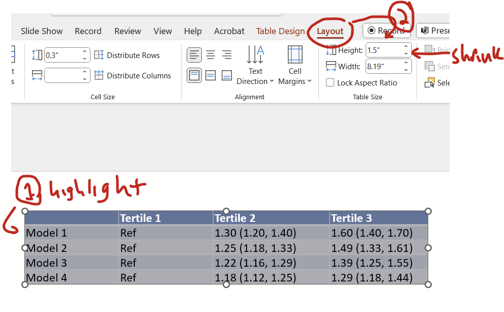
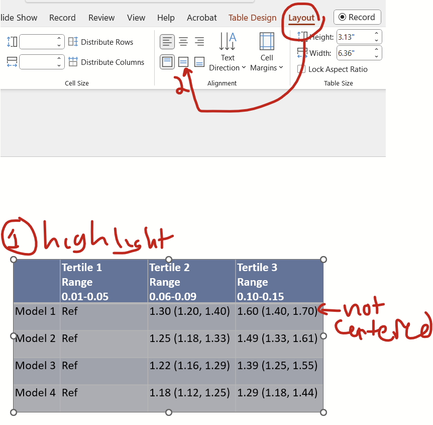
Second: PowerPoint example
You have a table that looks like this:
Step 1: Fixing paragraph settings
First, highlight the entire contents of the table (there’s no top left icon in PPT like there is in Word to highlight the entire table) then click on the little button at the home tab’s paragraph section’s bottom right.
On the pop up window, change indentation and spacing before and after to zero, special to none, and line spacing to single, and click okay.
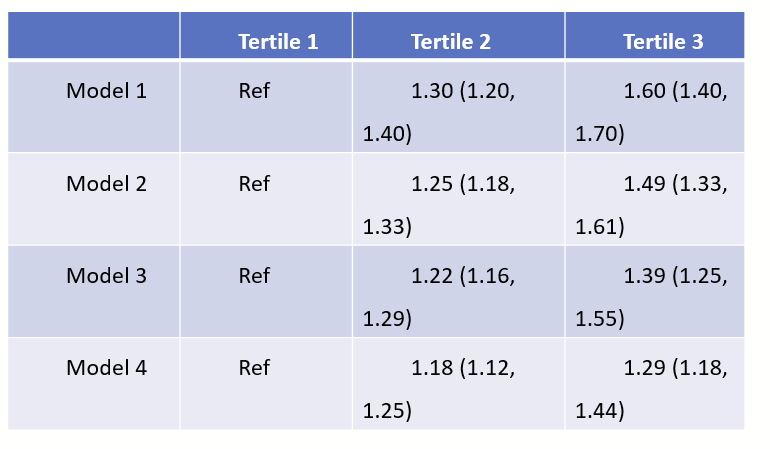
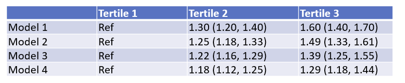
Now we see a less unwieldy table!
The margins separating the text to the
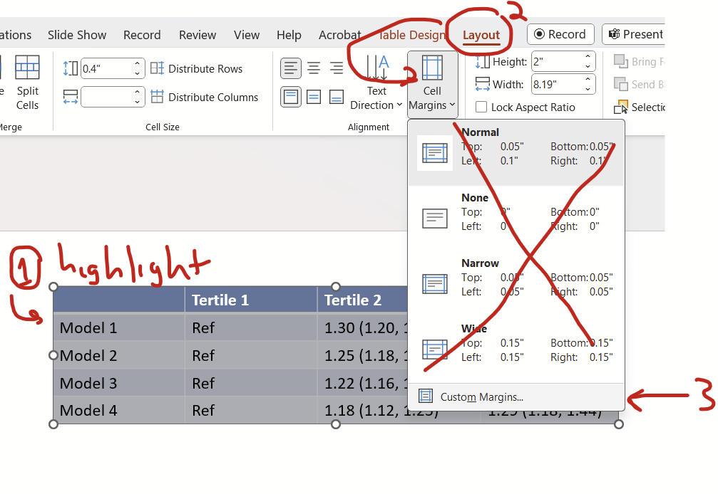
Step 2: Reduce cell margins
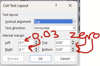
Let’s shrink the cell margins, which is the distance between the text and the border of the cells. Highlight the contents of your table, then on the layout tab, drop down the options under “cell margins”. Ignore the options inside and go to custom margins.
On the pop up window, change the left and right margins to 0.03 or 0.04 and change the top and bottom to zero.
Now we have some nice narrow margins!
Step 3: Reduce cell height
Let’s shrink down the height of the cells. Highlight the contents of the table, then under the layout tab, reduce the height as much as the down button will let you. Don’t worry about the width.
Now you have a table that is nice and short. (It didn’t actually change the table in this example so nothing to look at.)
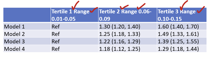
Step 4: Fix the column width
Let’s fix the width of the columns. In this example, I added some extra text in the first row. First, insert line breaks (“hit enter or return”) strategically so the cells aren’t overextended by length of lines. In this example, I’m inserting line breaks where the checks are
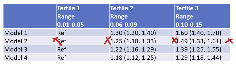
Now double click the border line of the columns to auto-fit the width.
Now you have a nice narrow table:
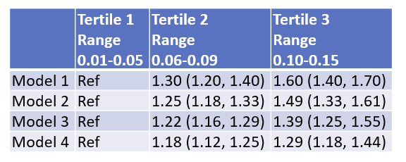
Step 5 (optional): Final tweaks
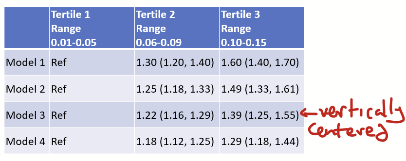
I think all cells should be arranged vertically, you hit this button under they layout tab to arrange the content vertically centered.
Now the cells are vertically centered!
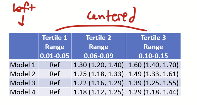
I also think that all columns except the first should be centered, so highlight those columns and hit the center button. I leave the first column aligned left.
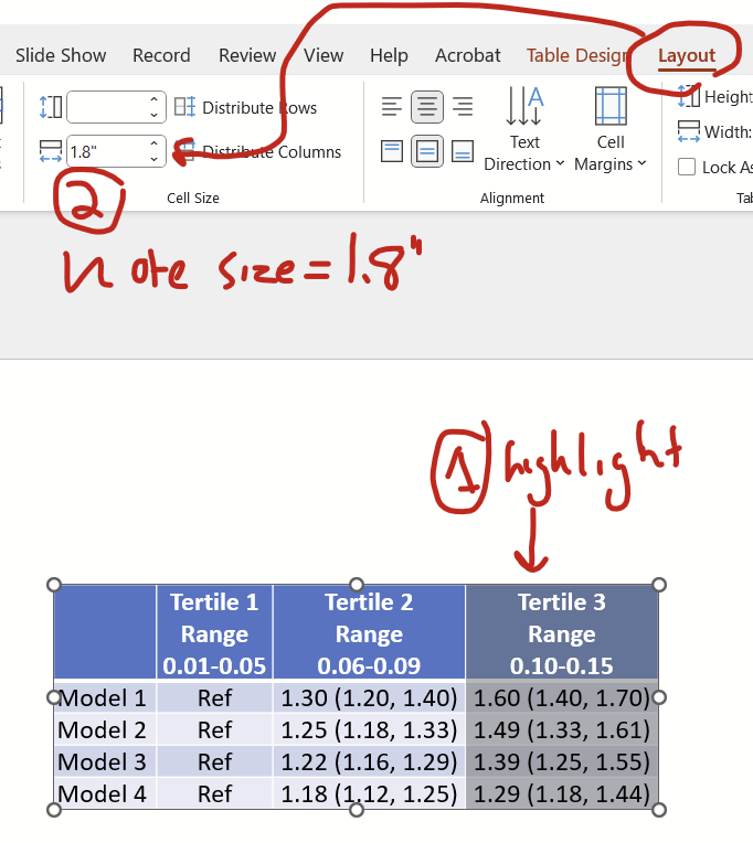
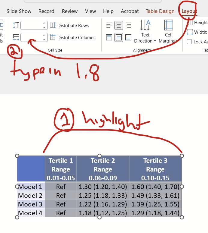
Now you might want to make all columns except the first the same width as the widest column. Specifically, notice that the Tertile 1 column (with the “ref”) is narrower than the other two. Click on the widest column and under the layout tab, note that the cell size width is 1.8″.
Now highlight all tertile columns and under the layout tab, type “1.8” (without quotes) into the cell size width box and hit enter.
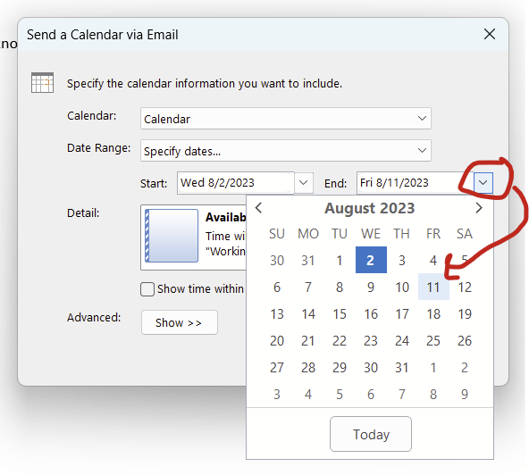
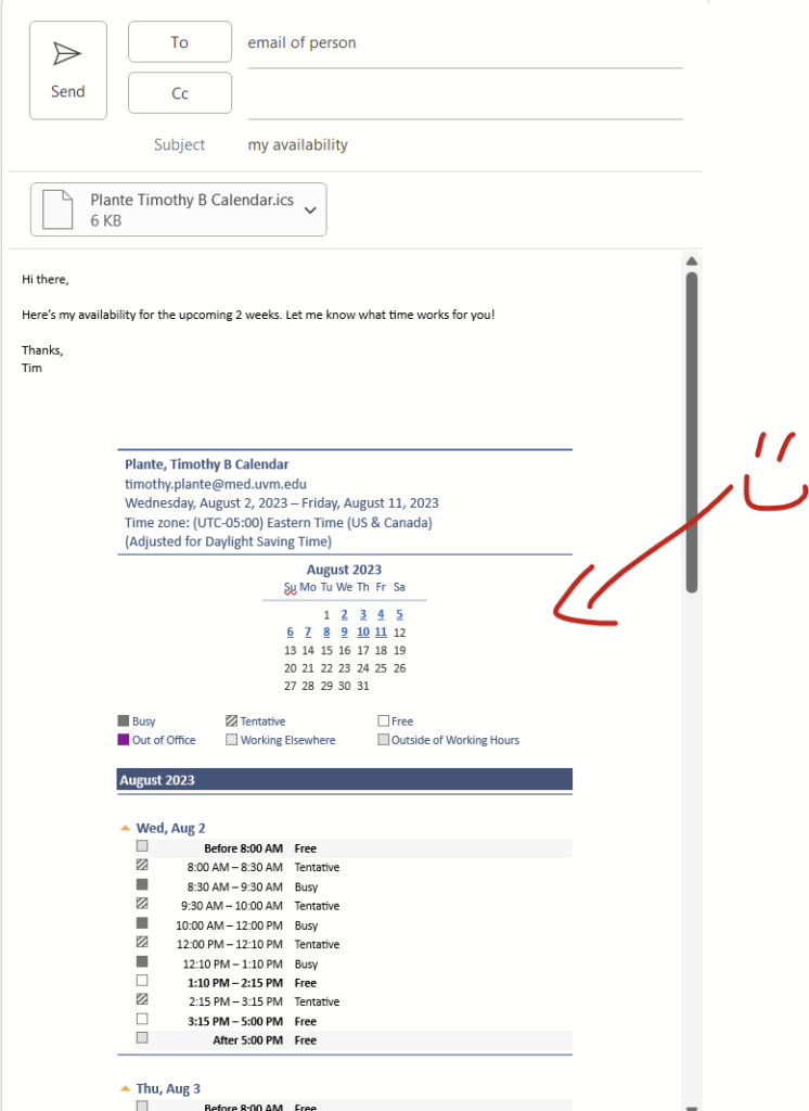
Scheduling meetings with someone inside of your institution is pretty easy in Outlook since you can typically look at shared availability with the Scheduling Assistant when generating a calendar invitation. Things get a bit more complex for folks outside of your institutions, which is why there are services like Doodle, WhenIsGood.net, and When2Meet.com. When you are trying to meet with 1 or 2 people outside of your institution, you can instead directly send your calendar availability in-line in an email.
Steps:
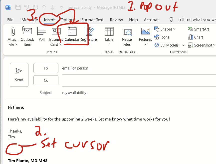
Pop out your email message draft
Click to set your cursor where you want your calendar to appear
Click insert –> calendar (you probably need to make your window full screen in order to see this calendar option)
Next:
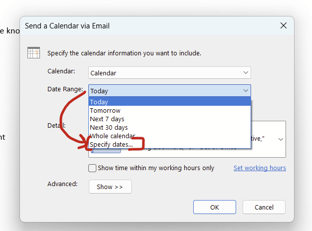
4. Change the date range to “specify dates…”
5. The start date will be today. Change the end date to some other date.
6. Click “okay” and then you’ll have your calendar in-line! It also tacks on an ics file.
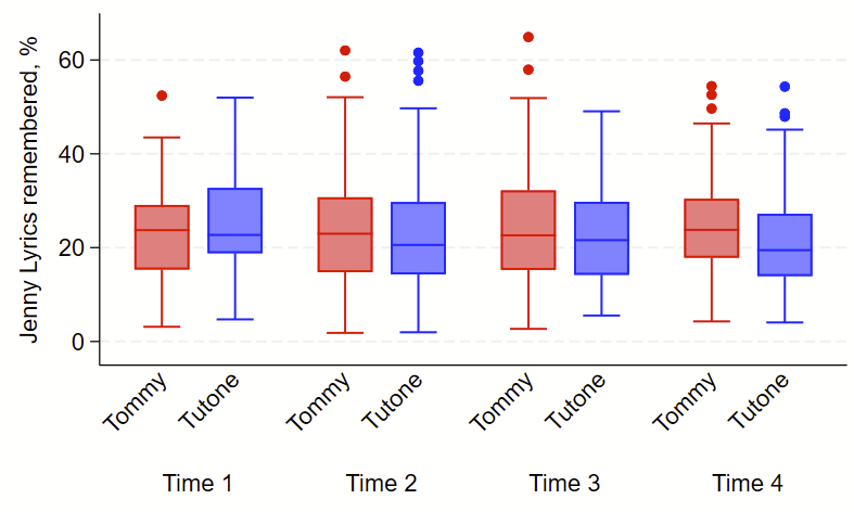
I recently had to make some boxplots with Stata’s –graph box– command. I find this to be challenging to use since it varies from syntax from the –twoway– command set that I use all the time. I was using the –over– subcommand x2 and wanted to change the colors of each box & dots by group from the first –over– subcommand. I found some helpful details on the Statalist Forum here and here. Here’s what I did to accomplish this, using the help from the Statalist forum.
Some tweaks here: I wanted to show rotate some labels 45 degrees with –angle– and I also aggressively labeled variables and their values so I didn’t need to manually relabel the figure (which is done with the –relabel– subcommand if needed). It takes an extra 30 seconds to label variables and values, and will save you lots of headbanging fiddling with the –relabel– command, so just label your variables and values from the start.
This example uses fake data. Code follows the picture. Good luck!
clear all
set obs 1000 // blank dataset with 1000 observations
set seed 8675309 // jenny seed
gen group = round(runiform()) // make group that is 0 or 1
gen time = round(3*runiform()) // make 4 times, 0 through 3
replace time = time+1 // now time is 1 through 4
gen tommy2tone = 100*rbeta(3,10) // fake skewed data

// now apply labels to variables.
// technically you only need to label the 3rd one
// of these since categorical variable value labels
// are shown instead of the variable label itself,
// but might as well do all 3 in case you need them
// labeled somewhere else.
label variable group "Group"
label variable time "Time"
label variable tommy2tone "Jenny Lyrics remembered, %"

// now make value labels.
* group
label define grouplab 0 "Tommy" 1 "Tutone"
label values group grouplab //DON'T FORGET TO APPLY LABELS

* time
label define timelab 1 "Time 1" 2 "Time 2" 3 "Time 3" 4 "Time 4"
label values time timelab //DON'T FORGET TO APPLY LABELS

// code for boxplot
graph box tommy2tone ///
, ///
over(group, label(angle(45))) ///
over(time) ///
scale(1.3) /// embiggen labels & figure components
box(1, color(red)) marker(1, mcolor(red)) ///
box(2, color(blue)) marker(2, mcolor(blue)) ///
asyvars showyvars leg(off)