Use Stata to download the NY Times COVID-19 database and render a Twitter-compatible US mortality figure

Note: this code probably doesn’t work anymore with changes in the NY Times database. I’m keeping it here for historical purposes (4/22/2022).

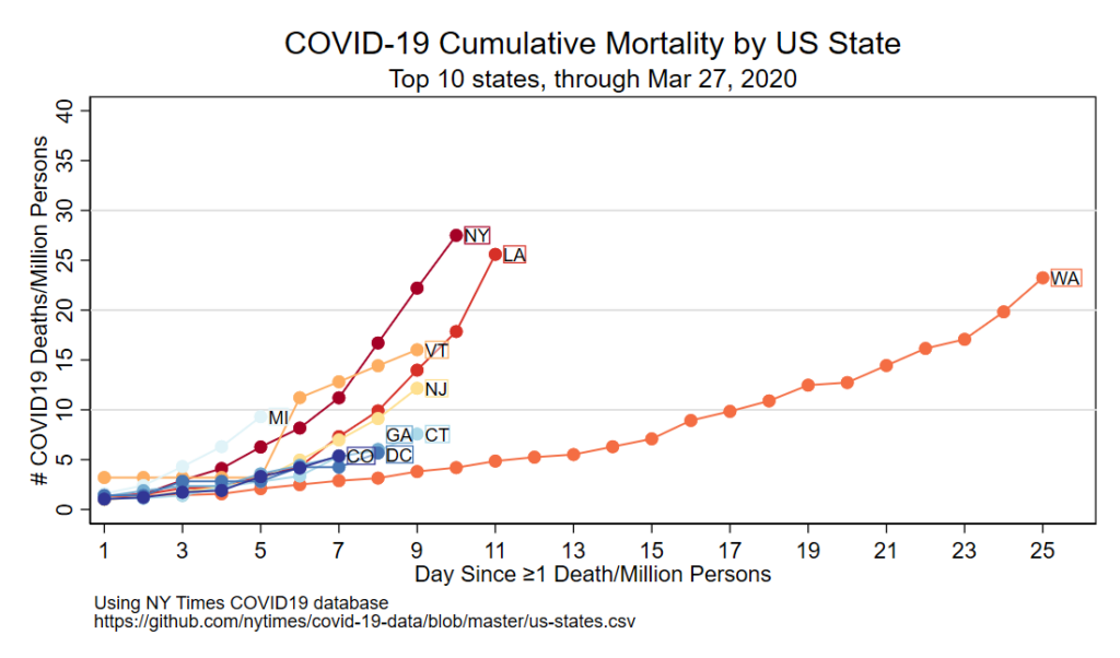
Here’s the figure!

Code follows

Comments are in-line below. Some unique strategies in this code:

  • This will automatically download the latest NY Times dataset, but the date of “last day of follow-up” needs to be specifically defined. I find that the label locations need to be tweaked every day, and this process isn’t simple to automate.
  • The colors are defined by global macros once and are applied multiple times by calling those macros.
  • Text blocks are rendered next to the last day of follow-up with a translucent white background and non-translucent colored border that matches the dotted line.
  • Twitter figures should be output at 1100 x 628, per this blog. This script does that. Twitter clips images that aren’t this size.
****************************************************
// step 1: download  and save NY times database
****************************************************
version 15.1 // my version of Stata when this was written

import delimited using ///
"https://raw.githubusercontent.com/nytimes/covid-19-data/master/us-states.csv", ///
varn(1) clear

// Now make the date a stata date. Load this handy date-fixing program 
// I wrote. The syntax is 'fixdate [variable name] [mdy, ymd, etc]
do https://www.uvm.edu/~tbplante/fixdate_v1_0.do
fixdate date ymd
// rename state to state_fullname
rename state state_fullname
****************************************************
// step 2: keep 50 states+DC, apply abbreviations
****************************************************
gen state=" " 
replace state="AL" if state_fullname=="Alabama"
replace state="AK" if state_fullname=="Alaska"
replace state="AZ" if state_fullname=="Arizona"
replace state="AR" if state_fullname=="Arkansas"
replace state="CA" if state_fullname=="California"
replace state="CO" if state_fullname=="Colorado"
replace state="CT" if state_fullname=="Connecticut"
replace state="DE" if state_fullname=="Delaware"
replace state="FL" if state_fullname=="Florida"
replace state="GA" if state_fullname=="Georgia"
replace state="HI" if state_fullname=="Hawaii"
replace state="ID" if state_fullname=="Idaho"
replace state="IL" if state_fullname=="Illinois"
replace state="IN" if state_fullname=="Indiana"
replace state="IA" if state_fullname=="Iowa"
replace state="KS" if state_fullname=="Kansas"
replace state="KY" if state_fullname=="Kentucky"
replace state="LA" if state_fullname=="Louisiana"
replace state="ME" if state_fullname=="Maine"
replace state="MD" if state_fullname=="Maryland"
replace state="MA" if state_fullname=="Massachusetts"
replace state="MI" if state_fullname=="Michigan"
replace state="MN" if state_fullname=="Minnesota"
replace state="MS" if state_fullname=="Mississippi"
replace state="MO" if state_fullname=="Missouri"
replace state="MT" if state_fullname=="Montana"
replace state="NE" if state_fullname=="Nebraska"
replace state="NV" if state_fullname=="Nevada"
replace state="NH" if state_fullname=="New Hampshire"
replace state="NJ" if state_fullname=="New Jersey"
replace state="NM" if state_fullname=="New Mexico"
replace state="NY" if state_fullname=="New York"
replace state="NC" if state_fullname=="North Carolina"
replace state="ND" if state_fullname=="North Dakota"
replace state="OH" if state_fullname=="Ohio"
replace state="OK" if state_fullname=="Oklahoma"
replace state="OR" if state_fullname=="Oregon"
replace state="PA" if state_fullname=="Pennsylvania"
replace state="RI" if state_fullname=="Rhode Island"
replace state="SC" if state_fullname=="South Carolina"
replace state="SD" if state_fullname=="South Dakota"
replace state="TN" if state_fullname=="Tennessee"
replace state="TX" if state_fullname=="Texas"
replace state="UT" if state_fullname=="Utah"
replace state="VT" if state_fullname=="Vermont"
replace state="VA" if state_fullname=="Virginia"
replace state="WA" if state_fullname=="Washington"
replace state="WV" if state_fullname=="West Virginia"
replace state="WI" if state_fullname=="Wisconsin"
replace state="WY" if state_fullname=="Wyoming"

replace state="DC" if state_fullname=="District of Columbia"

drop if state==" " // drop guam, VI, PR. would be reasonable to add them back
// would need to get their populations for the list below. 
****************************************************
// step 3: apply population by state
****************************************************
// ref: 
// https://www.census.gov/data/tables/time-series/demo/popest/2010s-state-total.html
// http://www2.census.gov/programs-surveys/popest/datasets/2010-2019/national/totals/nst-est2019-alldata.csv?#
gen statepop=.
replace statepop=4903185 if state=="AL"
replace statepop=731545 if state=="AK"
replace statepop=7278717 if state=="AZ"
replace statepop=3017804 if state=="AR"
replace statepop=39512223 if state=="CA"
replace statepop=5758736 if state=="CO"
replace statepop=3565287 if state=="CT"
replace statepop=973764 if state=="DE"
replace statepop=705749 if state=="DC"
replace statepop=21477737 if state=="FL"
replace statepop=10617423 if state=="GA"
replace statepop=1415872 if state=="HI"
replace statepop=1787065 if state=="ID"
replace statepop=12671821 if state=="IL"
replace statepop=6732219 if state=="IN"
replace statepop=3155070 if state=="IA"
replace statepop=2913314 if state=="KS"
replace statepop=4467673 if state=="KY"
replace statepop=4648794 if state=="LA"
replace statepop=1344212 if state=="ME"
replace statepop=6045680 if state=="MD"
replace statepop=6892503 if state=="MA"
replace statepop=9986857 if state=="MI"
replace statepop=5639632 if state=="MN"
replace statepop=2976149 if state=="MS"
replace statepop=6137428 if state=="MO"
replace statepop=1068778 if state=="MT"
replace statepop=1934408 if state=="NE"
replace statepop=3080156 if state=="NV"
replace statepop=1359711 if state=="NH"
replace statepop=8882190 if state=="NJ"
replace statepop=2096829 if state=="NM"
replace statepop=19453561 if state=="NY"
replace statepop=10488084 if state=="NC"
replace statepop=762062 if state=="ND"
replace statepop=11689100 if state=="OH"
replace statepop=3956971 if state=="OK"
replace statepop=4217737 if state=="OR"
replace statepop=12801989 if state=="PA"
replace statepop=1059361 if state=="RI"
replace statepop=5148714 if state=="SC"
replace statepop=884659 if state=="SD"
replace statepop=6829174 if state=="TN"
replace statepop=28995881 if state=="TX"
replace statepop=3205958 if state=="UT"
replace statepop=623989 if state=="VT"
replace statepop=8535519 if state=="VA"
replace statepop=7614893 if state=="WA"
replace statepop=1792147 if state=="WV"
replace statepop=5822434 if state=="WI"
replace statepop=578759 if state=="WY"

****************************************************
// step 4: make daily death count per capita
****************************************************
// now make variables for cases and deaths per capita in each state (per million persons)
gen statepopave_deaths = (deaths/statepop) *1000000

****************************************************
// step 5: make a variable for when the death rate is 
// >=1/1,000,000 people in each state, and count days
// following that
****************************************************
sort state date
gen days_1_death=.
replace days_1_death=0 if statepopave_deaths < 1 
replace days_1_death=1 if (statepopave_deaths >= 1 & statepopave_deaths[_n-1] <1 ) ///
& (state==state[_n-1])
//
replace days_1_death = days_1_death[_n-1]+1 if state==state[_n-1] ///
& days_1_death[_n-1]!=0
****************************************************
// step 6: save database
****************************************************

save nytimes_state_fu.dta, replace

****************************************************
// step 7: specify last day of follow-up and 
// get rank of states and location
// to put state names in x,y location for the 
// last day of follow-up
****************************************************
// reload
use nytimes_state_fu.dta, clear

// ****THIS NEEDS TO BE EDITED EVERY DAY.****
// Set the final date of follow-up. 
// as of today (3/29/2020), 3/27/2020 is the most
// recent day of data in the NY times database.
// 
// This is intentionally not automated because I want to manually adjust
// labels and range each time. 
global month Mar // needs to be in 3 letter abbreviation for month
global date 27 // 2 number day in month

// drop any day beyond the specified date
drop if date>date("${date}${month}2020", "DMY")

// this global will make the x axis 1 day longer than the current follow-up
sum days_1_death
global maxdate = r(max)+1

// actually determine the order of states on the last day of follow-up,
// which is how the labels and colors are applied.
// need to drop all but the last date of follow-up
keep if date==date("${date}${month}2020", "DMY")
gsort -statepopave_deaths // sort in reverse order
gen n=_n // make variable that contains order based upon sort
drop if n >10 // drop those not in the top 10

// need to figure out where to put the labels of state names
// this loop plucks out the state name and x&y coordinates for the last
// day of follow-up. 
// it also prints the order of the states. 
foreach x in 1 2 3 4 5 6 7 8 9 10 {
global statename`x'=state[`x'] // pull state name
global datecount`x' = days_1_death[`x'] + 0.2 // x axis, need to offset by 0.2 
//                                      so the label isn't on top of the dot
global statedeath`x' = statepopave_deaths[`x'] // yaxis

di "State rank #`x': ${statename`x'}"
di "(x axis) # of days: ${datecount`x'}" 
di "(y axis) deaths/million: ${statedeath`x'}"
di " "
}
//
// The labels might overlap each other. This you can manually readjust the 
// location on the y axis following here. This won't alter data in the 
// figure, just the location of the labels. 

global statedeath1 = ${statedeath1} // don't need to move label
global statedeath2 = ${statedeath2} // don't need to move label 
global statedeath3 = ${statedeath3}  // don't need to move label
global statedeath4 = ${statedeath4}  // don't need to move label
global statedeath5 = ${statedeath5}  // don't need to move label
global statedeath6 = ${statedeath6}  // don't need to move label
global statedeath7 = ${statedeath7}  // don't need to move label
global statedeath8 = ${statedeath8}+1.5 // move GA up on y axis
global statedeath9 = ${statedeath8}-2 // move DC down on y axis
global statedeath10 = ${statedeath10} // don't need to move label
****************************************************
// step 8: specify colors, make figure, save figure
// in size compatible with twitter
****************************************************

// reload the full dataset
use nytimes_state_fu.dta, replace
// drop any day beyond the specified date. 
drop if date>date("${date}${month}2020", "DMY")

// I like the s1mono scheme. Default stata theme is ugly. 
set scheme s1mono
// colors for these states, taken from colorbrewer website
// ref: https://colorbrewer2.org/#type=diverging&scheme=RdYlBu&n=10
// these are RGB triads
global color1 165 0 38
global color2 215 48 39
global color3 244 109 67
global color4 253 174 97
global color5 254 224 144
global color6 224 243 248
global color7 171 217 233
global color8 116 173 209
global color9 69 117 180
global color10 49 54 149

// the actual graphic!
// note: you need to put 'sort' after the 'twoway scatter' command so the line doesn't loop back around. 
twoway ///
(scatter statepopave_deaths days_1_death if state=="${statename1}" & days_1_death>=1 & date>=1, ///
mcolor("${color1}") msymbol(O) lpattern(solid) lcolor("${color1}") connect(L) sort) ///
(scatter statepopave_deaths days_1_death if state=="${statename2}" & days_1_death>=1 & date>=1, ///
mcolor("${color2}") msymbol(O) lpattern(solid) lcolor("${color2}") connect(L) sort) ///
(scatter statepopave_deaths days_1_death if state=="${statename3}" & days_1_death>=1 & date>=1, ///
mcolor("${color3}") msymbol(O) lpattern(solid) lcolor("${color3}") connect(L) sort) ///
(scatter statepopave_deaths days_1_death if state=="${statename4}" & days_1_death>=1 & date>=1, ///
mcolor("${color4}") msymbol(O) lpattern(solid) lcolor("${color4}") connect(L) sort) ///
(scatter statepopave_deaths days_1_death if state=="${statename5}" & days_1_death>=1 & date>=1, ///
mcolor("${color5}") msymbol(O) lpattern(solid) lcolor("${color5}") connect(L) sort) ///
(scatter statepopave_deaths days_1_death if state=="${statename6}" & days_1_death>=1 & date>=1, ///
mcolor("${color6}") msymbol(O) lpattern(solid) lcolor("${color6}") connect(L) sort) ///
(scatter statepopave_deaths days_1_death if state=="${statename7}" & days_1_death>=1 & date>=1, ///
mcolor("${color7}") msymbol(O) lpattern(solid) lcolor("${color7}") connect(L) sort) ///
(scatter statepopave_deaths days_1_death if state=="${statename8}" & days_1_death>=1 & date>=1, ///
mcolor("${color8}") msymbol(O) lpattern(solid) lcolor("${color8}") connect(L) sort) ///
(scatter statepopave_deaths days_1_death if state=="${statename9}" & days_1_death>=1 & date>=1, ///
mcolor("${color9}") msymbol(O) lpattern(solid) lcolor("${color9}") connect(L) sort) ///
(scatter statepopave_deaths days_1_death if state=="${statename10}" & days_1_death>=1 & date>=1, ///
mcolor("${color10}") msymbol(O) lpattern(solid) lcolor("${color10}") connect(L) sort) ///
, ///
yline(30, lcolor(gs14)) ///will need at add additional horizontal lines as figure grows
yline(20, lcolor(gs14)) ///
yline(10, lcolor(gs14)) ///
title("COVID-19 Cumulative Mortality by US State") ///
t1title("Top 10 states, through $month $date, 2020") ///
xla(1(2)$maxdate) ///
yla(0(5)40) ///
yti("# COVID19 Deaths/Million Persons") ///
xti("Day Since ≥1 Death/Million Persons") ///
legend(off) ///
/// the following will render each label with a surrounding box that's the same color as the line. 
text(${statedeath1} ${datecount1} "${statename1}", ///
size(small) place(e) just(left) box bcolor(white%40) lcolor("${color1}%100") lstyle(solid) lwidth(thin)) ///
text(${statedeath2} ${datecount2} "${statename2}", ///
size(small) place(e) just(left) box bcolor(white%40) lcolor("${color2}%100") lstyle(solid) lwidth(thin)) ///
text(${statedeath3} ${datecount3} "${statename3}", ///
size(small) place(e) just(left) box bcolor(white%40) lcolor("${color3}%100") lstyle(solid) lwidth(thin)) ///
text(${statedeath4} ${datecount4} "${statename4}", ///
size(small) place(e) just(left) box bcolor(white%40) lcolor("${color4}%100") lstyle(solid) lwidth(thin)) ///
text(${statedeath5} ${datecount5} "${statename5}", ///
size(small) place(e) just(left) box bcolor(white%40) lcolor("${color5}%100") lstyle(solid) lwidth(thin)) ///
text(${statedeath6} ${datecount6} "${statename6}", ///
size(small) place(e) just(left) box bcolor(white%40) lcolor("${color6}%100") lstyle(solid) lwidth(thin)) ///
text(${statedeath7} ${datecount7} "${statename7}", ///
size(small) place(e) just(left) box bcolor(white%40) lcolor("${color7}%100") lstyle(solid) lwidth(thin)) ///
text(${statedeath8} ${datecount8} "${statename8}", ///
size(small) place(e) just(left) box bcolor(white%40) lcolor("${color8}%100") lstyle(solid) lwidth(thin)) ///
text(${statedeath9} ${datecount9} "${statename9}", ///
size(small) place(e) just(left) box bcolor(white%40) lcolor("${color9}%100") lstyle(solid) lwidth(thin)) ///
text(${statedeath10} ${datecount10} "${statename10}", ///
size(small) place(e) just(left) box bcolor(white%40) lcolor("${color10}%100") lstyle(solid) lwidth(thin)) ///
caption("Using NY Times COVID19 database"  ///
"https://github.com/nytimes/covid-19-data/blob/master/us-states.csv",  ///
size(small)) ///
xsize(15.3) ysize(9.0) 
// twitter default width & height is 1100x628 pixels. 
//This last line sets the corresponding height and width in inches using 72 dpi. 

graph export "COVID_mortality_2020_${month}_${date}_continuous.png", replace width(1100) 
// width(1100) sets the output to be default width on twitter, or 1100 dpi. 

Output a Stata graph that won’t be clipped in Twitter

Twitter sizing

Twitter does this weird thing where it clips figures that aren’t the correct proportion. I came across this blog post that argues that 1100×628 px is the ‘optimal’ Twitter image size.

So, how do you output Stata figures to be 1100×628?

Output a Stata figure in Twitter size in 2 steps

Step 1: Force the width and height to be 15.3 x 9.0 inches

Stata allows you to use ‘xsize(##)’ and ‘ysize(##)’ to force the height and width of a figure. Assuming a 72 dpi resolution (the default resolution for monitors), that means that your width and height should be:

twoway ///
(scatter thing otherthing) ///
, ///
xsize(15.3) ysize(9.0)

…place above behind the comma of your graph

Step 2: Set the graph output to be 1100 pixels wide

In your graph export command, after the comma, place ‘width(1100)’. Or

graph export "figurename.png", replace width(1100)

That’s it!

Figure to show the distribution of quartiles plus their median in Stata

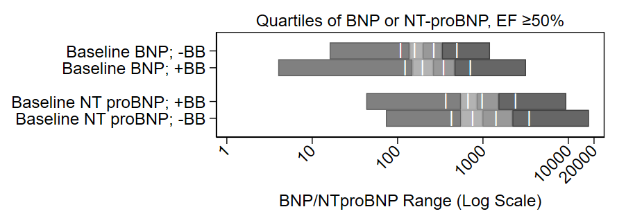
Buried in the supplement of a recent paper is a variant of this figure that I’m rather proud of:

It shows the distribution of quartiles of BNP and NT proBNP at baseline on a log scale, by use of beta blockers (BB) at baseline. It also shows the midway point of the medians. It’s a nice figure that shows the increase of BNP with beta blocker administration. My colleagues jokingly called it the “Plante Plot” since I have had it included in several drafts of manuscripts, this is just the first one in which it was published.

The code for it is pretty complex and follows. Steps 1-3 pluck out the ranges of the quartiles and their midpoints for each group and saves them as a CSV file. Steps 4-8 render the figure. You may find it more simple to skip Steps 1-3 and manually enter the ranges of the quartiles and their medians into an Excel file and just open up that excel file in Step 4.

Alternatively, I have a do file that automates this a bit. Just type:

do https://www.uvm.edu/~tbplante/plante%20plot%20for%20distribution%20of%20quartiles%20v1_0.do
distplot [xaxis variable] [yaxis group name]

Good luck!

// Step 1: load the database
use "029b1b analytic datset.dta", clear

// Step 2: You need quartiles plus the intermediate points of
// each quartile, which is really 8-iles.
// Step 2a: 
// You need the maximum and minimum variables to draw the bounds
// of the bottom and top quartile
// this is by group, here's the first group:
sum baseline_bnp if efstratus50==1 & baselinebb0n1y==0, d
return list // see that r(min) and r(max) are the points needed
// save min and max as macros for 0th bound and 0th bound
local bnp8ile_nobb_0=r(min) // beginning of q1
local bnp8ile_nobb_8=r(max) // end of q4
// Step 2b: 
// now get intermediate bounds for the 8-iles
_pctile baseline_bnp  if efstratus50==1  & baselinebb0n1y==0, percentiles(12.5(12.5)87.5) // this gets bounds by 12.5iles
return list // there they are!
local bnp8ile_nobb_1=r(r1) // middle of q1
local bnp8ile_nobb_2=r(r2) // end of q1/beginning of q2
local bnp8ile_nobb_3=r(r3) // middle of q2
local bnp8ile_nobb_4=r(r4) // end of q2/beginning of q3
local bnp8ile_nobb_5=r(r5) // middle of q3
local bnp8ile_nobb_6=r(r6) // end of q3/beginning of q4
local bnp8ile_nobb_7=r(r7) // middle of q4
// now come up with a label to eventually apply to the figure
// don't use commas in this label since we'll save this
// output as a CSV file and commas will screw up the cell
// structure of a CSV (C=comma)
// step 2c: 
local label_bnp_nobb="Baseline BNP; -BB"

// now repeat for the other groups
sum baseline_bnp if efstratus50==1 & baselinebb0n1y==1, d
return list
local bnp8ile_bb_0=r(min)
local bnp8ile_bb_8=r(max)
_pctile baseline_bnp  if efstratus50==1  & baselinebb0n1y==1, percentiles(12.5(12.5)87.5)
return list
local bnp8ile_bb_1=r(r1)
local bnp8ile_bb_2=r(r2)
local bnp8ile_bb_3=r(r3)
local bnp8ile_bb_4=r(r4)
local bnp8ile_bb_5=r(r5)
local bnp8ile_bb_6=r(r6)
local bnp8ile_bb_7=r(r7)
local label_bnp_bb="Baseline BNP; +BB"

sum baseline_ntprobnp if efstratus50==1 & baselinebb0n1y==0, d
return list
local ntprobnp8ile_nobb_0=r(min)
local ntprobnp8ile_nobb_8=r(max)
_pctile baseline_ntprobnp  if efstratus50==1  & baselinebb0n1y==0, percentiles(12.5(12.5)87.5)
return list
local ntprobnp8ile_nobb_1=r(r1)
local ntprobnp8ile_nobb_2=r(r2)
local ntprobnp8ile_nobb_3=r(r3)
local ntprobnp8ile_nobb_4=r(r4)
local ntprobnp8ile_nobb_5=r(r5)
local ntprobnp8ile_nobb_6=r(r6)
local ntprobnp8ile_nobb_7=r(r7)
local label_ntprobnp_nobb="Baseline NT proBNP; +BB"

sum baseline_ntprobnp if efstratus50==1 & baselinebb0n1y==1, d
return list
local ntprobnp8ile_bb_0=r(min)
local ntprobnp8ile_bb_8=r(max)
_pctile baseline_ntprobnp  if efstratus50==1  & baselinebb0n1y==1, percentiles(12.5(12.5)87.5)
return list
local ntprobnp8ile_bb_1=r(r1)
local ntprobnp8ile_bb_2=r(r2)
local ntprobnp8ile_bb_3=r(r3)
local ntprobnp8ile_bb_4=r(r4)
local ntprobnp8ile_bb_5=r(r5)
local ntprobnp8ile_bb_6=r(r6)
local ntprobnp8ile_bb_7=r(r7)
local label_ntprobnp_bb="Baseline NT proBNP; -BB"


// Step 3: save this to a csv file that we'll open up right away.
// Note: This code goes out of frame on my blog. copy and paste it 
// into a .do file and it'll all appear. 
quietly {
capture log close bnp 
log using "bnprangefigure.csv", replace text name(bnp)
// this is the row of headers:
noisily di "row,label,eight0,eight1,eight2,eight3,eight4,eight5,eight6,eight7,eight8" 
// row 1:
noisily di "1,`label_bnp_nobb',`bnp8ile_nobb_0',`bnp8ile_nobb_1',`bnp8ile_nobb_2',`bnp8ile_nobb_3',`bnp8ile_nobb_4',`bnp8ile_nobb_5',`bnp8ile_nobb_6',`bnp8ile_nobb_7',`bnp8ile_nobb_8'"
// row 2
noisily di "2,`label_bnp_bb',`bnp8ile_bb_0',`bnp8ile_bb_1',`bnp8ile_bb_2',`bnp8ile_bb_3',`bnp8ile_bb_4',`bnp8ile_bb_5',`bnp8ile_bb_6',`bnp8ile_bb_7',`bnp8ile_bb_8'"
// blank row 3:
noisily di "3"
// row 4:
noisily di "4,`label_ntprobnp_nobb',`ntprobnp8ile_nobb_0',`ntprobnp8ile_nobb_1',`ntprobnp8ile_nobb_2',`ntprobnp8ile_nobb_3',`ntprobnp8ile_nobb_4',`ntprobnp8ile_nobb_5',`ntprobnp8ile_nobb_6',`ntprobnp8ile_nobb_7',`ntprobnp8ile_nobb_8'"
// row 5:
noisily di "5,`label_ntprobnp_bb',`ntprobnp8ile_bb_0',`ntprobnp8ile_bb_1',`ntprobnp8ile_bb_2',`ntprobnp8ile_bb_3',`ntprobnp8ile_bb_4',`ntprobnp8ile_bb_5',`ntprobnp8ile_bb_6',`ntprobnp8ile_bb_7',`ntprobnp8ile_bb_8'"
log close bnp
}

// step 4: open CSV file as active database:
import delim using "bnprangefigure.csv", clear
// note, you may opt to skip steps 1-3 and manually compile the 
// ranges of each quartile and their median into an excel file.
// Use the -import excel- function to open that file up instead.
// IF YOU SKIP OVER STEPS 1-3, your excel file will need the 
/// following columns:
// row - each group, with a blank row 3 to match the figure
// label - title to go to the left of the figure
// eight0 through eight8 - the even numbers are ranges of the
//    quartiles and the odd numbers are the mid-ranges.
//    See my approach in steps 2a-2b on how to get these numbers.

// step 5: steal the labels. note skipping row 3 since it's blank
local label1=label[1]
local label2=label[2] 
local label4=label[4] // NO ROW 3!!
local label5=label[5]

// step 6: pluck the intermediate points of each quartile
// which are 8-iles 1, 3, 5 and 7
// and repeat for each row
local bar1row1=eight1[1]
local bar2row1=eight3[1]
local bar3row1=eight5[1]
local bar4row1=eight7[1]

local bar1row2=eight1[2]
local bar2row2=eight3[2]
local bar3row2=eight5[2]
local bar4row2=eight7[2]

// no row 3 in this figure

local bar1row4=eight1[4]
local bar2row4=eight3[4]
local bar3row4=eight5[4]
local bar4row4=eight7[4]

local bar1row5=eight1[5]
local bar2row5=eight3[5]
local bar3row5=eight5[5]
local bar4row5=eight7[5]

// step 7: pick a different scheme than the default stata one
// I like s1mono or s1color
set scheme s1mono

// step 8: complex graph.
// NOTE: RUN THIS SCRIPT FROM THE TOP EVERY TIME because
// stata likes to drop the macros ("local" commands) and 
// the things inside of the ticks will be missing if you 
// just run starting at the "graph twoway" below
// 
// step 8a: rbar the ends of the quartiles, which is:
// 0 to 2, 2 to 4, 4 to 6, and 6 to 8
//
// step 8b: apply the labels
//
// step 8c: place a vertical bar at the midpoints of the
// quartiles, which are at: 1, 3, 5, and 7. A bug in Stata
// is that a centered label (placement(c)) is actually a smidge
// south still, so the rows are offset by 0.13. You'll notice
// the Y label in the text box is row value minus 0.13 (0.87, etc.)
// to account for that.
//
// step 8d: adjust the aspect ratio to get the bar character ("|") 
// to fit within the width of the the bar itself.
//

graph twoway /// step 8a:
(rbar eight0 eight2 row , horizontal) /// 
(rbar eight2 eight4 row , horizontal) ///
(rbar eight4 eight6 row , horizontal) ///
(rbar eight6 eight8 row , horizontal) ///
, ///
yscale(reverse) ///
xscale(log) ///
t2title("Quartiles of BNP or NT-proBNP, EF ≥50%", justification(center)) /// 
xla(1 "1" 10 "10" 100 "100" 1000 "1000" 10000 "10000" 20000 "20000", angle(45)) /// step 8b:
yla(1 "`label1'" 2 "`label2'" 4 "`label4'" 5 "`label5'", angle(horizontal)) ///
ytitle(" ") ///
xtitle("BNP/NTproBNP Range (Log Scale)") ///
legend(off) ///
/// step 8c:
text(0.87 `bar1row1' "|", color(white) placement(c)) ///
text(0.87 `bar2row1' "|", color(white) placement(c)) ///
text(0.87 `bar3row1' "|", color(white) placement(c)) ///
text(0.87 `bar4row1' "|", color(white) placement(c)) ///
///
text(1.87 `bar1row2' "|", color(white) placement(c)) ///
text(1.87 `bar2row2' "|", color(white) placement(c)) ///
text(1.87 `bar3row2' "|", color(white) placement(c)) ///
text(1.87 `bar4row2' "|", color(white) placement(c)) ///
///
text(3.87 `bar1row4' "|", color(white) placement(c)) ///
text(3.87 `bar2row4' "|", color(white) placement(c)) ///
text(3.87 `bar3row4' "|", color(white) placement(c)) ///
text(3.87 `bar4row4' "|", color(white) placement(c)) ///
///
text(4.87 `bar1row5' "|", color(white) placement(c)) ///
text(4.87 `bar2row5' "|", color(white) placement(c)) ///
text(4.87 `bar3row5' "|", color(white) placement(c)) ///
text(4.87 `bar4row5' "|", color(white) placement(c)) ///
/// step 8d:
aspect(0.23)

Making a publication-ready Kaplan-Meier plot in Stata

This post is a bit dated but is a nice primer on KM curves. For a more recent one that includes printing the HR results on the KM curve, see this post.

In the early Winter of 2019, we had a paper published in JAMA: Network Open using the TOPCAT trial dataset looking at association between beta-blocker use at baseline and incident heart failure admissions. We obtained the data from the NIH/NHLBI BioLINCC repository. This is an incredible resource for datasets. With a quick application, IRB, and DUA, you can get world-class datasets from landmark clinical trials like ACCORD, SPRINT, TOPCAT, etc..

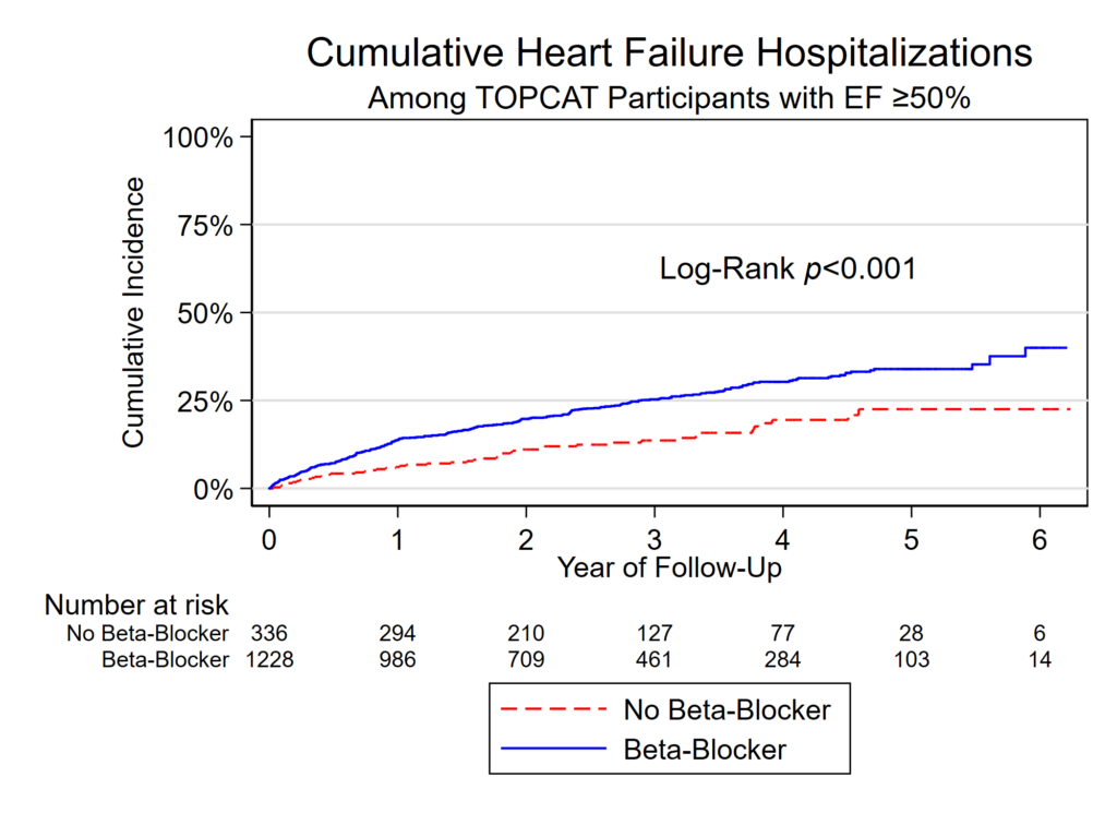
In this analysis we needed to put together a Kaplan-Meier plot for Figure 2 (sometimes called a survival plot). Well, technically it’s a cumulative incidence plot since the line starts a 0% and creeps up as events happen rather than starting at 100% and dropping down as events happen.

Features of this plot that are somewhat unique:

  • Lines are not only different colors, one is dashed and one is solid. This is key to avoiding color publication costs in some journals as it can be made greyscale and folks can still figure out which line is which. Even if there wasn’t an issue with color costs, including differing line patterns helps folks who may be colorblind. This is done with the -plot1opts- and -plot2opts- commands.
  • Text label for Log-Rank!
  • Bonus example of how to use italics in text. It’s {it:YOUR TEXT}. This could also have been bold using {bf:YOUR TEXT} instead.
  • Survival table that lines up with the years on the x axis!
  • Pretty legend on 2 rows with custom labels.

Of course, the JAMA folks remade my figure for the actual publication. Womp, womp. I still like how it came out.

What the figure looks like

Code to make this figure

// STEP 1: tell stata that it's time to event data. 
// Use the -stset- command. Syntax:
// stset [time], failure([thing that is 0 or 1 for the event of outcome]) ...
// id([participant id, useful if doing time varying covariates]) ...
// scale([time scale, here 365.25 days=1 year)

stset days_hfhosp, f(hfhosp) id(id) scale(365.25)

// STEP 2: Set the color scheme.
// I don't like the default stata color scheme.
// Try s1color or s1mono

set scheme s1color 

// STEP 3: Here's the actual figure!

sts graph if efstratus50==1 ///
, /// this was a subset of patients with EF >=50%
fail /// this makes the line starts at the bottom of the Y axis instead of the top
by(baselinebb0n1y) /// this is the variable that defines the two groups, bb use at baseline or none
title("Cumulative Heart Failure Hospitalizations") /// Title!
t1title("Among TOPCAT Participants with EF ≥50%") /// subtitle!
xtitle("Year of Follow-Up") /// x label!
ytitle("Cumulative Incidence") /// y label!
yla(0 "0%" .25 "25%" .5 "50%" .75 "75%" 1 "100%", angle(0)) /// Y-label values! Angle(0) rotates them.
xla(0(1)6) /// X-label values! From 0 to 6 years with 1 year intervals in between
text(0.63 3 "Log-Rank {it:p}<0.001", placement(e) size(medium)) /// floating label with italics!
legend(order(1 "No Beta-Blocker" 2 "Beta-Blocker") rows(2)) /// Legend, forced on two rows
plot1opts(lpattern(dash) lcolor(red)) /// this forces the first line to be dashed and red
plot2opts(lpattern(solid) lcolor(blue)) /// this forces the second line to be solid and blue
risktable(0(1)6 , size(small) order(1 "No Beta-Blocker" 2 "Beta-Blocker")) // the numbers under the X axis

// STEP 4: Export the graph as a tiny PNG file for the draft and 
// tif file to upload with the manuscript submission. 
graph export "Figure 2.png", replace width(2000)
graph export "Figure 2.tif", replace width(2000)

Working with Stata regression results: Matrix/matrices, macros, oh my!

If you make your own Stata programs and loops, you have discovered the wonders of automating output of analyses to tables. Extracting the results from regressions in Stata can be a bit cumbersome. Here’s one step-by-step approach that you might find helpful.

The set-up

Let’s use the classic 1978 auto dataset that comes with Stata. We want to regress MPG (Y) on weight (x) overall and by strata of domestic vs. foreign to complete the following table:

Weight Beta (95% CI) P-value
All
Domestic
Foreign

In Stata you’ll run three regressions to fill out the three rows:

sysuse auto, clear
regress mpg weight
regress mpg weight if foreign==0
regress mpg weight if foreign==1

You can either copy the output manually, or automate it! Let’s learn how to automate this process.

Let’s get familiar with the ‘guts’ and ‘brains’ behind Stata’s regression functions.

When you run a regression, Stata saves relevant bits of these regressions in scalars and matrices saved in different r() and e() levels. You can view the r() ‘guts’ with -return list- and e() ‘brains’ with -ereturn list-. These have different uses.

  • return list – This will give the ‘guts’ of the regression, namely the r() level bits, as you see it in the Stata output. Importantly, the r() level contains the r(table) matrix, which holds all of the raw numbers used to generate the output of your regression as you see it in Stata’s output. These are what you will use to fill out the above blank table.
    • Type -matrix list r(table)- to see the structured output of this matrix.
  • ereturn list – this will let you see the ‘brains’ behind the regression, namely the e() level bits, which are useful in post-estimation commands. We actually don’t need this to fill out the above table. Just pointing out that they’re here.

Let’s take a look at the regression output below and how they exist in the r() level r(table), I have bolded/underlined the output of interest. Our goal is to:

  1. Load the sysuse auto dataset.
  2. Run the regression.
  3. Take a look at the -return list- to see that the r(table) is hiding there (without actually viewing the contents of r(table))
  4. Actually view the r(table) matrix in order to verify that all of the data points of interest are hiding there.
. sysuse auto, clear
. regress mpg weight

Source |       SS           df       MS      Number of obs   =        74
-------+----------------------------------   F(1, 72)        =    134.62
 Model |   1591.9902         1   1591.9902   Prob > F        =    0.0000
Residu |  851.469256        72  11.8259619   R-squared       =    0.6515
-------+----------------------------------   Adj R-squared   =    0.6467
 Total |  2443.45946        73  33.4720474   Root MSE        =    3.4389

-------------------------------------------------------------------
   mpg |      Coef.   Std. Err.      t    P>|t|     [95% Conf. Interval]
-------+----------------------------------------------------------------     
weight |  -.0060087   .0005179   -11.60   0.000    -.0070411   -.0049763
 _cons |   39.44028   1.614003    24.44   0.000     36.22283    42.65774
----------------------------------------------------------------------

. return list

scalars:
              r(level) =  95
matrices:
              r(table) :  9 x 2

. matrix list r(table)

r(table)[9,2]
            weight       _cons
     b  -.00600869   39.440284
    se   .00051788   1.6140031
     t   -11.60251   24.436312
pvalue   3.798e-18   1.385e-36
    ll  -.00704106   36.222827
    ul  -.00497632    42.65774
    df          72          72
  crit   1.9934636   1.9934636
 eform           0           0

r(table) is a matrix, but an atypical matrix. Copy it to a custom ‘typical’ matrix before doing anything else!

Matrices are basically small spreadsheets saved in the memory that can be accessed by referencing a [row,column] cell reference. These exist separate from the dataset, which is also basically a big spreadsheet. You’ll note above (after the -matrix list r(table)- command) that Stata tells you that the r(table) matrix has 9 rows and 2 columns, or [9,2].

For various reasons that you can read about here, r(table) is not a usual matrix and Stata will do funny things if you try to run matrix commands on it. Make sure to save the r(table) matrix as custom matrix before going any further. Since we actually need to save 3 separate r(table) matrices to fill out the blank table (one for each row), you should do this anyway to help facilitate completing the table. Use the -matrix- command to copy the contents of the r(table) to a custom matrix. Here we’ll:

  1. Load the sysuse auto dataset
  2. Run three regressions, one for each row, and
  3. Save the r(table) matrix for each regression to a custom named matrix. We’ll specifically call them “row1”, “row2”, and “row3”.
  4. Then, we will confirm that each row is saved by plopping the command to view the matrices at the end.
sysuse auto, clear 
* first row
regress mpg weight
* save as a custom matrix
matrix row1=r(table)
* second row
regress mpg weight if foreign==0
* save as a custom matrix
matrix row2=r(table)
* third row
regress mpg weight if foreign==1
* save as a custom matrix
matrix row3=r(table)
* prove that all three saved
matrix list row1
matrix list row2
matrix list row3

The stata output for the last three lines should look like the output below. Note that the beta coefficient is at [1,1], the 95% confidence interval bounds are at [5,1] and [6,1], and the p-value is at [4,1]. I bolded/underlined the first to highlight this.

. matrix list row1

row1[9,2]
            weight       _cons
     b  -.00600869   39.440284
    se   .00051788   1.6140031
     t   -11.60251   24.436312
pvalue   3.798e-18   1.385e-36
    ll  -.00704106   36.222827
    ul  -.00497632    42.65774
    df          72          72
  crit   1.9934636   1.9934636
 eform           0           0

. 
. matrix list row2

row2[9,2]
            weight       _cons
     b  -.00597508   39.646965
    se   .00046538   1.5766224
     t  -12.839251   25.146772
pvalue   1.890e-17   4.898e-30
    ll  -.00690982   36.480225
    ul  -.00504035   42.813704
    df          50          50
  crit   2.0085591   2.0085591
 eform           0           0

. 
. matrix list row3

row3[9,2]
            weight       _cons
     b  -.01042596   48.918297
    se   .00249417   5.8718507
     t  -4.1801326   8.3309845
pvalue   .00046167   6.196e-08
    ll   -.0156287   36.669831
    ul  -.00522321   61.166763
    df          20          20
  crit   2.0859634   2.0859634
 eform           0           0

Let’s extract the matrix components of interest as macros!

Macros are little ‘codewords’ that represent another variable or string. You can pluck a cell of a matrix and store it as a macro. Later on, use can use that ‘codeword’ associated with the macro to make Stata blurt out the stored cell result. We just need to point the macro at the right matrix cell in order to extract the cell’s results. It sounds confusing but it’s not. Remember the [row,column] numbers from above? We’ll use those numbers to extract the matrix cell results into macros. Next steps:

  1. Load the sysuse auto dataset
  2. Run a regression for the first three rows of our table, saving the r(table) matrix for each regression as our custom matrix (row1-3)
  3. Use macros to extract the [1,1] as beta coefficient, [5,1] and [6,1] as the 95% confidence intervals, and [4,1] as the p-value for each row.
  4. View each macro with the -display- opening tick (`), to the left of the number 1 on your keyboard, the macro name, and a closing apostrophe (‘).
  5. You can use number formatting like %3.2f (e.g., 0.56) or %4.3f (0.558) to limit the number of digits following the decimal. This will also round. (Note: If you want to use super fancy formatting of a P-value, see this post.)

Code to do this:

sysuse auto, clear 
* first row
regress mpg weight
* save as a custom matrix
matrix row1=r(table)
* second row
regress mpg weight if foreign==0
* save as a custom matrix
matrix row2=r(table)
* third row
regress mpg weight if foreign==1
* save as a custom matrix
matrix row3=r(table)
****
*now save the beta, 95% ci, and P as macros
*row 1
local beta1=row1[1,1]
local low951=row1[5,1]
local high951=row1[6,1]
local pval1=row1[4,1]
*row 2
local beta2=row2[1,1]
local low952=row2[5,1]
local high952=row2[6,1]
local pval2=row2[4,1]
*row 3
local beta3=row3[1,1]
local low953=row3[5,1]
local high953=row3[6,1]
local pval3=row3[4,1]
*now view these
*row 1
di "row1 beta is " %3.2f `beta1'
di "row1 95% CI is " %3.2f `low951' " to " %3.2f `high951'
di "row1 P-val is " %4.3f `pval1'
*row 2
di "row2 beta is " %3.2f `beta2'
di "row2 95% CI is " %3.2f `low952' " to " %3.2f `high952'
di "row2 P-val is " %4.3f `pval2'
*row 3
di "row3 beta is " %3.2f `beta3'
di "row3 95% CI is " %3.2f `low953' " to " %3.2f `high953'
di "row3 P-val is " %4.3f `pval3'

Hide in -quietly- curly brackets and output a CSV file using -noisily- commands and a log!

Here’s my code to run the three regression, store the r(table) matrices, extract the data of interest, and output as a .csv file! Run this from a .do file as it includes the -quietly- command, which confuses Stata if it’s run from the command line.

sysuse auto, clear 
* first row
regress mpg weight
* save as a custom matrix
matrix row1=r(table)
* second row
regress mpg weight if foreign==0
* save as a custom matrix
matrix row2=r(table)
* third row
regress mpg weight if foreign==1
* save as a custom matrix
matrix row3=r(table)
****
*view the custom matrices to prove they worked
matrix list row1
matrix list row2
matrix list row3
****
*now save the beta, 95% ci, and P as macros
*here's a loop that automates this a bit
foreach x in 1 2 3 {
local beta`x'=row`x'[1,1]
local low95`x'=row`x'[5,1]
local high95`x'=row`x'[6,1]
local pval`x'=row`x'[4,1]
}

pwd // this is where your CSV file is saved

quietly {
capture log close table // always good to close any open logs
log using "regressiontable.csv", replace text name(table)
*header
noisily di ",Weight beta (95% CI),P-value"
*row 1
noisily di "All," %3.2f `beta1' " ("  %3.2f `low951' " to " %3.2f `high951' "),"  %4.3f `pval1'
*row 2
noisily di "Domestic," %3.2f `beta2' " ("  %3.2f `low952' " to " %3.2f `high952' "),"  %4.3f `pval2'
*row 3
noisily di "Foreign," %3.2f `beta3' " ("  %3.2f `low953' " to " %3.2f `high953' "),"  %4.3f `pval3'
log close table
}

Boom! you’ll get a CSV file that looks like this, which should be simple to import in Excel!

,Weight beta (95% CI),P-value
All,-0.01 (-0.01 to -0.00),0.000
Domestic,-0.01 (-0.01 to -0.01),0.000
Foreign,-0.01 (-0.02 to -0.01),0.000

You’ll notice that these numbers are small, so you may want to use %4.3f instead of %3.2f to get 3 digits past the decimal place for the beta and 95% CIs.

Bonus: Generating a CSV file with pretty P-values

Here’s the same code, but using the “pretty” p-value code documented in this separate post.

sysuse auto, clear 
* first row
regress mpg weight
* save as a custom matrix
matrix row1=r(table)
* second row
regress mpg weight if foreign==0
* save as a custom matrix
matrix row2=r(table)
* third row
regress mpg weight if foreign==1
* save as a custom matrix
matrix row3=r(table)
****
*view the custom matrices to prove they worked
matrix list row1
matrix list row2
matrix list row3
****
*now save the beta, 95% ci, and P as macros
*here's a loop that automates this a bit
foreach x in 1 2 3 {
local beta`x'=row`x'[1,1]
local low95`x'=row`x'[5,1]
local high95`x'=row`x'[6,1]
local pval`x'=row`x'[4,1]
local pval = r(table)[4,1] 

if `pval`x''>=0.056 {
	local pvalue`x' "P=`: display %3.2f `pval`x'''"
}
if `pval`x''>=0.044 & `pval'<0.056 {
	local pvalue`x' "P=`: display %5.4f `pval`x'''"
}
if `pval`x'' <0.044 {
	local pvalue`x' "P=`: display %4.3f `pval`x'''"
}
if `pval`x'' <0.001 {
	local pvalue`x' "P<0.001"
}
if `pval`x'' <0.0001 {
	local pvalue`x' "P<0.0001"
}
di "original P is " `pval`x'' ", formatted is " "`pvalue`x''"
}

pwd // this is where your CSV file is saved

quietly {
capture log close table // always good to close any open logs
log using "regressiontable.csv", replace text name(table)
*header
noisily di ",Weight beta (95% CI),P-value"
*row 1
noisily di "All," %3.2f `beta1' " ("  %3.2f `low951' " to " %3.2f `high951' "),"  "`pvalue1'"
*row 2
noisily di "Domestic," %3.2f `beta2' " ("  %3.2f `low952' " to " %3.2f `high952' ")," "`pvalue2'"
*row 3
noisily di "Foreign," %3.2f `beta3' " ("  %3.2f `low953' " to " %3.2f `high953' "),"   "`pvalue3'"
log close table
}

Here’s the output:

,Weight beta (95% CI),P-value
All,-0.01 (-0.01 to -0.00),P<0.0001
Domestic,-0.01 (-0.01 to -0.01),P<0.0001
Foreign,-0.01 (-0.02 to -0.01),P<0.001

Make a Table 1 in Stata in no time with table1_mc

What’s in a Table 1?

Baseline demographic tables (colloquially known as ‘Table 1’ given their common location) are a core feature of nearly all epidemiologic manuscripts. The columns represent the exposure you are studying. The rows are characteristics of your population that are relevant to your research project. In placebo-controlled RCTs, the columns are drug and placebo. In observational studies, the column is your exposure of interest. Say you are curious about the relationship between smoking and development of breast cancer in a cohort. Here, the columns would be smoking and no smoking.

Wait, I’m looking at a Table 1 has more than just a column for each exposure!

There are certain variations that you’ll see in Table 1s:

  • A row for the entire population – This always seems overkill to me.
  • A row with P-values – These are of no value in RCTs in my opinion. They are only occasionally helpful in observational studies.

The ultimate design of the Table 1 will be dictated by the target journal. This creates challenges for authors, who may need to rework Table 1s in the submission (and resubmission) process.

Why have Table 1s historically been such a pain in the butt to make in Stata?

Well, Stata doesn’t natively pop out Table 1s. Formulating one either requires manually running –sum– commands over and over again or writing custom code to help automate this for you.

Enter table1_mc

The Stata program table1_mc was released by Mark Chatfield, a biostatistician at the University of Queensland. It’s a derivation of the original table1 program by Phil Clayton. It’s a work of wonder. It automates the generation of a Table 1 with a few simple codes. Need to reformat for a new target journal? Make minor changes and hit re-run and — ”POOF”’ — out pops an updated and compliant Table 1.

Step 1: Install the program

Type:

ssc install table1_mc

Step 2: Label your variables

Pluck out the variables you’ll include as the exposure and outcome. The table1_mc code will apply your bizarre, space-less variable name to the output unless you are using labels. Use real capitalization and formatting like you’d want to appear.

Step 2a: Labeling the variable itself

Let’s say you want to label your systolic blood pressure variable ‘sbp’ to be ‘Systolic blood pressure, mm Hg’. Type:

label variable sbp "Systolic blood pressure, mm Hg" 

Step 2b: Labeling the categories within variables

My suggestion is to generate a numerical ordinal variable and apply the labels to a number. The table1_mc program will put things in alphabetical or numerical order. Applying labels to numbers makes it easy to control the order. In this example, I have labels for income that I’ll make into a numerical ordinal variable first. In the raw dataset, the variables are defined using strings like “$20k-$34k”.

gen income1234=.
replace income1234=1 if income_4cat=="less than $20k"
replace income1234=2 if income_4cat=="$20k-$34k"
replace income1234=3 if income_4cat=="$35k-$74k"
replace income1234=4 if income_4cat=="$75k and above"
replace income1234=99 if income_4cat=="Refused"

Now,

1. Define the labels that you want to apply to income1234’s values of 1, 2, 3, 4, or 99, and

2. Apply the stupid labels. I always forget to apply the labels to the categorical values.

label define income_labels 1 "<$20K" 2 "$20k-$34k" 3 "$35k-$74k" 4 "$75k and above" 99 "Refused" // define the labels
label values income1234 income_labels // apply the labels!!

And, while you’re at it, don’t forget to apply a label to the overall ‘income1234’ variable that you made.

label variable income1234 "Annual household income"

Step 3: Make a table 1

The help document (type ‘help table1_mc’) is a must read. Please look at it.

First: Start with ‘table1_mc,’ then the exposure expressed as ‘by(EXPOSURE VARIABLE NAME)’. Then just list out the variables you want in each row one by one. Each variable should have an indicator for the specific data types:

  • Binary:
    • bin – binary with P-value from Pearson’s chi2
    • bine – binary with P-value from Fisher’s exact
  • Continuous:
    • contn – normally distributed, continuous variable, which will give mean and SD
    • contln – log-normally distributed, continuous variable, which will give geometric mean and GSD
    • conts – other continuous variable, which will give median and IQR.
  • Categorical:
    • cat – categorical with P-value from Pearson’s chi2
    • cate – categorical with P-value from Fisher’s exact

After the code telling Stata which format you are using, you tell it what output format you want it to report the variables. Stata defaults to a lot of decimals. If you don’t specify, mean age may be presented as ‘42.818742022’. What a mess.

You can probably do 99% of your formatting with two codes:

  • %4.0f – four leading digits, nothing after the decimal (e.g., 43)
  • %4.1f – four leading digits, one digits after the decimal (e.g., 42.8)

Next, separate each variable with a backslash (‘\’). I like to break each line using the three forward slashes after (‘///’) so that I don’t have one ungodly line of text.

FINALLY, tell it some key options at the end:

  • Ones I recommend including every time:
    • onecol – categorical variables will have a header that’s an extra leading row before they are presented, rather than a whole separate column.
    • missing – this keeps missing variables included. Helpful to show missingness of categorical variables.
    • nospace – this will drop dead spaces before single digit numbers. E.g., it’ll present ‘(3%)’ instead of ‘( 3%)’.
    • saving – output the Table 1 to Excel. Make sure that the Excel file output is not open in an Excel window when trying to overwrite a table. Otherwise, Stata will not run and you will be sad.
  • Simple things to help reformatting for journals:
    • [nothing] – presents n (%)
    • percent – presents a % alone without including the n
    • percent_n – % (n)
    • slashN – n/N instead of just n
    • total(before) – leading row with overall baseline demographics.

Some actual code to run table1_mc!

// install it!
ssc install table1_mc

// now specify things by "myexposure"
table1_mc /// <--here, can put an "if" or "in" statement or specify weights
, ///
by(myexposure) ///
vars( ///
   age contn %4.0f \ ///
   sex0m1f bin %4.0f \ ///
   race0w1b bin %4.0f \ ///
   region123 cat %4.0f \ ///
   educ1234 cat %4.0f \ ///
   income1234 cat %4.0f \ ///
   sbp contn %4.0f \ ///
   dbp contn %4.0f \ ///
   smoke7_ideal bin %4.0f \ ///
   pa7_ideal bin %4.0f \ ///
   diet7_ideal bin %4.0f \ ///
   chol7_ideal bin %4.0f \ ///
   fpg7_ideal bin %4.0f \ ///
   bmi7_ideal bin %4.0f \ ///
   bp7_ideal bin %4.0f \ ///
) ///
nospace percent onecol missing total(before) ///
saving("table 1.xlsx", replace)

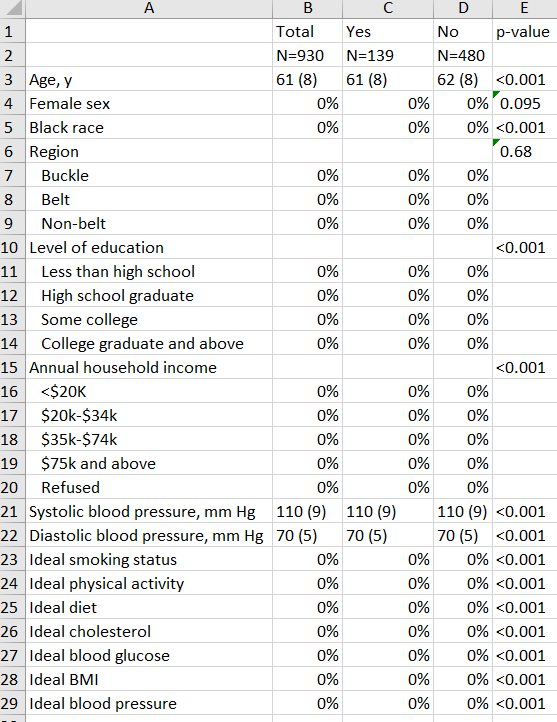
…And here’s the (fake) result!

I’m working on an actual analysis right now so replaced all of the data from the actual output above with fake numbers. But you get the idea!

The example table!

Rendering XKCD #2023 “Misleading Graph Makers” in Stata

Let’s render an XKCD comic using Stata!

I loved today’s XKCD comic so I decided to take some time while eating my sandwich to write a .do file script to render it in Stata. There aren’t great smooth line options without figuring out the exact function for each line in Stata, so I approximated the data points. One interesting problem was including quotes in the X axis label since quotation marks are used to define the label and line breaks for labels. The solution was wrapping the line with an opening tick (`, to the left of number 1 on your keyboard) and closing with an apostrophe. This is also a nice example of how to input data in a .do file.

End result:

Code follows.

clear all

input id proportion band1 band2 band3 band4 band5 band6 band7 band8 band9 band10
id proportion band1 band2 band3 band4 band5 band6 band7 band8 band9 band10
0 . 21 22 23 24 25 26 27 28 29 30
0.3 . 21 22 23.7 25.5 26.3 28 28.8 29.2 29.5 30
0.5 . 20.8 22.5 24.7 27 28 29 29.2 29.4 29.7 30
0.7 . 20.6 25 27.4 28.4 29 29.3 29.5 29.6 29.9 30
0.9 . 20.1 28 28.5 29 29.3 29.5 29.7 29.8 29.9 30
1 23 20.1 28.5 29 29.3 29.5 29.6 29.7 29.8 29.9 30
1.3 . 20.1 29.2 29.3 29.4 29.5 29.6 29.7 29.8 29.9 30
2 23.5 20.1 29.2 29.3 29.4 29.5 29.6 29.7 29.8 29.9 30
3 22.3 20.1 29.2 29.3 29.4 29.5 29.6 29.7 29.8 29.9 30
4 23.5 20.1 29.2 29.3 29.4 29.5 29.6 29.7 29.8 29.9 30
5 23 20.1 29.2 29.3 29.4 29.5 29.6 29.7 29.8 29.9 30
6 28 20.1 29.2 29.3 29.4 29.5 29.6 29.7 29.8 29.9 30
end

set scheme s1mono

graph twoway ///
(connected proportion id, lcolor(gs0) mcolor(gs0)) ///
(scatter band1 id, conn(j) lstyle(solid) lcolor(gs12) mstyle(none)) ///
(scatter band2 id, conn(j) lstyle(solid) lcolor(gs12) mstyle(none)) ///
(scatter band3 id, conn(j) lstyle(solid) lcolor(gs12) mstyle(none)) ///
(scatter band4 id, conn(j) lstyle(solid) lcolor(gs12) mstyle(none)) ///
(scatter band5 id, conn(j) lstyle(solid) lcolor(gs12) mstyle(none)) ///
(scatter band6 id, conn(j) lstyle(solid) lcolor(gs12) mstyle(none)) ///
(scatter band7 id, conn(j) lstyle(solid) lcolor(gs12) mstyle(none)) ///
(scatter band8 id, conn(j) lstyle(solid) lcolor(gs12) mstyle(none)) ///
(scatter band9 id, conn(j) lstyle(solid) lcolor(gs12) mstyle(none)) ///
(scatter band10 id, conn(j) lstyle(solid) lcolor(gs12) mstyle(none)) ///
, ///
title(Y-Axis) ///
xlabel(none) /// 
xline(1(1)6, lpattern(solid) lcolor(gs12)) ///
ylabel(20 "0%" 25 "50%" 30 "100%", angle(0)) ///
aspect(1) ///
ytitle("") ///
legend(off) ///
xtitle(`"People have wised up to the "carefully"' ///
`"chosen Y-axis range" trick, so we misleading"' ///
"graph makers have had to get creative.")

graph export xkcd_2023.png, width(1000) replace

Making Scatterplots and Bland-Altman plots in Stata

NOTE: I have more recently put together user-friendly code on scatterplots and Bland-Altman plots. Go check those pages out.

Scatterplots with a fitted line

This is pretty straightforward in Stata. This is a variation of a figure that I made for a JAMA Internal Medicine paper. (I like to think that the original figure was publication quality, but they had their graphics team redo it in their own format.) This contains a diagonal line of unity and cutoffs for systolic hypertension as vertical/horizontal bars. Different from the publication version, this includes a thick dotted fitted line.

This code actually makes two different scatterplots then merges them together and puts labels over the merged version.

The scatter function here wants a Y-axis variable and X-axis variable. The two variables were ibp_sbp_pair (Y-axis) and average_sbp_omron_23 (X-axis) for systolic and ibp_dbp_pair and average_dbp_omron_23 for diastolic.

Bland-Altman plots

This is from the same paper.

Again, two different B-A plots that are merged then labels applied. The dotted line is relative mean difference, the long dashed lines are +/- 2 SD.

As far as Stata’s graph maker is concerned, this is a scatterplot. You just need to set up all of the variables intentionally to trick it into rendering a B-A plot. The Y-axis is the difference between the variables and the X-axis is a mean of the variables.

Code for both figures follows.

**********scatterplot ave with lines of fit
***sbp
twoway (lfit ibp_sbp_pair average_sbp_omron_23, lcolor(gray) lpattern(dash) lwidth(vthick)) /// line of fit code
(function y=x, ra(average_sbp_omron_23) clcolor(gs4)) /// diagonal line of unity
(scatter ibp_sbp_pair average_sbp_omron_23 , mcolor(black) msize(vsmall)), /// make dots appear for scatter, y x axis
legend(off) /// hide legend
title("Systolic BP", color(black)) ///
ytitle("") /// no title, will add when merging SBP and DBP
xtitle("") /// ditto
xline(140, lpattern(solid) lcolor(gray)) /// cutoff for systolic hypertension
yline(140, lpattern(solid) lcolor(gray)) /// ditto
graphregion(color(white)) ylabel(, grid glcolor(gs14)) /// white background, light gray lines
xlabel(90(20)170) ylabel(90(20)170) /// where X and Y labels occur
aspectratio(1) // force figure to be a 1x1 square, not a rectangle
graph save 20_sbp_scatterplot_fit.gph, replace // need graph to merge later
graph export 20_sbp_scatterplot_fit.png, width(4000) replace

***dbp
twoway (lfit ibp_dbp_pair average_dbp_omron_23, lcolor(gray) lpattern(dash) lwidth(vthick)) /// 
(function y=x, ra(average_dbp_omron_23) clcolor(gs4)) ///
(scatter ibp_dbp_pair average_dbp_omron_23, mcolor(black) msize(vsmall)), /// 
legend(off) ///
title("Diastolic BP", color(black)) ///
ytitle("") ///
xtitle("") ///
xline(90, lpattern(solid) lcolor(gray)) ///
yline(90, lpattern(solid) lcolor(gray)) ///
graphregion(color(white)) ylabel(, grid glcolor(gs14)) ///
xlabel(30(20)110) ylabel(30(20)110) ///
aspectratio(1)
graph save 21_dbp_scatterplot_fit.gph, replace
graph export 21_dbp_scatterplot_fit.png, width(4000) replace

****combined scatterplot
graph combine 20_sbp_scatterplot_fit.gph 21_dbp_scatterplot_fit.gph, /// 
graphregion(color(white)) ///
b1title("Standard (mmHg)") ///
l1title("IBP (mmHg)") ///
ysize(3)
graph save combined_scatterplots_fit.gph, replace // 
graph export combined_scatterplots_fit.png, width(4000) replace

***************************Bland-altman plots
***sbp ***prep for figure gen mean_sbp_ave=(average_sbp_omron_23+ibp_sbp_pair)/2 // this will be the x-axis gen diff_sbp_ave=ibp_sbp_pair-average_sbp_omron_23 // this will be y-axis sum diff_sbp_ave // this allows you to make a macro of the mean ("r(mean)") of the y axis variable global mean1=r(mean) // this saves the macro as mean1, to be called later global lowerCL1=r(mean) - 2*r(sd) // this saves a macro for the mean+2 times the SD ("r(sd)") global upperCL1=r(mean) + 2*r(sd) ***make graph graph twoway scatter diff_sbp_ave mean_sbp_ave, /// legend(off) mcolor(black) /// ytitle("") /// ytitle("Reference Minus Comparator (mmHg)") xtitle("") /// xtitle("Average of Reference and Comparator (mmHg)") title("Systolic BP", color(black)) /// yline($mean1, lpattern(shortdash) lcolor(gray)) /// calls the macro from above yline($lowerCL1, lpattern(dash) lcolor(gray)) /// ditto yline($upperCL1, lpattern(dash) lcolor(gray)) /// graphregion(color(white)) ylabel(, grid glcolor(gs14)) /// white background ylabel(-40(20)40) xlabel(90(20)170) /// aspectratio(1.08) // annoyingly, this wasn't a perfectly square figure so this line fixes it. ***save graph graph save 1_sbp_bland_altman_ave.gph, replace graph export 1_sbp_bland_altman_ave.png, width(4000) replace ***dbp ***prep for figure gen mean_dbp_ave=(average_dbp_omron_23+ibp_dbp_pair)/2 gen diff_dbp_ave=ibp_dbp_pair-average_dbp_omron_23 sum diff_dbp_ave global mean1=r(mean) global lowerCL1=r(mean) - 2*r(sd) global upperCL1=r(mean) + 2*r(sd) ***make graph graph twoway scatter diff_dbp_ave mean_dbp_ave, /// legend(off) mcolor(black) /// ytitle("") /// xtitle("") /// title("Diastolic BP", color(black)) /// msize(vsmall) /// yline($mean1, lpattern(shortdash) lcolor(gray)) /// yline($lowerCL1, lpattern(dash) lcolor(gray)) /// yline($upperCL1, lpattern(dash) lcolor(gray)) /// graphregion(color(white)) ylabel(, grid glcolor(gs14)) /// ylabel(-40(20)40) xlabel(30(20)110) /// aspectratio(1.08) ***save graph graph save 2_dbp_bland_altman_ave.gph, replace graph export 2_dbp_bland_altman_ave.png, width(4000) replace ***********combined image bland altman graph combine 1_sbp_bland_altman_ave.gph pictures/2_dbp_bland_altman_ave.gph, /// ycommon /// so the y axes are on the same scale graphregion(color(white)) /// b1title("Average of IBP and Standard (mmHg)") /// l1title("IBP Minus Standard (mmHg)") /// ysize(3) graph save combined_dbp_sbp_ba.gph, replace // graph export combined_dbp_sbp_ba.png, width(4000) replace

Code to make a dot and 95% confidence interval figure in Stata

Dot and confidence interval figures in Stata

Stata has a pretty handy -twoway scatter- code that can be combined with -twoway rcap- to make the figure below. Example code at the bottom.

Horizontal version

Vertical version

First step, make an Excel file or input directly in a do file

You might find it a bit easier to input data from an excel file than straight in a do file. Here’s an example of an excel file called “dot and 95 percent ci data.xlsx” saved in the same folder as my .do file. This figure will display row 1 at the top and row 14 at the bottom. The gaps in between the lines are the absent rows 3,6, 9, and 12. Group tells Stata if you want a red diamond or blue square. Proportion is the point estimate and low95 and high95 are the surrounding 95% confidence intervals.

Note that the data here are made up and are not related to any actual ongoing clinical investigation. 

Alternatively, you can use Stata’s –input– functionality to input data from the top of your do file. I’ve been doing this step more often recently. Things to remember: (1) variables in Stata cannot start with a number, hence ‘low95′ and not ’95low’ above, (2) remember to use –end– at the end of your input command, (3) if you are inputting a string variable, specify that the following variable is a string (e.g., “strL varname”) in your input loop, and (4) remember to use blanks (dots or “” for strings) for missing variables. Here’s what the above would look like using an –input– command in the do file, right above the following code.

clear all // clear all data in memory

input ///
group proportion low95 high95
1 1.2 1.1 1.4
2 1.3 1.2 1.4
. . . .
1 1.05 1.01 1.5
2 1.3 1.2 1.4
. . . .
1 1.1 1.05 1.15
2 1.2 1.14 1.25
. . . .
1 1.3 1.2 1.4
2 1.3 1.2 1.4
. . . .
1 1.4 1.3 1.45
2 1.4 1.2 1.5
end

// this makes a variable that's 1 through n for each row by group, called "row"
gen row = _n

Next step, make a .do file

In the same folder as the Excel file, copy/paste/save the code below as a .do file. Close Excel and close Stata then find the .do file from Windows Explorer and double click it. Doing this will force Stata to set the working directory as the folder containing the .do file (and the Excel file).

If the code won’t work, you probably have Excel open. Close it and try again.

That’s it! Code for both versions of the figure follows.

********************************************************************************
******************************IMPORT DATA HERE**********************************
********************************************************************************
// if importing from an excel file, do that here:
clear all // clear all data in memory
import excel "dot and 95 percent ci data.xlsx", firstrow clear
destring, replace

// if using Stata's --input-- command, plop that here (see example code above)

******************************************************************************** 
******************************CODE STARTS HERE********************************** 
******************************************************************************** 
set scheme s1mono // black and white

twoway ///
(rcap low95 high95 row, horizontal) /// code for 95% CI
(scatter row proportion if group ==1, mcolor(red)) /// dot for group 1
(scatter row proportion if group ==2, mcolor(blue)) /// dot for group 2
, ///
legend(row(1) order(2 "legend 1" 3 "legend 2") pos(6)) /// legend at 6 o'clock position
ylabel(1.5 "Model A" 4.5 "Model B" 7.5 "Model C" 10.5 "Model D" 13.5 "Model E", angle(0) noticks) ///
/// note that the labels are 1.5, 4.5, etc so they are between rows 1&2, 4&5, etc.
/// also note that there is a space in between different rows by leaving out rows 3, 6, 9, and 12 
xlabel(.95 " " 1 "1.0" 1.1 "1.1" 1.2 "1.2" 1.3 "1.3" 1.4 "1.4" 1.5 "1.5" 1.6 " ", angle(0)) /// no 1.6 label
title("Title") ///
xtitle("X axis") /// 
ytitle("Y axis") /// 
yscale(reverse) /// y axis is flipped
xline(1.0, lpattern(dash) lcolor(gs8)) ///
/// aspect (next line) is how tall or wide the figure is
aspect(.5)

graph export "dot and 95 percent ci figure horiz.png", replace width(2000)
//graph export "dot and 95 percent ci figure horiz.tif", replace width(2000)


********************************************************************************
******************************CODE STARTS HERE**********************************
********************************************************************************
set scheme s1mono // black and white

twoway ///
(rcap low95 high95 row, vert) /// code for 95% CI
(scatter proportion row if group ==1, mcolor(red)) /// dot for group 1
(scatter proportion row if group ==2, mcolor(blue)) /// dot for group 2
, ///
legend(row(1) order(2 "legend 1" 3 "legend 2") pos(6)) /// legend at 6 o’clock position
xlabel(1.5 "Model A" 4.5 "Model B" 7.5 "Model C" 10.5 "Model D" 13.5 "Model E", angle(0) noticks) ///
/// note that the labels are 1.5, 4.5, etc so they are between rows 1&2, 4&5, etc.
/// also note that there is a space in between different rows by leaving out rows 3, 6, 9, and 12
ylabel(0.9 "0.9" 1 "1.0" 1.1 "1.1" 1.2 "1.2" 1.3 "1.3" 1.4 "1.4" 1.5 "1.5" , angle(0)) /// no 1.6 label
title("Title") ///
xtitle("X axis") ///
ytitle("Y axis") ///
yline(1.0, lpattern(dash) lcolor(gs8)) ///
/// aspect (next line) is how tall or wide the figure is
aspect(.5)

graph export "dot and 95 percent ci figure vert.png", replace width(2000)
//graph export "dot and 95 percent ci figure vert.tif", replace width(2000)

Making a horizontal stacked bar graph with -graph twoway rbar- in Stata

Making a horizontal stacked bar graph in Stata

I spent a bit of time making a variation of this figure today. (The data here are made up.) I’m pleased with how it came out. I first tried to use the -graph bar, horizontal- command, but it didn’t give me as much customization as -twoway graph rbar…, horizontal-. I think it looks pretty slick.

Start with an Excel file

I made an Excel file called stacked bar graph data.xlsx that I saved in the same folder as a .do file. I closed Stata and reopened that .do file from Windows explorer so that Stata set the working directory as the same folder that contains the .do file. More importantly, it set the working directory as the same folder that also contains the Excel file.

Group is the number of the individual bars, bottom is the bottom of the first segment of a bar, q1 is the top of the first segment of each bar. The rest should be obvious. I made this for quartiles, hence the q1-4 names. You can tweak the numbers by editing the Excel file, hitting save/close, and rerunning the .do file.

Make sure that you save and close Excel before running the .do file or the .do file won’t run and you will be sad. 

My .do file for making this horizontal stacked bar graph

Here’s my code! I hope it’s useful.

********************************************************************************
******************************IMPORT DATA HERE**********************************
********************************************************************************
import excel "stacked bar graph data.xlsx", firstrow clear // make sure that excel
//                                                           is closed before you
//                                                           run this script!
destring, replace

********************************************************************************
******************************CODE STARTS HERE**********************************
********************************************************************************
capture ssc install scheme-burd, replace // this installs nicer color schemes
// see the schemes here: https://github.com/briatte/burd
set scheme burd4 

graph twoway ///
(rbar bottom q1 group, horizontal) ///
(rbar q1 q2 group, horizontal) ///
(rbar q2 q3 group, horizontal) ///
(rbar q3 q4 group, horizontal) ///
, /// if you modify this file and it stops working, check the placement of this comma
xscale(log) /// make the x axis log scale
xla(0.25 "0.25" 0.5 "0.5" 1 "1" 2.5 "2.5" 5 "5" 10 "10" 25 "25" 50 "50" 100 "100") ///
yla(1 "Group 1" 2 "Group 2" 3 "Group 3" 4 "Group 4") ///
ytitle("Y title") ///
xtitle("X title") ///
text(4 1.2 "Q1", color(white)) /// first number is y second is x.
text(4 4.3 "Q2", color(white)) ///
text(4 20 "Q3", color(white)) ///
text(4 90 "Q4", color(white)) ///
legend(off) /// no legend, aspect is the shape of the figure. 1 is tall and thin.
aspect(.25) 
//
// export the graph as a PNG file
graph export "stacked graph.png", replace width(2000)
// graph export "stacked graph.tif", replace width(2000) // in case you want as a tiff