(See the part 1 post here.)
Viewing and changing your working directory
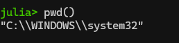
One step will be changing your working directory to the place where you actually want to be working. See your current working directory with “pwd()“. Note: if you get a message saying “pwd (generic function with 1 method)”, you entered “pwd” and not “pwd()”.
Anyway, here’s what I see:
What’s up with the double slashes in Windows directories? Windows is unique among OSes in that it uses backslashes (\) and not forward slashes (/) in its file structure. It turns out that the backward slash is also special character in coding so you have to do two slashes for “normal” slashes as a translation in a lot of coding programs (details here). If you want to change your directory in Windows, you’ll need to deal with single to double backslashes conversion by either (1) adding a second backslash everywhere it shows up in a directory, or (2) declare the string to be raw as is described here. See more on the second, easier option below.
You can change the directory in Julia with “cd([your directory])“. In Windows explorer, you can copy the path by right-clicking on the desired folder and clicking “copy as path”.
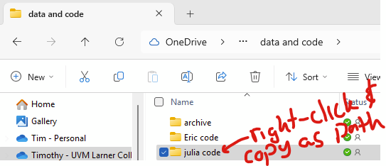
So, to change your directory in windows, you need to deal with how Julia handles backslashes. Adding “raw” before the string of the directory is simpler. The following two are equivalent:
cd("C:\\Users\\USER\\julia code")
cd(raw"C:\Users\USER\julia code")
The second allows you to simply paste the directory from Windows Explorer. So, use raw before your directory string! I don’t know if people will have this problem with other operating systems, I’m guessing not.
You can view the contents of your working directory (e.g., like “ls” or “dir”) with “readdir()“. In this example, I have already used cd() to change my pwd() to the folder that has a Julia script in it:
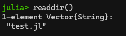
Hey! It’s my “count to a billion” code from part 1. Since it’s in my current directory, I can load it and run it using the include() command as follows:
include("test.jl")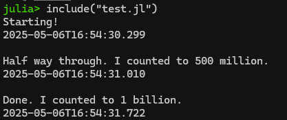
This is actually quite a helpful command if you are writing your script in Notepad++ like we covered in Part 1. Rather than copying/pasting the contents of your script from Notepad++ into Julia/REPL, you can simply do your editing in Notepad++, save the updated script, and then re-run it using include(filename.jl)! A bit less clunky.
Importing files from other statistical packages (SAS’s sas7bdat, Stata’s .dta) using TidierFiles
As discussed in part 1, Tidier is a meta-package that includes a ton of sub-packages in an attempt to create Tidyverse in Julia. One of Tidier’s included packages is the TidierFiles package, which reads and writes all sorts of stuff. Note: You load all Tidier packages, including TidierFiles, when you load Tidier itself. TidierFiles uses Julia’s revered DataFrame package, FYI. You’ll see “df” to name imported data sitting in a dataframe.
Step 1: Installing Tidier (and with it, TidierFiles) and DataFrame
In the package manager (hit “]” to enter), type “add Tidier”. After they install, hit backspace to get back to Julia’s REPL. Alternatively, you can run the following in the REPL or in a script to install Tidier:
using Pkg # need to remember to load Pkg itself!!
Pkg.add("Tidier") # This loads lots, including TiderFiles and DataFrame
Pkg.status() # see that it installed.
using Tidier # load tidier
# type ? and "Tidier" to see all of the packages that come with it.
# type ? and "Tidier.TidierFiles" to read about that specific package.
Step 2: Importing SAS, Stata, CSV and other files
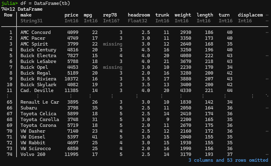
Importing SAS: Now let’s download the airline.sas7bdat dataset from here: https://www.principlesofeconometrics.com/sas.htm — save it to your pwd(). The following command (1) uses Tidier’s TidierFiles to import the airline.sas7bdat as a DataFrame called “df” then (2) shows that it loaded correctly using varinfo().
Note: You can opt to use “read_file” instead of “read_sas” and let TidierFiles figure out what type of file it is. In 2025, this gives an error if you are trying to automate the download using a string, so better to use the “read_sas” command here.
using Tidier # this loads TidierFiles
# set pwd() with cd(), confirm you did it correctly with pwd(), then read the pwd() contents with readdir()
cd(raw"C:\YOUR DIRECTORY")
pwd()
readdir() # the airline file should be in the pwd()
# the following saves the sas file as a dataframe called "df1"
df1 = read_sas("airline.sas7bdat")
# see that it loaded as a dataframe:
varinfo()
# fin
In theory, you should also be able to load the above file directly from the web, but I’m getting an IO error doing that. I’ll come back and try to debug later. This should be the correct code, I’m not sure why it’s not working.
using Tidier
# set pwd() with cd(), confirm you did it correctly with pwd(), then read the pwd() contents with readdir()
cd(raw"C:\YOUR DIRECTORY")
pwd()
readdir()
df2 = read_sas("http://www.principlesofeconometrics.com/sas/airline.sas7bdat")
# see that it loaded as a dataframe:
varinfo()
# fin
Alternatively, you can instead use Julia to download a file to your pwd() in a script. Let’s say you want to download the andy.sas7bdat file and save it to the pwd(). the Downloads package can help with that. Install it with “]” and “add Downloads” or “using Pkg” and “Pkg.add(“Downloads”)”.
using Tidier
using Downloads
# set pwd() with cd(), confirm you did it correctly with pwd(), then read the pwd() contents with readdir()
cd(raw"C:\YOUR DIRECTORY")
pwd()
readdir()

# specify the URL
url = "http://www.principlesofeconometrics.com/sas/andy.sas7bdat"

# Specify the destination, but need to explicitly name the file
# so grab the filename from the end of the URL and list it
# along with the pwd using the joinpath command
filename = split(url,"/") |> last
dest = joinpath(pwd(), filename)
Downloads.download(url, dest)

# see that the file is downloaded in your pwd()
readdir()

# Now use the above script to import the andy file, using the
# captured filename string to automate the import
df3 = read_sas(filename)
# see that it loaded as a dataframe:
varinfo()
# fin
Importing Stata: This is essentially identical to importing a SAS file, but use the “read_dta” command in place of “read_sas”. If you had the auto.dta file in your working directory, this is how you’d import it.
using Tidier
using Downloads
# set pwd() with cd(), confirm you did it correctly with pwd(), then read the pwd() contents with readdir()
cd(raw"C:\YOUR DIRECTORY")
pwd()
readdir()
df4 = read_dta("auto.dta")
# see that it loaded as a dataframe:
varinfo()
# fin
Here’s how that’d look using the auto.dta file from Stata’s website (https://www.stata-press.com/data/r17/r.html):
using Tidier
using Downloads
# set pwd() with cd(), confirm you did it correctly with pwd(), then read the pwd() contents with readdir()
cd(raw"C:\YOUR DIRECTORY")
pwd()
readdir()

# specify the URL
url = "https://www.stata-press.com/data/r17/auto.dta"

# Specify the destination, but need to explicitly name the file
# so grab the filename from the end of the URL and list it
# along with the pwd using the joinpath command
filename = split(url,"/") |> last
dest = joinpath(pwd(), filename)
Downloads.download(url, dest)

# see that the file is downloaded in your pwd()
readdir()
# now import that file as a dataframe:
df5 = read_dta(filename)
# see that it loaded as a dataframe:
varinfo()
# fin
Here you go!
Importing CSV and other filetypes – TidierFiles will import “csv”, “tsv”, “xlsx”, “delim”, “table”, “fwf”, “sav”, “sas”, “dta”, “arrow”, “parquet”, “rdata”, “rds, and Google sheets, you just need to select the correct command to do so (see details here) to replace “read_sas” and “read_dta” above.
Step 3: Merging DataFrames together
We’ll use NHANES data (saved as sas7bdat) and merge on SEQN, aka a unique identifier. The following script downloads the DEMO file and a cholesterol file, and saves them in DataFrames called df_demo and df_trigly
using Tidier
using Downloads
# set pwd() with cd(), confirm you did it correctly with pwd(), then read the pwd() contents with readdir()
cd(raw"C:\YOUR DIRECTORY")
pwd()
readdir()

# Demo file
url = "https://wwwn.cdc.gov/Nchs/Data/Nhanes/Public/2013/DataFiles/DEMO_H.xpt"
filename = split(url, "/") |> last
dest = joinpath(pwd(), filename)
Downloads.download(url, dest)
readdir()
df_demo=read_sas(filename)


# Cholesterol file
url = "https://wwwn.cdc.gov/Nchs/Data/Nhanes/Public/2013/DataFiles/TRIGLY_H.xpt"
filename = split(url, "/") |> last
dest = joinpath(pwd(), filename)
Downloads.download(url, dest)
readdir()
df_chol=read_sas(filename)


# look at dataframes and strings loaded:
varinfo()
# fin
Now, let’s merge/join the df_demo and df_chol dataframes together and save it as a dataframe called df_merge. This will use TidierData’s join function, you can read about here. There are a bunch of different joins, we’ll be doing a full_join which will preserve all rows without dropping any for missing. Read about joins (“merge”) here. Of note, the join command as implemented in TidierData will infer the matching variable based upon identical columns in the two datasets. Continuing with the prior script:
df_merge = @full_join(df_demo, df_chol)Combined code:
using Tidier
using Downloads
# set pwd() with cd(), confirm you did it correctly with pwd(), then read the pwd() contents with readdir()
cd(raw"C:\YOUR DIRECTORY")
pwd()
readdir()

# Demo file
url = "https://wwwn.cdc.gov/Nchs/Data/Nhanes/Public/2013/DataFiles/DEMO_H.xpt"
filename = split(url, "/") |> last
dest = joinpath(pwd(), filename)
Downloads.download(url, dest)
readdir()
df_demo=read_sas(filename)


# Cholesterol file
url = "https://wwwn.cdc.gov/Nchs/Data/Nhanes/Public/2013/DataFiles/TRIGLY_H.xpt"
filename = split(url, "/") |> last
dest = joinpath(pwd(), filename)
Downloads.download(url, dest)
readdir()
df_chol=read_sas(filename)

# join/merge datasets, save as "df_merge" dataframe
df_merge = @full_join(df_demo, df_chol)
# look at dataframes that are there:
varinfo()
# fin
Exporting data
You can export your work using TidierData, just use “write_sas”, “write_dta”, “write_csv” or whatever you want. Details are here. For example, you can append the following to the end of the prior code and save the df_merge dataframe as a CSV file in your pwd(), including the column names as the first row.:
write_csv(df_merge, "NHANES_merged.csv", col_names=true)
# fin
Saving your work in Julia’s JLD2 format and then later loading it
The JLD2 file format seems to be designed to be compatible with future changes in Julia. See details here. Install it in the Pkg interface (hit “]”) then “add JLD2” or “using Pkg” and “Pkg.add(“JLD2″)”. You can save things in your memory (type “varinfo()” to see what’s loaded). For example, you can save the df_merge from 2 sections above with:
using JLD2
# set pwd() with cd(), confirm you did it correctly with pwd(), then read the pwd() contents with readdir()
cd(raw"C:\YOUR DIRECTORY")
pwd()
readdir()
@save "mydataframe.jld2" df_merge
# look at files in pwd()
readdir()
# fin
I haven’t quite found an elegant way to reload JLD2 with Tidier, it instead uses DataFrames (which is actually included in Tidier but doesn’t correctly work with this). You’ll need to separately install DataFrames in the Pkg interface (hit “]” and type “add DataFrames” or in REML type “using Pkg” and “Pkg.add(“DataFrames”)
# close and reopen Julia, load JLD2 and DataFrames
using JLD2
using DataFrames
# set pwd() with cd(), confirm you did it correctly with pwd(), then read the pwd() contents with readdir()
cd(raw"C:\YOUR DIRECTORY")
pwd()
readdir()
# load the dataframe as df_merge.
@load "mydataframe.jld2" df_merge
# look at dataframes and strings loaded:
varinfo()
# fin
Viewing your data in the browser
One great Stata feature is “browse”, allowing you to look at all of the data. The “BrowseTables” package allows you to do something similar in Julia’s interface and (more importantly) a browser window. We will demonstrate this using the merged NHANES dataset above.
Jump to the pkg interface (hit “]”) and type “add BrowseTables” or add in REPL with “using Pkg” and “Pkg.add(“BrowseTables”) then the following:
using BrowseTables
# view 'whatever fits' in the julia terminal:
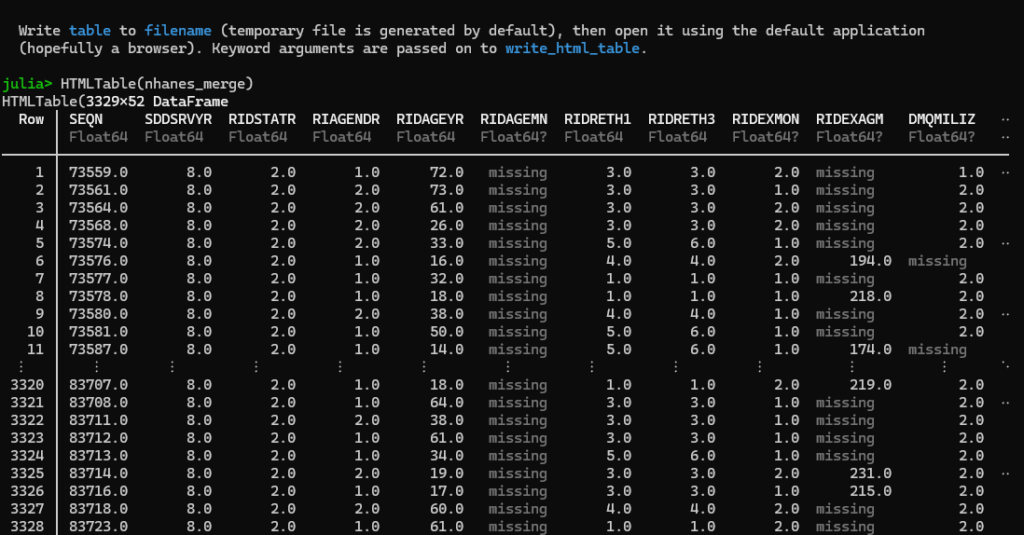
HTMLTable(df_merge)
# open up the nhanes_merge example from above in a browser:
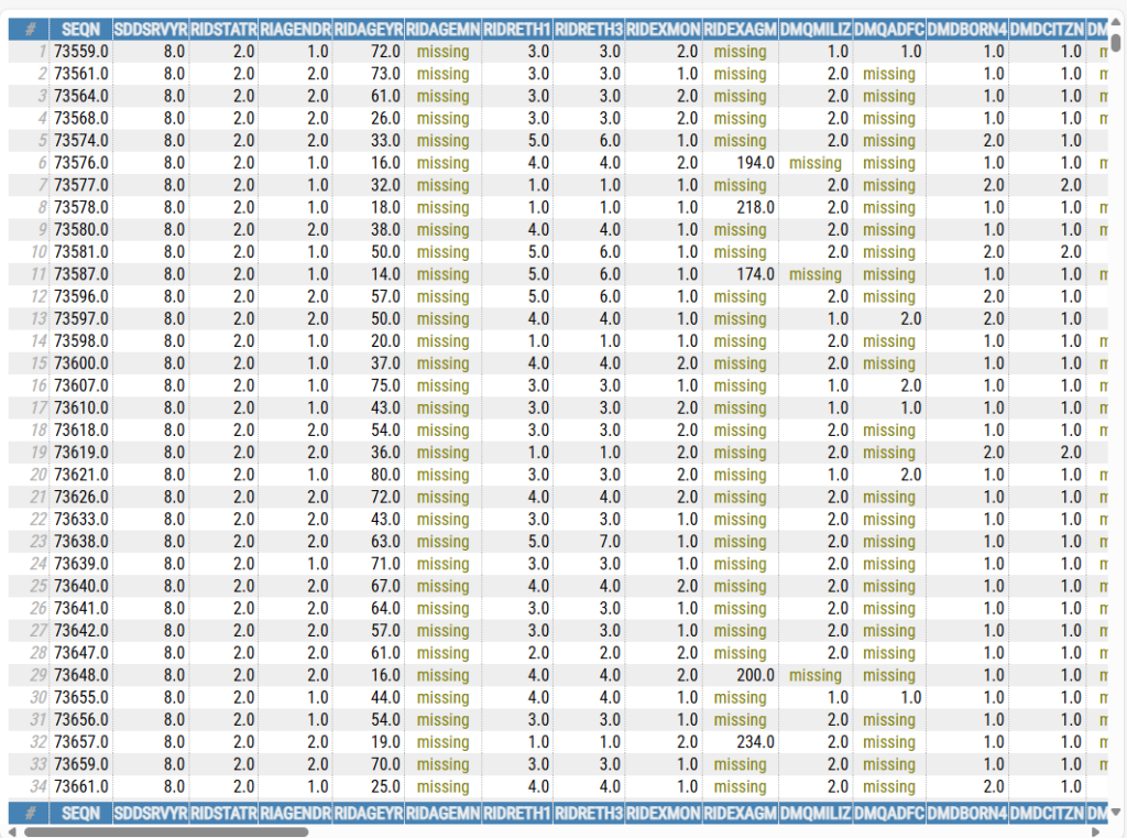
open_html_table(df_merge)
# finThe first command, HTMLTable(df_merge), will show output in the Julia browser, truncating the columns and rows so that it fits like such:
The second command, open_html_table(df_merge), will open the entire dataset in your default browser, like so:
Stata’s ‘browse’ feature is nice in that it allows you to browse subsets of data, e.g., ‘browse if sex==”M”‘ would show data for just males. I’ll play around with this a bit more and see if there’s a simple way to subset the rendered tables to just a sample of the data.