Making a subgroup analysis figure in Stata

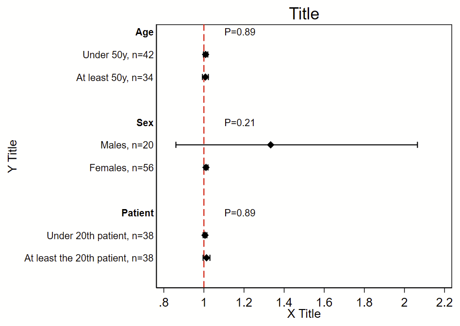
I was the analyst for the myPACE trial (published here in JAMA Cardiology), and needed to put together a subgroup analysis figure. I didn’t find any helpful stock code, so I wrote my own. The code uses the Frames feature that was introduced in Stata 16. It will (a) make a new frame with the required variables but no data, (b) generate a new dichotomous variable from continuous variables, (c) generate labels, (d) grab the Ns, point estimates, and 95% CI from a logistic regression, (e) grab the P-value for interaction for the primary exposure dependent variable*, (f) write the point estimate/95% CI/P-value for interaction to the new frame, then (g) switch to the new frame and make this figure. This script uses local macros so needs to be run all at once in a do file, not line by line.

This uses a stock Stata dataset called “catheter”. The outcome of interest/dependent variable is “infect”, the primary exposure/independent variable of interest is “time”, and the subgroups are age, sex, and patient number. This uses logistic regression, but you can easily swap this model out for any other model.

*You can get more complex code to format the P-values here.
Here’s the code!

frame reset // drop all existing frames and data
webuse catheter, clear // load analytical dataset
version 16 // need Stata version 16 or newer
*
* Make an empty frame with the variables we'll add later row by row
* The variables "rowname" and "pvalue" will be strings so when
* you add to these variables with the --frame post-- command,
* you need to use quotes. 
frame create subgroup str30 rowname n beta low95 high95 str30 pval
*
*** Age
* Need to generate a dichotomous age variable 
* You don't need to do this if the variable is already dichotomous, 
* ordinal, or nominal
generate agesplit = (age>=50) if !missing(age) // below 50 is 0, 50 and above is 1
* 
* Now generate a label for the overall grouping
local label_group "{bf:Age}" 
* 
* Group 0, below age 50
* Generate label for this subgroup
local label_subgroup_0 "Under 50y" 
* Now run the model for this subgroup
logistic infect time if agesplit==0 
* Now save the N, beta, and 95% CI as local macros.
* There's lots you can save after a regression, type --return list--, 
* --ereturn list--, and --matrix list r(table)-- to see what's there
local n_0 = e(N) 
local beta_0 = r(table)[1,1] 
local low95_0 = r(table)[5,1]
local high95_0 = r(table)[6,1]
* print above local macros to prove you collected them correctly: 
di "For `label_subgroup_0', n=" `n_0' ", beta (95% CI)=" %4.2f `beta_0' " (" %4.2f `low95_0' " to " %4.2f `high95_0' ")" 
*
* Group 1, at least 50 years old
local label_subgroup_1 "At least 50y" 
logistic infect time if agesplit==1 
local n_1 = e(N)
local beta_1 = r(table)[1,1] 
local low95_1 = r(table)[5,1]
local high95_1 = r(table)[6,1]
di "For `label_group', subgroup `label_subgroup_1', n=" `n_1' ", beta (95% CI)=" %4.2f `beta_1' " (" %4.2f `low95_1' " to " %4.2f `high95_1' ")" 
* 
* Now run the model with an interaction term between the primary exposure
* and the subgroup. 
logistic infect c.time##i.agesplit
* Grab the p-value as a local macro saved as pval
local pval = r(table)[4,5] 
* Print that local macro to see that you've grabbed it correctly
di "P-int = " %4.3f `pval'
* Format that P-value and save that as a new local macro called pvalue
local pvalue "P=`: display %3.2f `pval''"
di "`pvalue'"
* 
* Now write your local macros to the the "subgroup" frame
* Each "frame post" command will add 1 additional row to the frame.
* We will graph these line by line.
* First line with overall group name a P-value for interaction:
frame post subgroup ("`label_group'") (.)  (.) (.) (.) ("`pvalue'") 
* Now each subgroup by itself:
frame post subgroup ("`label_subgroup_0'") (`n_0')  (`beta_0') (`low95_0') (`high95_0') ("") 
frame post subgroup ("`label_subgroup_1'") (`n_1')  (`beta_1') (`low95_1') (`high95_1') ("") 
* Optional blank line:
frame post subgroup ("") (.) (.) (.) (.) ("") 
*
*** Female sex
* This is already dichotomous, so don't need to create a new variable
* like we did for age.
local label_group "{bf:Sex}"  
*group 0, males
local label_subgroup_0 "Males" 
logistic infect time if female==0 
local n_0 = e(N) 
local beta_0 = r(table)[1,1] 
local low95_0 = r(table)[5,1]
local high95_0 = r(table)[6,1]
*group 1, females
local label_subgroup_1 "Females" 
logistic infect time if female==1 
local n_1 = e(N) // N
local beta_1 = r(table)[1,1] 
local low95_1 = r(table)[5,1]
local high95_1 = r(table)[6,1]
*interaction P-value
logistic infect c.time##i.female
local pval = r(table)[4,5]
local pvalue "P=`: display %3.2f `pval''"
*write to subgroup frame
frame post subgroup ("`label_group'") (.)  (.) (.) (.) ("`pvalue'") 
frame post subgroup ("`label_subgroup_0'") (`n_0')  (`beta_0') (`low95_0') (`high95_0') ("") 
frame post subgroup ("`label_subgroup_1'") (`n_1')  (`beta_1') (`low95_1') (`high95_1') ("") 
frame post subgroup ("") (.) (.) (.) (.) ("") 
*
*** patient
* need to generate a patient dichotomous variable
generate patientsplit = (patient>=20) if !missing(patient) // below 20 is 0, 20 and above is 1
local label_group "{bf:Patient}" 
*group 0, below 20
local label_subgroup_0 "Under 20th patient" 
logistic infect time if patientsplit==0 
local n_0 = e(N) 
local beta_0 = r(table)[1,1] 
local low95_0 = r(table)[5,1]
local high95_0 = r(table)[6,1]
*group 1, 20 and above
local label_subgroup_1 "At least the 20th patient" 
logistic infect time if patientsplit==1 
local n_1 = e(N) 
local beta_1 = r(table)[1,1] 
local low95_1 = r(table)[5,1]
local high95_1 = r(table)[6,1]
*interaction P-value
logistic infect c.time##i.agesplit
local pval = r(table)[4,5] 
local pvalue "P=`: display %3.2f `pval''"
*write to subgroup frame
frame post subgroup ("`label_group'") (.)  (.) (.) (.) ("`pvalue'") 
frame post subgroup ("`label_subgroup_0'") (`n_0')  (`beta_0') (`low95_0') (`high95_0') ("") 
frame post subgroup ("`label_subgroup_1'") (`n_1')  (`beta_1') (`low95_1') (`high95_1') ("") 
frame post subgroup ("") (.) (.) (.) (.) ("") 
*
*** Now make the figure. You'll have to modify this so the number of rows 
*   in your subgroup frame matches the labels and whatnot
set scheme s1mono // I like this scheme
* Change frame to the subgroup frame
cwf subgroup
* Generate a row number by the current order of the data in this frame
gen row=_n
* Here's the code to make the figure
twoway ///
(scatter row beta, msymbol(d) mcolor(black) msize(medium)) ///
(rcap low95 high95 row, horizontal lcolor(black) lwidth(medlarge)) ///
, ///
legend(off) ///
xline(1, lcolor(red) lpattern(dash) lwidth(medium)) ///
title("Title") ///
yti("Y Title") ///
xti("X Title") ///
yscale(reverse) ///
yla( ///
1 "`=rowname[1]'" ///
2 "`=rowname[2]', n=`=n[2]'" ///
3 "`=rowname[3]', n=`=n[3]'" ///
4 " " /// blank since it's a blank row
5 "`=rowname[5]'" ///
6 "`=rowname[6]', n=`=n[6]'" ///
7 "`=rowname[7]', n=`=n[7]'" ///
8 " " /// blank since it's a blank row
9 "`=rowname[9]'" ///
10 "`=rowname[10]', n=`=n[10]'" ///
11 "`=rowname[11]', n=`=n[11]'" ///
12 " " /// blank since it's a blank row
, angle(0) labsize(small) noticks) ///
xla(0.8(.2)2.2) ///
text(1 1.1 "`=pval[1]'", placement(e) size(small)) /// these are the p-value labels
text(5 1.1 "`=pval[5]'", placement(e) size(small)) ///
text(9 1.1 "`=pval[9]'", placement(e) size(small)) 
*
* Now export your figure as a PNG file
graph export "myfigure.png", replace width(1000)
Formatting P-values for Stata output

If you like automating your Stata output, you have probably struggled with how to format P-values so they display in a format that is common in journals, namely:

  • If P>0.05 and not close to 0.05, P has an equals sign and you round at the hundredth place
    • E.g., P=0.2777 becomes P=0.28
  • If P is close to 0.05 , P has an equals sign and you round at the ten thousandth place
    • E.g., P=0.05033259 becomes P=0.0503
    • E.g., P=0.0492823 become P=0.0493
  • If well below 0.05 but above 0.001, P has an equals sign and you round at the hundredth place
    • E.g., P=0.0028832 becomes P=0.003
  • if below 0.001, display as “P<0.001"
  • if below 0.0001, display as “P<0.0001"

Here’s a loop that will do that for you. This contains local macros so you need to run it all at once from a do file, not line by line. You’ll need to have grabbed the P-value as a from Stata as a local macro named pval. It will generate a new local macro called pvalue that you need to treat as a string.

local pval 0.05535235 // change me to play around with this
if `pval'>=0.056 {
	local pvalue "P=`: display %3.2f `pval''"
}
if `pval'>=0.044 & `pval'<0.056 {
	local pvalue "P=`: display %5.4f `pval''"
}
if `pval' <0.044 {
	local pvalue "P=`: display %4.3f `pval''"
}
if `pval' <0.001 {
	local pvalue "P<0.001"
}
if `pval' <0.0001 {
	local pvalue "P<0.0001"
}
di "original P is " `pval' ", formatted is " "`pvalue'"

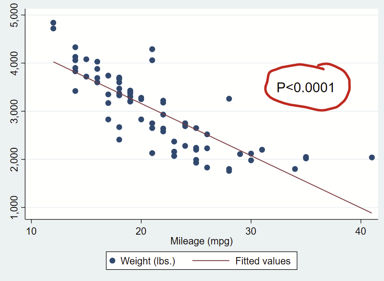
Here’s how you might use it to format the text of a regression coefficient that you put on a figure.

sysuse auto, clear
regress weight mpg
// let's grab the P-value for the mpg
matrix list r(table) //notice that it's at [4,1]
local pval = r(table)[4,1] 

if `pval'>=0.056 {
	local pvalue "P=`: display %3.2f `pval''"
}
if `pval'>=0.044 & `pval'<0.056 {
	local pvalue "P=`: display %5.4f `pval''"
}
if `pval' <0.044 {
	local pvalue "P=`: display %4.3f `pval''"
}
if `pval' <0.001 {
	local pvalue "P<0.001"
}
if `pval' <0.0001 {
	local pvalue "P<0.0001"
}
di "original P is " `pval' ", formatted is " "`pvalue'"

// now make a scatterplot and print out that formatted p-value
twoway ///
(scatter weight mpg) ///
(lfit weight mpg) ///
, ///
text(3500 35 "`pvalue'", size(large))

Adding overlaying text “boxes”/markup to Stata figures/graphs

What’s up with adding text to figures in Stata?

It’s handy to add text to your plots to orient your readers to specific observations in your figures. You might opt to highlight a datapoint, add percentages to bars, or say what part of a figure range is good vs. bad.

Adding text to Stata is relatively straightforward, once you get over the initial learning hump. Check out the added text help files by typing —help added_text_options— and —help textbox_options— for details.

Added text syntax

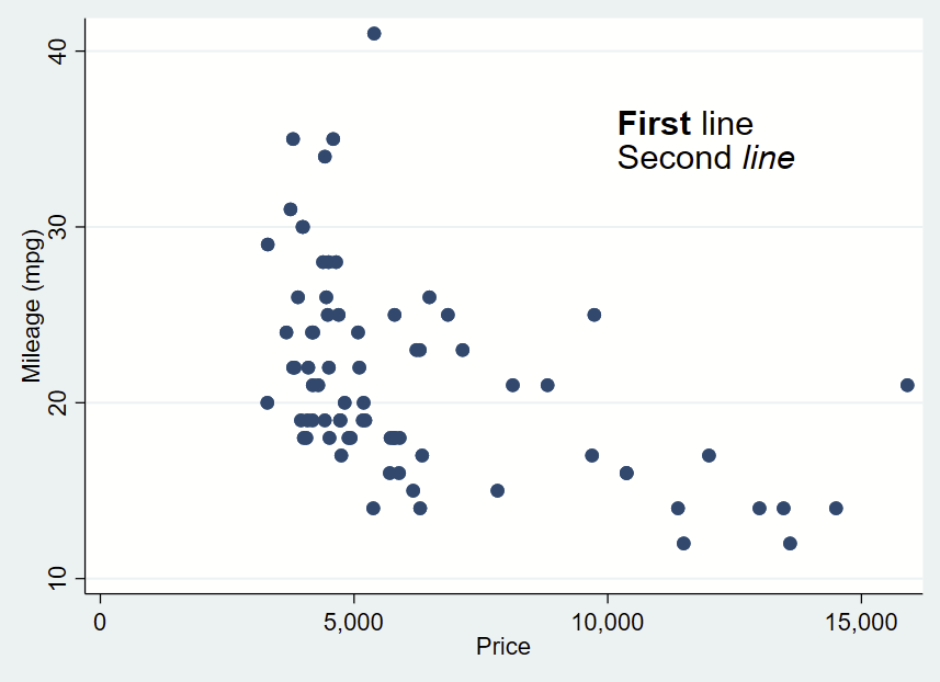
First, make your figure, then add your comma, then add your syntax. Like everything(?) in Stata, the location is specified as Y then X. Then add your text in quotes (or multiple quotes in a row if you want to insert a line break). You can bold or italicize by using the it: and bf: formatting and wrapping the text you want to apply it to in brackets. Then you drop a comma, specify placement as centered (c) or cardinal directions (e.g., ne, s, w) of that text box relative to the Y,X coordinates, justification of the text as left-aligned (left), centered (center), or right-aligned (right), and size of the text (vsmall, small, medsmall, medium, medlarge, large, vlarge, huge as shown in —help textsizestyle–).

Text box without outline, playing around with bolding and italicizing:

sysuse auto, clear
twoway ///
(scatter mpg price) ///
, ///
text(35 12000 "{bf:First} line" "Second {it:line}", placement(c) justification(left) size(large))

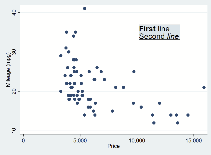
Text box with outline

The main difference is that you add the word “box” to your text box options.

sysuse auto, clear
twoway ///
(scatter mpg price) ///
, ///
text(35 12000 "{bf:First} line" "Second {it:line}", placement(c) justification(left) size(large) box)

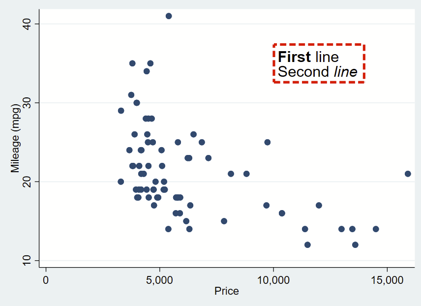
You can further customize your box by specifying options shown under —help textbox_options–. Here, I’m making a box with no fill, and a thick/dashed/red outline with fcolor (fill color, which can be “none” for blank/see-through), lcolor (outline color), lpattern (outline pattern), and lwidth (thickness of outline).

sysuse auto, clear
twoway ///
(scatter mpg price) ///
, ///
text(35 12000 "{bf:First} line" "Second {it:line}", placement(c) justification(left) size(large) box fcolor(none) lcolor(red) lpattern(dash) lwidth(thick)) 

That looks pretty cool, but I’d like there to be more space between the text and the border. That’s specified with “margin”. There’s lots of complex options for this command you can read about in —help marginstyle–, but specifying “small” margin will add just a little buffer.

sysuse auto, clear
twoway ///
(scatter mpg price) ///
, ///
text(35 12000 "{bf:First} line" "Second {it:line}", placement(c) justification(left) size(large) box fcolor(none) lcolor(red) lpattern(dash) lwidth(thick) margin(small))

Special characters, and offsetting the Y,X coordinates

Sometimes you need a superscript 2 or 3, an arrow, or some other special character. Here are some that you can copy/paste into your text:

≥
≤
±
↑
↓
←
→
↔
🗸
χ² (chi-squared)
°
α
β
δ
Δ
γ
² (squared)
³ (cubed)

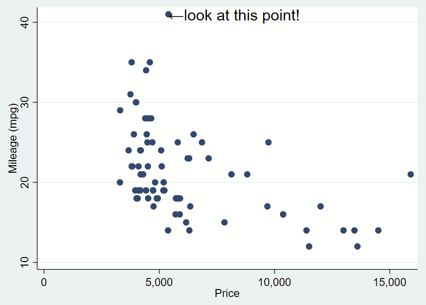
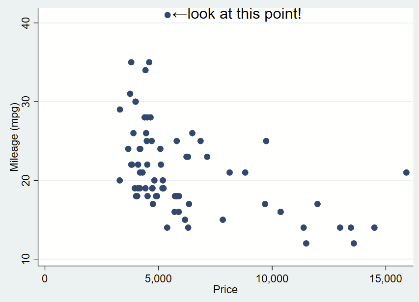
Here’s how you might use the above arrow. Here, I’ve changed the placement to “e” for “east” so the text is to the right and centered of the specified Y,X coordinates of this point (which I looked up, it’s 41,5397). I’ve dropped the box and it’s only one line. I need to manually specify the Y,X coordinates, so it’s a bit clunky still.

sysuse auto, clear
twoway ///
(scatter mpg price) ///
, ///
text(41 5397 "←look at this point!", placement(e) justification(left) size(large))

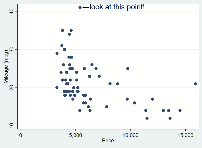
You’ll notice that the left pointing arrow is inside the point of interest. The left pointing arrow in Ariel text isn’t exactly vertically centered (that’s a quirk of Ariel). You can “nudge” the text box to the right and up by adding an offset to the Y and X coordinates. To do math on an x,y point and add an offset, you place the point in an opening tick (to the left of 1 on your keyboard) and an apostrophe, and putting an equal sign at the beginning. After a bit of trial and error, we want to add an offset of +0.3 to the Y coordinate and +200 to the X coordinate.

sysuse auto, clear
twoway ///
(scatter mpg price) ///
, ///
text(`=41+0.3' `=5397+200' "←look at this point!", placement(e) justification(left) size(large))

If we want to automate the extreme numbers on either axis, we can use the sum command to grab the maximum value aka r(max) of the Y axis and the corresponding x value for that extreme. We can make a local macro to grab that value. Since this uses local macros, you need to run all lines at once in a do file, not line by line.

sysuse auto, clear
// grab yaxis (mpg) extreme
sum mpg, d
// now look at the r-value scalars we can call.
// note that r(max) is 41 and is the maximum. 
return list
// now save r(max) as a local macro
local ymax = r(max)
// now let's find the x value for that y value.
// remember that the x axis variable is "price" 
sum price if mpg==`ymax', d
// now look at r-value scalars you can call.
// since there's only 1 value, the mean, min, max,
// and sum are all the same. 
return list
// let's now grab the r(mean) of as a local macro
local ymax_x = r(mean)
// now you can prove that you grabbed the correct point
di "Y max =" `ymax' ", and that point is at X=" `ymax_x'
// now place those local macros in the Y and X, keeping
// the other offsets
twoway ///
(scatter mpg price) ///
, ///
text(`=`ymax'+0.3' `=`ymax_x'+200' "←look at this point!", placement(e) justification(center) size(large))

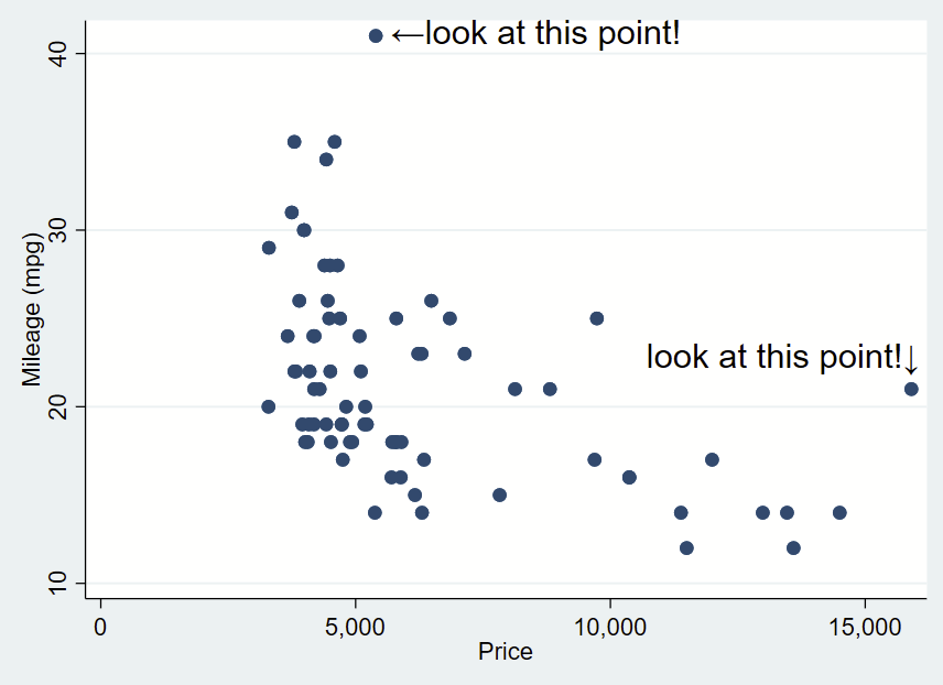
You can do the same for the x-axis extreme in the same script. for the X extreme, we’ll change the placement so it’s northwest and also tweak the Y,X coordinate offsets.

sysuse auto, clear
sum mpg, d
local ymax = r(max)
sum price if mpg==`ymax', d
local ymax_x = r(mean)
di "Y max =" `ymax' ", and that point is at X=" `ymax_x'
//
sum price, d
local xmax=r(max)
sum mpg if price==`xmax', d
local xmax_y=r(mean)
di "X max =" `xmax' ", and that point is at Y=" `xmax_y'

twoway ///
(scatter mpg price) ///
, ///
text(`=`ymax'+0.3' `=`ymax_x'+200' "←look at this point!", placement(e) justification(center) size(large)) ///
text(`=`xmax_y'+1' `=`xmax'+260' "look at this point!↓", placement(nw) justification(center) size(large))

What about adding text labels bar graphs?

There’s a simple –graph bar– command, which isn’t terribly customizable. Here, we’ll be using the –twoway bar– bar graphs and add some fancy error bars with –twoway rcap–. The simplest way to do this is to make a new “dataset” from summary statistics in a separate frame. Frames are new in Stata 16, so if you are using an older version, this won’t work.

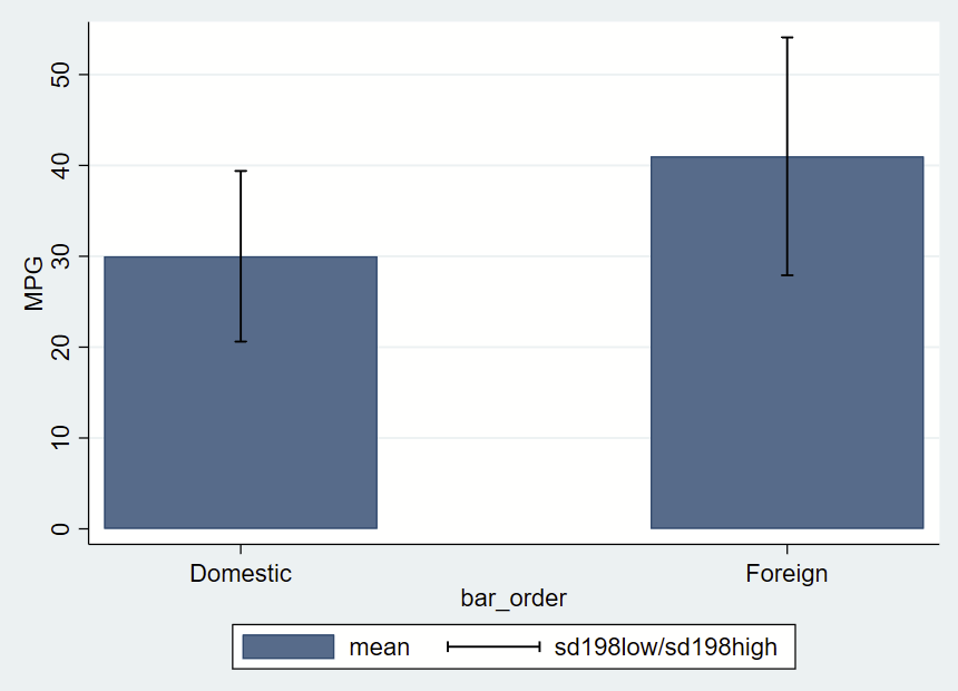
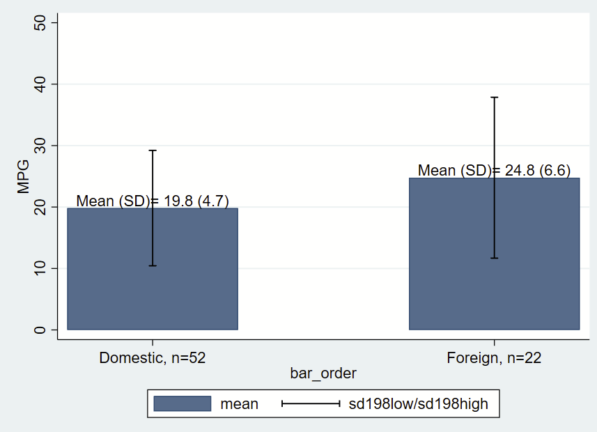
After making a frame with a bunch of summary statistics by group (most of which we won’t use here, but you might opt to later so we’ll keep it all there), you get this figure of mean and +/- 1.98*SD error bars.

// this has local macros so need to run from top to bottom in a do file!
// clear all frames
version 16
frames reset
sysuse auto, clear
// make a new frame called "bardata" that will store the values for bars. 
frame create bardata str20 rowname n low95 high95 mean sd median iqrlow iqrhigh bar_order
//
// now grab summary statistics for foreign==0 
// grab 2.5th and 95th %ile and save as local macros
// in case you might want them ever
_pctile mpg if foreign==0, percentiles(2.5 97.5)
local low95 = r(r1)
local high95= r(r2)
// now sum with detail one row 
sum mpg if foreign==0, d
// post these to the new frame/bardata
// note the final row, which will be the x axis value that will correspond with bar placement
frame post bardata  ("Foreign==0") (r(N)) (r(mean)) (`low95') (`high95') (r(sd)) (r(p50)) (r(p25)) (r(p75)) (1)
// 
// now repeat for foreign==1
_pctile mpg if foreign==1, percentiles(2.5 97.5)
local low95 = r(r1)
local high95= r(r2)
sum mpg if foreign==1, d
// note the final row is now 3, leaving a gap of between the prior row 
frame post bardata  ("Foreign==1") (r(N)) (r(mean)) (`low95') (`high95') (r(sd)) (r(p50)) (r(p25)) (r(p75)) (3)

// now change to the frame with the summary statistics
cwf bardata 
// let's make a new variable that's the mean +/- 1.98*sd
gen sd198low = mean-(sd*1.98)
gen sd198high = mean+(sd*1.98)

// now graph those data 
twoway ///
(bar mean bar_order) ///
(rcap sd198low sd198high bar_order, vert lcolor(black)) ///
, ///
yla(0(10)50) ///
xla(1 "Domestic" 3 "Foreign") ///
ytitle("MPG") 

Let’s make things a bit more fancy with labels, and place a text box with the mean and SD immediately above/north of the bars, which themselves are means of MPG by group. One quirk of Stata is that when formatting printed text from stored values, you need to place the label in an opening and closing tick, put a colon, type display, then apply the formatting (e.g., %3.1f for 1 digit after the decimal) then the value you are trying to show. You’ll notice that formatting in the last two lines of the following code.

// clear all frames
version 16
frames reset
sysuse auto, clear
// make a new frame called "bardata" that will store the values for bars. 
frame create bardata str20 rowname n mean low95 high95  sd median iqrlow iqrhigh bar_order
//
// now grab summary statisticis for foreign==0 
// grab 2.5th and 95th %ile and save as local macros
_pctile mpg if foreign==0, percentiles(2.5 97.5)
local low95 = r(r1)
local high95= r(r2)
// now sum with detail one row 
sum mpg if foreign==0, d
// post these to the new frame/bardata
// note the final row, which will be the x axis value that will correspond with bar placement
frame post bardata  ("Foreign==0") (r(N)) (r(mean)) (`low95') (`high95') (r(sd)) (r(p50)) (r(p25)) (r(p75)) (1)
// 
// now repeat for foreign==1
_pctile mpg if foreign==1, percentiles(2.5 97.5)
local low95 = r(r1)
local high95= r(r2)
sum mpg if foreign==1, d
// note the final row is now 3, leaving a gap of between the prior row 
frame post bardata  ("Foreign==1") (r(N)) (r(mean)) (`low95') (`high95') (r(sd)) (r(p50)) (r(p25)) (r(p75)) (3)

// now change to the frame with the summary statistics
cwf bardata 
// let's make a new variable that's the mean +/- 1.98*sd
gen sd198low = mean-(sd*1.98)
gen sd198high = mean+(sd*1.98)

// let's grab the mean and SD for each group. This frame has only two 
// rows of data, so we'll use the row notatition to generate a local from
// the first and second rows, with row number specified in brackets
local group0_mean = mean[1]
local group0_sd =sd[1]
local group0_n = n[1]
// print to check your work
di "for group 0, mean =" `group0_mean' ", SD=" `group0_sd' ", n=" `group0_n'
// do the other group 
local group1_mean = mean[2]
local group1_sd =sd[2]
local group1_n = n[2]
// print to check your work
di "for group 1, mean =" `group1_mean' ", SD=" `group1_sd' ", n=" `group1_n'

// now graph those data 
// we'll add labels for the mean and SD and also
// label the N in the xlabels
twoway ///
(bar mean bar_order) ///
(rcap sd198low sd198high bar_order, vert lcolor(black)) ///
, ///
yla(0(10)50) ///
xla(1 "Domestic, n=`group0_n'" 3 "Foreign, n=`group1_n'") ///
ytitle("MPG") ///
text(`group0_mean' 1 "Mean (SD)= `: display %3.1f `group0_mean'' (`: display %3.1f `group0_sd'')", placement(n)) ///
text(`group1_mean' 3 "Mean (SD)= `: display %3.1f `group1_mean'' (`: display %3.1f `group1_sd'')", placement(n)) 

Appending/merging/combining Stata figures/images with ImageMagick

Sometimes you want to combine two figures in Stata but the –graph combine– command isn’t doing it for you for whatever reason. I’ve run into this when I’ve already merged several figures (abcd), and want to combine that with another merged figure (1234):

[a]
[b]
[c]
[d]
...run graph combine then graph export in Stata and get:
[abcd].png

[1]
[2]
[3]
[4]
...graph combine and graph export to get:
[1234].png

But what I want is one image that looks like this, stacking one on top of the other:

[abcd
 1234].png

My previous workflow was to open up GIMP and manually combine them together. It turns out ImageMagick allows you to do this from the command line, so you can embed a couple of lines of code in your Stata do file to combine images together quickly. You can read details on the append command here (and also the related smush command here).

Getting started with Imagemagick & Stata, and example on how to combine/merge/append images

Note: I am doing this on Windows. The process might be slightly different for Mac or *nix.

Also note: The examples here use PNG files since they are smaller than TIFF files. You might opt to use TIFF files since they are uncompressed and won’t introduce compression artifact with multiple manipulations. Journals will probably want TIFF files anyway so perhaps do that from the start.

Also also note: Imagemagick doesn’t like extra spaces in code. If your code doesn’t run as expected, check that you don’t have extra spaces in your code. And also make sure you are also running the “local pwd=c(pwd)” command along with your other lines of code all at once.

  • Step 1: Download and install ImageMagick. Make sure to check the box next to “Add application directory to your system path”. This allows you to call ImageMagick from the command line so you can use it in Stata.
  • Step 2: From a do file, make some figures and use –graph export– to save them in your working directory as a common filetype (e.g., PNG, JPG, SVG). Let’s assume you have one figure called abcd.png and another called 1234.png.
    • Note: Type -pwd- to see where your working directory is.
  • Step 3: In your do file below the code that makes your two figures, call ImageMagick from the shell (“!” is the Stata command to call the shell), list out the names of the figures you want to combine, say you want to combine them, then tell it the name of the combined filetype.
    • To simplify the code, we’ll also grab the present working directory and put it before the filename as a local macro. Since this uses local macros, you need to run all lines at once from a do file and not one-by-one in Stata.

Combining figures using convert -append

Here’s some code that will vertically append a file “abcd.png” to “1234.png” and save as “abcd1234.png”:

local pwd = c(pwd) // pluck stata's working directory
//
!magick ///
convert ///
"`pwd'/abcd.png" ///
"`pwd'/1234.png" ///
-append ///
"`pwd'/abcd1234.png"

Note that if you want to combine them horizontally instead of vertically, you’d use “+append” instead.

Combining figures using mosaic

Alternatively, you can use the mosaic command, and specify “concatenate” to do the same thing, specifying they are tiled in a 1×2 tiling (read about the mosaic command here). Note that adding -label “” before each figure name keeps any generated labels from appearing under each figure in the final mosaic:

local pwd = c(pwd) // pluck stata's working directory
//
!magick ///
montage ///
-label "" "`pwd'/abcd.png" ///
-label "" "`pwd'/1234.png" ///
-mode Concatenate -tile 1x2 ///
"`pwd'/abcd1234.png"

Or you can use the mosaic command to stick together all of the original figures as 4×2 tiling:

local pwd = c(pwd) // pluck stata's working directory
// 
!magick ///
montage ///
-label "" "`pwd'/a.png" ///
-label "" "`pwd'/b.png" ///
-label "" "`pwd'/c.png" ///
-label "" "`pwd'/d.png" ///
-label "" "`pwd'/1.png" ///
-label "" "`pwd'/2.png" ///
-label "" "`pwd'/3.png" ///
-label "" "`pwd'/4.png" ///
-mode Concatenate -tile 4x2 ///
"`pwd'/abcd1234.png"

Adding text/annotation to your image

Adding text label on the figure itself with Convert -annotate

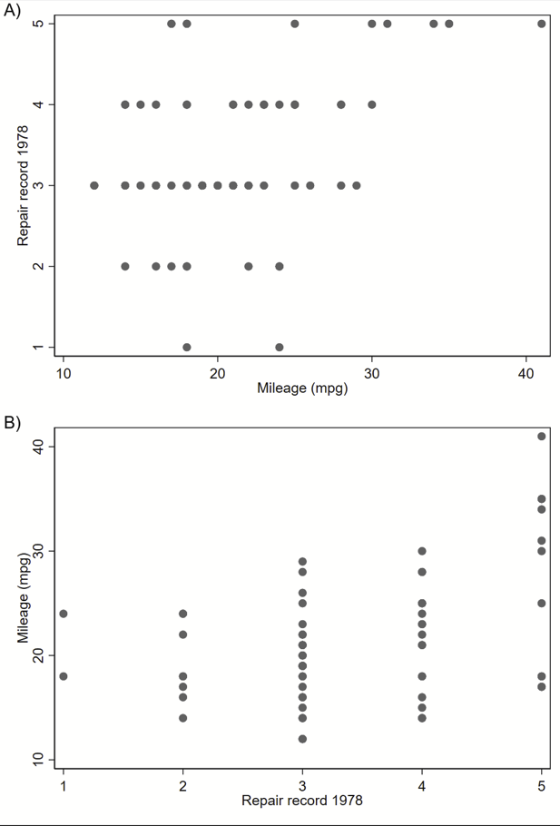
You can also add some labels right on your figure with the “convert -annotate” command (details here). Here we are adding a label “A)” and “B)” to the top left corner of each figure, or “Northwest” as defined by gravity (can use other cardinal directions too). You can move things up or down from the Northwest point if needed by changing the +0+0 (that’s +x+y) offset.

sysuse auto, clear

set scheme s1mono // I like this scheme
twoway scatter mpg rep78
graph export 1234.png, width(1000) replace

twoway scatter rep78 mpg
graph export abcd.png, width(1000) replace 

local pwd = c(pwd) // pluck stata's working directory
//
!magick ///
convert ///
"`pwd'/abcd.png" -gravity Northwest -pointsize 30 -annotate +10+0 "A)" ///
"`pwd'/abcd_labeled.png"
//
!magick ///
convert ///
"`pwd'/1234.png" -gravity Northwest -pointsize 30 -annotate +10+0 "B)" ///
"`pwd'/1234_labeled.png"
//
!magick ///
"`pwd'/abcd_labeled.png" ///
"`pwd'/1234_labeled.png" ///
-append ///
"`pwd'/abcd1234_labeled.png"

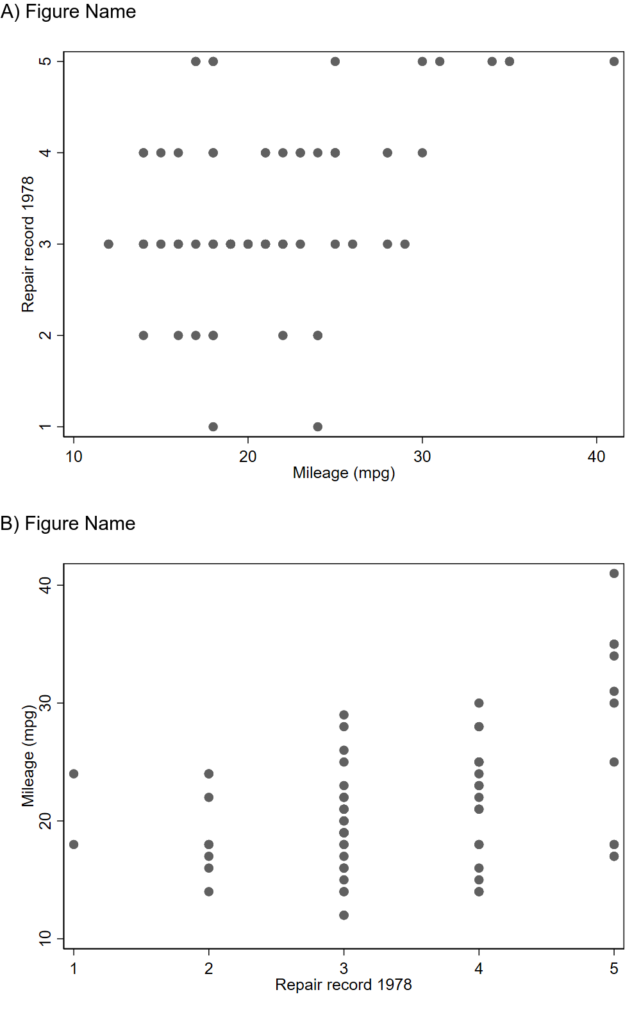
Here’s the resulting figure:

Adding text above your figure with convert -label, then combining figures with mosaic

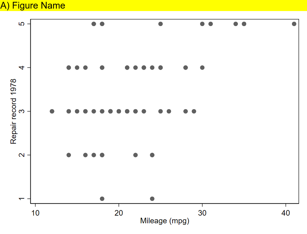
This will add a label above your image, instead of on your image like convert -annotate. Here, the background is yellow so you can see it. Details are here.

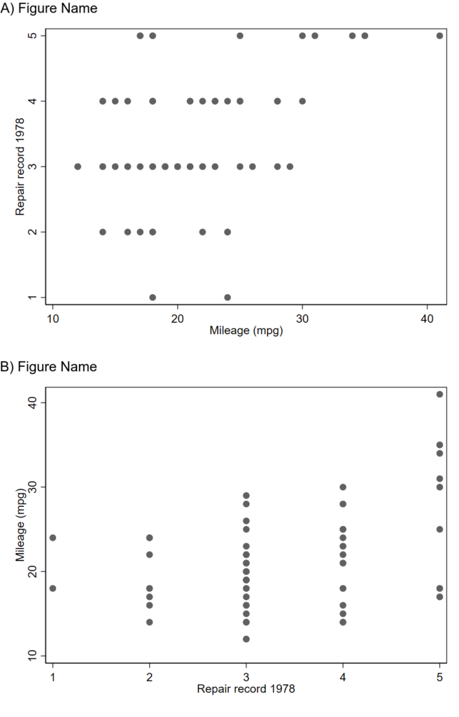
This can be followed by a mosaic command so you can get a figure like this (with white label now).

Note that Imagemagick will try to append the labels that you generated in prior lines (“A) Figure Name” and “B) Figure Name”) under each image before combining unless you specify -label “”. Code to make the above figures:

sysuse auto, clear

set scheme s1mono // I like this scheme
twoway scatter mpg rep78
graph export 1234.png, width(1000) replace

twoway scatter rep78 mpg
graph export abcd.png, width(1000) replace 

local pwd = c(pwd) // pluck stata's working directory
// label
!magick ///
convert ///
"`pwd'/abcd.png" -background white -pointsize 30 label:"A) Figure Name" +swap -gravity West -append ///
"`pwd'/abcd_labeled.png"
//
!magick ///
convert ///
"`pwd'/1234.png" -background white -pointsize 30 label:"B) Figure Name" +swap -gravity West -append ///
"`pwd'/1234_labeled.png"
// combine as a montage
!magick ///
montage ///
-label "" "`pwd'/abcd_labeled.png" ///
-label "" "`pwd'/1234_labeled.png" ///
-mode Concatenate -tile 1x2 ///
"`pwd'/abcd1234_labeled_montage.png"

Generating an image with text then sticking that on top of your figures

ImageMagick will allow you to make an image that’s just text, which you can then stack on top of your figures using the montage feature. Just make sure to set the text width to be the same width as your figure, 1000 pixels here. You will stack them like this:

[abcd_label <-newly generated image of just text
abcd
1234_label <-newly generated image of just text
1234]

And you’ll get something like this:

sysuse auto, clear

set scheme s1mono // I like this scheme
twoway scatter rep78 mpg
graph export abcd.png, width(1000) replace 

twoway scatter mpg rep78
graph export 1234.png, width(1000) replace

local pwd = c(pwd) // pluck stata's working directory
// make two separate text labels that you will later combine with your
// abcd and 1234 figures using montage
// 
// first make the labels
// note: the caption option will use word wrap if it's too wide. 
// This is 1000 pixels wide to match the other figures. 
//
!magick ///
convert ///
-background none -size 1000x -fill black -font ariel -pointsize 30 caption:"A) Figure Name" ///
"`pwd'/abcdlabel.png"
//
!magick ///
convert ///
-background none -size 1000x -fill black -font ariel -pointsize 30 caption:"B) Figure Name" ///
"`pwd'/1234label.png"
//now use montage to put those labels on top of your other ones. 
//combine as a montage
//
!magick ///
montage ///
-label "" "`pwd'/abcdlabel.png" ///
-label "" "`pwd'/abcd.png" ///
-label "" "`pwd'/1234label.png" ///
-label "" "`pwd'/1234.png" ///
-mode Concatenate -tile 1x4 ///
"`pwd'/abcd1234_labeled_montage.png"

Other useful functions of Imagemagick

Convert and -Trim

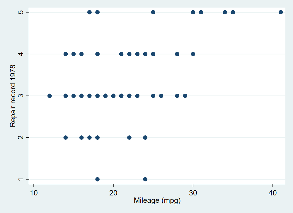
Trimming removes all of the extra border around your figure. The border is defined as whatever color the pixel in the corner is. So if you have a figure that looks like this:

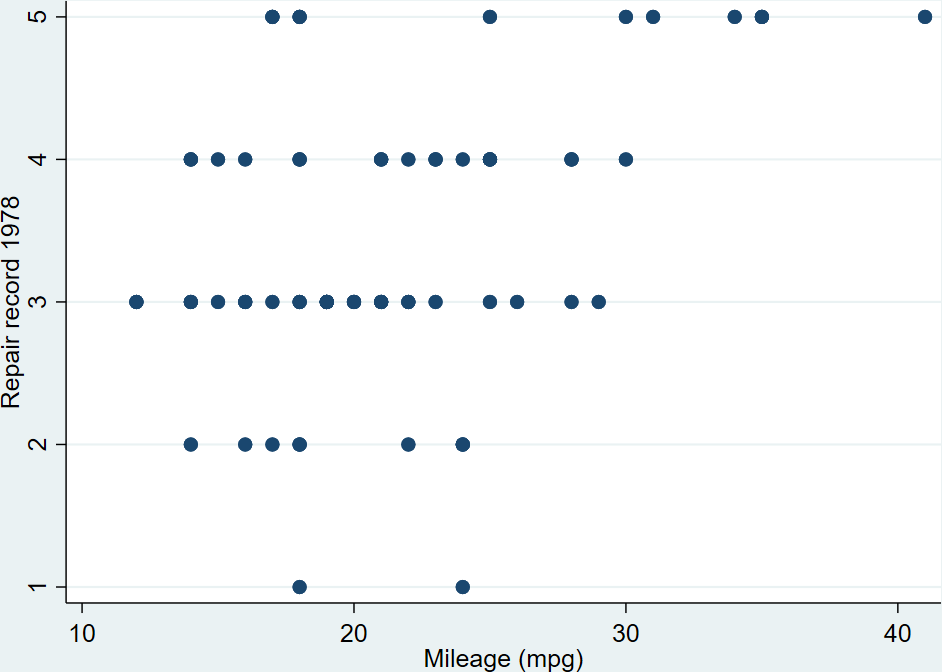
Trimming will remove the small amount of blue space outside of your labels and around the figure, so you get this:

Code to do this:

sysuse auto, clear
set scheme s2color // stata's default scheme
twoway scatter rep78 mpg
graph export abcd.png, width(1000) replace 
//
local pwd = c(pwd) // pluck stata's working directory
//
!magick ///
convert ///
"`pwd'/abcd.png" -trim ///
"`pwd'/abcd_trim.png"

Replicating Stata’s Graph Combine feature

I’m not quite sure why you’d want to do this, but you can combine several figures without axis labels and use one overall label like specifying l1label and b1label in –graph combine–. This code makes 4 separate figures without labels then merges them together then generates text to go on the left side vertically and on the bottom horizontally. You get this figure in the end:

sysuse auto, clear
set scheme s1mono // I like this scheme
//
// Make 4 figures without labels
twoway scatter mpg weight if rep78==1 ///
, ///
xti("") ///
yti("")
//
graph export 1.png, width(1000) replace
//
twoway scatter mpg weight if rep78==2 ///
, ///
xti("") ///
yti("")
//
graph export 2.png, width(1000) replace
//
twoway scatter mpg weight if rep78==3 ///
, ///
xti("") ///
yti("")
//
graph export 3.png, width(1000) replace
//
twoway scatter mpg weight if rep78==4 ///
, ///
xti("") ///
yti("")
//
graph export 4.png, width(1000) replace
// 
local pwd = c(pwd) // pluck stata's working directory
// now merge the 4 figures horizontally:
!magick ///
montage ///
-label "" "`pwd'/1.png" ///
-label "" "`pwd'/2.png" ///
-label "" "`pwd'/3.png" ///
-label "" "`pwd'/4.png" ///
-mode Concatenate -tile 4x1 ///
"`pwd'/1234_noaxislabel.png"
// now make a side label as a text block:
//
!magick ///
convert ///
-pointsize 50 label:"Side Label!" -rotate -90 ///
"`pwd'/1234sidelabel.png"
//
// ditto bottom label: 
//
!magick ///
convert ///
-pointsize 50 label:"Bottom Label!" -rotate -0 ///
"`pwd'/1234bottomlabel.png"
//
// now combine them together:
!magick convert \( "`pwd'/1234sidelabel.png" "`pwd'/1234_noaxislabel.png" -gravity Center +append \) \( "`pwd'/1234bottomlabel.png" \) -append 1234_labeled.png

Making a Bland-Altman plot with printed mean and SD in Stata

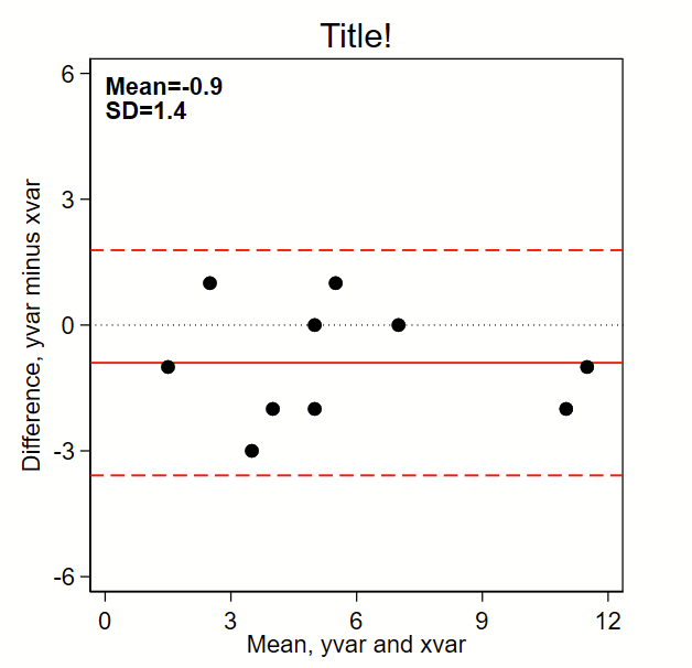
The below code outputs this Bland-Altman plot figure, which prints the mean and SD and puts a solid line for mean difference and red dotted lines for mean difference +/- 1.96*SD. (Note: the original BA paper used +/- 2*SD, but it’s reasonable to use +/-1.96*SD given it’s commonality in estimating the bounds of 95% confidence intervals of a normally-distributed plot). By the way, see the related page on making a scatterplot here, which should probably be shown alongside this figure in any publication.

Here’s the code:

// note this uses local macros so you need to run this entire thing
// top to bottom in a do file, not line by line. 
//
// Step 1: input some fake data:
// Note: for comparing tests (e.g., lab tests), I make x the "gold standard" 
//       test and y the investigational test 
clear all

input id yvar xvar
1 2 5
2 3 5
3 6 5
4 7 7
5 3 2
6 10 12
7 1 2
8 11 12
9 4 6
10 5 5
end

// Step 2a: make difference (to go on y axis) and mean (x axis) variables
gen diff= yvar - xvar
gen mean = (yvar+xvar)/2

// Step 2b: Grab the difference (y axis) mean and sd
sum diff, d
local diffmean= r(mean)
local diffsd = r(sd)

// Step 3: graph!
set scheme s1mono // I like this scheme

twoway ///
(scatter diff mean, msymbol(O) msize(medium) mcolor(black)) ///
, ///
/// black dotted line at zero:
yline(0, lcolor(black) lpattern(dot) lwidth(medium)) ///
/// red solid line at mean:
yline(`=`diffmean'',lcolor(red) lpattern(solid) lwidth(medium)) ///
/// red dashed lines at mean +/- 1.96*sd
yline(`=`diffmean'+1.96*`diffsd''  , lcolor(red) lpattern(dash) lwidth(medium)) ///
yline(`=`diffmean'-1.96*`diffsd''  , lcolor(red) lpattern(dash) lwidth(medium)) ///
aspect(1) /// force output to be square
/// here's the text box with mean and sd,
/// you'll need to tweak the first two numbers so the y,x
/// coordinates drop the text where you want it
text(6 0 "{bf:Mean=`:di %3.1f `=`diffmean'''}" "{bf:SD=`:di %3.1f `=`diffsd'''}", placement(se) justification(left)) /// 
legend(off) /// Shut off the legend
/// Now tweak the ranges of the axes to your liking. 
/// I like to make them the same width. In this example, the x axis is from 
/// 0 to 12 so is 12 units wide. So I set the y axis to also be 
/// 12 units wide, going from -6 to +6.
xla(0(3)12) /// you'll need to tweak range for your data
yla(-6(3)6, angle(0)) /// you'll need to tweak range for your data
ytitle("Difference, yvar minus xvar") ///
xtitle("Mean, yvar and xvar") ///
title("Title!") 

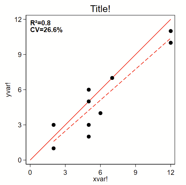
Making a scatterplot with R squared and percent coefficient of variation in Stata

I recently had to make some scatterplots for Figure 3 of this paper. I decided to clean up the code in case it might be helpful to others.

The below code outputs a scatterplot with R-squared and %CV. I grabbed the %CV-from-a-regression code from Mehmet Mehmetoglu’s CV program. (Type –ssc install cv– to grab that one. It’s not needed for below.) By the way, you might also be interested in how to make a related Bland-Altman plot here.

Here’s the code:

// note this uses local macros so you need to run this entire thing
// top to bottom in a do file, not line by line. 
//
// Step 1: input some fake data:
clear all

input id yvar xvar
1 2 5
2 3 5
3 6 5
4 7 7
5 3 2
6 10 12
7 1 2
8 11 12
9 4 6
10 5 5
end

// Step 2a: Grab the R2 from a regresssion
regress yvar xvar
local rsq = e(r2)
// Step 2b, from the same regression, calculate the percent CV
local  rmse= e(rmse)
local depvar = e(depvar)
sum `depvar' if e(sample), meanonly
local depvarmean = r(mean)
local cv = `rmse'/`depvarmean'*100

// Step 3: graph!
set scheme s1mono // I like this scheme

twoway ///
/// Line of unity, you'll need to tweak the range for your data.
/// note that 'y' and 'x' are not the same as 'yvar' and 'xvar'
/// but are instead what's required here to print the line of
/// unity:
(function y=x , range(0 12) lcolor(red) lpattern(solid) lwidth(medium)) ///
/// line of fit:
(lfit yvar xvar,  lcolor(red) lpattern(dash) lwidth(medium)) ///
/// Scatter plot dots:
(scatter yvar xvar, msymbol(O) msize(medium) mcolor(black)) ///
, ///
aspect(1) /// force output to be square
/// here's the text box with R2 and CV,
/// you'll need to tweak the first two numbers so the y,x
/// coordinates drop the text where you want it
text(12 0 "{bf:R²=`:di %3.1f `=`rsq'''}" "{bf:CV=`:di %4.1f `=`cv'''%}", placement(se) justification(left)) /// 
legend(off) /// Shut off the legend
yla(0(3)12, angle(0)) /// you'll need to tweak range for your data
xla(0(3)12) /// you'll need to tweak range for your data
ytitle("yvar!") ///
xtitle("xvar!") ///
title("Title!")