NOTE: I have more recently put together user-friendly code on scatterplots and Bland-Altman plots. Go check those pages out.
Scatterplots with a fitted line
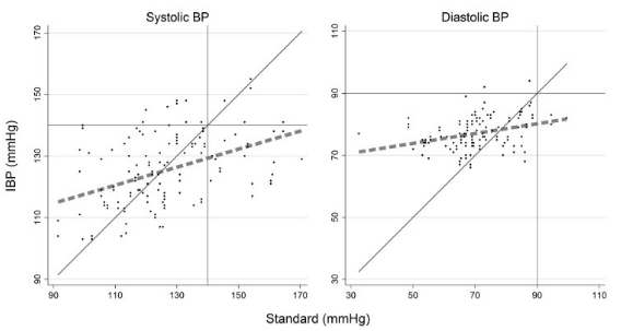
This is pretty straightforward in Stata. This is a variation of a figure that I made for a JAMA Internal Medicine paper. (I like to think that the original figure was publication quality, but they had their graphics team redo it in their own format.) This contains a diagonal line of unity and cutoffs for systolic hypertension as vertical/horizontal bars. Different from the publication version, this includes a thick dotted fitted line.
This code actually makes two different scatterplots then merges them together and puts labels over the merged version.
The scatter function here wants a Y-axis variable and X-axis variable. The two variables were ibp_sbp_pair (Y-axis) and average_sbp_omron_23 (X-axis) for systolic and ibp_dbp_pair and average_dbp_omron_23 for diastolic.
Bland-Altman plots
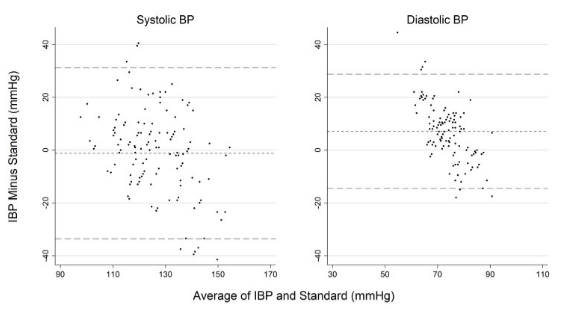
This is from the same paper.
Again, two different B-A plots that are merged then labels applied. The dotted line is relative mean difference, the long dashed lines are +/- 2 SD.
As far as Stata’s graph maker is concerned, this is a scatterplot. You just need to set up all of the variables intentionally to trick it into rendering a B-A plot. The Y-axis is the difference between the variables and the X-axis is a mean of the variables.
Code for both figures follows.
**********scatterplot ave with lines of fit
***sbp
twoway (lfit ibp_sbp_pair average_sbp_omron_23, lcolor(gray) lpattern(dash) lwidth(vthick)) /// line of fit code
(function y=x, ra(average_sbp_omron_23) clcolor(gs4)) /// diagonal line of unity
(scatter ibp_sbp_pair average_sbp_omron_23 , mcolor(black) msize(vsmall)), /// make dots appear for scatter, y x axis
legend(off) /// hide legend
title("Systolic BP", color(black)) ///
ytitle("") /// no title, will add when merging SBP and DBP
xtitle("") /// ditto
xline(140, lpattern(solid) lcolor(gray)) /// cutoff for systolic hypertension
yline(140, lpattern(solid) lcolor(gray)) /// ditto
graphregion(color(white)) ylabel(, grid glcolor(gs14)) /// white background, light gray lines
xlabel(90(20)170) ylabel(90(20)170) /// where X and Y labels occur
aspectratio(1) // force figure to be a 1x1 square, not a rectangle
graph save 20_sbp_scatterplot_fit.gph, replace // need graph to merge later
graph export 20_sbp_scatterplot_fit.png, width(4000) replace

***dbp
twoway (lfit ibp_dbp_pair average_dbp_omron_23, lcolor(gray) lpattern(dash) lwidth(vthick)) ///
(function y=x, ra(average_dbp_omron_23) clcolor(gs4)) ///
(scatter ibp_dbp_pair average_dbp_omron_23, mcolor(black) msize(vsmall)), ///
legend(off) ///
title("Diastolic BP", color(black)) ///
ytitle("") ///
xtitle("") ///
xline(90, lpattern(solid) lcolor(gray)) ///
yline(90, lpattern(solid) lcolor(gray)) ///
graphregion(color(white)) ylabel(, grid glcolor(gs14)) ///
xlabel(30(20)110) ylabel(30(20)110) ///
aspectratio(1)
graph save 21_dbp_scatterplot_fit.gph, replace
graph export 21_dbp_scatterplot_fit.png, width(4000) replace

****combined scatterplot
graph combine 20_sbp_scatterplot_fit.gph 21_dbp_scatterplot_fit.gph, ///
graphregion(color(white)) ///
b1title("Standard (mmHg)") ///
l1title("IBP (mmHg)") ///
ysize(3)
graph save combined_scatterplots_fit.gph, replace //
graph export combined_scatterplots_fit.png, width(4000) replace
***************************Bland-altman plots
***sbp
***prep for figure
gen mean_sbp_ave=(average_sbp_omron_23+ibp_sbp_pair)/2 // this will be the x-axis
gen diff_sbp_ave=ibp_sbp_pair-average_sbp_omron_23 // this will be y-axis
sum diff_sbp_ave // this allows you to make a macro of the mean ("r(mean)") of the y axis variable
global mean1=r(mean) // this saves the macro as mean1, to be called later
global lowerCL1=r(mean) - 2*r(sd) // this saves a macro for the mean+2 times the SD ("r(sd)")
global upperCL1=r(mean) + 2*r(sd)
***make graph
graph twoway scatter diff_sbp_ave mean_sbp_ave, ///
legend(off) mcolor(black) ///
ytitle("") /// ytitle("Reference Minus Comparator (mmHg)")
xtitle("") /// xtitle("Average of Reference and Comparator (mmHg)")
title("Systolic BP", color(black)) ///
yline($mean1, lpattern(shortdash) lcolor(gray)) /// calls the macro from above
yline($lowerCL1, lpattern(dash) lcolor(gray)) /// ditto
yline($upperCL1, lpattern(dash) lcolor(gray)) ///
graphregion(color(white)) ylabel(, grid glcolor(gs14)) /// white background
ylabel(-40(20)40) xlabel(90(20)170) ///
aspectratio(1.08) // annoyingly, this wasn't a perfectly square figure so this line fixes it.
***save graph
graph save 1_sbp_bland_altman_ave.gph, replace
graph export 1_sbp_bland_altman_ave.png, width(4000) replace

***dbp
***prep for figure
gen mean_dbp_ave=(average_dbp_omron_23+ibp_dbp_pair)/2
gen diff_dbp_ave=ibp_dbp_pair-average_dbp_omron_23
sum diff_dbp_ave
global mean1=r(mean)
global lowerCL1=r(mean) - 2*r(sd)
global upperCL1=r(mean) + 2*r(sd)
***make graph
graph twoway scatter diff_dbp_ave mean_dbp_ave, ///
legend(off) mcolor(black) ///
ytitle("") ///
xtitle("") ///
title("Diastolic BP", color(black)) ///
msize(vsmall) ///
yline($mean1, lpattern(shortdash) lcolor(gray)) ///
yline($lowerCL1, lpattern(dash) lcolor(gray)) ///
yline($upperCL1, lpattern(dash) lcolor(gray)) ///
graphregion(color(white)) ylabel(, grid glcolor(gs14)) ///
ylabel(-40(20)40) xlabel(30(20)110) ///
aspectratio(1.08)
***save graph
graph save 2_dbp_bland_altman_ave.gph, replace
graph export 2_dbp_bland_altman_ave.png, width(4000) replace

***********combined image bland altman
graph combine 1_sbp_bland_altman_ave.gph pictures/2_dbp_bland_altman_ave.gph, ///
ycommon /// so the y axes are on the same scale
graphregion(color(white)) ///
b1title("Average of IBP and Standard (mmHg)") ///
l1title("IBP Minus Standard (mmHg)") ///
ysize(3)
graph save combined_dbp_sbp_ba.gph, replace //
graph export combined_dbp_sbp_ba.png, width(4000) replace


