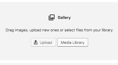
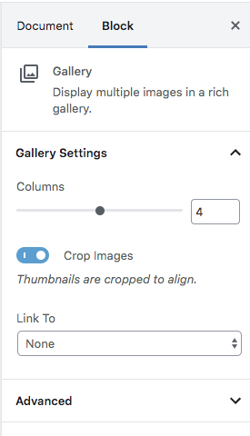
Gallery blocks have two settings: the number of columns, and whether or not images should be cropped. The default number of columns is three, and the maximum number of columns is eight. We don’t recommend using more than 4 columns.
Gallery
Reusable Block Name: Gallery__
If the number of images cannot be divided into the number of columns you have selected, the default is to have the last image(s) automatically stretch to the width of your gallery. The gallery above has 7 images with 2-columns selected. Thus, at desktop size, the last row has just one image as the gallery is short one image to make 4 rows of 2.
Keep in mind though that the ‘straggler’ image will not scale to fit unless the “crop images” switch is selected. This will fix the problem with the sizing of the orphan image but will force crop all of the images. Best to not have an “orphan” image and crop them all in advance to the same size.

In general, I select “Media Library” as you can either select images or add images once you are in the media library.
TIP: Your Gallery will look the best if all of your images are cropped to the same size.

TIP: “Crop Images” can mess up how your photos are viewed.
Test out the “Crop Images” option to get a sense of how it affects the images in your gallery. We have found that the forced crop makes the images thin, tall rectangles and doesn’t work for mobile views. We recommend having all images the same size in a gallery and turning off “crop images”. Play with it though and see how it works for you. Make sure you do a visual test on your mobile phone also.


