A hero banner provides a strong introduction to your content and with a button can provide a call to action.
The following two hero banners were made using an AB Block “hero header” and adding a Gutenberg button element. The overlay text and call to action button can be displayed either flush left or centered.
A UVM education is deep, broad and interconnected.
Lorem ipsum dolor sit amet, consectetur adipiscing elit, sed do eiusmod tempor incididunt.
A UVM education is deep, broad and interconnected.
Ut enim ad minim veniam, quis nostrud exercitation ullamco laboris nisi ut aliquip ex ea commodo consequat. Duis aute irure dolor in reprehenderit in voluptate velit esse cillum dolore eu fugiat nulla pariatur.
How to create a hero banner like the ones above
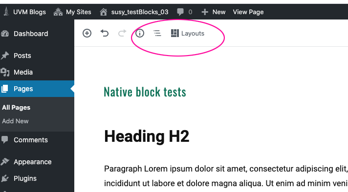
Navigate to “layouts”
While in edit mode, select “LAYOUTS” at the top of your page.
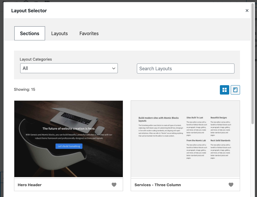
Select the Hero Header block
The “hero header” block has a large placeholder image with text and a blue button overlay.
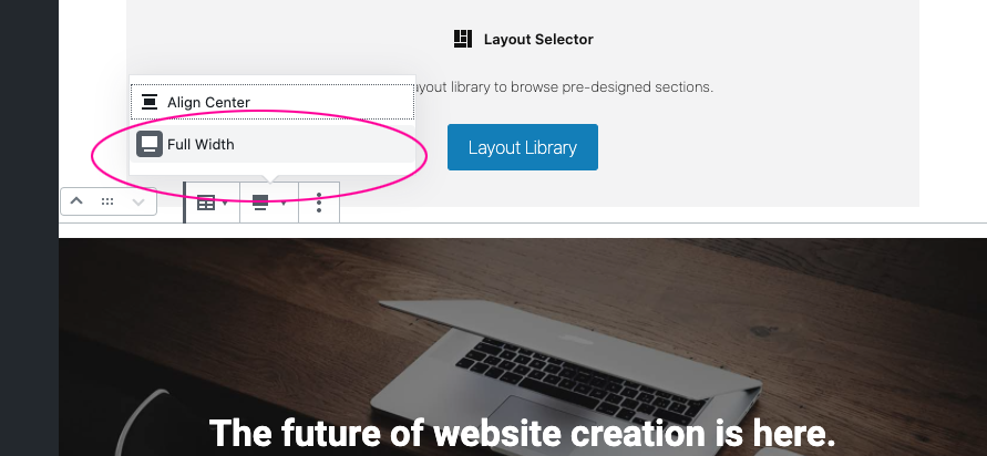
Change the image setting for proper display
The “hero header” block by default is set to be wider than our theme’s page width and the text will get cut off on the right in your browser. To fix this, select “full width” in your image options just above the block.

Fix button display
The “hero header” block natively has a blue call to action button. Delete this button as the color is off-brand. Add a new “button” block below the text if you want a call to action (CTA). The native Gutenberg button style will be the UVM green when displayed in your browser.