Typography Do’s and Don’ts
The typography for this theme is kept simple, but we do have some tips for typesetting. Some extra care will need to be taken to make sure your type is readable- this is especially true when it comes to keeping text within a comfortable line-length as well as making sure you have enough vertical white space between blocks. Here are some tips.
Tip 1: Keep line lengths of text blocks readable
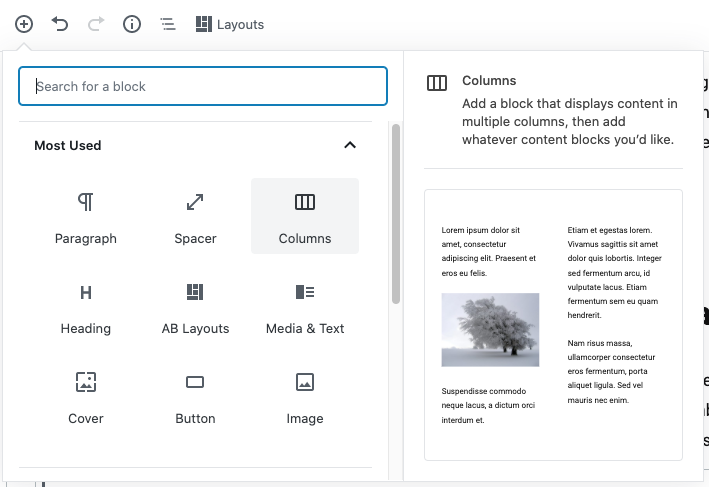
Pages in WordPress, by default, are full width. For most instances, this is not recommended for copy of any sort. Headlines and body copy need to be not more than 75 or so characters in length to have line-lengths that provide comfortable reading. Gutenberg WordPress has a “column” block though and you can put all of your text into a column to keep the line-length optimal. Furthermore, the column block responsively scales and will collapse down to one column of readable text on mobile.
We’ve set most of the text in the pages manual with a 60%-40% column width with the text on the left in the 60% column. This is roughly equivalent to the the way the text is set in the posts in the UVM theme so handling it this way provides visually consistency between your website posts and pages. You can also use a Media + Text block if your content is more marketing oriented. Here’s an example of that.


Tip 2: Vertical Space
We have built-in some vertical spacing into the type styles and have provided some “spacer” blocks for you to use to insert vertical spacing if you find you need even more space. Generally, 48px of space is expected between different blocks of content.
By default, the spacer sets 100px of vertical space. We have found that the following guidelines for vertical spacing work well on both desktop view and mobile. Here are some other guidelines:
8px spacer: Use after headlines
48px spacer: Use between blocks
120px spacer: Use above the footer
Tip 3: A headline and Introductory text make a good team and provide clarity
Heading this is a headline. It is a heading 2 with a 16px spacer after it
You can follow your headline with some larger introductory content. This content is a regular paragraph but uses the larger “intro” style. You can load the “intro” block from your block library and then “convert it to Regular Block” and change the content. Alternatively, you can assign the “intro–left” class to a paragraph.
This is body copy. It is just a paragraph of placeholder text. Lorem ipsum dolor sit amet, consectetur adipiscing elit, sed do eiusmod tempor incididunt ut labore et dolore magna aliqua. Felis eget velit aliquet sagittis id consectetur purus ut. Ultricies mi quis hendrerit dolor magna eget. Venenatis a condimentum vitae sapien pellentesque habitant morbi tristique senectus. Vitae ultricies leo integer malesuada nunc vel. Nullam ac tortor vitae purus faucibus ornare suspendisse. Feugiat nisl pretium fusce id velit. Risus viverra adipiscing at in tellus integer. Accumsan sit amet nulla facilisi morbi tempus iaculis. Vitae tortor condimentum lacinia quis vel eros donec. Morbi tristique senectus et netus et malesuada fames ac turpis. Varius duis at consectetur lorem donec. Morbi tempus iaculis urna id volutpat lacus laoreet non curabitur.
Alternatively, you can assign the “intro–left” class to a paragraph of text by typing in “intro–left” in the Additional CSS Class name on the right. (that is intro followed by 2 hyphens left with no spaces)

Tip 4: Don’t stack your headlines together
Headline-3 UVM Named the #4 Green School
Headline-04 Do not do this please. Headlines stacked together do not look nice or read well.
DO follow your headlines with “intro” copy (paragraph of text with “intro–left” class assigned under the “Advanced” setting in the right sidebar) or regular body copy.
UVM is a Green School
This headline has a 24 pixel spacer and larger intro text following. This would be the minimum space desired in this scenario. The larger text style is called “intro–left” and is set by placing the class name “intro–left” in the “Additional CSS Class(es) box to the right under “Advanced.”
You can follow an “intro–left” styled intro with body copy like this. Notice there is naturally a little bit of vertical space between the intro text and the body copy. Duis aute irure dolor in reprehenderit in voluptate velit esse cillum dolore eu fugiat nulla pariatur. Excepteur sint occaecat cupidatat non proident, sunt in culpa qui officia deserunt mollit anim id est laborum.
UVM is a Green School
This paragraph is just regular body text. If you don’t need larger intro text, then your text will be set normally like this with not additional type style or class needed. Duis aute irure dolor in reprehenderit in voluptate velit esse cillum dolore eu fugiat nulla pariatur. Excepteur sint occaecat cupidatat non proident, sunt in culpa qui officia deserunt mollit anim id est laborum.