Posts

Measuring the Success of Email Newsletters

So you’re tasked with creating and distributing an email newsletter for your department. Creating newsletters can be a labor of love. A lot of effort often goes into wrangling content, formatting, and designing each communication. At the end of the day, how do we know if all that work has paid off? How can we begin to measure return on investment (ROI) and compare efficacy with the other communications work we do on he website or on social media? Fortunately, there are several tools and metrics that help measure the success of email communications and inform decisions about newsletter content, distribution frequency, design, and a lot more. Depending on the nature of your newsletter, you may opt to use one, two, or even all three of these methods.

Open Rates

If no one even opens your email newsletter, it is probably safe to say that your email campaign has failed. Open rates will give you a good idea of how many times and often when your email was opened by its recipients. However, open rates alone can’t give a sense of whether an email was actually read or acted open. If your email is a communication unto itself – a stand alone piece with no or few links to additional web content – open rates may be your only quantifiable metric.

The standard method for gathering data on open rates is to add a small “tracking” graphic to your newsletter. This invisible image file is subsequently used to collect information every time an email is opened. Some email distribution services (MailChimp, Constant Contact, etc.) can do this kind of tracking for you, but if your system does not, or if you don’t use such a system, try using a tracking service such as Pixelsite.

There are, however, drawbacks to this tracking method. In order for the open to register, your user must have the graphics loaded in the email. There are frequent scenarios where this might not be the case. Some email providers and/or clients do not load graphics by default unless the recipient explicitly opts to view the images. In this case, your open rates may be under-reported.

Click-throughs

Chances are your email newsletter contains a variety of links enticing your reader to consume additional content on a website or perform some kind of action (register, download a file, request information, etc.). Simply put, email click-through rates represent the number of clicks that the links in your email generated. In this case, links within an email can be compared and the newsletter editor can gain a good sense of what content is popular and most frequently consumed.

Click-through rates are often calculated using one of two methods. If your links point to a website on which you already use Google Analytics (0r another web tracking service), you can append tracking variable on to the end of each of your links using Google’s URL Builder tool. In turn, when a recipient clicks on a link, that information will be registered in your GA campaign report. If you don’t use Google Analytics or if your email links to a website to which you don’t have access, it is still possible to track click-through rates by using a link shortening service. Simply create a unique shortened link for each link in your newsletter. UVM’s Link Shortener tracks the number of clicks on each shortener URL that you create. It is also possible to shorten links containing Google’s tracking variables and use both methods.

Email Traffic Analysis in Google Analytics

Once you’ve tagged all your links with Google’s campaign tracking variables, you will have access to a huge litany of data about your email newsletter marketing efforts in Google Analytics. Not only will you know if and when they clicked on your newsletter’s links, but you can also find out what else they did once they landed on your site. Did they read additional content, complete a registration form, download a document, request additional information? How long did their visit last and how many pages did they end up viewing? How often do they visit your site? Where is their geographic location? And the list goes on and on… Depending on your online marketing goals and outcomes, this additional pieces of information can be invaluable in formulating strategies for future email newsletters.

Turning Data into Action

Once you are collecting data on your email newsletters, you have a greater ability to make informed decisions about future email newsletter content, frequency, distribution, and design. Just like web metrics, email newsletter metrics is most effective when you clearly iterate your marketing goals and set key performance indicators to measure those goals. Keep in mind that Analytics is an iterative process, and is best measured over time, so keep tracking your KPI’s and observe how the newsletter changes you make effect your bottom line.

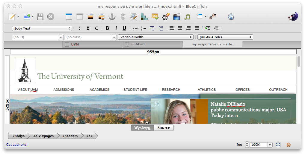
Need a free HTML editor? Along comes Blue Griffon to the rescue

A plethora of free WYSIWYG (what you see is what you get) HTML editors have been released over the years. Several of these – SeaMonkey, KompoZer, Nvu – grew out of Netscape Composer, which was last updated in 2004. SeaMonkey and KompoZer have not seen  much meaningful development in several years and Nvu was discontinued in 2005 thus leaving those looking for a no-cost easy HTML authoring solution few good options for developing web pages using the most current coding practices – that is, until recently.

BlueGriffon has recently entered the free Open Source HTML editor scene and incorporates contemporary web standards including HTML5 and CSS3. Developed by Daniel Glazman, who was the original Nvu developer, the software is available for Windows, Macintosh and Linux and shows a lot of promise for beginning- and intermediate-level web page authors looking for a no-cost solution for creating and editing basic web pages. And while it does not have all the features I’d like to see in an HTML editor, it does a great job producing clean markup and CSS without touching the code.

 The Interface

The interface is similar to other HTML or text editors and allows you to have several files open in separate tabs. It’s easy to add images and drag and drop them into position in your layout. Lists, tables, and forms are also easily added and formatted. A quick toggle to the source code allows experienced authors to directly adjust the code as desired.

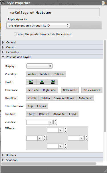
One of my favorite features in BlueGriffon is the style properties box which gives you access to CSS properties in an easy to understand and use format. Not only can you do standard formatting of text and borders in this panel, you can also position elements, make shadow effects, create columns, define flexible elements, and much more.

Deficiencies

BlueGriffon is missing some handy features included in commercial HTML editing software, such as Adobe Dreamweaver. It does not come with any integrated site management or remote file access mechanism so you’ll need to mount the server hosting web files on your or use an external file transfer application like WinSCP or Fetch to access your web files. There is a free FTP add-on but I found the interface clunky and preferred to use my favorite FTP program. Additionally, most of the add-on features, including the user manual, will also cost you a few bucks. Template users may also be disappointed to find out that, like the other free editors, BlueGriffon automatically adds , , and tags to HTML “fragment” pages.

The Final Verdict

If you are looking for a free HTML editor, you should give BlueGriffon a try. It is a truly modern editor with a user-friendly interface. My only major gripes are the integrated “paid” add-ons and the lack of integrated WebDAV or SFTP and site management tools.

UVM moves towards Responsive Web Design

Visitors are accessing websites with an ever increasing array of devices and browsers from desktop computers and laptops to netbooks and tablets, and, of course, mobile phones. The challenge for web developers is to design their sites to look great and be easy to use on everything from a cinema display with 2560-by-1440 pixel resolution to a mobile phone with 240-by-320 pixel resolution.

Becoming Responsive

Ethan Marcotte coined the term “responsive web design” to describe a method of using CSS to create multiple “looks” for a single website according to the screen resolution and orientation of the device viewing the site. The method involves three components:

  1. A flexible, grid-based layout,
  2. Flexible images and media, and
  3. Media queries, a module from the CSS3 specification.

In a nutshell this means making your design and images shrink and grow to the browser window and altering the layout (often the number of columns) at specified resolution thresholds. The result, when implemented well, is a highly functional and highly attractive website regardless of the device used to access it. In many case, responsive design even eliminates the need to develop a dedicated mobile website and/or content.

Coding a responsive design is surprisingly easy for developers with CSS experience, but creating an effective and highly usable responsive design for the big and small (and mid-size) screen is often a bigger challenge. The exercise requires rethinking not only visual design, but also navigation and content design as well as traditional concepts of user interface – remember that many mobile devices are operated by the touch of a finger or a number keypad rather than a keyboard and mouse.

Early leaders in responsive design

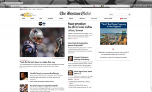
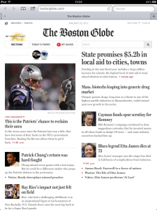
The Boston Globe is an oft cited example of responsive design among mainstream website. Their responsive website was launched amidst a lot of fanfare and has been received well by both the web design and lay community. Higher Ed – usually a late adapter on the web technology scene – is also beginning to adopt the responsive design approach. Notre Dame  has been an early leader among high profile institutions with much of their website incorporating responsive design.

The Boston Globe site as seen on a high resolution laptop

The Boston Globe site as seen on an iPad

The Boston Globe site as seen on an iPod or iPhone

Both the Globe and Notre Dame sites demonstrate how content can be manipulated, and not simply shrunk, to be highly usable on smaller devices.

Mobile First

Small screens present a particular challenge for mobile developers. There is less space visible at one time, less space “above the fold” to present your site’s most strategic and sought after content. This often means paring down navigation lists and, sometimes, content by hiding content using CSS. According to usability expert Jakob Nielsen: “When you have a smaller screen, you must limit the number of features to those that matter the most for the mobile use case.” How much, or whether, to pare down content is somewhat contentious among web developers and usability experts with some arguing that website visitors should have access to all content regardless of device screen size.

Luke Wroblewski has argued in his book Mobile First that developers should first be designed for smaller mobile devices. He further supposes that when forced to pare down content and navigation to optimize the experience for mobile users, developers are often left with a design that is better for the large screen as well. Designing for mobile first leads to better all-around web design and increased usability on all devices.

Preparing for responsive design at UVM

The UVM Web Team hopes to roll out a new responsive design for the institutional website sometime this summer. It is expected that departments will be able to opt into the design as soon as they’ve verified that their sites are compatible with responsive design. Here’s your short list to help prepare for the transition to responsive design:

  • Remove the ROT (Redundant, Outdated, Trivial) content from your site
  • Create clean, well-structured HTML pages
  • Focus navigation and content on only the most important data and actions

If you have a mobile device and are not already doing so, spend time navigating the web. It can be an enlightening exercise in discovering the benefits and challenges of accessing websites from these smaller mobile devices.

Fabulous online forms

Several common web form types.

Too often our website is merely a one-way conversation with our audience. You probably have read that engaging our web visitors is not only important for generating web traffic and higher search engine rankings, but it is also an indicator of the overall success of website. So how can we create bi-directional conversations on our site? How can we increase interactivity with our audience?

Web forms have traditionally been  a common vehicle to allow our audience to converse with us. Through forms a visitor might: leave a comment, ask a question, sign up for a newsletter, answer a survey, register for an event, submit a request, make a purchase, and much, much more. In return, we gain useful information, insight or revenue from them.

Creating forms can be a tedious and intimidating process, especially for non-programmers. Fortunately, there are some great free (or low cost) tools available that can make the process a lot less painful for both novice and experienced web developers alike. Let’s take a closer look at what three of these tools have to offer and how they might be integrated into your website.

Woo hoo Wufoo!

One the most elegant and easy to use options out there is the Wufoo Online Form Builder. Wufoo’s features include payment integration, built-in accessibility compliance and custom reporting. Wufoo’s drag and drop interface makes creating forms a snap for those creating their first or one-hundredth online form. There is a template gallery with oodles of common types of forms available for you to customize. If you can’t find what you are looking for in the templates area, it is super easy to create your own from scratch by adding standard fields to a blank form using the drag and drop interface. If you know CSS, you can easily further customize the visual design of your form. Completed forms can be embedded into any webpage using the provided HTML code snippet or you can add your own logo and run your form from the Wufoo site directly. Data can be accessed by logging into your Wufoo account and also emailed to an email address (or addresses) of your choosing.

Wufoo offers free form processing (form data collection and email forwarding) for up to three active forms including up to 10 fields each receiving up to 100 monthly submissions per Wufoo account. If your form needs surpass the free quota or if you require online payment options, their is a single monthly fee ranging from $15-200 depending on the number of expected monthly submissions. Additionally, advanced users and designers with knowledge of HTML and CSS who want a jump start on creating the markup for their HTML forms can download free of charge any form created in Wufoo using the template or the drag and drop form builder. The downloaded forms can be easily integrated with custom PHP form processing or other form processing scripts.

Google does it again

Google offers a smorgasbord of free tools for web developers including Google Analytics, Custom Search, Webmaster Tools, Calendar, Maps, YouTube, and more. It should come as no surprise that Google also offers free form creation and processing. Google forms are available as part of the Google Docs suite along with documents, spreadsheets, presentations, and a few other things. While the interface is a little less friendly than that offered by Wufoo, it is easy to title and add different types of questions to your form. Data is stored in a Google Docs spreadsheet (which can be shared easily) and can also be emailed to you directly. Google offers about 100 different themes for customizing the appearance of your form. As with Wufoo, you can link to your form on Google or you can add the embed code (under  “more options”) to any web page on your site. Fine tuning the visual appearance of your Google form is a bit tricky, but it is possible if you have advanced CSS skills. Google Form’s primary advantage over Wufoo is that there are no limitations to the number of forms, fields or responses.

Creating full-featured surveys with Lime Survey

Lime Survey is a free, open source survey application packed with features. Forms are created with the aid of a web-embedded WYSIWYG HTML editor with results stored in a MySQL database. Lime Survey also allows open and closed group of participant surveys, conditions for questions depending on earlier answers (skip logic/branching), multilingual surveys, and an option for participants to buffer answers to continue survey at a later time. The dizzying array of options can be a bit overwhelming if you have not built online forms before, but if you are creating long or complicated surveys, Lime Survey may be a good choice. Although the interface is a bit clunky at first, Lime survey includes reusable editable answer sets and ready-made importable questions that help speed up the form creation process. Online surveys produced with Lime Survey must be hosted on the Lime Survey platform but the design is customizable via template and inline CSS.

Because Lime Survey can be hosted locally, it is a better choice for any forms required sensitive or confidential data. UVM hosts Lime Survey for members of the UVM community and offers an officially branded UVM design template. Additionally, Lime Service provides free external hosting of Lime Survey.


Web Metrics at UVM: developing a holistic approach

Many university websites, including ours, suffer from a split personality disorder. As emails seem to indicate, most site visitors perceive the institutional website as a single entity with ultimate power residing with the infamous Webmaster. One might expect that as our institutions have oversight from administrators and administrative bodies, so must our institutional website. This perception is further enforced by tools, such as content management systems, that give the institutional website a common visual appearance and, in many cases, a common navigational structure. However, the reality can often be quite different. At our institution the institutional website consists of literally hundreds of websites maintained exclusively by the individual units. Furthermore, the units have the freedom to design and populate their websites as they see fit. While this level of freedom allows the units to differentiate their offerings and permit exciting innovations in content and design, it does not come without costs. One cost at UVM is the inability to fully leverage web metrics. I think that it’s time to take a new approach to how we look at site traffic.

Where our web metrics policy has failed us

A few years back when we first implemented Google Analytics on our website we tracked all websites using our central CMS to one account. Knowing that the units would also want to measure their own traffic we added some code which allowed website owners to add an additional GA account that would track only their pages, but as time went on, we found that tracking to multiple accounts created data problems and we soon abandoned this model in favor of a single GA set by each site owner. [BTW, if anyone has figured out how to track two GA accounts on a single page, let me know the secret.] Since then campus website developers have been happily but individually tracking their sites, but here’s the glitch… When anyone wants to step back and look at how visitors use the institutional site as a whole (bounce rate, time spent, percent exit, page depth, etc.), the complete picture is absent because our site metrics picture is one of hundreds independently operating websites and GA accounts. Aggregate web metrics data from the institutional website eludes us using this model and this separation of data particularly impedes our ability to optimize paths to each unit’s content from both the top-tier of the site and across the units.

A new holistic approach

So what is the solution? I recommend that we reign much of the site back under a single GA account. This will be a voluntary effort, but I hope that many will see the added usefulness of this new approach. New features in Google Analytics v5 now makes this much more desirable and attainable. When units choose to come back under the master GA account umbrella, they will be given access not only to their data, but they will have access to added insights as to how their content is accesses from other areas of the institutional site. A highly trained GA administrator can not only help them with their metrics questions and recognize and repair many problems in data collection, but also help them gain insights that can lead to actionable items to improve website performance based on their sites connection to the UVM website as a whole. But above all, we’ll be able to get a clearer picture of how to improve the top pages of the institutional site and much deeper insight into how visitors navigate uvm.edu.

If you manage a UVM website and would like to join this unified metrics effort contact the web team.

Cyber Hacks, a growing concern for everyone

Website development has taken on a dark passenger in recent years. As the number of websites continues to grow exponentially, the internet now ubiquitous in our daily lives with more and more of our personal information passed around online via online shopping, bill paying, banking accounts and Facebook, the number and voracity of individuals seeking to hack those sites and exploit our personal information has exploded.

And these days hackers are no longer focusing primarily on big banks, governments, large online retailers and web giants such as Google and Facebook. Small and medium sites, which usually have fewer security measures in place, have become frequent and often easy targets for these cyber attacks making millions of web pages hacker landmines.

Assuming a defensive posture

No doubt about it, our websites are at higher risk than ever before. Even UVM is not exempt from attacks and attempts to hack into data or infect the system are regular occurrence. Occasionally, the hackers have met with success. Thus far, no sensitive data has been harvested from and no serious damage has been inflicted on the UVM website – we’ve been lucky. To assure the website is not attacked in the future, there are basic steps that UVM web developers should and must take to minimize website hacks.

  • Protect your passwords
    Not only could someone with your credentials deface your website and hack into your email, they can potentially upload harmful code to the UVM web servers causing a myriad of problems from negatively affecting server performance to causing site visitors to download malware or viruses. Creating very simple passwords, speaking them aloud in a public space, sending them in email or writing them down all increase the possibility that they will be discovered by a hacker.
  • Don’t set files or folders to world-writable
    Anyone logged into zoo has the ability to edit or add files to your world-writable files and folders and if an outside hacker is able to enter the server, they will be able to do the same.
  • Practice secure coding practices
    If you use PHP or mySQL on your website, your security risk is greater. It is important to verify that your code is secure. There are several PHP security concerns including SQL injections, cross site scripting, and remote file inclusion that should be considered.

Cyber-attacks are a serious threat for all web developers, but by taking a few precautions, you can significantly reduce your vulnerability to such attacks. An ounce of prevention is worth a pound of cure.

Members of the UVM community can access more detailed information about secure web coding practices on ETS’s Wiki.

Google Calendar: one of the most flexible calendaring options

The folks at Google have cornered the market on web search and are leaders in email and online maps, but as many of already know, they have also taken the lead in many other corners of the Internet including web metrics, news feeds, document sharing and calendars. Google Calendar offers a lot of useful components to leverage for websites including web widgets, a large variety of feeds, sharing and now appointment slots. With all these options the tool promises to cover most all your calendaring needs. Let’s break it down.

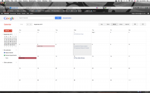
Screen shot of Google Calendar
Google Calendar in action.

Google Calendar has all of the features that you’d expect in a personal calendar. It also functions well a departmental or topical calendar. Each Google account can support multiple calendars for organizing groups of events, these calendars can be shared in email or on the web individually or merged. You can add single or repeating events with descriptions (basic HTML is supported in descriptions) and detailed location information (yes, it integrates with Google Maps), calendar and event privacy settings allow you to restrict what information can be viewed publicly. You can also share management of calendars or individual events with other Google account holders or simply invite them to attend an event.

Where Google Calendar shines is the advanced syndication capabilities. For starters, each calendar has a unique URL that you can share with anyone. Google also allows you customize your calendar’s presentation and provides you with a snippet of HTML code which you can embed in any web page. Google calendars can also be shared in iCal, RSS and XML formats, this permits the opportunity to integrate data stored in Google Calendar with other applications. We’re currently working on using Google Calendar’s iCal feeds for creating a mobile dining web site-let. And for those adept in web programming, highly customized applications can be constructed using the Google’s Calendar API.

This summer Google added a cool new feature to calendar called appointment slots. Using appointment slots a Google calendar user can block out tine periods in which other Google account holders can schedule (and subsequently cancel) appointments. Appointment slots still look a little rough around the edges, but are a promising feature to watch with lots of great potential applications.

UVM Mobile greets returning students…

UVM Mobile Screenshot
A look at the UVM mobile site on an iPod Touch.

The new UVM mobile website officially launched just a couple weeks before students returned to campus and if a first glance at statistics is any measure, the site has definitely attracted some attention.

It’s probably no surprise that the courses section has received a large number of hits as students negotiate the add/drop period. Thus far news has been the most popular section, although I have to wonder if there is some correlation with Irene’s visit to Vermont earlier this week. Places also seems quite popular and we already have plans to add additional locations.

We’re working hard with UDS and TPS to integrate dining and shuttle information. We’re holding two workshops on create a mobile presence which we hope will lead to more mobile-friendly info on the UVM Mobile in the coming months.

Skip to toolbar