
Visitors are accessing websites with an ever increasing array of devices and browsers from desktop computers and laptops to netbooks and tablets, and, of course, mobile phones. The challenge for web developers is to design their sites to look great and be easy to use on everything from a cinema display with 2560-by-1440 pixel resolution to a mobile phone with 240-by-320 pixel resolution.
Becoming Responsive
Ethan Marcotte coined the term “responsive web design” to describe a method of using CSS to create multiple “looks” for a single website according to the screen resolution and orientation of the device viewing the site. The method involves three components:
- A flexible, grid-based layout,
- Flexible images and media, and
- Media queries, a module from the CSS3 specification.
In a nutshell this means making your design and images shrink and grow to the browser window and altering the layout (often the number of columns) at specified resolution thresholds. The result, when implemented well, is a highly functional and highly attractive website regardless of the device used to access it. In many case, responsive design even eliminates the need to develop a dedicated mobile website and/or content.
Coding a responsive design is surprisingly easy for developers with CSS experience, but creating an effective and highly usable responsive design for the big and small (and mid-size) screen is often a bigger challenge. The exercise requires rethinking not only visual design, but also navigation and content design as well as traditional concepts of user interface – remember that many mobile devices are operated by the touch of a finger or a number keypad rather than a keyboard and mouse.
Early leaders in responsive design
The Boston Globe is an oft cited example of responsive design among mainstream website. Their responsive website was launched amidst a lot of fanfare and has been received well by both the web design and lay community. Higher Ed – usually a late adapter on the web technology scene – is also beginning to adopt the responsive design approach. Notre Dame has been an early leader among high profile institutions with much of their website incorporating responsive design.
|
|
|
|

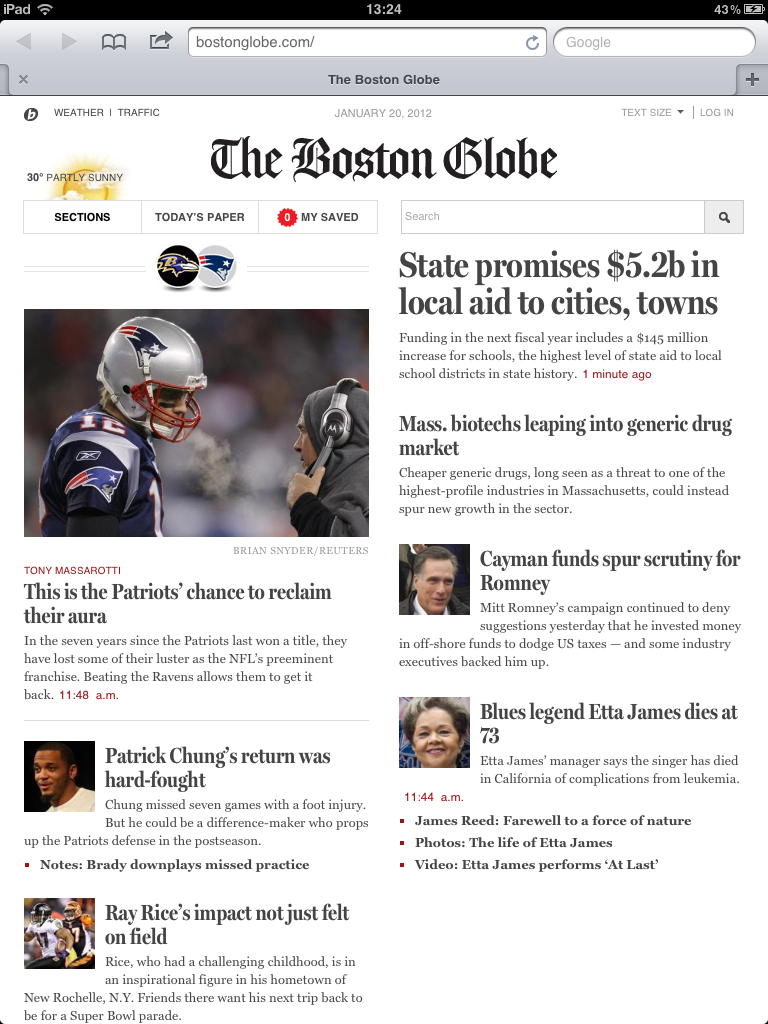

Both the Globe and Notre Dame sites demonstrate how content can be manipulated, and not simply shrunk, to be highly usable on smaller devices.
Mobile First
Small screens present a particular challenge for mobile developers. There is less space visible at one time, less space “above the fold” to present your site’s most strategic and sought after content. This often means paring down navigation lists and, sometimes, content by hiding content using CSS. According to usability expert Jakob Nielsen: “When you have a smaller screen, you must limit the number of features to those that matter the most for the mobile use case.” How much, or whether, to pare down content is somewhat contentious among web developers and usability experts with some arguing that website visitors should have access to all content regardless of device screen size.
Luke Wroblewski has argued in his book Mobile First that developers should first be designed for smaller mobile devices. He further supposes that when forced to pare down content and navigation to optimize the experience for mobile users, developers are often left with a design that is better for the large screen as well. Designing for mobile first leads to better all-around web design and increased usability on all devices.
Preparing for responsive design at UVM
The UVM Web Team hopes to roll out a new responsive design for the institutional website sometime this summer. It is expected that departments will be able to opt into the design as soon as they’ve verified that their sites are compatible with responsive design. Here’s your short list to help prepare for the transition to responsive design:
- Remove the ROT (Redundant, Outdated, Trivial) content from your site
- Create clean, well-structured HTML pages
- Focus navigation and content on only the most important data and actions
If you have a mobile device and are not already doing so, spend time navigating the web. It can be an enlightening exercise in discovering the benefits and challenges of accessing websites from these smaller mobile devices.