This specific example works with figures and text made within PowerPoint, YMMV if you are trying to embed pictures (eg microscopy). For that, you might want to use Photoshop or GIMP or the excellent web-based equivalent, Photopea. Just remember to output a file that is 1772×1772 pixels and saved as a jpeg.
Step 1: Make a square PowerPoint slide.
Open PowerPoint, make a blank presentation
Design –> slide size –> custom slide size
Change width to 15 cm and height to 15 cm (it defaults to inches in the US version of PPT)
Make your graphical abstract.
Save the pptx file.
Note: Following this bullet point is the one I made if you want to use the general format. Obviously it’ll need to be heavily modified for your article. I selected the colors using https://colorbrewer2.org. I’m not sure I love the color palate in the end, but it worked:
Step 2: Output your PowerPoint slide as an SVG file. I use this format since it’s a vector format that uses curves and lines to make an image that can be enlarged without any loss in quality. It doesn’t use pixels.
While looking at your slide in PowerPoint, hit File –> export –> change file type –> save as another file type.
In the pop up, change the “save as type” drop down to “scalable vector graphics format (*.svg)” and click save.
Note: For some reason OneDrive in Windows wouldn’t let me save an SVG file to it at this step. I had to save to my desktop instead, which was fine.
If you get a pop up, select “this slide only”.
Step 3: Set resolution in Inkscape
Open Inkscape, and open your new SVG file.
Note: In the file browser, it might look like a Chrome html file if you have chrome installed since Windows doesn’t natively handle SVG files.
When you have the SVG file open in Inkscape, click file –> export. You will see the export panel open up on the right hand side. Change the file type to jpeg. Above, change the DPI to 300 and the width and height should automatically change to 1772 pixels.
Those of us with accounts at both the Larner College of Medicine (hereafter, “med.uvm”) and UVM Health Network (hereafter, “uvmhealth.org”) know the frustration of trying to access uvmhealth.org resources from the web on anything but a medical center-owned computer or the Virtual Desktop. For me, I notice the uvmhealth.org account auto-logs out on my home computer after about 10 minutes whereas my med.uvm account stays logged in basically forever. And for whatever reason, this breaks the “usual” uvmhealth.org login prompt.
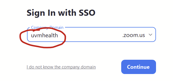
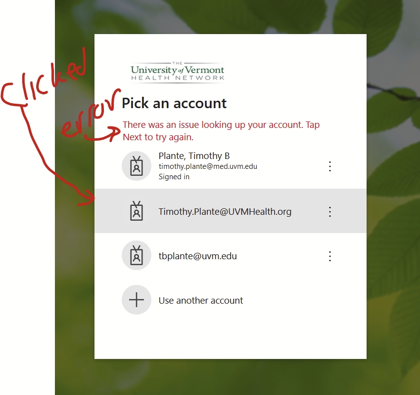
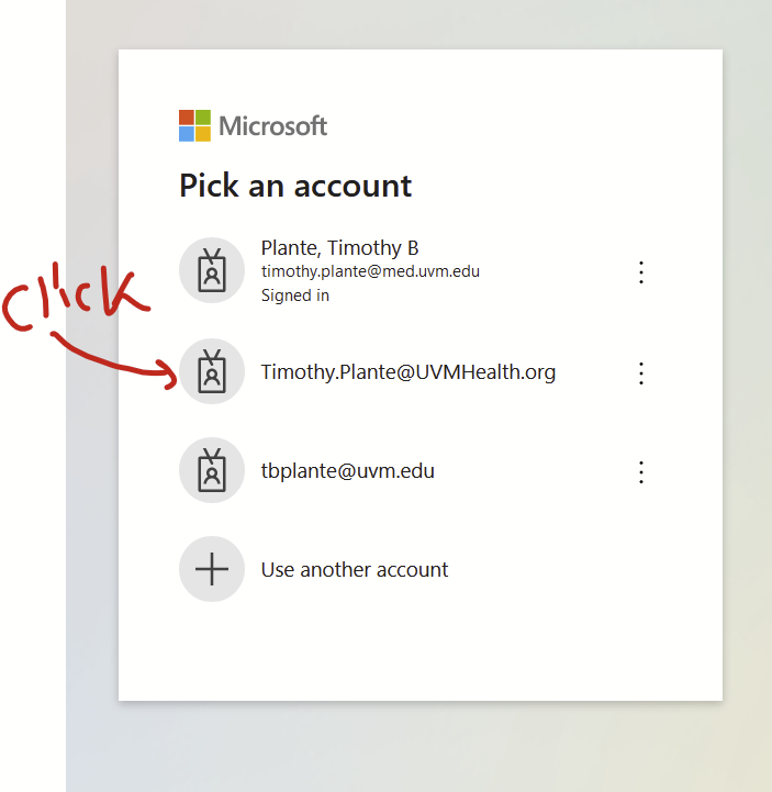
The classic scenario is that I’ll try to log into some uvmhealth.org resource on my personal laptop (say, signing into uvmhealth.org’s Zoom account with the “sign in with SSO” option, typing in “uvmhealth” at the prompt in the Zoom app, which pops up a web-based login page) and I’ll see a list of my Microsoft 365 accounts that I’ve logged in with previously. The uvmhealth.org one will be right there. If I click on it, I get this weird error saying “There was an issue looking up your account. Tap Next to try again.”. This is because I’m not already logged into uvmhealth.org in my browser so it can’t even find my account. I can’t log in. Super frustrating.
It turns out that Microsoft has a handy but not-well-known My Account website that allows you to directly control which Microsoft 365 accounts your browser is currently logged into. As a bonus, if you log into your uvmhealth.org account on the Microsoft My Account website, you can easily access Office 365 resources (e.g., Outlook, Sharepoint, OneDrive) and a few other uvmhealth.org web-based resources (eg Workday) with a few clicks. Very simple.
So, when I want to access uvmhealth.org’s Zoom web-based login, I first log into my uvmhealth.org account at the Microsoft My Account website and then I log into uvmhealth.org’s Zoom account using the “sign in with SSO” option. It always lets me right in.
Here’s how to do this.
Using the Microsoft My Account website to manage access to uvmhealth.org sites in your web browser
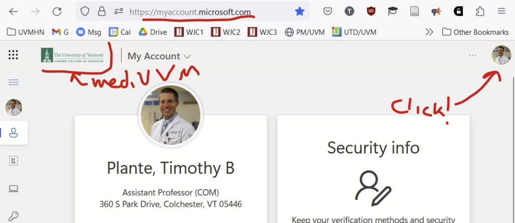
This Microsoft My Account website is located at https://myaccount.microsoft.com/ — Please bookmark this website somewhere obvious in your browser. If you are like me, you’ll use it a lot.
Head over to that website. (If you try to access the Microsoft My Accounts website and you aren’t already logged in persistently with some Microsoft 365 account, it might just prompt you to log in with your uvmhealth.org account and you might be all set. If this is the case, skip down to the next section that starts with “Things that you can do now that you are logged into…”.)
I’m persistently logged in with my med.uvm account so the homepage for my Microsoft My Accounts website loads with details from my med.uvm account.
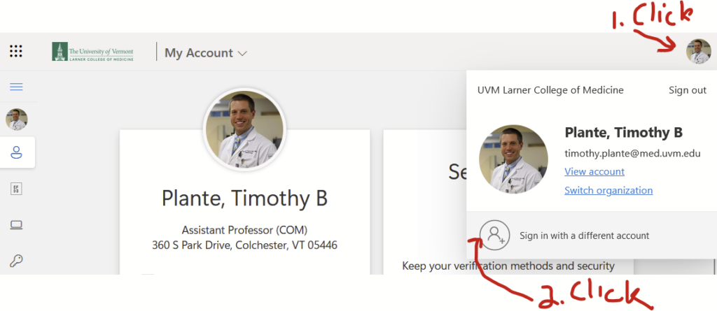
Let’s now use the Microsoft My Account website to log into my uvmhealth.org account. In the top right corner, you’ll see a smaller version of your photo or user initials. Click on that…
…and you’ll see the option to “Sign in with a different account”. Click that.
Now you’ll see a Microsoft 365 login screen that doesn’t have med.uvm or uvmhealth.org branding. Select the account you want to log into. Here, that’s my uvmhealth.org account. It will bring you to the uvmhealth.org login page. It should actually let you log in this time.
Things that you can do now that you are logged into the Microsoft My Account website with your uvmhealth.org account
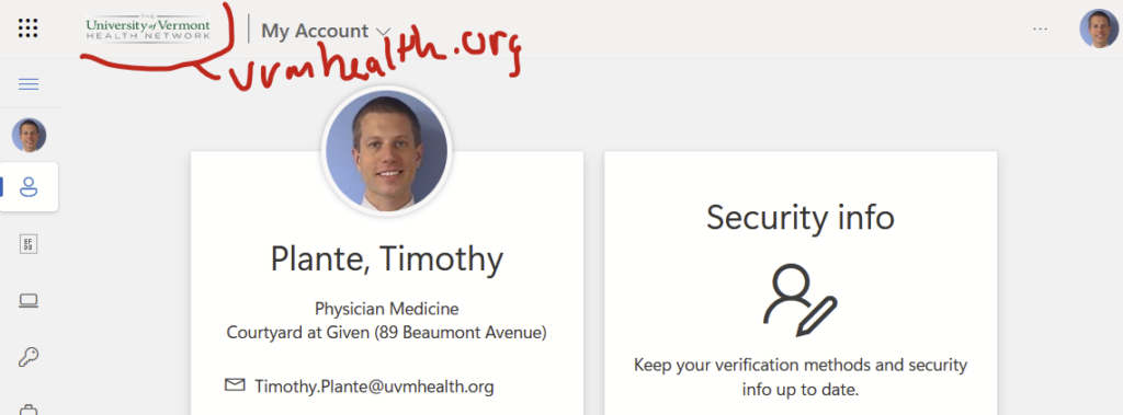
You should be back on your Microsoft My Account homepage. DO NOT CLOSE THE BROWSER AT THIS POINT. The Microsoft My Account looks different since it shows details from my uvmhealth.org account. Quite the ancient photo of me before I had multiple kids and a lot more grey hair:
Now go back to whatever uvmhealth.org website you are trying to access and attempt to log in again. For me, that was the logging into uvmhealth.org’s Zoom account in the Zoom app, which prompts a web-based sign-inso I can start my telemedicine clinic. It should let you right in. If it doesn’t, make sure that you used Microsoft My Account in the browser that Zoom opens to log in.
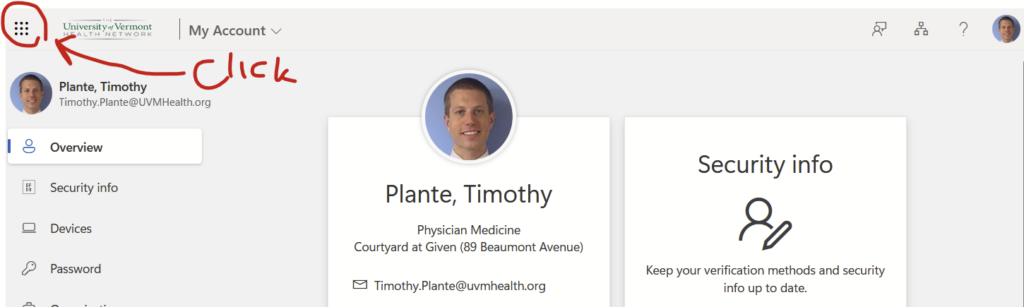
Bonus: Simple access to your uvmhealth.org Outlook, SharePoint, OneDrive, and a few other resources from within the Microsoft My Account webpage
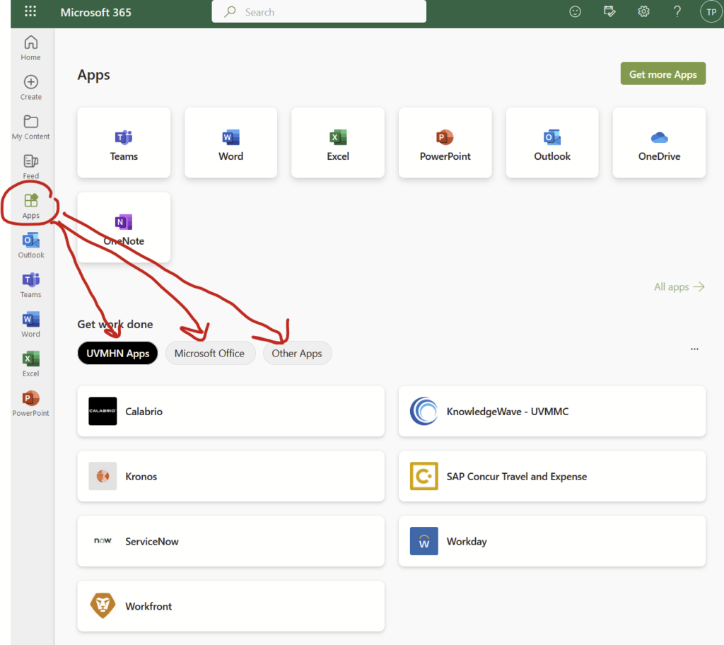
Now that you are logged into your uvmhealth.org account, you can easily access your Office 365 resources from within the Microsoft My Account webpage. Click the square of dots in the upper left corner…
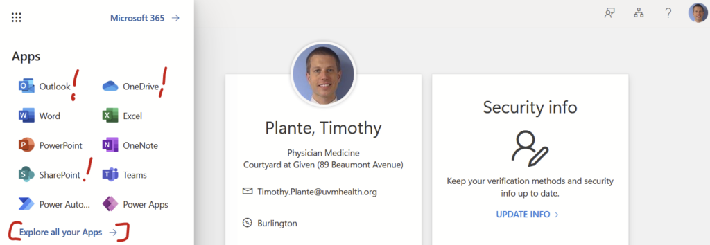
And you’ll see a menu of Outlook, OneDrive, SharePoint, and more. Click on those and it will bring you right to the web-based version of those resources without an additional login. If you click on the “Explore all of your Apps –>” link…
…you’ll find “UVMHN Apps”, including Calabrio, KnowledgeWave, Kronos, Concur, ServiceNow, Workday, and Workfront. I honestly don’t know what half of those apps do. I requested IT to add Zoom here but they declined for reasons that I don’t at all understand. There’s also an expanded list of “Microsoft Office” apps. There’s also “Other Apps”, which adds a few other apps that have other indecipherable names.
We have 2 separate email accounts at UVM if you are on the medical faculty: (1) the College of Medicine aka med.uvm.edu and (2) the hospital aka uvmhealth.org. They don’t integrate. (There’s actually a 3rd one with the University aka uvm.edu without the med, but that easily forwards to the College of Medicine email.) Having two separate inboxes is kind of a pain but is somewhat manageable. Having two separate calendars is nonsense. I use my College of Medicine email as my primary and only calendar.
To keep my hospital calendar from being used accidentally by well-meaning people trying to send me calendar invites, I set up a rule in my hospital Outlook account that automatically sends a reply to all calendar invitations. This reply says that the invite was deleted and to send the invite to my College of Medicine account instead. Works like a charm.
Here’s how I did it.
Step 1: Open up the desktop version of Outlook for the calendar you don’t want to use
This won’t work with the internet browser version of Outlook. For med.uvm.edu, use your desktop version of Outlook, which you can install on any device.
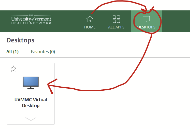
For uvmhealth.org, accessing the Outlook desktop app is a bit more complicated. On campus, log into a hospital-owned desktop and open up Outlook. Off campus, log into the Citrix Workspace portal using your hospital credentials then open up the virtual desktop that’s under the “Desktops” tab.
Wait for the virtual desktop to open then open up the desktop version of Outlook.
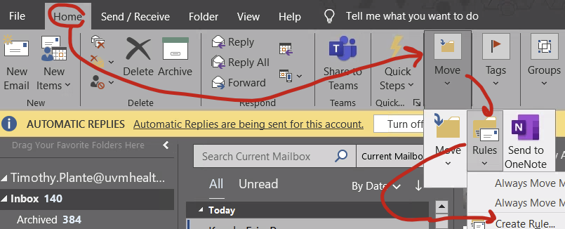
Step 2: Open up the “Rules” function
This is hidden under the Home –> Move –> Rules –> “Create rule…” if your window isn’t all the way expanded or Home –> Rules –> “Create rule…” if your window is really big.
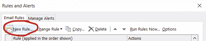
Step 3: Make a rule
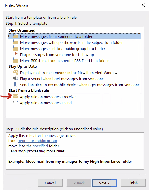
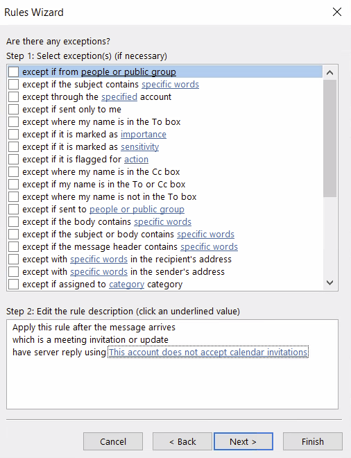
In the Rules and Alerts pop-up, select “new rule…”
On the Rules Wizard, select “Start from a blank rule… Apply rule on messages I receive” and click next.
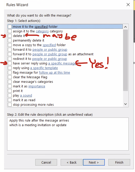
In your new rule, select for Select Conditions, scroll way down and select “Which is a meeting invitation or update” and click next
For Select actions, select “have server reply using a specific message” at the very least. You can also select “delete it” if you want to really delete it but you can also just pretend you are deleting it and folks will assume you really did delete it. It’s the same effect in my opinion.
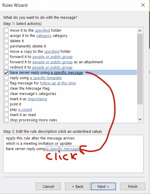
After checking at least the “have the server reply…” option, click at the link in the bottom half of the window to pop up the “specific message” to reply with.
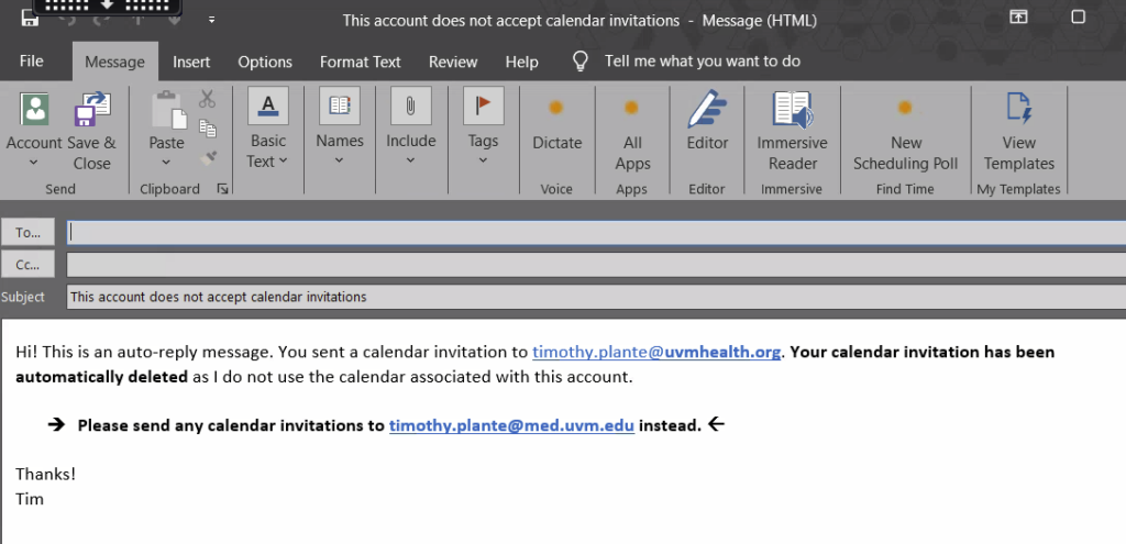
This pops up a blank message that you can fill out. Make sure to fill out a very clear subject line as well as the actual message that will go back to the person who sent you the calendar invite. Hit “save and close” when done. Then click “next” on the Select Options menu.
For Exceptions, I didn’t include any exceptions so this was blank and I clicked next.
Then turn the rule on and you should be good to go! Give it a test by sending a calendar invite from your other account.
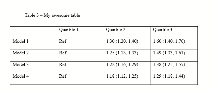
Tables can render weirdly in MS Word and Powerpoint, and you can have a hard time figuring out why. Here’s few steps to fix them so they are snappy.
First: MS Word example (see Powerpoint below)
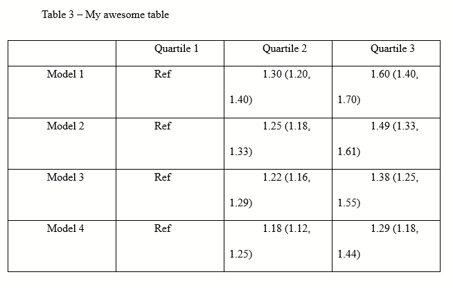
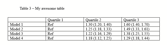
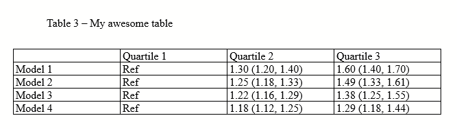
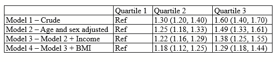
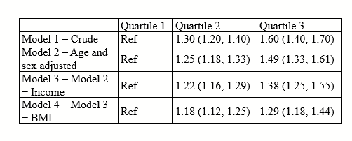
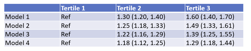
You get a table that looks like this. You start pulling your hair.
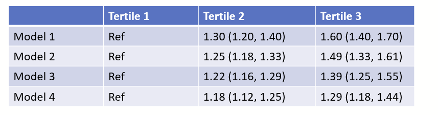
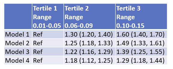
(Ignore that there are only 3 quartiles, I should have written tertile and made all of the figures in this post before I realized that typo.)
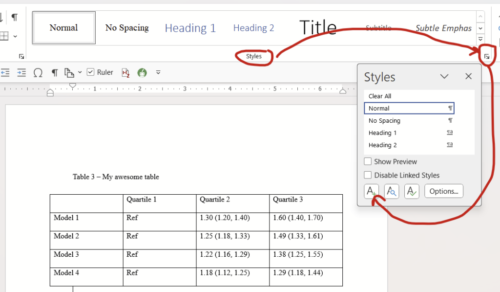
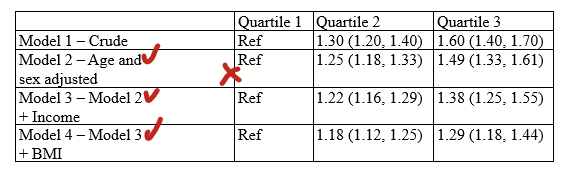
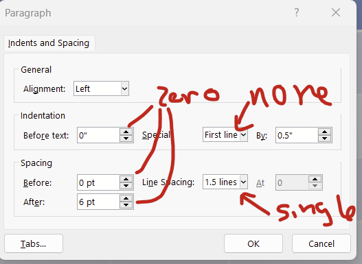
Step 1: fix the “paragraph” settings.
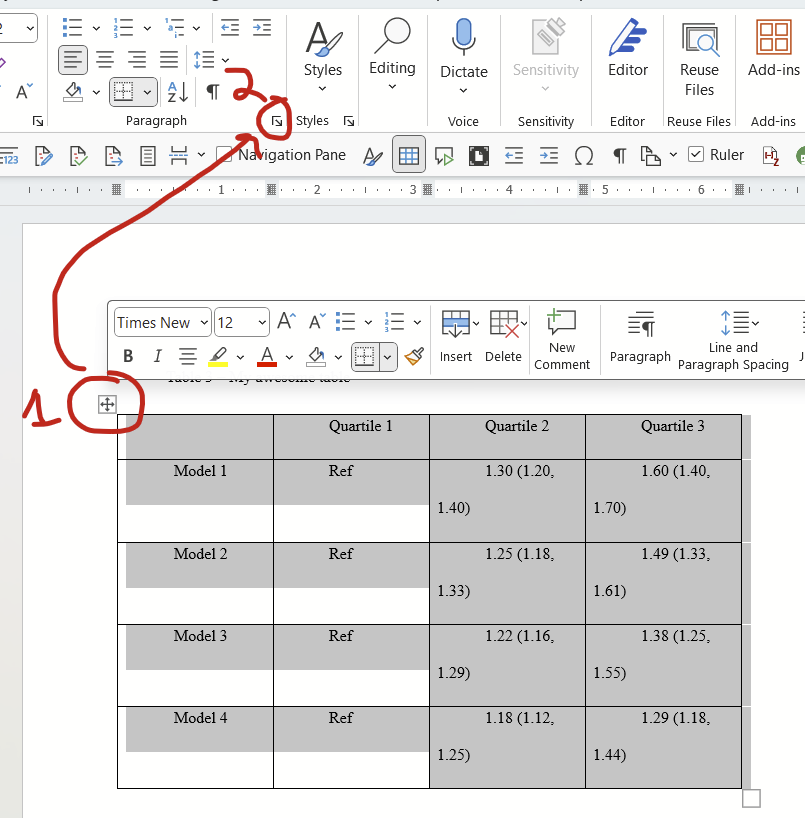
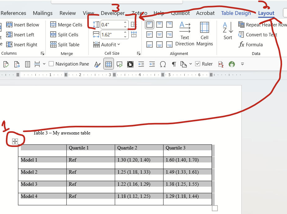
Select the entire table by clicking this symbol in the top left, then click the tiny little arrow at the bottom right of the paragraph options on the home tab:
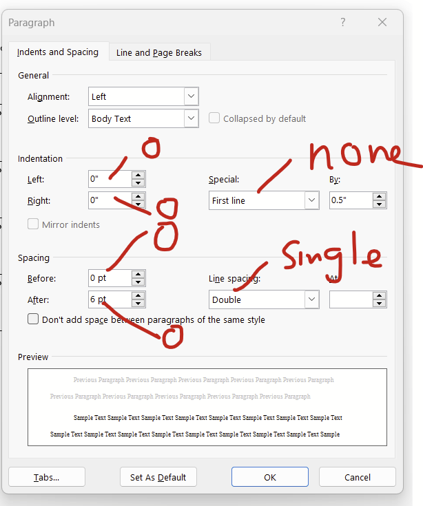
This paragraph dialogue will open up. Change indentations to zero on left and right, for the dropdown of “special”, change it to “none”, and change spacing to zero for before and after, and change line spacing to single.
Now we go back to our table and see that it looks a little better.
Step 1B (optional): Save the fixed paragraph formatting as a new Style
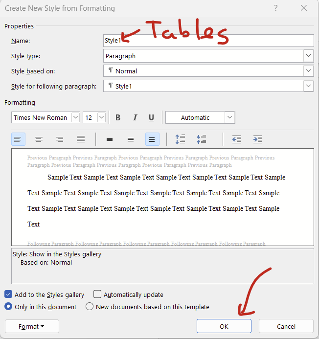
For bonus points: Save this paragraph format as a new style called “Tables” that you can apply and edit as needed! While on the “Home” tab, click this little box at the bottom right of the Styles section, then click the A+ button that appears.
On the pop-up screen, name the style “Tables”, leave everything else unchanged, then hit “okay”.
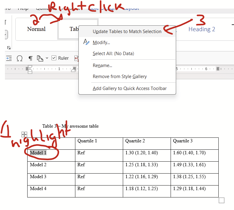
Now highlight some text in your table, right click the “Tables” style in the home/Styles block, and click “update tables to match selection”.
Now to fix the paragraph settings for future tables all you need to do is select the entire table (top left symbol on table) and click the “Tables” style. You can also edit the font and paragraph settings of all tables that have your Table style applied simultaneously by editing the Tables style directly (right click on “Tables” style then click “Modify”). This is handy if you want to change the fonts from Times New Roman to Arial all at once, for example.
Step 2: Change cell size minimums
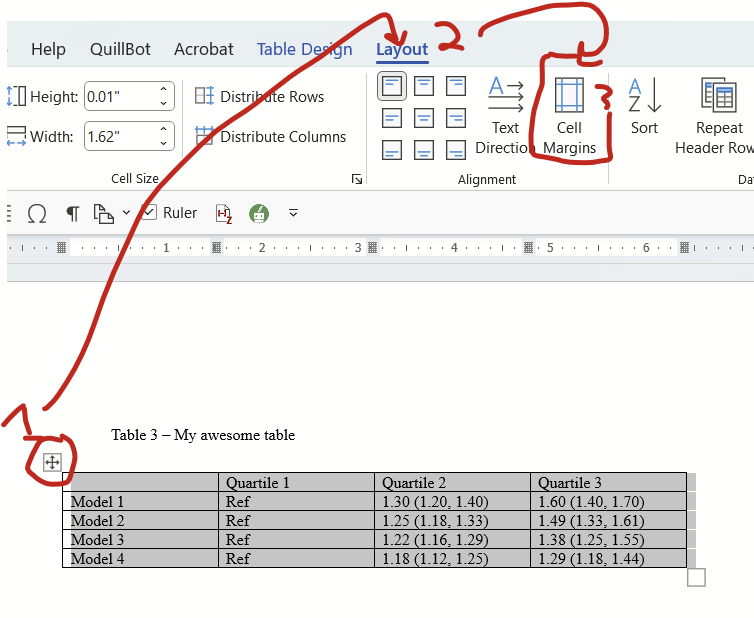
The cells are still pretty tall. Let’s see if we can fix that. Click on the symbol on the top left again to highlight the entire table, go to the layout tab, then find the cell size box for HEIGHT (we don’t care about width now). Change this to zero. (It will change itself to 0.01″ and that’s fine.)
There we go! A much neater table. We can do one better though, there’s still a bit of extra spacing in the cell margins that can probably be removed.
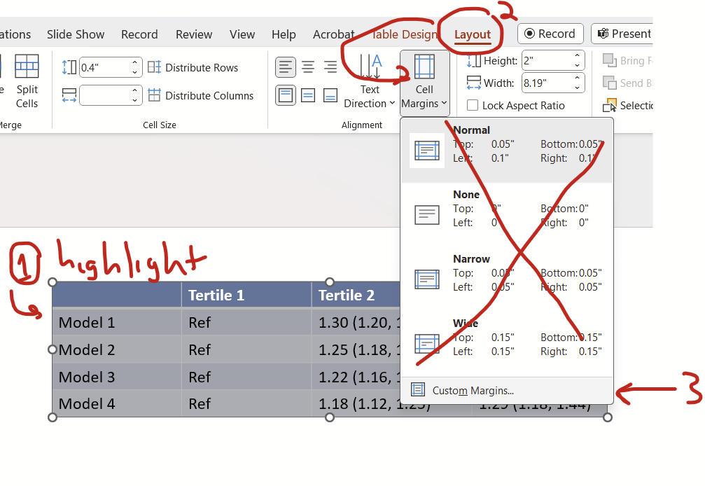
Step 3: Narrowing the margins
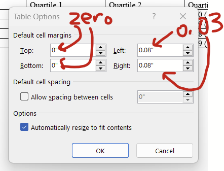
Select the entire table by clicking the symbol on the top left, go to the Layout tab, then click “Cell Margins”.
In the window that pops up, change the left and right margin to 0.03 or 0.04. The top and bottom should be zero if they aren’t already.
Now the text is a little closer to the cell border. It’s subtle, but it’s there! Notice how the “M” in “Model” is pretty close to the left border. This example uses 0.03 as left and right, you might opt to use 0.04 instead if this is too narrow for you.
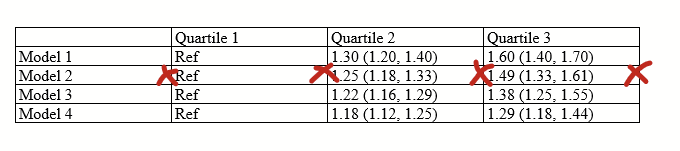
Step 4: Resizing your columns
This is pretty straightforward. Double click on the column borders (where I drew x marks) to shrink the column to be the maximum width of the contents of the cells.
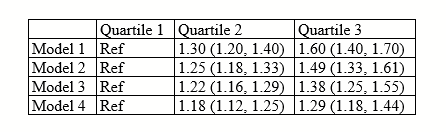
Now you have this:
But let’s say that you have some sort of really wide cell for some reason?
Notice that the first column has long labels. If you click on the borders of the columns (starting with the right most, moving left), you get this:
…But let’s say that you wanted to have the text wrap a bit more neatly, rather than be stretched out? In this scenario, I recommend strategically inserting line breaks (“hitting enter or return”, red checks in this picture) so the text wraps at the maximum width of the cell that you want. THEN click the right border of the first column to shrink it down:
…and you get this:
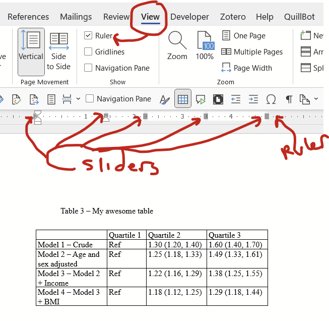
If you want even more control over column width, you can directly adjust them using the sliders on the ruler. If you don’t see the ruler, you need to turn it on under “View” tab then check the box next to “Ruler”. Then click anywhere on your table and you’ll see the grey sliders appear on the ruler.
Step 5 (optional): Final tweaks
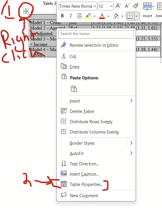
I think all cells should have the text floating in the middle (rather than all the way at the top, which is default), which can be changed by RIGHT clicking on the top left symbol then selecting table properties…
…and then selecting the “Cell” tab and clicking the “Center” option.
Now notice that things are floating nicely with vertical centering.
I also like to make the top row’s font bolded, and center all columns except the first.
Now you can fiddle with the font type and size as needed. And there you are! What I think is a nicely optimized table.
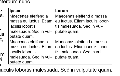
Second: PowerPoint example
You have a table that looks like this:
Step 1: Fixing paragraph settings
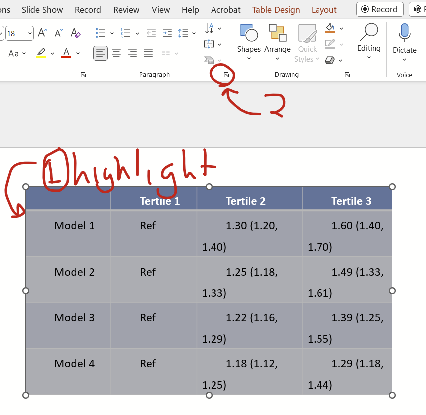
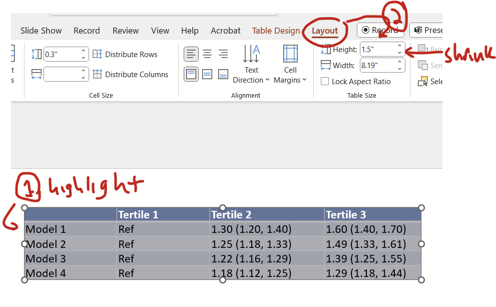
First, highlight the entire contents of the table (there’s no top left icon in PPT like there is in Word to highlight the entire table) then click on the little button at the home tab’s paragraph section’s bottom right.
On the pop up window, change indentation and spacing before and after to zero, special to none, and line spacing to single, and click okay.
Now we see a less unwieldy table!
The margins separating the text to the
Step 2: Reduce cell margins
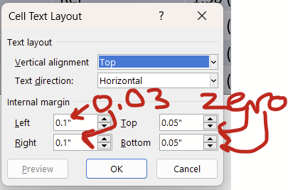
Let’s shrink the cell margins, which is the distance between the text and the border of the cells. Highlight the contents of your table, then on the layout tab, drop down the options under “cell margins”. Ignore the options inside and go to custom margins.
On the pop up window, change the left and right margins to 0.03 or 0.04 and change the top and bottom to zero.
Now we have some nice narrow margins!
Step 3: Reduce cell height
Let’s shrink down the height of the cells. Highlight the contents of the table, then under the layout tab, reduce the height as much as the down button will let you. Don’t worry about the width.
Now you have a table that is nice and short. (It didn’t actually change the table in this example so nothing to look at.)
Step 4: Fix the column width
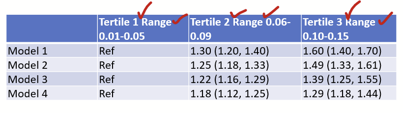
Let’s fix the width of the columns. In this example, I added some extra text in the first row. First, insert line breaks (“hit enter or return”) strategically so the cells aren’t overextended by length of lines. In this example, I’m inserting line breaks where the checks are
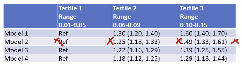
Now double click the border line of the columns to auto-fit the width.
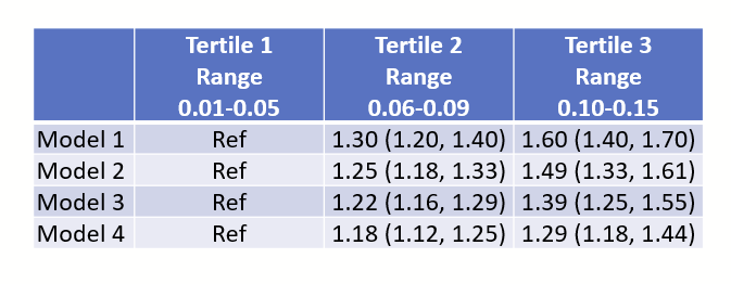
Now you have a nice narrow table:
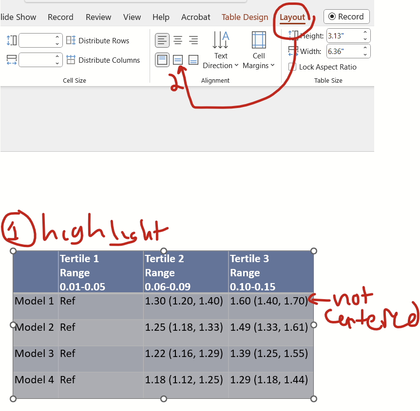
Step 5 (optional): Final tweaks
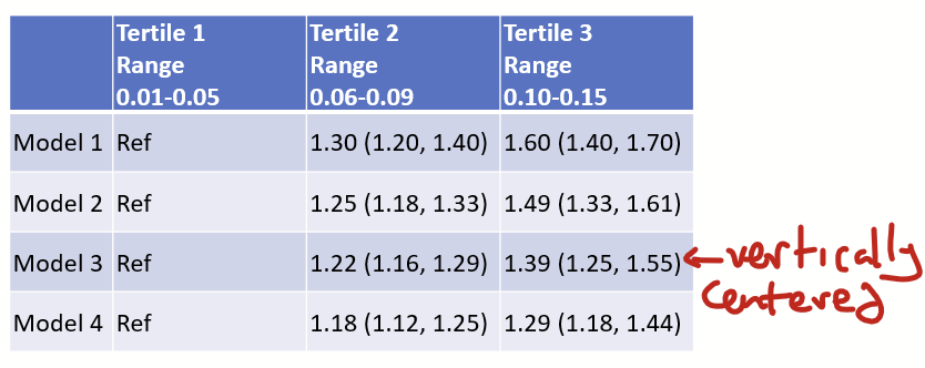
I think all cells should be arranged vertically, you hit this button under they layout tab to arrange the content vertically centered.
Now the cells are vertically centered!
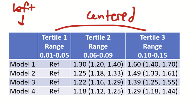
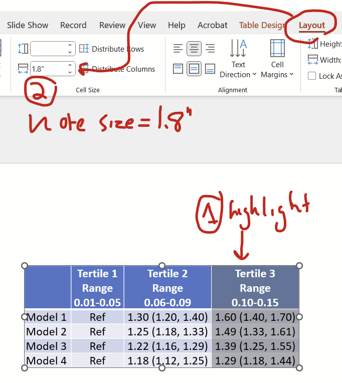
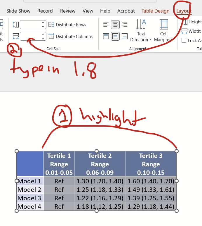
I also think that all columns except the first should be centered, so highlight those columns and hit the center button. I leave the first column aligned left.
Now you might want to make all columns except the first the same width as the widest column. Specifically, notice that the Tertile 1 column (with the “ref”) is narrower than the other two. Click on the widest column and under the layout tab, note that the cell size width is 1.8″.
Now highlight all tertile columns and under the layout tab, type “1.8” (without quotes) into the cell size width box and hit enter.
Scheduling meetings with someone inside of your institution is pretty easy in Outlook since you can typically look at shared availability with the Scheduling Assistant when generating a calendar invitation. Things get a bit more complex for folks outside of your institutions, which is why there are services like Doodle, WhenIsGood.net, and When2Meet.com. When you are trying to meet with 1 or 2 people outside of your institution, you can instead directly send your calendar availability in-line in an email.
Steps:
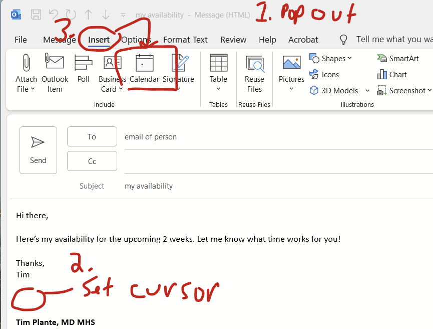
Pop out your email message draft
Click to set your cursor where you want your calendar to appear
Click insert –> calendar (you probably need to make your window full screen in order to see this calendar option)
Next:
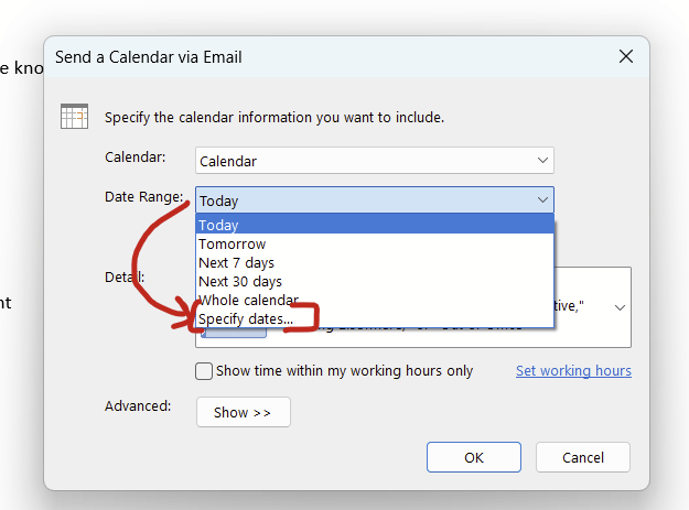
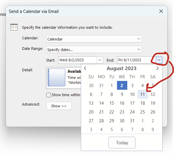
4. Change the date range to “specify dates…”
5. The start date will be today. Change the end date to some other date.
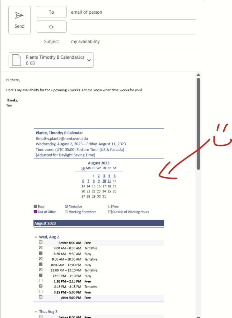
6. Click “okay” and then you’ll have your calendar in-line! It also tacks on an ics file.
Writing the first draft of a scientific conference abstract is challenging. As part of an Early Career Advisory Committee ‘Science Jam’ sponsored by the UVM CVRI, a group of us came up with fill-in-the-blank, Mad Lib-style guide to help guide the completion of the first draft of a scientific conference abstract.
There’s one Zip file with 2 documents:
Clinical or epidemiological-style abstract (Note: Not intended for case reports)
Basic science abstract
The first page is where you declare all of the terms and concepts, the second page is the fill-in-the-blank section that is drawn from the first page. Do the first page first. I also color coded the clinical/epidemiology one since that’s the one I’m using.
These documents use some fancy MS Word features to help you complete the sections that may not work too well with browser-based MS Word applications, so best to do on your computer with the ‘standard’ MS Word desktop app.
Zotero is an excellent and free reference manager that is my go-to for writing grants and manuscripts. It has some very handy features, like word processor plugins, web browser plugins that will grab PDF versions of documents if available, and ability to share “group libraries” with collaborators. It has all of the standard features of reference managers, like auto-formatting of references to meet submission requirements, automatic renumbering of in-line references, etc.
Zotero works well with MS Word and Google Docs. Examples here are taken from MS Word, but are also applicable to Google Docs. The main difference between Google Docs and MS Word is that the web browser plugin is also the Google Docs plugin. MS Word has a plugin separate from the web browser plugin. Regardless, whenever you use a Zotero plugin (eg the MS Word, Google Docs, or browser extensions), you also need to have the Zotero desktop app open. You’ll get an error if you try to insert a reference into a document or snag a reference from PubMed/a journal website if the Zotero desktop app isn’t also open.
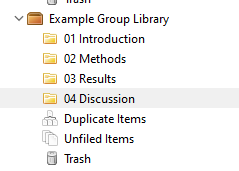
Organizing your folders (“collections”) and subfolders (“subcollections”).
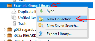
In your desktop app, navigate to the shared library that I’ll send you. Make folders/collections or subfolders/subcollections in there to help stay organized. To make a new folder/collection, right click on the shared group library and click “New Collection…”. To make subfolders/subcollections, right click on that new folder/subfolder that you made.
I suggest making collections/folders by section of your document, and numbering them so they stay in order, so: “01 Introduction”, “02 Methods”, “03 Results”, and “04 Discussion”. If you are writing something that doesn’t follow a usual flow (eg an opinion piece), number/name things by the major sections in your outline. You can always rename these folders/collections and renumber them so they show up in order.
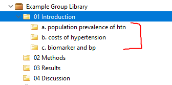
Now, within each of these folders/collections, make specific groupings of subfolders/subcollections by topic. For example, in the introduction, you might have a sentence talking about the epidemiology/population prevalence of hypertension, then the costs (eg DALY lost) of hypertension, then an overview of the pathophysiology of hypertension, then how some biomarker relates to blood pressure. I recommend having a subfolder for each of these concepts separately in the “01 introduction” folder. You can also order these with numbers or letters, but it also might make sense to keep them unordered if you aren’t sure of how the introduction (or any other section) will flow.
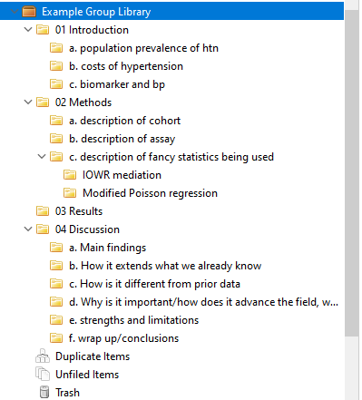
Now repeat this for all of the other subfolders. The results folder might be pretty thin because usually (for me at least) there aren’t many references in that section. For the “discussion section”, I recommend including the suggested sections from my “your first epidemiology manuscript” example under “Download” here. It’ll look like this when you are done:
Next: Grabbing citations.
You need to install the Zotero browser extension, and make sure that you have the Zotero desktop app open when you are grabbing citations. I STRONGLY RECOMMEND GRABBING JOURNAL CITATIONS FROM PubMed AND ONLY PubMed. (For textbooks, Google Books works quite well.) Zotero uses metadata from websites to populate the reference. PubMed’s metadata is pristine. Journal websites have metadata, but it’s inconsistent and often incomplete. So, stick with PubMed when grabbing citations.
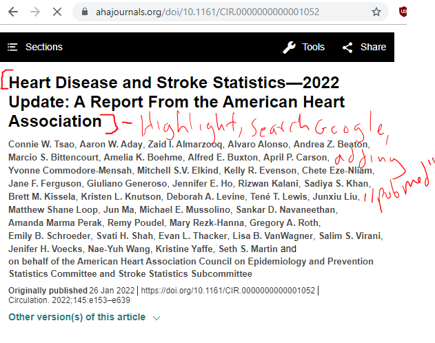
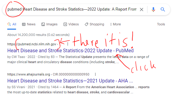
The first step is to find your article on PubMed. Let’s say you want to grab the AHA’s statistical update document, and using Google you find it on the Journal’s website. Welp, that’s not pubmed so don’t even think about grabbing the reference from here.
Instead, highlight the title and search Google again, appending the word “PubMed” to the search. This will get you to the Pubmed listing for that article.
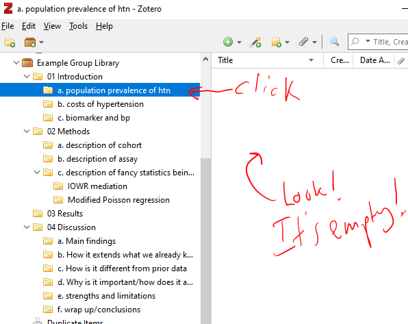
Now this is very important! Go over to your Zotero desktop app and choose the subcollection/subfolder you want this to go in. This will be in the Introduction/Population Prevalence of HTN subfolder. You’ll notice it’s empty.
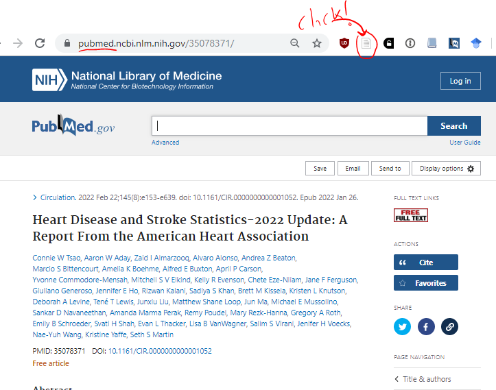
Now go back to the PubMed page for your document and click the Zotero plugin button.
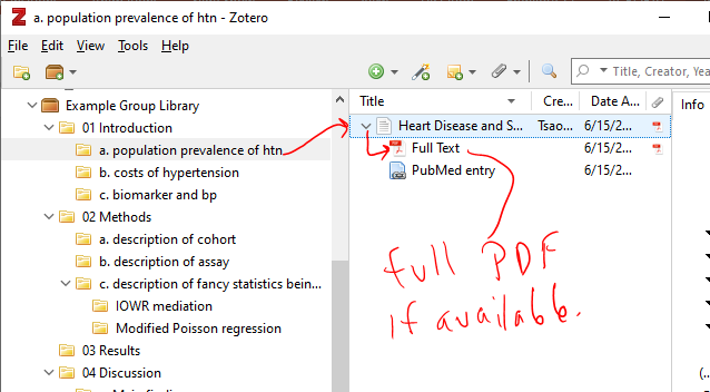
Now when you go back to the Zotero Desktop app, you’ll see that the AHA Statistical Update is now saved in your “population prevalence of HTN” folder. If a PDF is available through Unpaywalled (a separate service that’s integrated into Zotero that grabs free/legal copies of journal PDFs), then a PDF will be saved as well.
When you grab references, make sure to sort them into a specific folder along the way. You’ll thank yourself later.
Next: Inserting citations in an MS Word document
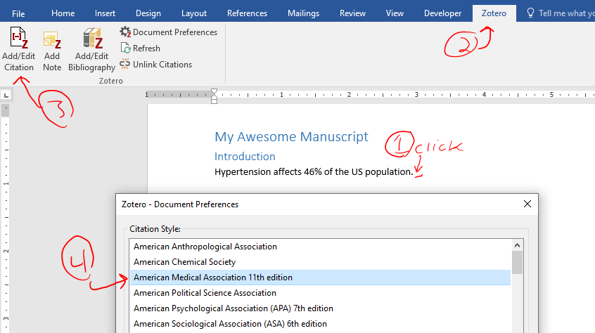
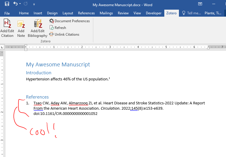
Open up your manuscript file in MS Word. Make sure you click/set your cursor in the place in your document where you want the citation to land. (I’m a “citation goes after the period and not before the period” guy myself.) Then, click the Zotero tab. (If you don’t see the Zotero tab, you might need to try to reboot, or manually install the plugin. See the “Setting Things Up/Zotero” section here.) Now, click the “Add/Edit Citation” button. If this is the first citation/reference you are adding to this document, you’ll be prompted to select a formatting style, just pick anything since you can always change it later (I like the American Medical Association one to start with). You won’t see this pop up when adding other references.
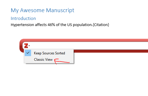
Now you’ll see the hovering Zotero window. This isn’t a part of MS Word, it’s actually the Zotero desktop app. Sometimes this gets lost among your various programs/windows on your desktop and you need to go find it, it’ll be under the Zotero icon on your taskbar on windows. Or Alt+Tab until you find it. Anyway, this allows you to find a citation by text search (ie, by typing in the author name or title), but if you select the dropdown menu here, you can use the “classic view” and manually grab citations from your subcollections/subfolders. I recommend adding citations through the classic view.
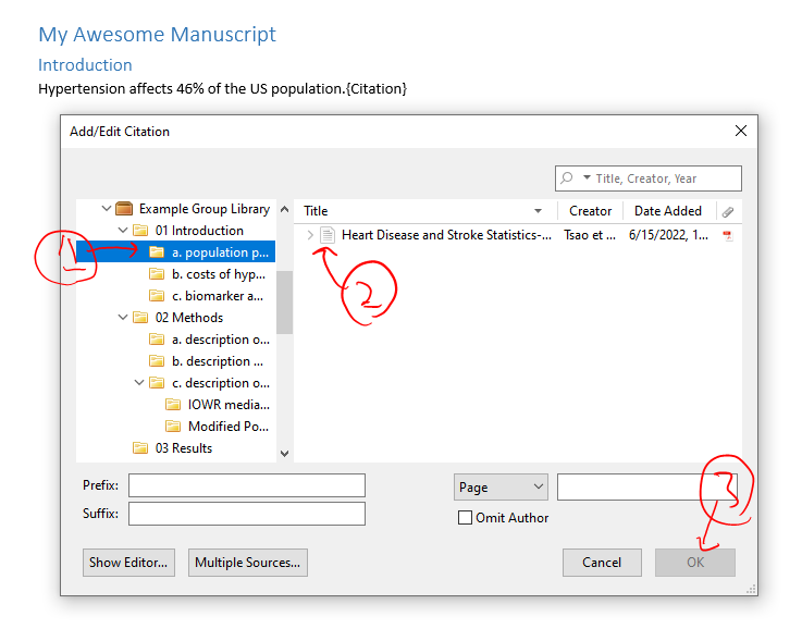
In the classic view you will see all of your subcollections/subfolders. Navigate to your subcollection/subfolder of interest and click on the citation that you’d like to insert and hit “okay”. Notice in the “Classic View”, you can select multiple references at the same time by clicking the “Multiple Sources…” button at the bottom.
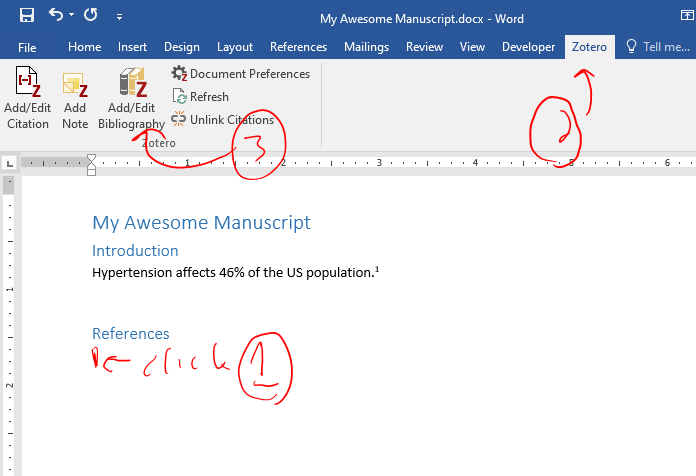
Now your citation is in-line! See the floating “1” after the first sentence. But where is the Reference list? Let’s plop one in. I added a new heading for references in MS Word and we’ll add it there. Click on the line after your “references” header, go to the zotero tab, and click “add/edit bibliography”.
End product is below. This reference list will update while you insert references in your manuscript. The reference numbers will also update automatically as you go.
You’ve toiled on your grant day in and out for weeks on end, and despite chopping out loads of overly verbose text, it’s still over the length. It turns out that there are some built-in settings in MS Word to help you get below the length limit without removing additional text. This post is focused on NIH grant formatting but details here are relevant for most grants. This also assumes that you are already using narrow margins. I made up a 4 page ‘ipsum lorem’ document for this so I can give actual quantifications of what this does to document length.
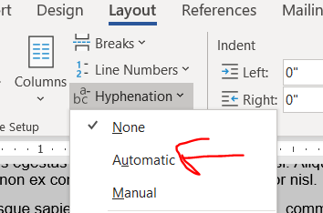
Hyphenation and justification
I only just learned about hyphens from Jason Buxbaum in this tweet. Hyphenation breaks longer words across lines with a hyphen in the style commonly used in novels. Hyphenation will get you a few lines in a 4 page document.
Justification makes words reach from the left to rightmost extremes of the margin, stretching or compressing the width of the spacing between words to make it fit. Justification’s effect on length is unpredictable. Sometimes it shortens a lot, sometimes it stays the same, sometimes it’s a smidge longer. In my 4 page ipsum lorem document, the length didn’t change. It’s worked to shorten some prior grants, so it’s worth giving a try. (Also, try combining justification with different fonts, see below.)
Here is the button to turn on justification.
Personally, I like ragged lines (“align left”) and not justified lines because I find justified text harder to read. I have colleagues who really like justification because it looks more orderly on a page. If you are going to use justification, please remember to apply it to the entirety of the text and not just a subset of paragraphs for the same reason that you don’t wear a tie with a polo shirt.
You can try combining hyphenation and justification, though I’m not sure it will gain anything. It didn’t in my demo document.
Modifying your size 11 font
Try Georgia, Palatino Linotype, or Helvetica fonts instead of Arial
The NIH guidelines specify size 11 Arial, Georgia, Helvetica, and Palatino Linotype fonts as acceptable options. (Note: Helvetica doesn’t come pre-installed on Windows. It’s pre-installed on Mac.) There were not major differences in length in my aligned-left ipsum lorem document between any of the fonts when the lines were aligned-left. But, try combining different fonts with justification. In the ipsum lorem document, justified Georgia was a couple of lines shorter than any other combinations of aligned-left/justification and NIH-approved fonts in Windows.
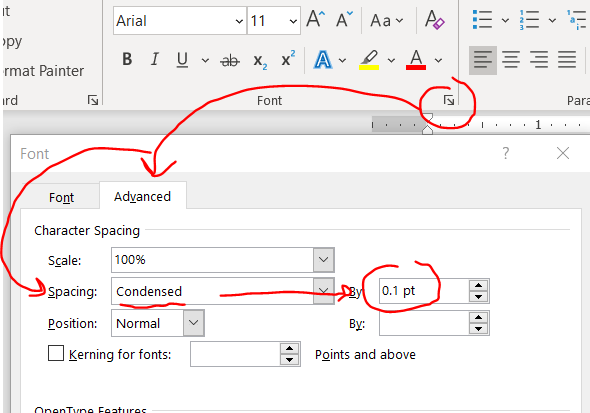
Condensing fonts
Kudos to Jason Buxbaum for this one. You can shrink the space between your letters without actually changing the font size/size of the letters. Highlight your text then home –> font little arrow –> advanced –> spacing becomes condensed then change the selecter menu to 0.1 pt.
This change will give you a few lines back in a 4 page document.
I can’t tell the difference in the letter spacing before and after using 0.1. If you increase to a number larger than 0.1, it might start looking weird, so don’t push it to far.
A word of advice with this feature: If you are too aggressive, you might run amok with NIH guidelines, which specify 15 characters per linear inch, so double check the character count in an inch (view –> ruler will allow you to manually check). FYI: all NIH-approved fonts are proportional fonts so narrow characters like lowercase L (“l”) take up less width than an uppercase W, and a random sample of text that happens to have a lot of narrow letters might have more than 15 characters/linear inch. You might need to sample a few inches to get a better idea of whether you or not are under the 15 character limit. (In contrast, Courier is a monospaced font and every character is exactly the same width.)
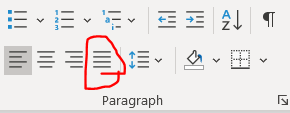
Adjust line and paragraph spacing
Both line and paragraph spacing affect the amount of white space on your page. Maintaining white space in your grant is crucial to improve its readability, so don’t squeeze it too much. In my opinion folks will notice shrunken paragraph spacing but not shrunken line spacing. So if you have to choose between modifying line or paragraph spacing, do line spacing first.
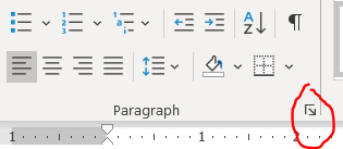
You can modify line and paragraph spacing by clicking this tiny checkbox under home tab –> “paragraph”.
Remember to highlight text before changing this (or if you are using MS Word’s excellent built-in Styles, just directly edit the style).
Line spacing
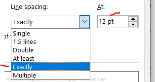
As long as you have 6 or fewer lines per vertical inch (view –> ruler will allow you to manually check), you are set by NIH guidelines. The default line spacing in MS Word is 1.08. Changing it to “single” will give you back about and eighth of a page in a 4 pg document. Today I learned that there’s ANOTHER option called “exactly” that will get you even more than a quarter of a page beyond single spacing. Exact spacing is my new favorite thing. Wow. Thanks to Michael McWilliams for sharing exact line spacing in this tweet. I wouldn’t go below “exactly” at 12 pt because that gets you at about 6.5 lines per inch, which goes against NIH standards of 6 lines per inch.
Paragraph spacing
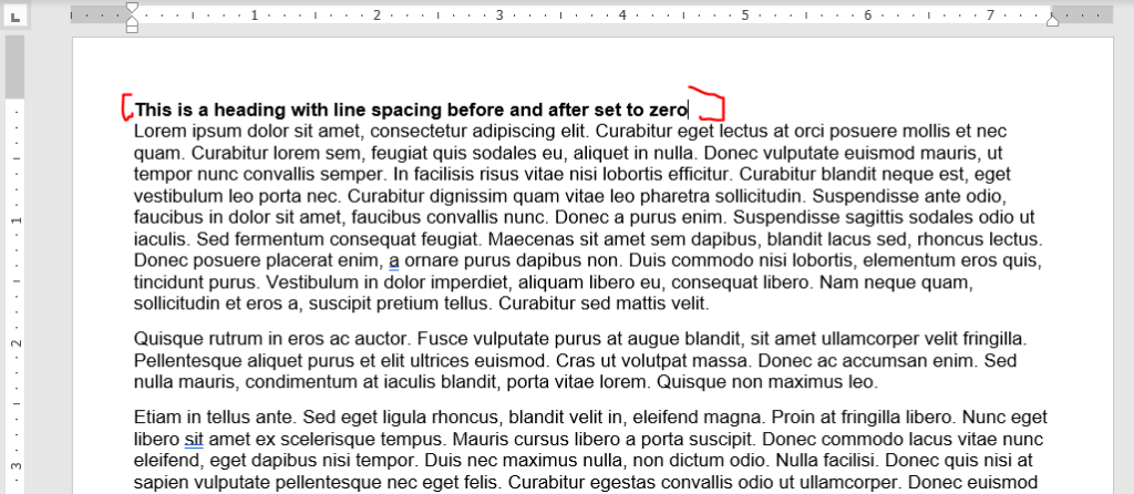
The default in MS Word is 0 points before and 8 points after the paragraph. I don’t see a need to have any gaps between a heading and the following paragraph, so set the line spacing before and afterheadings to be zero. Looks nice here, right?
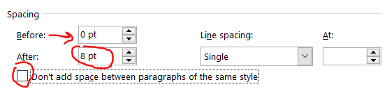
Now you can tweak the spacing between paragraphs. I like leaving the before to zero and modifying the after. If you modify the before and not the after, you’ll re-introduce the space after the header. Also, leave the “don’t add space between paragraphs of the same style” box unchecked of you’ll have no spacing between most paragraphs.
Here’s the same document from above changing the after spacing from 8 to 6 points.
Looks about the same, right? This got us about 3 lines down on a 4 pg document. Don’t be too greedy here, if you go too far, it’ll look terrible (unless you also indent the first line, but then you run the risk of it looking like a high school essay).
Play around with modifying both paragraph and line spacing. Again, I recommend tweaking line spacing before fiddling with paragraph spacing.
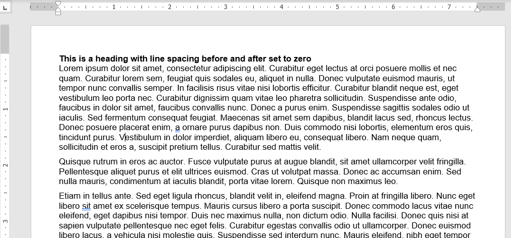
Window/orphan control, or how to make paragraphs break at the maximum page length
MS Word tries to keep paragraphs together if a small piece of it extends across pages. For example, if the first line of a paragraph is on page 2 and the rest of the paragraph is on page 3, it’ll bring that first line so that it ALSO starts on page 3, leaving valuable space unused on page 2. This is called window/orphan control, and it’s easy to disable. Highlight your text and shut it off under home –> paragraph tiny arrow –> line and page breaks then uncheck the window/orphan control button.
This gives a couple of lines back in our 4 page document.
Modifying the format of embedded tables of figures
Tables and figures can take up some serious real estate! You might want to nudge a figure or table out of the margin bounds, but that will get you in some serious trouble with the NIH — Stay inside the margins! Try these strategies instead.
Note: I have a separate post that goes in-depth into optimizing tables in MS word and PPT, here.Check it out if you are struggling with general formatting issues for tables.
Wrap text around your tables or figures
Note: In 3/2024, I discovered a better way to get tables and figures to behave that is described at the end of this section. I’m keeping the older pieces here since I think they are still relevant.
Consider reclaiming some unused real estate by wrapping the text around tables or figures. Be warned! Wrapping text unearths the demons of MS Word formatting. For this example, we’ll focus on just wrapping text around a table to make a ‘floating table’. Below is an example of a table without text wrapping.
Right click on your table and select “Table Properties” then click right or left alignment and set text wrapping to around. (For figures, right click your figure and click “size and position”, which is analogous to the table options. For simplicity, I’ll focus on tables only here.).
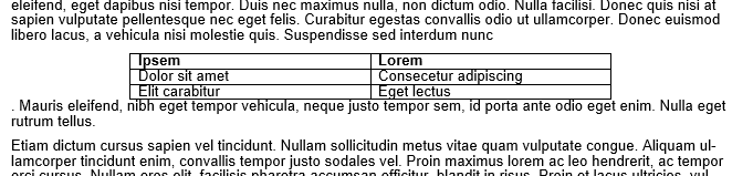
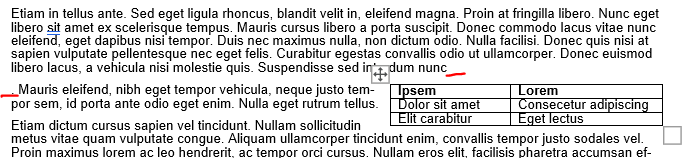
Adjust your row width a bit and now you have a nice compact table! But wait, what’s this? The table decided to insert itself between a word and a period! That’s not good.
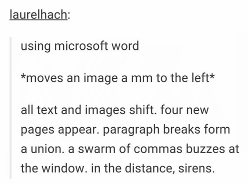
When MS Word wraps text around a table, it decides the placement of the now floating table by inserting an invisible anchor followed by a line break. Here, there’s an invisible anchor is placed between “nunc” and the period. Your instinct will be to move the table to fix this problem, and that is the wrong thing to do. Avoid moving the table because the anchor will do unpredictable things to your document’s formatting. This is so well known to create havoc that it led to a viral Tumblr post from user laurelhach:
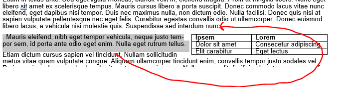
Moving tables is pointless in MS word because it doesn’t do what you think it does and you will be sad. Move the text instead. Here, highlight that stray period and the rest of the paragraph starting with “Mauris eleifend” and move it where that weird line break occurred after “nunc”.
There will be a new line break to erase, but the table should now follow the entire paragraph.
If you are hopelessly lost in fighting the MS Word Floating Table Anchor Demon, and the table decides that it doesn’t want to move ever or is shifted way to the right (so much so that it’s sitting off screen on the right), then the invisible anchor might be sitting to the right of the final word in a heading or paragraph. I recommend reverting the floating table to a non-text wrapped table to figure out what’s wrong and fix everything. Right-click the table and open up the “table properties” option again and change the text wrapping to “none”. The table will appear where the invisible anchor is and now you can shift around the text a bit to get it away from the end of a sentence. Now turn back on text wrapping. This usually fixes everything.
Note: I actually made the table intentionally insert between ‘nunc” and the period for this example. This was just a re-enactment so it’s not MS Word’s fault — this time. BUT this really happens. It’s very problematic if you have >1 table or figure on a page because the Floating Table Anchor Demons will fight with each other and your grant’s formatting will pay.
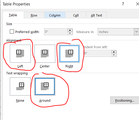
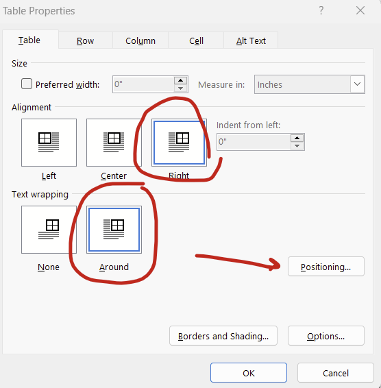
Update 3/2024: There’s actually a simpler way to fight the demons of embedded tables and figures: Setting the position relative to the margin. Setting relative to the margin not only makes anchors disappear, it also ensures that your figures don’t extend outside of the margin. We’ve all heard horror stories about grants being rejected because some table or figure snuck beyond the margin limits.
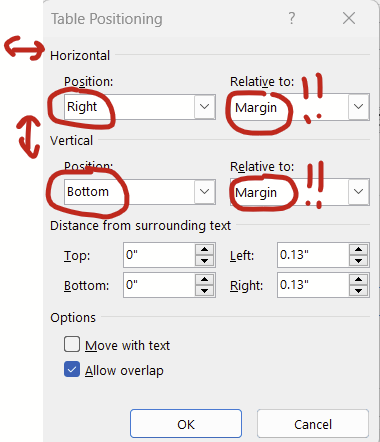
To set the positioning of your table or figure relative to the margin, right click on your table/figure and select “table properties”, set alignment to “right” (or center or left) and text wrapping to “around” then hit the “positioning” button:
You can then set the horizontal and vertical position relative to the margin rather than the paragraph. Then the anchors go away completely! You can set it all the way to the extremes (left/right, top/bottom) or put in a measurement (eg replacing “bottom” with “5 in” in the vertical “position” box will put your figure or table about 2/3rds of the way down a page).
Tables and figures behave much better when you set the positioning relative to the margin.
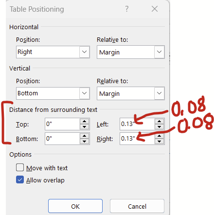
Changing cell padding *around* your tables and figures
Continuing with the window above (right click table –> table properties –> position), there’s this “distance from the surrounding text” section at the bottom that changes how much white space padding there is around the table/figure. The default padding is 0.13 inches, which I think is a bit too generous. Try changing this to 0.08 inches and you might get to squeeze in a few extra words in the surrounding text before a new line break.
For figures, there’s an analogous series of options that you can get to by right clicking your figure –> size and position. Under “size and position”, set the wrapping to “tight” and then have at it.
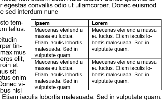
Reduce cell padding *inside* your tables
This is especially helpful for tables with lots of cells. Reducing the cell padding shrinks the white space between the text in a cell and borders of the tables. In contrast with the “save the whitespace” principle of lines and paragraph spacing, I personally think that less white space in tables improves readability. Here’s before, with default cell margins of 0.08:
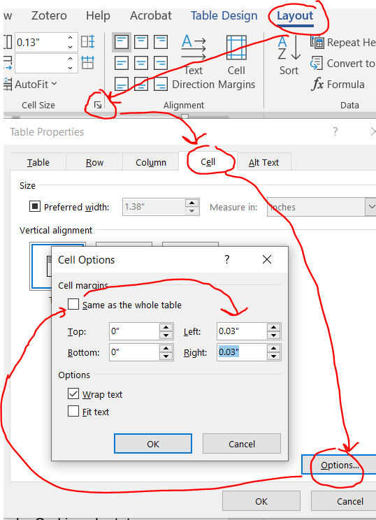
Highlight your entire table and you’ll notice a new contextual ribbon with “design” and “layout” tabs appear. Click layout –> cell size little arrow –> cell –> options –> uncheck the box next to same size as the whole table then reduce the cell margins.
Here’s that same table reduced with cell margins reduced from 0.08 to 0.03.
Now you can strategically adjust the column size to get back some space.
Also note that you can also apply justification and adjust the line and paragraph spacing within your tables, which might also help shrink these things down a bit.
Shrink the font in your tables
AFAIK, NIH guidelines don’t specify a font size to use in tables, just something that can be read. I typically use size 8 or 9 font.
Did I miss anything?
If I did, shoot me an email at timothy.plante@uvm.edu!
The first manuscript you’ll ever write is probably best described as a ‘slog’. It’ll take 2-3 times longer than you expect. This’ll be from a few different reasons:
Unfamiliarity with typical structure
Lack of a structured approach to writing a first draft
Developing the analysis too late in the drafting of the manuscript (i.e., not as a first step in drafting)
Deciding the tables and figures to include too late in the manuscript (i.e., after completing the analysis)
Not knowing how to use MS Word’s advanced features that can help optimize drafting
Here’s a resource that can help
I developed this generic research manuscript over several years of slogging through first drafts of epidemiology manuscripts. It attempts to address the common problems and includes recommendations for the first drafts.
Here’s what it contains:
Page 1 – Helpful hints
Page 2 – Suggested steps to bring this to publication
Page 3 – ‘fill in the blanks’ cover letter
Page 4 – ‘fill in the blanks’ title page
Pages 5+ – ‘fill in the blanks’ for the rest of the manuscript
Let’s be honest. Much of modern epidemiological research will be online, whether it be cruising PubMed, journal websites, learning introductory concepts on Wikipedia, or just straight-up Googling. You might as well optimize Chrome to help you surf for research in the most productive way possible.
Here’s a list of Chrome extensions that I have used and like.
Read Aloud: A Text to Speech Voice Reader
Have you used a screen reader before? Try it out! It’s especially helpful getting through huge blocks of text. There isn’t a perfect text-to-speech (TTS) extension yet. The closest is Read Aloud. Highlight the text to be read, right-click, and select the Read Aloud option.
Zotero (my favorite reference manager)
If you haven’t already committed to a bloated, high-cost, litigious reference manager that rhymes with “spend smote”, I’d recommend checking out Zotero. It’s an excellent, free reference manager with a very slick Chrome plugin. Just navigate to the PubMed page for a journal article of interest and click the Zotero Chrome extension’s button (you’ll need to have the Zotero desktop app open at the same time) and it’ll pull the full reference AND PDF if it’s available using Unpaywall.
Unpaywall: Direct linkage to freely-available PDFs for manuscripts
Unpaywall is brilliant. So brilliant, it’s integrated into Zotero. It indexes legal, university- and government-hosted PDFs for journal articles. If you’re on a journal’s website, you’ll see a grey or green lock appear on the right-hand side. If it’s green, just click on the lock and it’ll download the PDF from wherever it’s hosted. I bat about a 50% average of getting paywalled PDFs using Unpaywall.
EZProxy Redirect
UVM uses EZProxy to provide off-campus access to subscribed journals. If I wound up on a paywalled journal article that UVM has access to, there was a multi-step process of navigating to the library site, logging in through the proxy, and searching for the journal.
EZProxy Redirect automates that whole process. While you’re on a paywalled article’s site, just hit the button and it’ll bring you to the proxy access login then bounce you back to the article page with full access. It’s super easy. You just need to configure your institution once by right clicking on the icon and clicking Options. Note, this extension only works if your institution uses EZProxy. You can check the EZProxy database to see if your institution uses it.
Right-Click Search PubMed
Want to do a text search in PubMed? Just highlight the text, right-click, and select the “Search Pubmed” option. This extension simplifies searches for text.