Blog Post #1
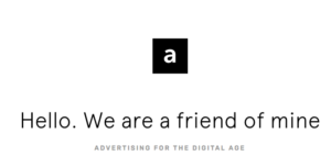
While there aren’t any guidelines as to what one’s portfolio website ought to be, A Friend of Mine feels like how a portfolio website should. The user interface is sharp but minimal, allowing the displayed work to take center stage. Upon entering the website, you are greeted with a simple “Hello” and an introduction from the organization. There is no load time, no garish visuals, and best of all no distracting audio (whoever autoplays music in 2018 needs to get their internet license revoked). While “advertising for the digital age” is a fairly banal slogan, it successfully conveys two important ideas: A Friend of Mine is an advertising agency, and they’re a contemporary company that works primarily on the web.
The site itself has a relatively clean, simplistic design, making it easy to navigate without having any visual clutter. On the far left and right of the window are stylized links to the company’s “work” page (showing their recent projects) and the “about” section, respectively. Additionally, clicking these links depicts the website scrolling from one page to another, which gives the website a sense of tangibility—it’s as if you’re interacting with a physical object. That being said, the transition was a little choppy on my computer, which kind of broke the immersion. That just goes to show how fine a line portfolio websites must walk between having an engaging interface and hurting the user experience. Regardless, I imagine the transitions would look pretty slick when displayed as they were intended.
Back on the main page, the first things one sees when scrolling down are two boxes. The left is labeled “get to know us” followed by “Giving a shit since 2011.” accompanied by a trendy-looking Netherlander smiling and resting his arm on what appears to be a miniature prop column. The casual language and imagery in this box works to establish A Friend of Mine as a young, hip company that works with other young, hip companies that do things targeted to young, hip people. The second box depicts a cartoon superhero and links to their latest project. While the image doesn’t really fit with the rest of the website, it shows the viewer front-and-center what they’re working on and what it looks like. Further down is a bar of scrolling sans-serif text which reads “less talkie, more walkie,” followed by more boxes with links to the company’s Instagram, a Medium article about their relationship with a large client, and a countdown timer to Friday (which isn’t a link, but cheerily invites you to “come join our Friday drinks!”). All of these elements come together to create a kind of character for A Friend of Mine. Even though the website is visually basic, the clean design, casual language, and the prominence of the company’s projects resonate with one another to give the viewer a very clear idea of what A Friend of Mine is all about. With only a handful of pictures and a text on a white backdrop, the company was able to bill itself as a laid-back, hip ad company that takes its work seriously but still knows how to have a good time.
 https://afriendofmine.nl/